« June 2013 |
Main
| September 2013 »
Arts of Japan series : print #6 - printing steps 14~16
OK, let's finish this off! Her kerchief needs a touch of tint - and this is a different blue from the one used on the water; this is shinbashi, a nice 'fashionable' blue (although there isn't enough of it here to really show the effect ...)
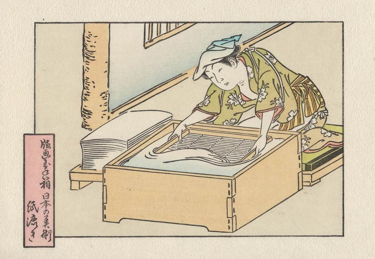
This next tone also may pass by pretty much unnoticed. I'll save you the trouble of hunting for it ... check the vertical post on the wall ...
And we wrap it up the same way as all the designs in this set, with the series title hidden in the embossing around the edges:
As I have been 'building' this one over the past few days, a couple of the staff members here have given their opinions. They think it's 'pretty quiet' ... To which I simply reply, "Thank you!"
I certainly don't want all my prints to be as low key as this, but now and then, I think it's suitable. (One of them commented that this is obviously a reaction to all the bright colours we have been using on our Chibi Heroes series recently, and maybe they're right!)
Posted by Dave Bull at 7:05 AM
| Comments (6)
Arts of Japan series : print #6 - printing steps 11~13
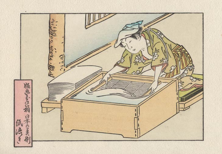
The first impression this morning was the one that I had primarily in mind when doing the colour design for this image - the main tint for her kimono. I used a moss green, and did it with a gradation (top down) over the pale brown base tone.

This has long been a favourite combination of mine, and I have been looking forward to using it again. It gives a very subtle result, but I don't want any 'in your face' tones in this print; as I mentioned back at the beginning, this will be a quiet one ...
Having said that, here we come with the most overt tone in the image - a tint on the striped pattern of her obi:
And for the last one this evening ... well, if I don't point it out to you, you might not even notice it ...

That leaves us with three left I think ...
Posted by Dave Bull at 8:23 AM
| Comments (1)
Arts of Japan series : print #6 - printing steps 8~10
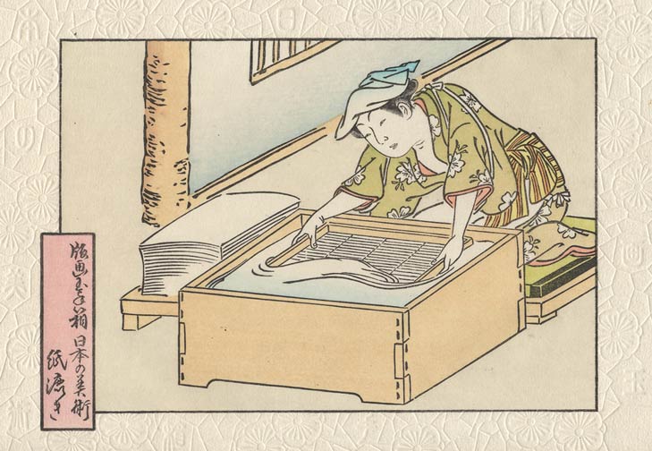
Three impressions today also. First up is a pale gradation on the water. This wasn't present in the original, but I think it adds a nice touch:
Next is a gradation on the wall:
And the last one today is a base tone for her obi sash. We'll colour the stripes separately later ...
Posted by Dave Bull at 10:30 AM
| Comments (0)
Arts of Japan series : print #6 - printing steps 5~7
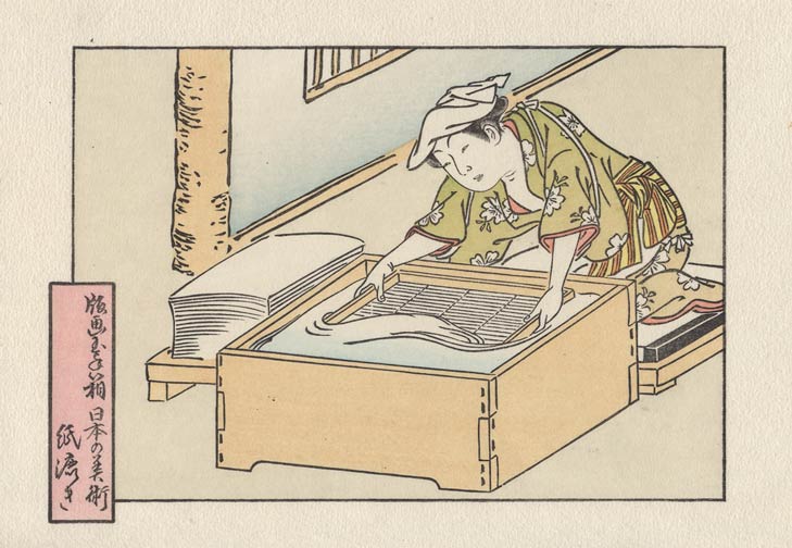
Three impressions today ... (actually only two ...). First was the background tone - a completely neutral tone that merely serves to put something on the background so that it won't be bare paper:
Next is a base tone for her kimono:
This next impression - the cartouche - was actually done during the same pass as the kimono colour. The two areas are far enough apart on the block that the brushes won't interfere with each other. I used two brushes, and worked quickly, getting both areas brushed out so that they could be printed at the same time:
When doing this, you have to work in a very consistent way - keeping the two brushes and pigment bowls in set locations, and staying on the alert not to get the brushes switched around.
(And do you know, sometimes I do actually manage to get through the entire batch without getting them mixed up!)
Posted by Dave Bull at 8:06 AM
| Comments (0)
Arts of Japan series : print #6 - printing steps 3~4
Next up is the same outline block that is used for every print in this set:
Followed by the first of the actual colour impressions:
I'm going to keep most of the tones on this print on the 'quiet' side. We'll have a couple of highlights, but for the most part this one will be an exercise in smooth and delicate printing.
Posted by Dave Bull at 7:46 PM
| Comments (0)
Arts of Japan series : print #6 - printing begins
After a few days of sidetracked work on next month's Chibi Heroes prints (if I didn't get them carved right NOW, the staff will have nothing to print over the next couple of weeks ...), I'm now back to my own printing.
Here are the first two impressions of this design:
This is what is known as a beta block; it is totally blank, and printed with just a smidgeon of paste. The intent is to calendar the surface of the paper, because if left in its natural state, the fine lines of the next step - the key block - could not be printed cleanly.
Next up is the key block itself, printed very gently with a very flat baren:
Hopefully the next impressions should appear around two or three each day ... (hah!)
Posted by Dave Bull at 8:06 AM
| Comments (1)
Another episode of 'Journeys in Japan'
Here is my most recent appearance in NHK's Journeys in Japan series - a visit to Osaka to find some 'art' (as the program producers defined it!)
(It'll take a few seconds to start streaming after you click 'Play' ...)
If you missed the previous NHK episodes, here is the 'Journeys' series visit to the Shirakami Sanchi region, and here is the 'Japanophiles' episode with Peter Barakan.
Posted by Dave Bull at 11:01 PM
| Comments (1)
Arts of Japan series : print #6 - keyblock done
It's taken a few days longer than it should, but the carving work on the keyblock is now 'done':
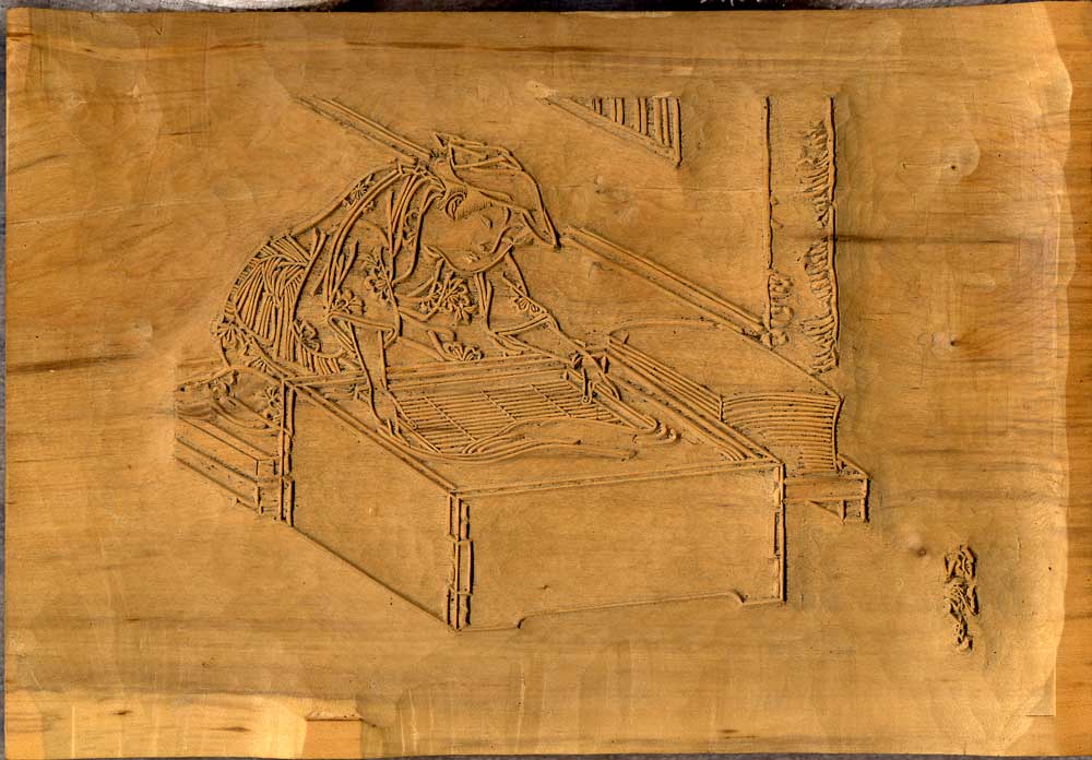
'Done' is in quotes because I'll be back to touch this up and re-carve any needed areas once I get a chance to proof it and see what it all looks like.
As for what comes next, I've decided to move ahead and cut a set of colour blocks in the traditional way for this one. After doing a bit of investigation into the possibility of using the old stencil-spray method, including a conversation with a craftsman familiar with the technique, I have to admit that it just isn't practical/possible to do it that way at present. If I had a couple of 'spare' weeks to prepare - doing trials and practice, not to mention the slow process of doing every sheet in multiple sprays one-at-a-time by hand - it would be nice, but that sort of time is simply not available.
No problem ... it will simply have to remain on my 'to do' list for a little while longer ...
In any case, colour block carving gets under way this morning. Should be around 12~13 tones, I think.
Posted by Dave Bull at 7:54 AM
| Comments (6)
Or is 'homage' just a euphemism for 'stealing'?
First, a bit of history. The Japanese prints of the Edo-era get a pretty good press these days, and most people with any knowledge of the field have come to think of Japanese printmaking as a pinnacle of the art. That may indeed be so, and some of the work created here at the height of the popularity of the genre is indeed astonishing in its intricacy and complexity. But we who work 'over here' would be less than honest if we failed to acknowledge that the Europeans also were capable of pretty fine work. And not only fine work, but work done much earlier than the Japanese.
Here is an example of a European print, dating from the 1640s, long before the Japanese were doing anything but rudimentary buddhist iconography. (Clicking will link to a 1.6Mb enlargement, so please give it time to download, and then enlarge it in your browser - or save it on your own computer and view it in a proper image viewer).
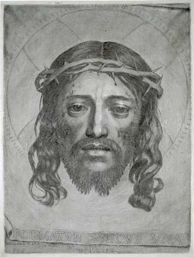
This is by Claude Mellan, and requires a bit of explanation. The print is a tour-de-force of technique. If you look at the enlargement closely, you can see - starting at the nose - that the entire image - face, background fabric, lettering, etc. - is formed from a single engraved line. As this line swells and shrinks in thickness, the deposition of the ink changes, and our brains perceive the areas to have different 'tone', even though this is a print in one colour in one impression.
He had an astonishing degree of skill at cutting, especially considering that he had no photography to guide him (nor Photoshop!). I have admired this print for years, and have always wanted to give this a try.
Well, a couple of months ago, I got my chance. Printmaker Maria Arango in Las Vegas has in recent years sponsored a number of collaborative print exchanges, in which she prepares a large sheet of wood, chops it into pieces, distributes these to printmakers around the world, and then reassembles everything in her studio, where she takes impressions from the resulting 'fractured' block.
I decided to join her most recent project - her 'Puzzleprint' blog is here - and for my entry I made a small print using the Mellan formula - a single spiral line that thickened here and there to create an image.
Mine is nowhere near as sophisticated as Mellan's version, but it was fun to make, and I think I might explore this idea further in the future.
I sent my block off to Maria some weeks ago, and although her project is not yet complete, she is blogging the progress, and today featured some images of my block and a test proof taken from it.

I hope Mr. Mellan doesn't mind!
Posted by Dave Bull at 11:56 PM
| Comments (7)
Remember the 'Journeys in Japan' trip I made last year to the Shirakami Sanchi woodland area?
Well, here we are with another similar trip - broadcast is tomorrow on the next episode, and this time it isn't to the countryside, but to the big city.
Here's the 'blurb' I wrote for their introductory page to the program:
Many episodes in the Journeys in Japan series take the viewers to rather remote places, and just getting there might be quite a journey. For this episode though, "getting there" is not a problem at all, because of course Osaka is a place that is probably on most visitors' itinerary already!
When the program producers first contacted me about taking a visit to Osaka, I "knew" what they would say next, "Dave, we're going to do an episode about some of the great food to be had in Osaka! Won't you join us?" So even before they explained the program concept, I was already saying, "Yes, yes ... yes!"
As it turned out, I was mistaken. They had a different concept in mind for the program, which you will discover when you watch it. We weren't on a journey looking for food for the belly, but for food for the eyes! I myself discovered a whole new face to this wonderful city, as we went searching for interesting _art_.
I can tell you that our hunt was most successful, and I think you will very much enjoy looking over my shoulder as I take you around to some of the locations we discovered and the interesting art we found there. And next time you yourself are in Osaka, remember that you can feed more than one part of your body while you are here! 'Kuidaore no machi' indeed! (Look it up!)
The program will run six times over a 24-hour period on the 9th~10th (8th~9th for some of you), and will be visible from the NHK World front page (use the 512K button for the best view)
[Update: the broadcast is over, but a dub of the program is here.]
Posted by Dave Bull at 7:56 AM
| Comments (5)
Late last year I picked up a better quality camera - a digital SLR - mostly for the purpose of making videos for the YouTube channel. It has done that job very well, and a lot of the praise for those videos should really be directed at the camera makers!
I actually haven't been using it much for 'still' photography. It takes images far too massive for my normal use, and the camera itself is covered with buttons and controls that I quite honestly don't have the time to study and learn. For most daily stuff around here I'm still using a point and shoot type of camera.
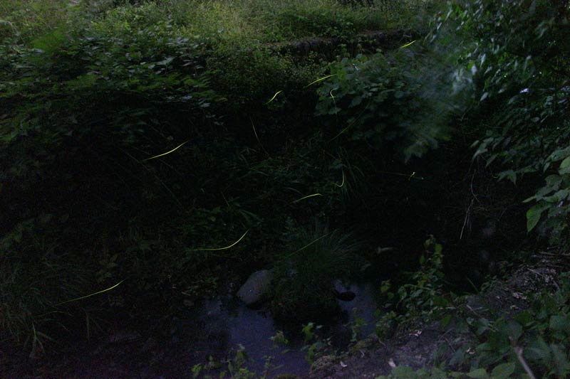
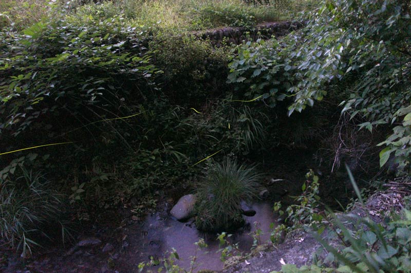
But tonight I thought I would have a go at taking some pictures of the fireflies in the river behind the workshop, and for that, a point and click is useless of course. So I got out the manual for the new camera and learned how to set it to 'bulb' mode, where the shutter stays open as long as you want.
I charged the battery, set the camera on a firm tripod on the riverbank, and sat next to it to await the fireflies. We're actually pretty much at the end of their season, and I should have tried this a week ago. But some did come along, and I fired the shutter open, and then manually controlled the exposure by placing and removing the lens cap each time a firefly moved into view.
And surprise surprise, I actually got some results!

I'm regretting now that I didn't try this earlier. I had basically been thinking, "Dave, don't spend your time taking photos of these things, just enjoy them in real life ..."
But maybe there is time for both ...
[Update: Although those photos look just fine on my own monitor, I got a 'Can't see anything!' report from a blog reader, so here they are again, with the levels adjusted in Photoshop. This seems to bring out the digital noise, but at least the trails are more visible.]
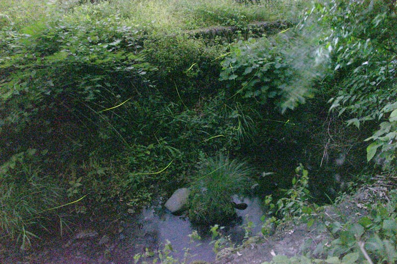
If the flies come out again tonight - not a sure thing, as we are at the very tail end of the season - I'll try again, with some different ISO settings.
Posted by Dave Bull at 11:12 PM
| Comments (2)
Arts of Japan series : print #6 - tracing ready
After a couple of days of 'stare at a screen' Photoshop work, the image is now traced at high resolution (600 dpi), and ready to print out for carving:
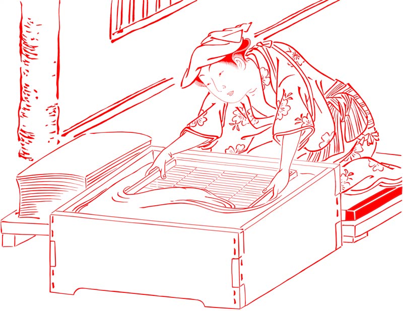

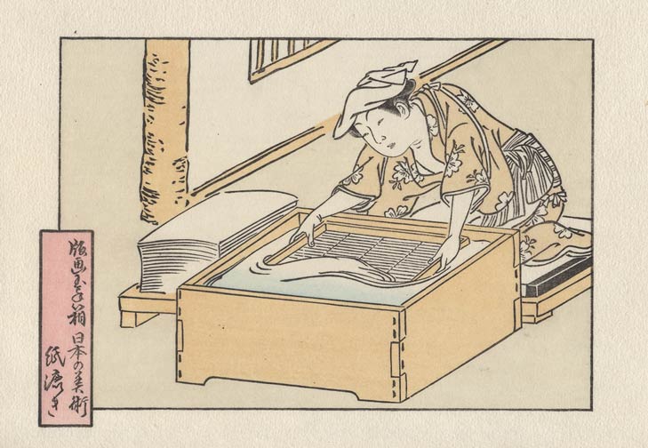
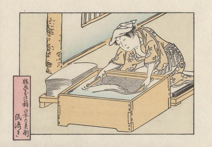
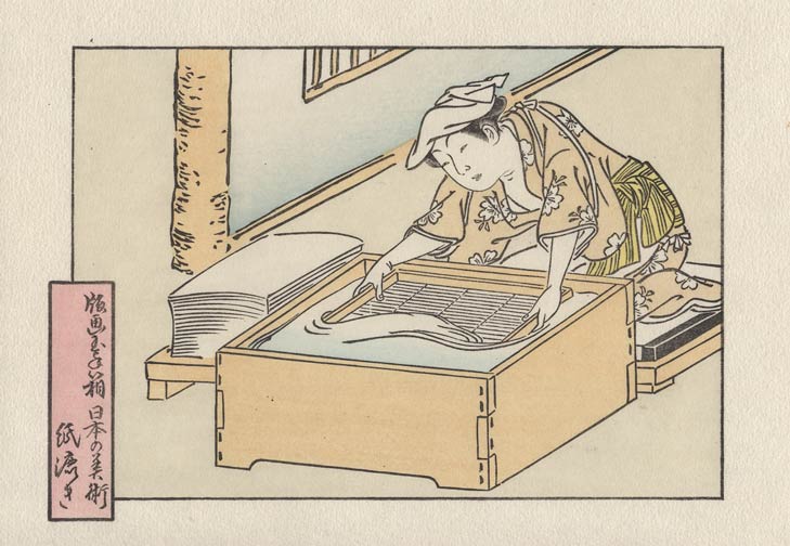
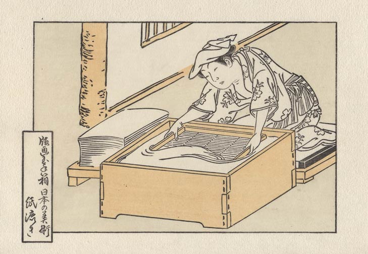
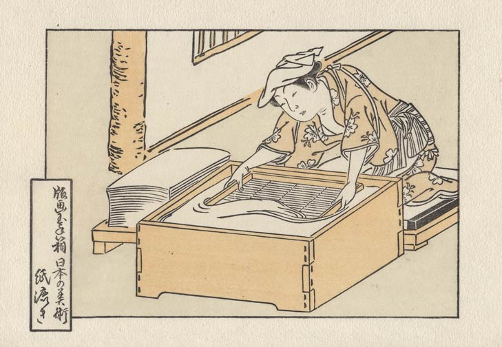
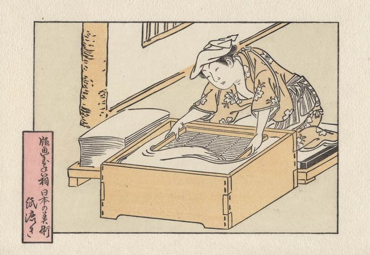
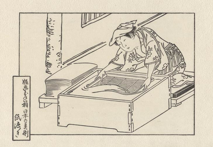
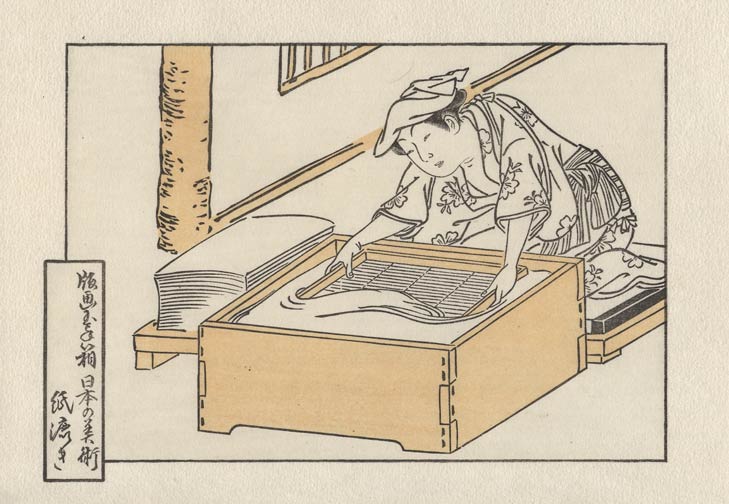
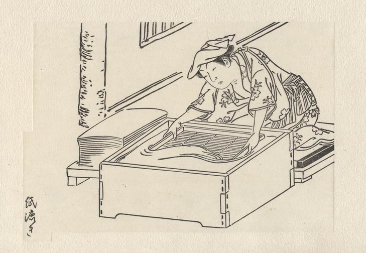
As pointed out by Serge in the comments to the previous post, our picture is one portion of the 'Papermakers' page from the book 'Shokunin Burui', illustrated by Tachibana Minko and published originally in 1770.
My friend book-dealer Shingo Ueda has a couple of copies of the book, and lent me one of them for my work. I'll keep it handy by my bench while carving, so that I can refer to it as I go along.
As the key block gets near completion it will be time to make a fairly big decision - just how far to reproduce the original while making this print. It's a big decision because the original book is not printed in colours.
Eh? But here it is ... there are clearly colours.
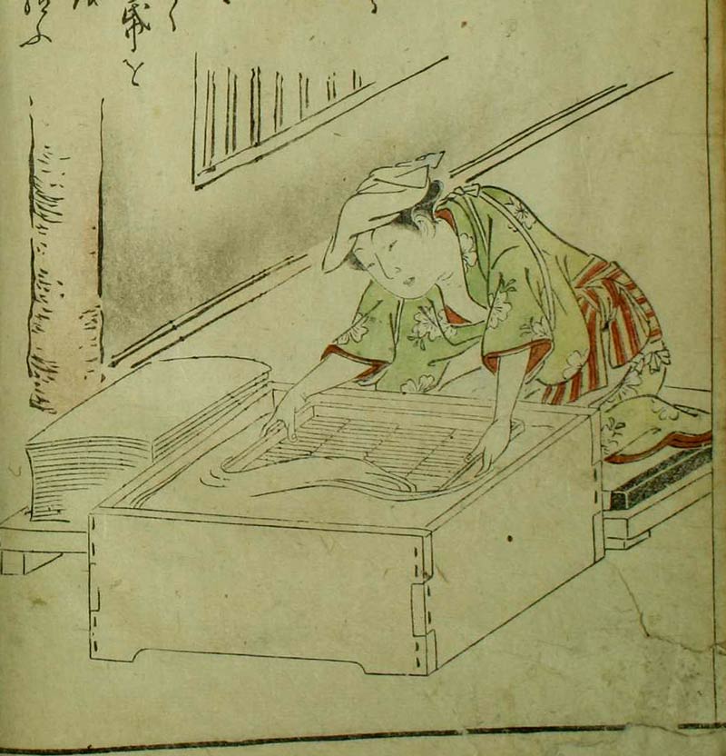
Hah. I said it was not printed in colours. This is an example of 'kappa-zuri' - colouring with stencils. The colours were applied by hand using a couple of different techniques; either simply painted on through a stencil mask, or blown on, to create gradations.
Whether or not I will attempt those techniques, or use a normal printing technique, I haven't yet decided ...
Posted by Dave Bull at 10:16 AM
| Comments (3)
Arts of Japan series : print #6 - tracing begins
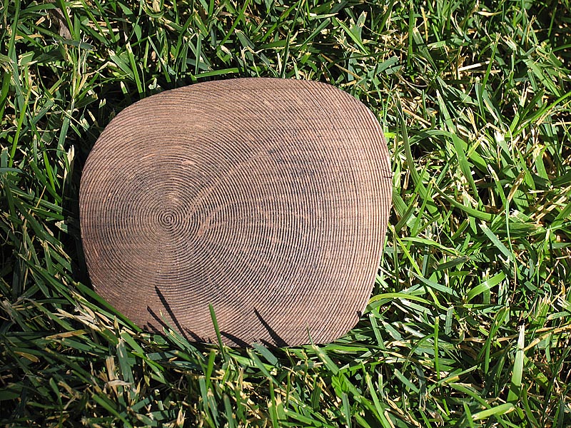
Amid all the other recent updates, work has also begun on my own next print - the sixth in the 'Arts of Japan' series. We'll get a chance to see the entire image a bit later along the process, but here's a crop of the original from which I will be working.

Can you tell the 'theme'? What is this person doing ... ?
I am currently tracing over the entire image to prepare the sen-gaki, the sheet that will be pasted down onto the wood for carving. Doing this takes almost as long as the actual carving itself, but if I don't spend time and do it properly, the carving will not progress smoothly.
Once I got the image scanned and imported into the computer for tracing, I was able to look at the lines close-up, and was a bit disappointed at the quality of the carving on the original. Look at the places marked in red ...
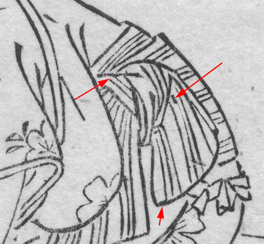
This is pretty poor quality work, but there are a couple of reasons for it. First is that this original dates from 1770, and the general level of carving was nowhere near the quality that it would reach a couple of decades later. The second is that this is a book page, and books were generally not given the same level of attention that expensive single sheet productions were. It was slam, bang, get it out the door work, and an image like this would have been mostly created by younger less-experienced carvers. Perhaps the faces and other important points got the attention of the top men in the shop.
The question for me is, how much to 'fix'? Some parts are easy - those three places in red are clearly not acceptable, and I will be 'cleaning them up', creating smooth tasteful lines in those areas. But if I start to 'clean up' everything, the whole character of the image changes, and it ceases to be an accurate representation of the original print.
So I'll play it by ear as I go along, fixing the most egregious spots, lightly adjusting others, and cutting the rest pretty much as I see it.
It'll take me another couple of days to get the tracing ready, and it'll then be time to get to the bench ...
Posted by Dave Bull at 7:56 PM
| Comments (4)
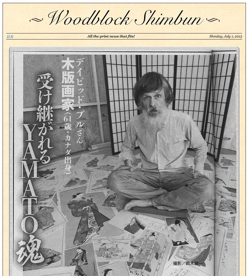
Woodblock Shimbun updated!
Have you been reading the 'Woodblock Shimbun' recently? Motto: 'All the Print News that Fits!'
I stole a bit of time from the carving work yesterday (I've begun work on my own next print, in the 'Arts of Japan' series ...) and did some updating of our press/media pages.
It's good news/bad news though, for most readers of this blog. There are a number of very interesting magazine stories just uploaded ... but they are all in Japanese!
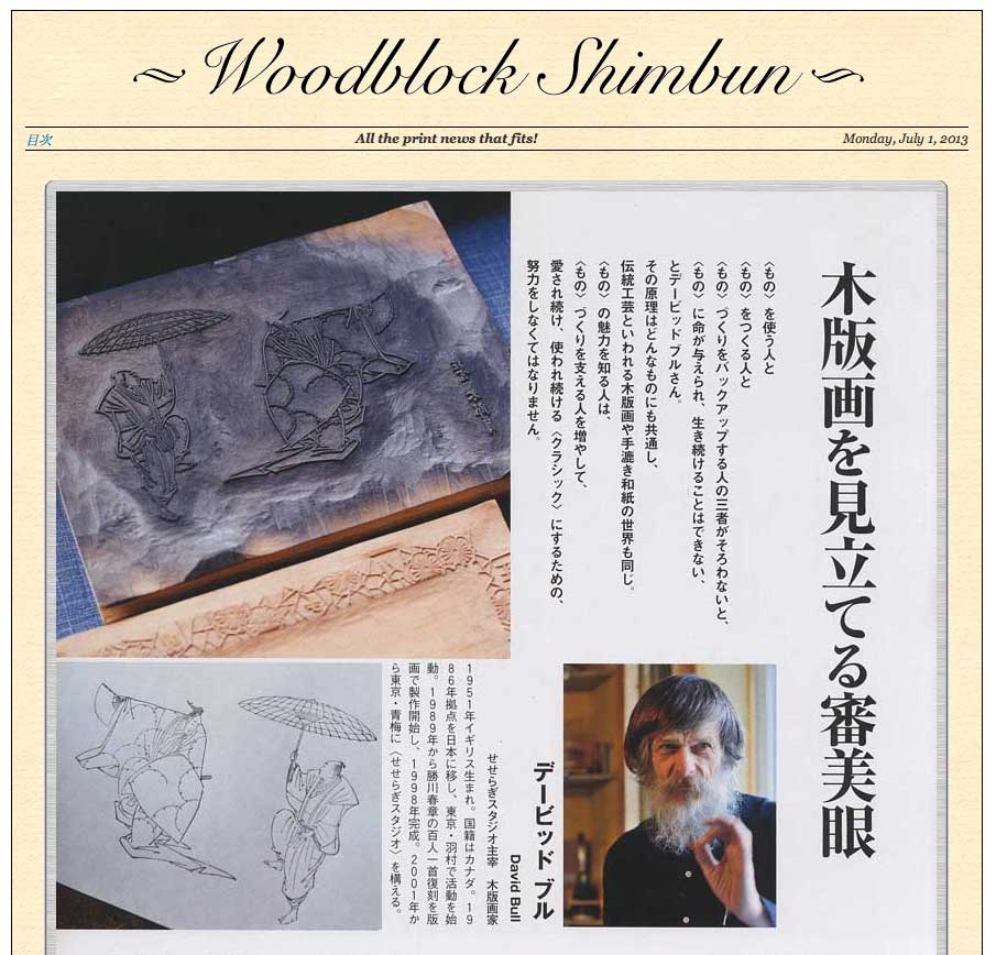
Still, if you would like to look at pretty pictures :-) head over to the (Japanese) index page, and select some of the more recent items in the list.
If you don't mind seeing older items, use the English index page, where there are a number of them stretching back in time ... (including lots of TV clips further down the page)
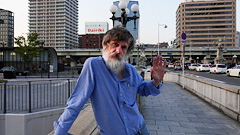
Not all the photography is the most flattering, though; who chose this one (published just last week)??
Posted by Dave Bull at 9:12 AM
| Comments (0)
