Posted by Dave Bull at 7:05 AM, July 31, 2013 [Permalink]
OK, let's finish this off! Her kerchief needs a touch of tint - and this is a different blue from the one used on the water; this is shinbashi, a nice 'fashionable' blue (although there isn't enough of it here to really show the effect ...)
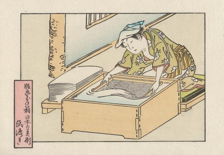
This next tone also may pass by pretty much unnoticed. I'll save you the trouble of hunting for it ... check the vertical post on the wall ...
And we wrap it up the same way as all the designs in this set, with the series title hidden in the embossing around the edges:
As I have been 'building' this one over the past few days, a couple of the staff members here have given their opinions. They think it's 'pretty quiet' ... To which I simply reply, "Thank you!"
I certainly don't want all my prints to be as low key as this, but now and then, I think it's suitable. (One of them commented that this is obviously a reaction to all the bright colours we have been using on our Chibi Heroes series recently, and maybe they're right!)
The subtle colors, along with the multiple gradations, and the nicely balanced composition, make this a real beauty. I'm looking forward to receiving mine!
Good work!

I particularly like the kerchief.
kerchief
Funny you mention that one in particular, because I'm getting a bit of blowback on it from the staff here, who have been watching this thing come together.
All the other pigments I used are of an older more traditional type, but for her kerchief I used the 'new' pigment known as shinbashi iro. New in this case refers to the Taisho period, when this tint became popular for young women's fashions (or so I have read).
So it actually doesn't 'fit' with the other tones, but I felt that using it in that small area wouldn't disturb the overall balance too much. I may be wrong on that ...
Got mine today. A beautiful print! Thanks.
Thanks Marc! Glad to have it as part of your wonderful collection!
I've had mine for a few days now, and have looked at it a few different times. I see what the staff mean; the kerchief color definitely has a different feel than the other pigments.
But I still like it.