Posted by Dave Bull at 8:23 AM, July 30, 2013 [Permalink]
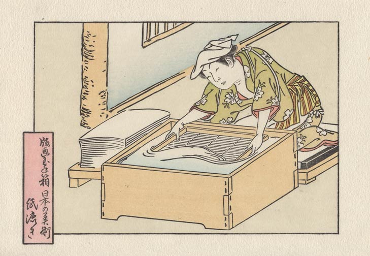
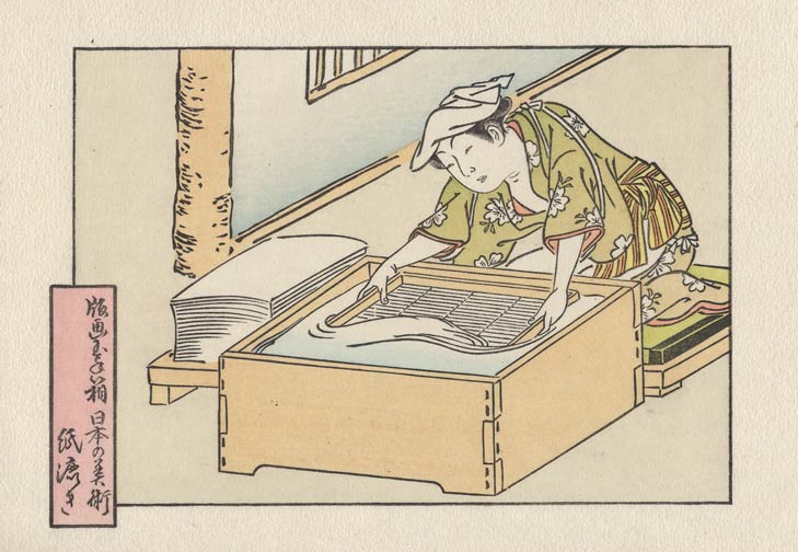
The first impression this morning was the one that I had primarily in mind when doing the colour design for this image - the main tint for her kimono. I used a moss green, and did it with a gradation (top down) over the pale brown base tone.

This has long been a favourite combination of mine, and I have been looking forward to using it again. It gives a very subtle result, but I don't want any 'in your face' tones in this print; as I mentioned back at the beginning, this will be a quiet one ...


