« January 2011 |
Main
| March 2011 »
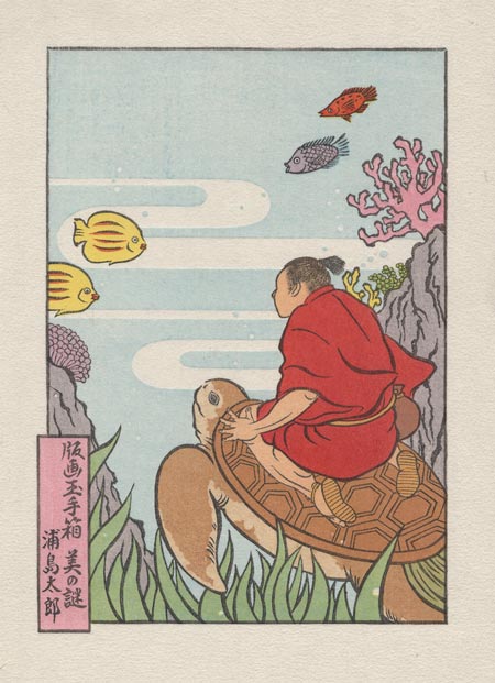
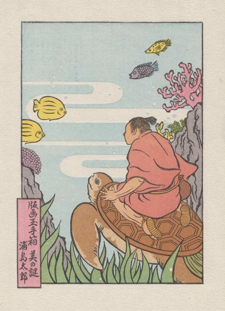
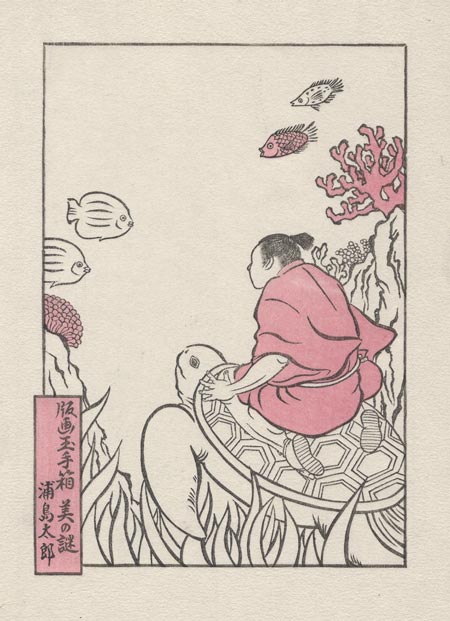
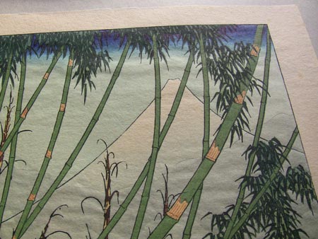
Mystique Series #11 : printing steps 17~19 ... she's done!
So let's finish this off today - the collectors are waiting!
I asked in yesterday's post about what people thought might be coming up, but I doubt that anybody would have guessed this one (nor would I have). Seki-san depicted our hero in traditional fashion, with a kind of 'skirt' wrapped over his kimono. (I have no idea if this is an item of traditional fisherman's clothing, or is something related to his adventures below the sea; I'll have to ask her when I see her tomorrow for our 'signing session'):

Back when I first introduced Seki-san here, I mentioned that she has studied ukiyo-e prints and considers her work to be in the same tradition. Well, with the addition of this next impression, you can certainly see where she is 'coming from'!
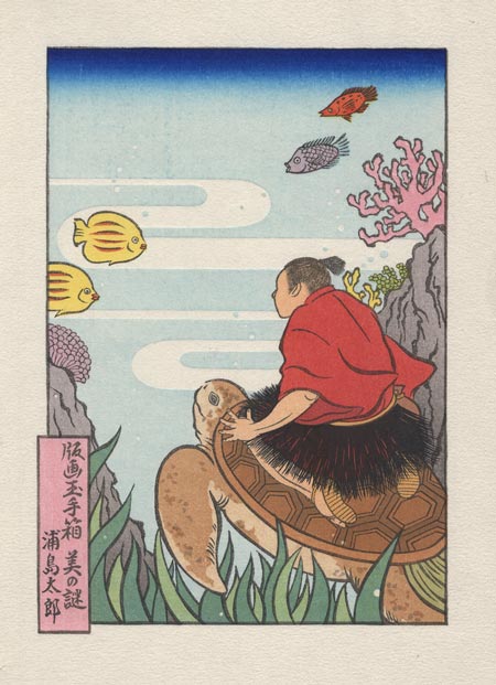
And I think that'll just about do it. There are other things that could be added, as was mentioned in the comments yesterday, but this is where we'll leave it. Any further complexity would - I think - just be a bit too much for a small 'simple' image like this (not to mention 'time vs money', etc. etc.).
So I'll just add the marginal embossings ...

... and call it done. This one was fun!
Posted by Dave Bull at 4:06 AM
| Comments (12)
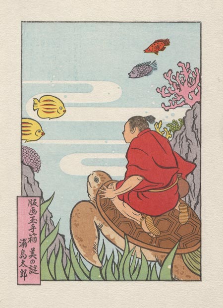
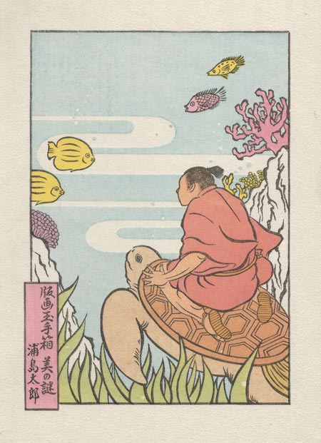
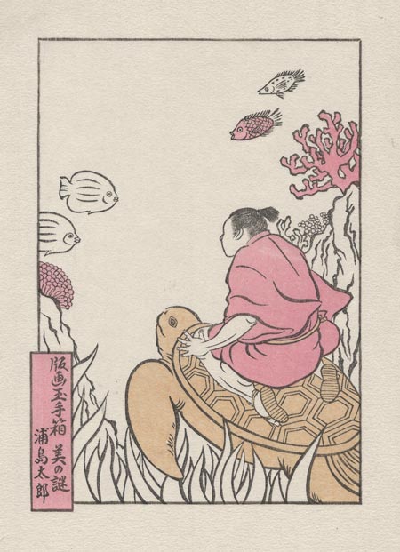
Mystique Series #11 : printing steps 14~16
Another application of a blue tone - just at the bottom of the image this time - will complete the grasses:
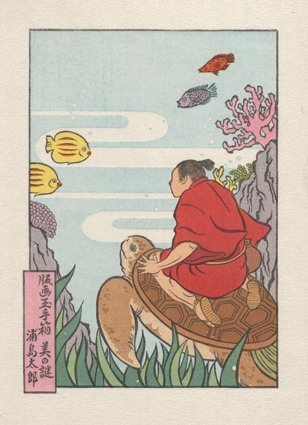
I think this leaves us with four different greens in the print, although one of them, on the tail, is very similar to part of the grass, and wouldn't really get noticed as being distinct ...
Next is the final 'highlight' tone block on the turtle shell:
We continue 'filling in' areas that need more depth, with a gradation on the rocks - bottom up:
In the home stretch now, but still too much for a single day's work. The next two blocks are both a bit difficult to print, but they'll transform our image. Looking at this now, what do you think it still needs? Anything 'missing' that you can determine? (And I don't mean the outer border embossing pattern, which will come after everything else is done ...)
Posted by Dave Bull at 4:40 AM
| Comments (3)
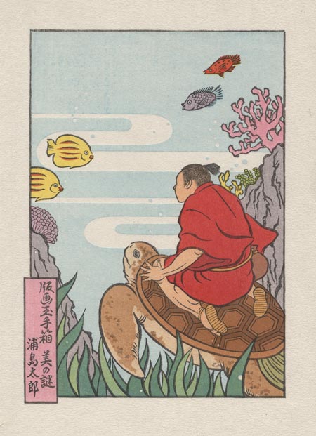
Mystique Series #11 : printing steps 11~13
'Pop' we need, and pop is what we get! It's too bad that the pleasant under-colour has to disappear, but that's the way it goes! It will 'live on' in the added depth of this final kimono colour. This block also adds highlights to the yellow fish at left, and provides a total 'makeover' of the fish at the top:
Next we have the third build-up on the turtle (one more to go):
And because that was a 'quick' one, and the next one is also a small area, there was time for three stages today. A very small 'grey block' adds a bit of necessary depth to his hair, and a nice touch to the inner sleeve of the kimono:
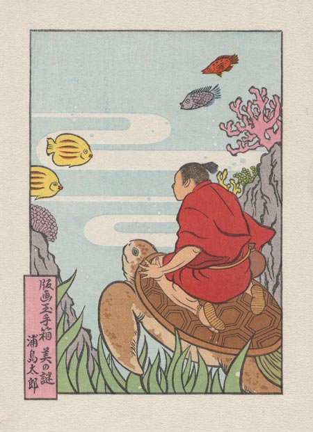
Still not sure quite how many are left. Perhaps five, perhaps six ...
Posted by Dave Bull at 4:44 AM
| Comments (0)
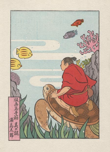
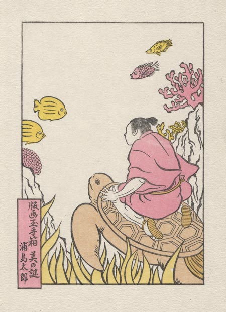
Mystique Series #11 : printing steps 9~10
It's perhaps not clear at first exactly what has changed, but if you were to put them side by side, you would see that we've had another blue block - this one mostly on the grasses, although touching other areas too, including one of the fish.
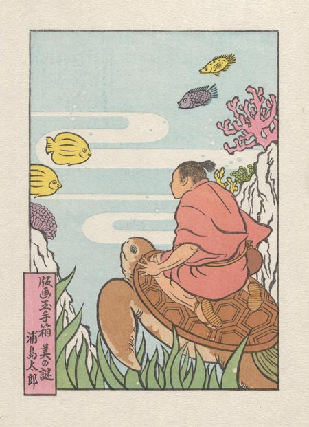
These two blue blocks have turned out to be essentially the same tone, which is not what was planned. The mock-up that Seki-san originally gave me had the sea colour much lighter than what you see here. I worked out the separations thus planning for two blues - a very light one for the sea, and a darker one to bring the green to these grasses. But after seeing my first proof, she changed her idea and asked me to deepen the sea to about this level, which has had the side effect of making the plant at left (which is pink plus the 'light' blue block for the sea) the same tone as the fish (which is pink plus the 'heavier' blue used for making the green). But that's something she'll have to accept, unless I chop it off that block and carve another one for it.
Anyway, the grass at bottom now has its 'base colour'. Coming up later is another block for just some of the blades in the bunch, giving a multi-toned effect ... The turtle tail has now reached its final 'olive green' tone, and Taro's pouch is also done I think. For that little area, I didn't really 'calculate' particularly carefully; I simply put it onto many of the blocks, knowing that what would result is a kind of 'muddy' indeterminate colour. That wouldn't be suitable for any area of the print that would get important visual focus, but I think it's just right for that little object.
We next fill in one of the last remaining areas of untouched paper - the rocks that 'frame' the scene:
I was showing this to somebody today (via Skype) and they assumed that it was the finished version. "Looks nice!"
Well ... it might be 'nice', but there is no way that this could be the finished version. You would be completely bored with it after a minute or so. We have - I think - seven or perhaps eight impressions still to go. We need some 'pop'!
And pop pop pop is what we're going to get ... at least three of the upcoming blocks will help do that for us, including the very next one!
Posted by Dave Bull at 4:58 AM
| Comments (0)
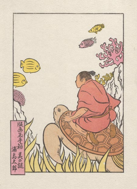
Mystique Series #11 : printing steps 7~8
Now it jumps to life, with the base tone for the sea, and interestingly, right away the kimono colour turns 'duller' and loses interest. None of these tones really make sense until everything is in place. It's fun too, that we get both positive and negative bubbles from the one block ...
Overprintings here include the little plant at the left which has become lilac, one at the right which is now very light green, and of course on the grass at the bottom, most of which will receive another touch later, and parts of which will get two more ...
And I think this image is perhaps too small to see it, but a mistake is now visible ... Nothing dramatic, and it will be mostly covered up later, but a mistake nonetheless.
And the second overlay on the turtle:

This uses exactly the same pigment as the undercoat, but a little denser.
Posted by Dave Bull at 3:50 AM
| Comments (0)
Mystique Series #11 : printing steps 5~6
We now get our first - albeit small - overprinted areas ... his sandals, and the turtle's tail. The yellow block here uses two brushes: one loaded with a bright yellow for the tropical fish, and the other with a paler tone for the sea grass at the bottom, which will of course receive more overprintings later:
This next one is interesting. It's the hada-iro - skin tone. But instead of simply applying this to his exposed skin areas, it is printed across the entire region, including the top area of the turtle, his sandals, and his clothing.
The resulting tone on the kimono - made from the pink of the coral plus the skin tone - is a wonderfully rich colour that would be difficult to create on a single pass. And although it doesn't really show on this kind of scan, the way that the colour is embedded among the fibres of the paper adds another dimension.
From here on in, most of the blocks will be adding overprintings here and there ...
Posted by Dave Bull at 4:09 AM
| Comments (3)
Mystique Series #11 : printing steps 3~4
We start the colour blocks with the traditional tint known as beni. The cartouche area will be untouched from here on in, but the rest will probably all be overprinted:
Next up is a simple one - a base tone for the turtle area:

Most of the prints in this series have a kind of 'technical' point tied to them, and this one is no exception. Here's an excerpt from the story that will accompany the print when it is mailed out to collectors:
... and that brings us to another very important point about traditional Japanese print production, one that is unfortunately not readily visible to the typical viewer.
Three different green tones appear in the finished print, but I used no green pigment at all (I do not own any). Purple is there also, as is orange, but again, neither of those tones appeared anywhere in my mixing bowls. Our colours are all _transparent_, and thus create blends when overprinted. The bright yellow of the tropical fish in this picture is also printed in other areas - in the sea grasses and the orange fish. Blue also printed on the grass thus creates a green tone, while light red printed on the fish turns it orange.
Combining colours like this does save some time by reducing the number of blocks required, but that’s not really why we do it. Colours created in this way - blended in place _on the paper_, rather than being mixed separately in bowls and then applied side by side - have a wonderful harmony and coherence. This is one of the least-known ‘secrets’ of the old prints, and is the single most important factor contributing to their visual appeal.
Posted by Dave Bull at 4:03 AM
| Comments (0)
Mystique Series #11 : printing begins ...
If I still remember how ... printing of the Urashima Taro design now begins!
After Tuesday's school demonstrations, and yesterday's trip downtown to see young carver Sato-san (and Takahashi-san, the lady who is sponsoring his work at present), to discuss the senshafuda project, it's time to get back to the bench.
I'm on a very tight deadline now with this print, for a couple of reasons: the nominal schedule which the collectors have become used to is that each print is ready for shipping preparation by the 15th of each month, at which time I do all the invoicing. The 15th is obviously impossible this time, but the first batch of 100+ should be off the blocks by around a week from now, maybe the 18th. I would then normally get started on the second batch right away, but there is another 'distraction' coming up; I will be flying over to Canada on the 21st for a quick family visit with my parents, my girls, and the grand-sons. I haven't seen them all since last June, and a few months ago when I looked ahead to late February, I thought that the schedule might be a bit relaxed at that time, so booked the ticket.
Hah.
But it'll only be a short break, just seven days, and I'll then be back at it. So this print will be a few days late for everybody I guess, but the next one - which has yet to be carved - won't even begin production until somewhere around March7~8th at the earliest, so it can't possibly be ready by the 15th.
Well ... we'll deal with that when we get to it.
Anyway, three impressions on this one are now done. The first is the familiar outline around the image, and the second is a blank beta block to flatten the paper in the area where the image will fall (missing the outer border, which should stay thick and fluffy). So there is nothing to show for those two, but here is the result after the key block impression:
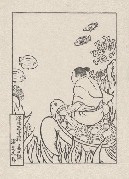
Tomorrow, we start to get colourful!
Posted by Dave Bull at 3:15 AM
| Comments (3)
'Mokuhankan Conversations' wakes from its sleep ...
I've been posting here about the ideas for developing Mokuhankan - my 'publishing' venture - and I think it's better to start using the Mokuhankan site itself for pushing things forward.
So I have just made a post on the 'Mokuhankan Conversations' blog about the next project. If you have been following this, please add that site to the list of places you check now and then (or of course add it to your RSS reader, etc.).
The new post is here.
I'll of course still be posting here on the RoundTable, but I'll try to keep this venue for my 'personal' work (the Mystique series, etc.), and put the publishing projects over there. Not quite sure if it will work out that way, but we'll try ...
Posted by Dave Bull at 9:09 AM
| Comments (0)
Five or six times a year, I find in my mailbox an envelope with a thick catalogue inside. This is from one or another of the print and oldbook dealers downtown. Some years back, during the years when I was making the very popular poetry series, and had money 'to spare', I was a regular customer of those shops, but in recent years the number of catalogues arriving in my postbox has tapered off, as they have one-by-one dropped me from their mailing lists!
These catalogues are a lot of fun to browse. It is sometimes frustrating to see a beautiful book or print that I would like to own, but which carries a very high price because it has become a 'collectors' item'. I don't want to buy it for its 'collectible value', I just want to have the beautiful object here on my bookshelf, but unfortunately the two things can't be separated ...
One such catalogue arrived here a couple of weeks ago, and this one is a little bit different from that issued by other companies. Most of the catalogues are simply that, catalogues. The items are listed with a price, and whichever customer calls up to order any particular item first, can have it. Because these are old items, there are of course no other copies available; everything is a 'one off'. But this particular company doesn't sell things that way; they send out the catalogue - which has a price listed for each item - then take orders for the next ten days, letting them build up, including multiple orders for the same items.
But it's not what you think - they are not taking bids on the items. At the end of the ten days, they simply draw straws on each one, and if your name comes up, you get the item - at the catalogue price.
I never really had much luck with their stuff. Desirable items of course always draw many offers, so the chances of getting a 'hot' item are pretty small. But I browsed through this catalogue anyway, seeing what treasures might be in there.
And this year, there were so many! There were easily more than a dozen items that I would love to have as part of my collection here. So I couldn't help but think ... "Dave, you had a very good Gift season in December. You worked so hard ... Surely it's OK if you put your name down for just one of these items, isn't it?"
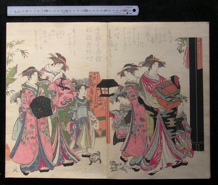
Well, it didn't take much to talk myself into it. I called up the girl who takes the orders, and put my name down for something that I have lusted after looked at from afar for many years - a fine copy of the Taisho-era reproduction of the famous Masanobu album Yoshiwara keisei shin bijin awase jihitsu kagami (A Mirror Comparing the Calligraphy of New and Beautiful Yoshiwara Courtesans).
The Edo period original version is of course museum material, and even single pages from it go at auction for around $5,000. This Taisho period reproduction of the album was listed at 35,000 yen (just under $400). She took down my name, along with the item number, and then asked "And ....?"
And I couldn't help myself; I added one more, a boxed set of 50 prints based on Hokusai designs, which was issued by the Takamizawa company in the pre-war period. These are usually found all split apart and in poor condition, but this was listed as being complete, and in 'very fine' condition. It was 49,000 yen (just over $500), but as I 'knew' that I would only win one of these items, if that, I wasn't worried.
That was a couple of weeks ago, and I basically put it out of my mind, being busy (very busy!) with the current print project.
This morning, I was interrupted in my proof printing by the doorbell; a package delivery.
As I said ... Christmas in January! Both items were in the box!
It's funny, but the first emotion was a bit of a rush of guilt! My collectors have been supporting me so well recently, many of them perhaps because they want to help this guy 'get by' in his projects, and here I go and start throwing money around like this!
But please ... just have a look!
The Masanobu album. Padded cover, all printed in woodblock, of course.
It's accordion-style, and opens on full-page spreads. Look at the ruler ... 30cm. This is a huge volume - each page equal to two full-size prints (snapshot is enlargeable):

Each spread represents a Yoshiwara scene, accompanied by calligraphy from the ladies depicted (these were real people, and it's probably better if you don't ask what their line of work was ...).
Every page is a total riot of detail and colour:
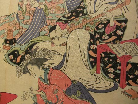
There are seven such spreads in this album. And to think that they would let this go for just around $400 ... incredible!
Anyway, it has now found a very good home for the next couple of few decades, I think!
And ...
The Hokusai set.
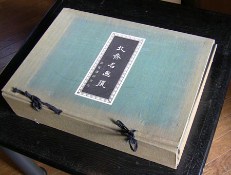
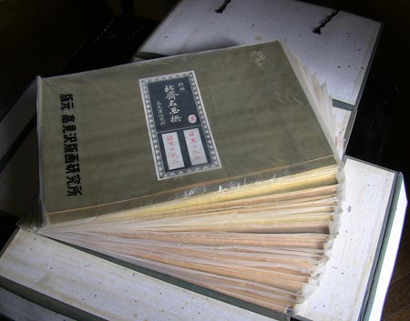
Very sun-bleached case. Inside are twenty-five packages, each one containing a pair of prints. (This was a subscription set at the time ...)
Takamizawa prints vary widely in quality, but these are very nicely printed - with clean, unspotted gradations, smooth colour, and perfect registration.
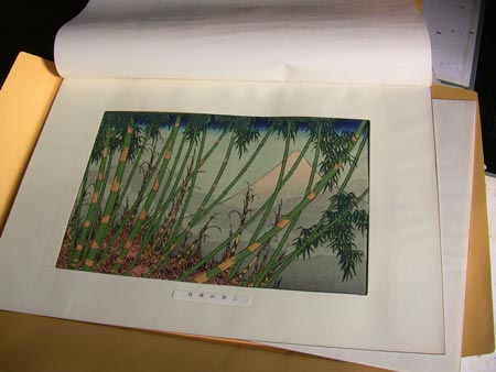
Here's a closeup (enlargeable). Nice stuff!
The top few packets in the set have been opened a number of times, and they show a bit of wear and tear, but when you look down into the pile, it's clear that most of these things have never been disturbed. A set like this is very difficult to 'browse' and I'm sure very few of these prints have ever seen the light of day.
And that's going to have to change. The backboards and cover sheets for the prints are a very cheap pressboard, and the prints are already showing signs of 'burn' from the acidic pulp. I really don't want to 'destroy' this item, but those prints are going to have to come out of there, or they'll be doomed.
No chance to work on this now, but when I can find the time (hah!) I'll carefully remove the prints and put them into an acid-free album. I won't toss out the original packaging, but will preserve it separately, for historical interest. But there is no way that they can stay 'together' ...
Enough of this playing around though ... I have proofing work to do! I have an appointment to see Kaori-chan tomorrow evening (all the way over at her place on the other side of the metropolis ...) and I don't have anything to show her yet!
Posted by Dave Bull at 7:02 AM
| Comments (10)
Mystique Series #11 : sizing the paper ... in winter!
With most of the carving now finished (except for the sea block, for which Seki-san is sending me a bit more detail later ... bubbles, etc) it's time to start getting ready for the printing.
And that means ... sizing time!

This is the fourth pair of prints that I have done since beginning to do the sizing myself, back in the summer. As I reported at that time, it went pretty well (considering I had never done it before), and I was feeling fairly confident about it.
The second 'go-round' a couple of months later also went smoothly, but when I did the paper the third time - for the previous pair of prints exactly two months ago - I ran into many problems. That was in early December, and the ambient conditions here could not be more different; instead of hot and humid, it had become cold and very dry. But I was ready for that, or so I thought.
I went back to the 'books' for advice on how sizing in winter should be approached differently from summer, but all I found were repeated comments to the effect that the mix should be 'weaker' (less gelatin to any given amount of water). So I cut it back about 10%, and proceeded as usual.
If I said 'it was a disaster' that would be an exaggeration, because I was able to print on the paper (cursing at the 'paper sizer' every step of the way), but it was basically a mess, start to finish.
What I hadn't realized - because my 'introduction' to sizing came in the warm season - was that doing it in summer is easy compared to a colder season. Paper at room temperature (in summer) is soft and absorbent, and the warm size floods into it smoothly. But paper in December is (of course) cold and brittle, and even though the size itself is warm (coming straight from the heated bath), the instant it hits the paper it 'gels' and tightens up. I could see this happening as it came out of the brush, and later when I was printing, the 'spottiness' was very evident. Rather than being distributed evenly throughout the body of the paper, the gelatin was 'dotted' everywhere.
And then when I was drying it, no matter how tightly I kept the windows closed, the paper dried almost instantly, curling up and 'crisping' as it did so. It was very difficult to get it smooth and ready for printing when moistening it later.
So ... this time around, I was ready. I made up the mix with an even lighter amount of gelatin and alum than before. For the record - if anybody is 'doing this at home', I used 2 litres of water, 80 grams of gelatin, and 23 grams of alum.
Then, getting an old panel heater out of the closet, I set it up so that the waiting paper stack got basically warmed up (photo above). (I also prepared the paper an hour or so before this, by 'hiding' it under my kotatsu (the sunken table with the infra-red heater underneath) in the living room.
This all helped a great deal, and the size came out of the brush into the paper very smoothly indeed. One problem solved!
But there was another problem with my previous attempts, both in summer and winter. I have been having a lot of trouble getting the sizing evenly spread across the sheet. The problem is the 'touch-down'. The moment the full brush touches the paper, it 'lets go' of a lot of the liquid, and even though I tried to move quickly at first, then slowing down as the brush became more empty, the initial spot was always too wet.
So this time I decided to try something else.
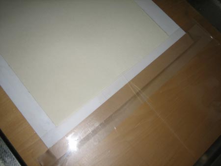
Not sure how visible it is in this photo (and the one above), but I have put a very thin (but stiff) plastic sheet in the 'touch-down' area at the right side of the brushing area. Here's a closeup of how the paper stack (these are finished sheets) extends just a tiny bit under the sheet:
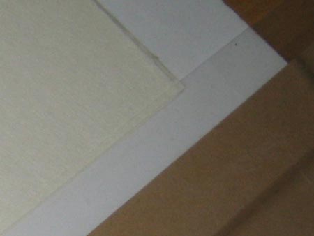
Each fresh sheet goes onto this stack, and is slipped under the edge of the plastic. I then touch down with the brush out in the plastic area, and sweep it smoothly onto - and across - the paper. The plastic catches the initial flood. The very tip of each sheet thus gets missed in the brushing, but that won't be printed on, and actually will be trimmed off later anyway.
How did it work? Very well indeed. I still had some sheets with too much at that end, but it was greatly improved over last time.
But there is something else to mention about this kind of 'trick'. Every now and then, I get an email from somebody who has seen one of my sharpening videos, letting me know about a wonderful tool that they want to recommend - a little roller device that will keep the bevel of the knife 'flat' when rubbing it across a sharpening stone. "It's great! You never have to worry about the tool rocking on the stone!"
Yes, I'm sure. But also, if you use such an aide to sharpening, you yourself will never become able to hold the tool properly. For the rest of your life you will be dependent on it. No thanks. I'd rather struggle (at first), then later, enjoy my ability to do it properly without the crutch.
So I was thinking about that as I set up this plastic sheet today. "Am I 'crippling' myself?"
I think not. I'm still trying to get the proper smooth 'touchdown' motion, and whether or not the plastic is there I think won't make too much difference in my progress.
Maybe.
Anyway, it's all done now, and ready for printing. I think the results should be better than the previous batch (it couldn't be any worse!), but we'll discover that next week.
In other news ... Did you read the comment I posted in the previous entry? I'll be out of here on Sunday for an appointment with Seki-san, and then I'll be downtown again on Wednesday for a visit to Takahashi-san, who is the lady currently sponsoring young Sato-san's training. It's not possible to make arrangements with him directly, and I will have to go through her. I think she should be cooperative though ... we'll see.
What's cooking? Well, I had better not talk too much about it until I get the "OK, I can do that!" from these people, but the idea for a nice little 'fun' project has bubbled to the surface over the past couple of days ...
And on top of that stuff, I'll be out of here all day Tuesday too, for a day of demonstrations and fooling around at school!
So ... I made it through the first half of the Mystique series with everything getting out the door on time, but it's looking a bit iffy for these next two ... Dave's falling into his bad habits again!
Posted by Dave Bull at 4:04 AM
| Comments (3)
Carving of the colour blocks for the Urashima Taro design is coming along well, and should be done by the end of the week.
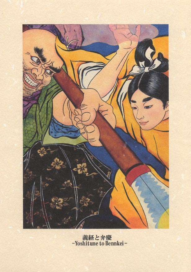
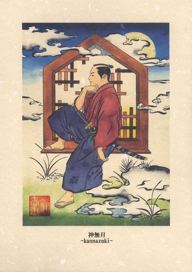
I had to call up Kaori Seki - the designer of this image - this evening to ask about a detail of the design, and while talking with her, asked if it would be alright if I uploaded a couple of other images of her work, so that people could get an idea of what she is doing. She said OK, so here you go! (clickable)

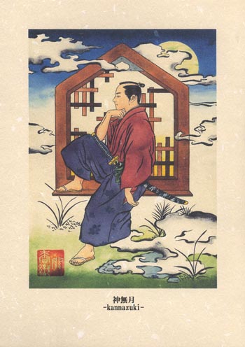
These are scanned postcards from the five that I purchased from her at the Design Festa last year. The top one is from a series she has done on historical episodes. Her spelling on the title is a bit off, but if you Google 'Yoshitsune and Benkei' you will learn about the famous battle at Gojo Bridge.
The second is from a set of 12 images of the traditional calendar months. This one is equivalent to October/November period. I don't know if there is a 'story' behind her image ...
As I mentioned before, when I visited her home she pulled out book after book and box after box of drawings and fully worked-out images. I thought it was a treasure trove, but I hope she can start to work on her p/r a bit more, because hiding this stuff away isn't going to help anybody!
If you have any comments, please leave them below, and I'll see that they are passed on to her ...
Posted by Dave Bull at 4:40 AM
| Comments (4)