Posted by Dave Bull at 4:09 AM, February 12, 2011 [Permalink]
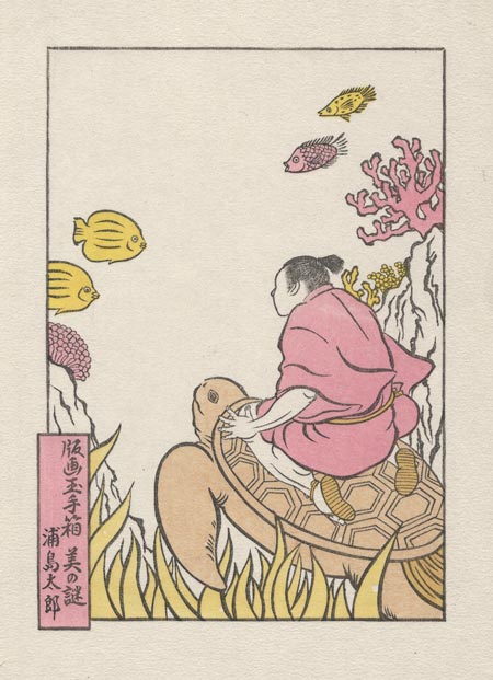
We now get our first - albeit small - overprinted areas ... his sandals, and the turtle's tail. The yellow block here uses two brushes: one loaded with a bright yellow for the tropical fish, and the other with a paler tone for the sea grass at the bottom, which will of course receive more overprintings later:

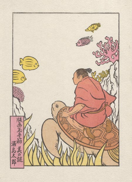
This next one is interesting. It's the hada-iro - skin tone. But instead of simply applying this to his exposed skin areas, it is printed across the entire region, including the top area of the turtle, his sandals, and his clothing.

The resulting tone on the kimono - made from the pink of the coral plus the skin tone - is a wonderfully rich colour that would be difficult to create on a single pass. And although it doesn't really show on this kind of scan, the way that the colour is embedded among the fibres of the paper adds another dimension.
From here on in, most of the blocks will be adding overprintings here and there ...
Dave,
I always marvel at how two very thin layers of transparent color will be so beautiful while one layer of a similar color will look flat. There is something about that double or triple layer that just makes color sing. So far it looks pretty good. There must be a story behind this turtle riding woman

I'm curious about the communication and collaboration between the artist and the carver/printer which led to using that particular splendid 2-layered color for the kimono.
It is unlikely (to me) that the artist thought through the printing process to specify that compound color tone (skin + coral) for the kimono. It's also unlikely that she turned over a black on white line drawing to you and said, "You pick the colors". It had to have been a collaborative effort.
Please discuss how such a collaboration takes place, specifically how you arrived at THAT color for the kimono.
Marc

story behind this turtle riding woman ...
Barbara, it's a man - known as Urashima Tarō - and his story is here
discuss how such a collaboration takes place ...
Marc, I've got to get downstairs! Don't do this to me! 
This is a hugely interesting part of the process. We've all seen that video of Hasui working with the Watanabe crew: he draws the outlines, Maeda carves it, Hasui then - on his own - decides all the colours, including overlays etc., Maeda then carves them, Ono-san then - on his own - produces the prints.
That's almost certainly a gross simplification. Hasui was a watercolour artist, so he certainly knew something about colour transparency. But I find it hard to believe that he understood the 'woodblock' transparencies well enough to create a perfect block set on his own. At least early in his career. Maybe after working for so many years together with the printers he did indeed learn how to get these effects, and that video was taken just before he died, so yes, I guess by that point he could ...
My point though, is that an 'outside' artist would not have a clue how to do this, nor would the carvers (on their own). I can't see anybody else but an experienced printer having this kind of knowledge.
So that's what we have done in this case. Seki-san handed over two things: the outline drawing (which went straight to Dave the carver ...), and a watercolour mockup of the finished concept (which is what printer Dave looked at when designing the colour separations).
I would very much like for her to study what we have done (once we're done) with an eye towards building her skills at designing for prints.
One more thing to mention before I chase downstairs - that kimono colour isn't the final. There is one more to go on top of it. It was a happenstance that such an attractive colour has come about on an intermediate step. (But I have certainly taken note of it, and this colour will appear again somewhere in a future project, you can be sure!)


