« October 2007 |
Main
| December 2007 »
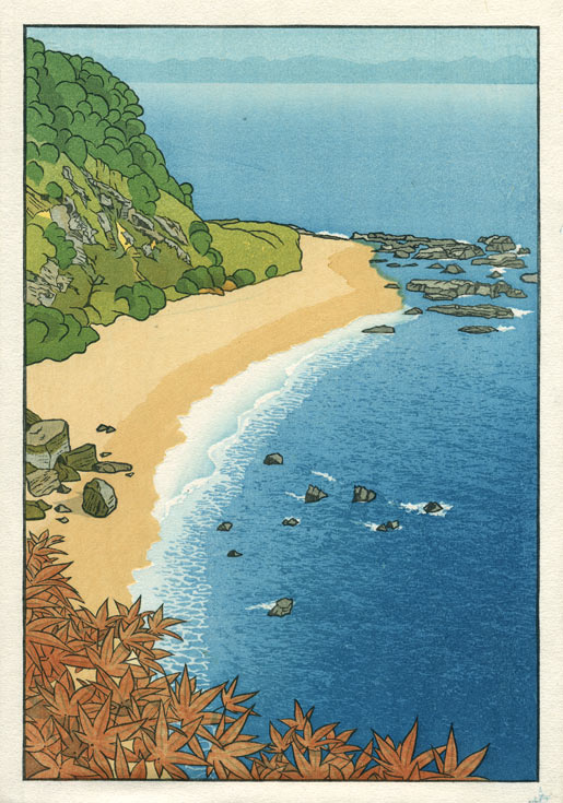
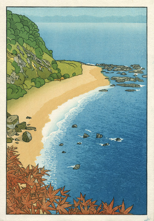
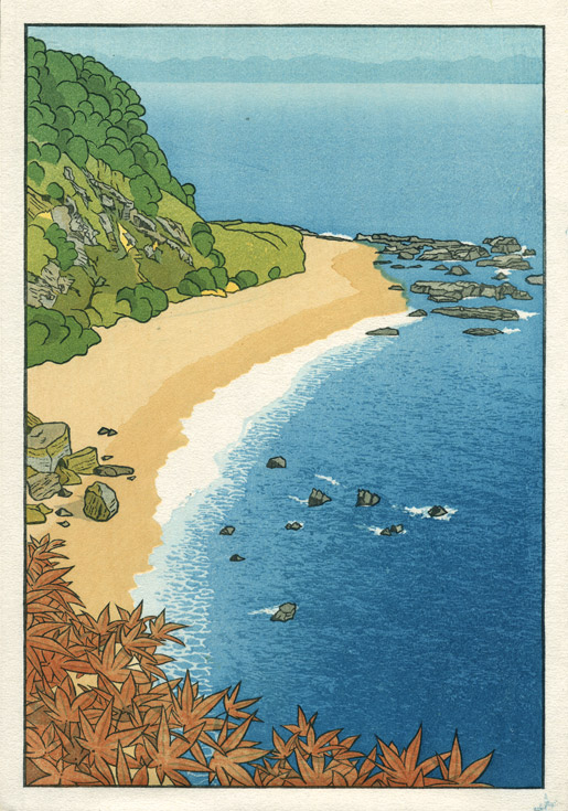
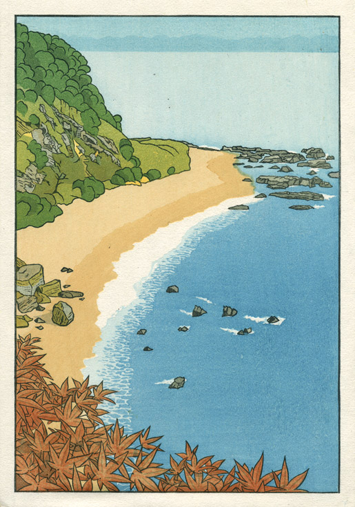
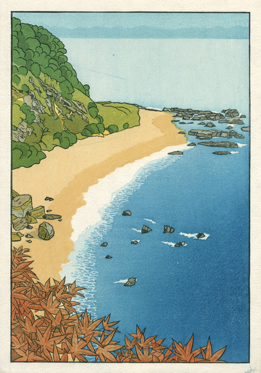
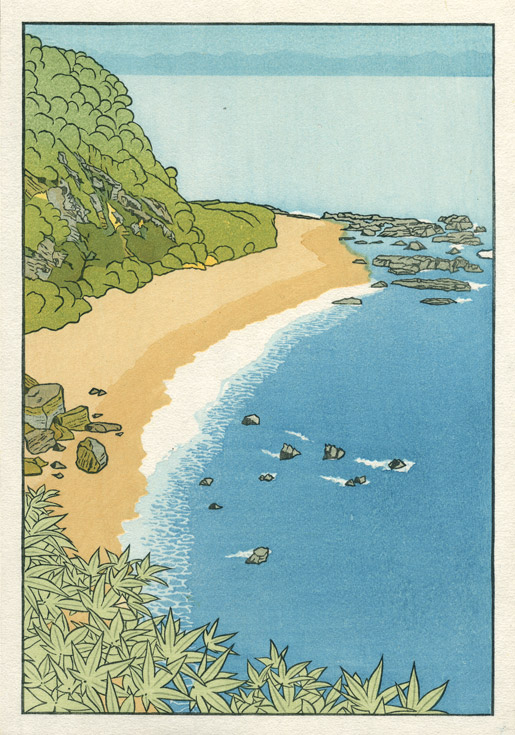
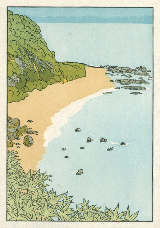
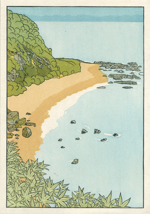
[Seacoast in Autumn - 11] : Final Printing - step 19 ~ 21
Continued from [Seacoast in Autumn - 10] | Starting point of the thread is [Seacoast in Autumn - 1]

Here we go ... with the final three impressions!
Impression #19 - Foam on the beach ...
This was the most difficult impression of this print - making a gradation along the length of such a narrow area is tough. Doing one is no problem ... get 100 of them to look alike certainly is!
But isn't it neat how this simple strip of colour makes foamy waves appear all along the shore!
That impression by itself (on scrap paper ...) :
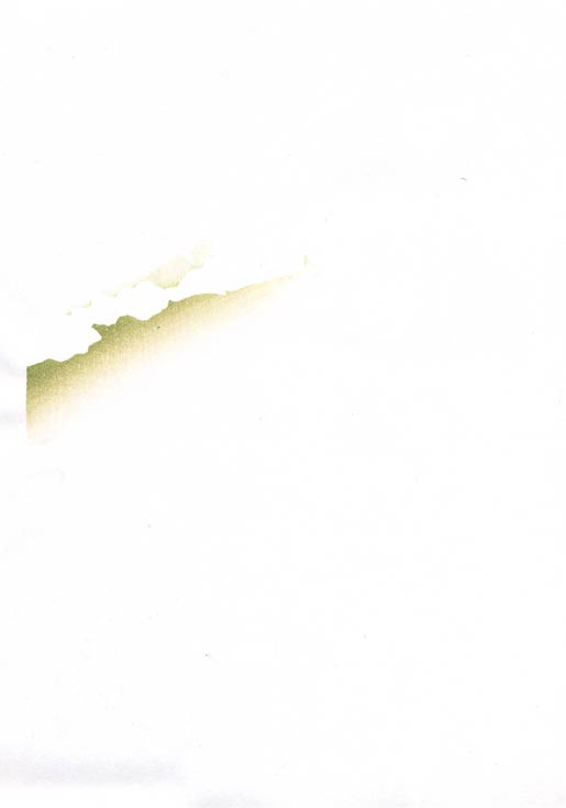
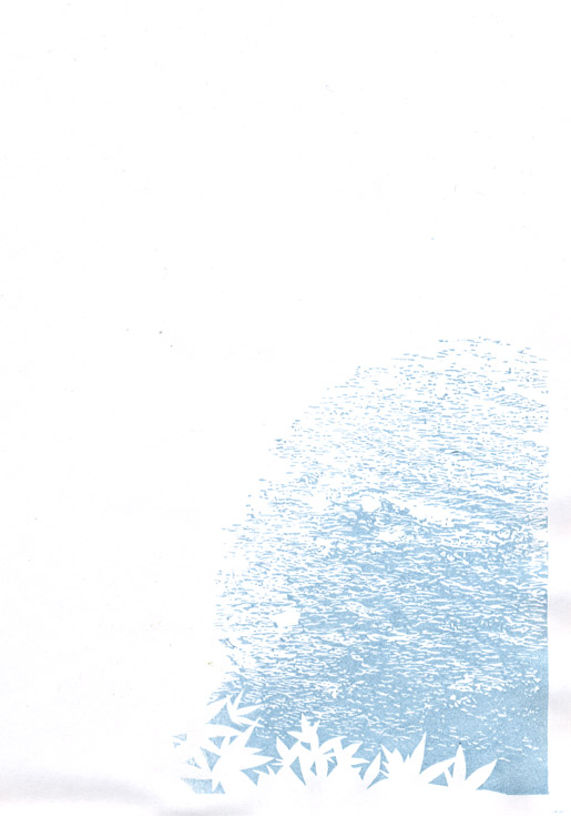
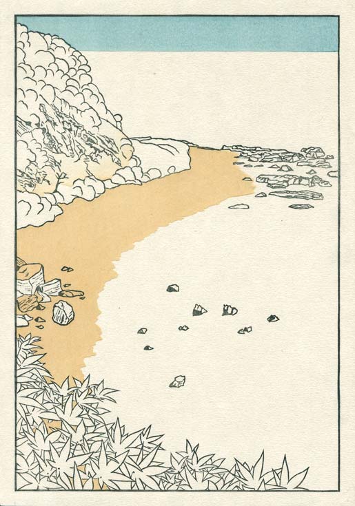
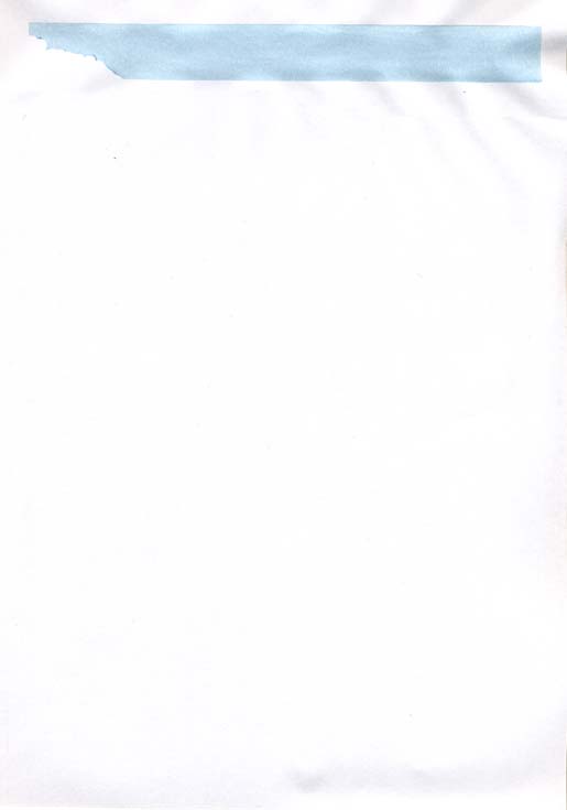
Impression #20 - Gradation on upper beach area ...
The previous impression 'tied' the sea to the beach ... this one ties the beach up to the mountain side ...
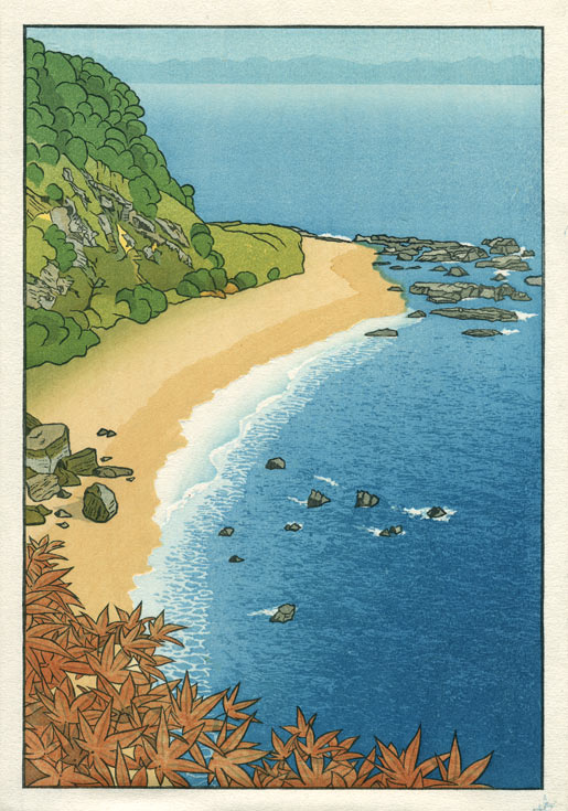
That impression by itself (on scrap paper ...) :
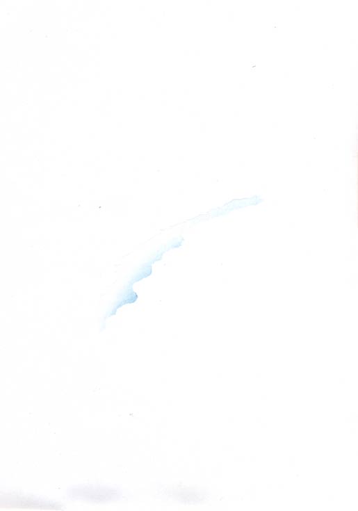
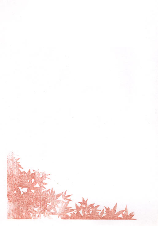
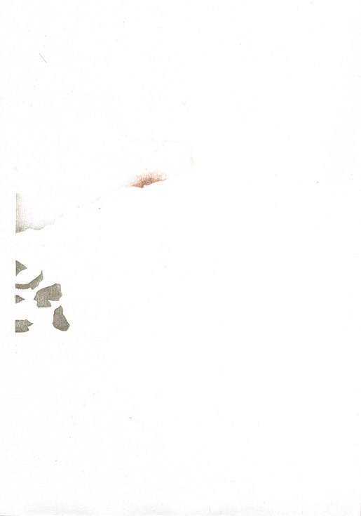
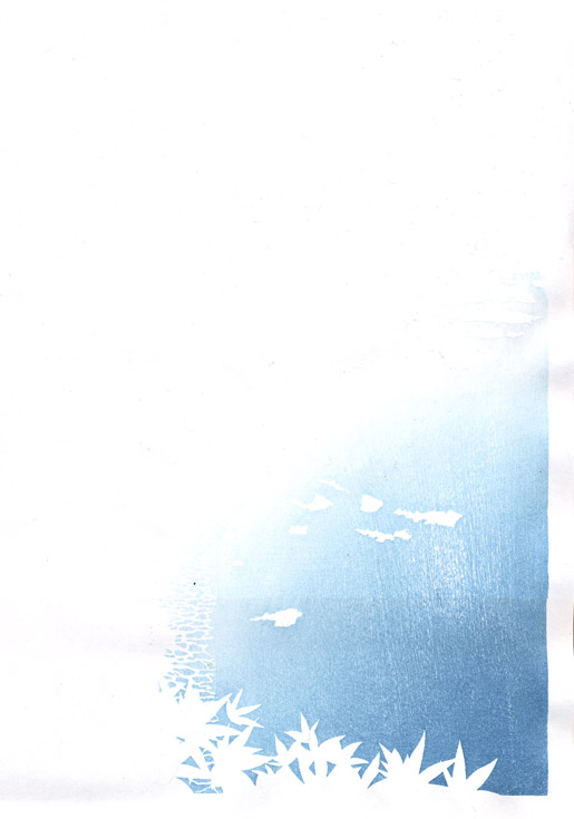
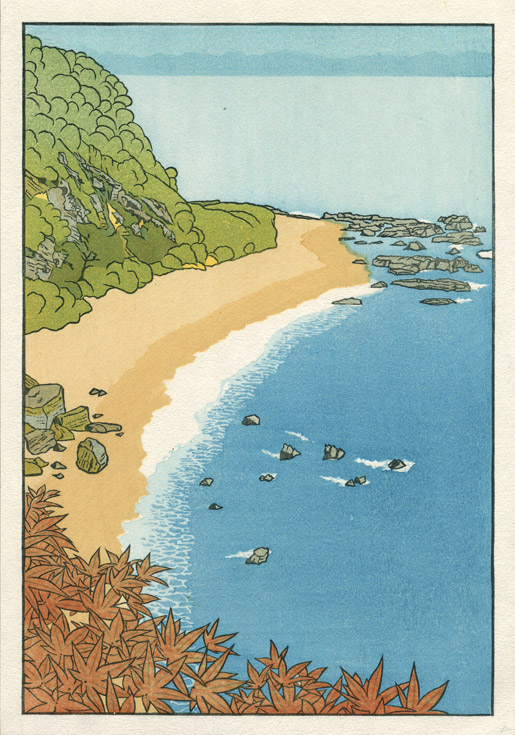
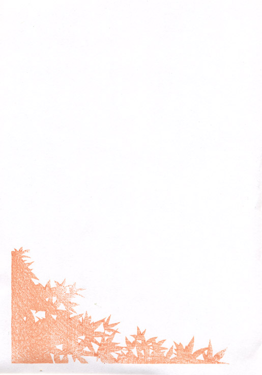
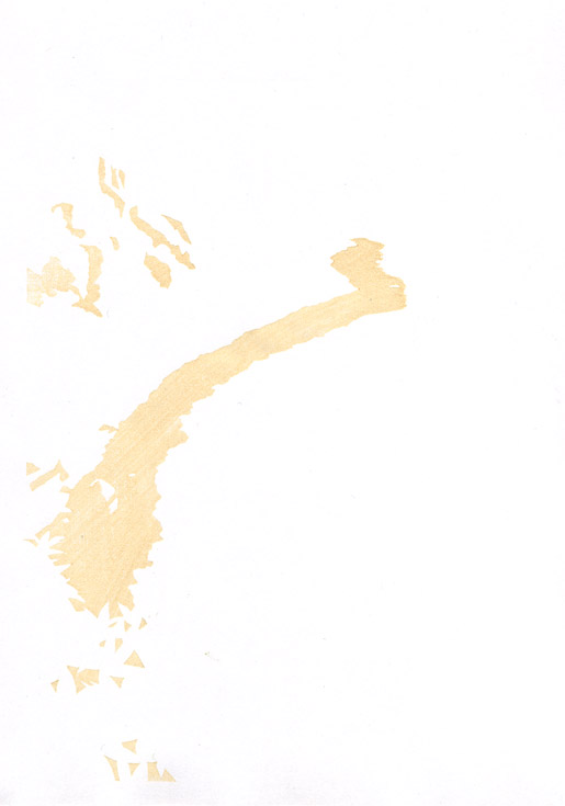
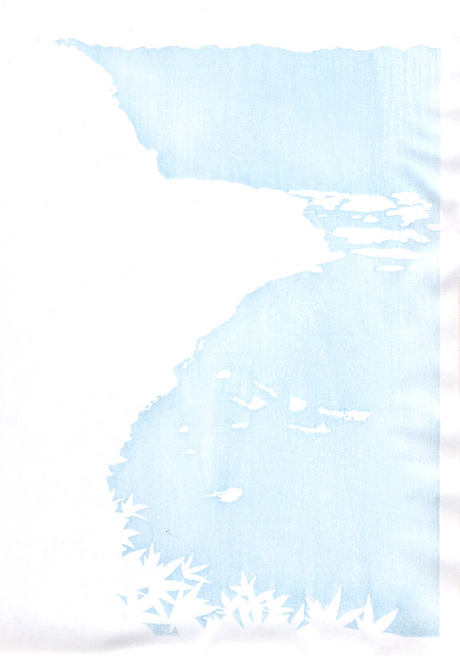
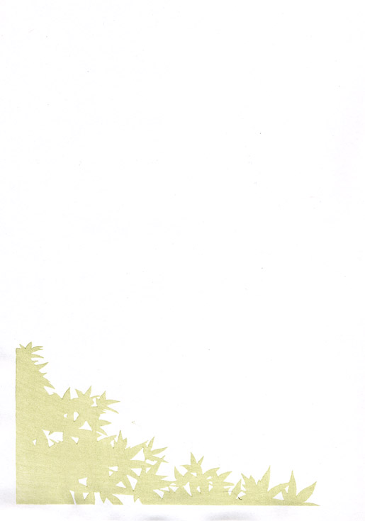
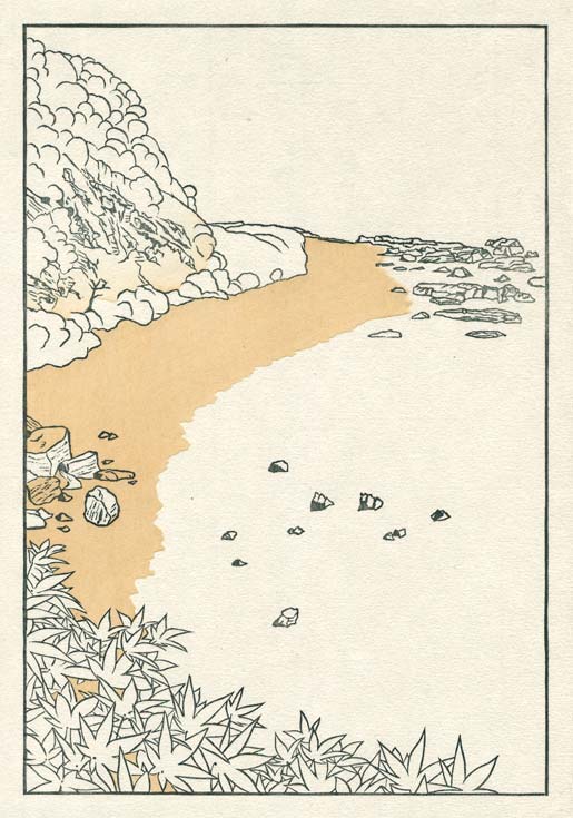
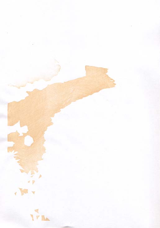
Impression #21 - Red 'spatter' on vegetation ...
And just to finish it off ... a bit of bright red spattered on the leaves here and there. I used a very short-haired flat brush, and simply banged it down on the block in places, leaving light blots of pigment scattered about. I then printed it with a very light touch of a sandpaper baren.
That impression by itself (on scrap paper ...) :
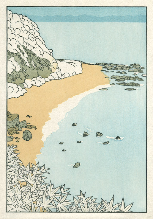
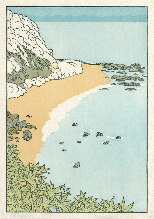
All done ... I think she looks fine! Please check out the Slideshow of this printing procedure.
Posted by Dave Bull at 4:39 PM
| Comments (7)
[Seacoast in Autumn - 10] : Printing - step 16 ~ 18
Continued from [Seacoast in Autumn - 9] | Starting point of the thread is [Seacoast in Autumn - 1]
Every day, three more!
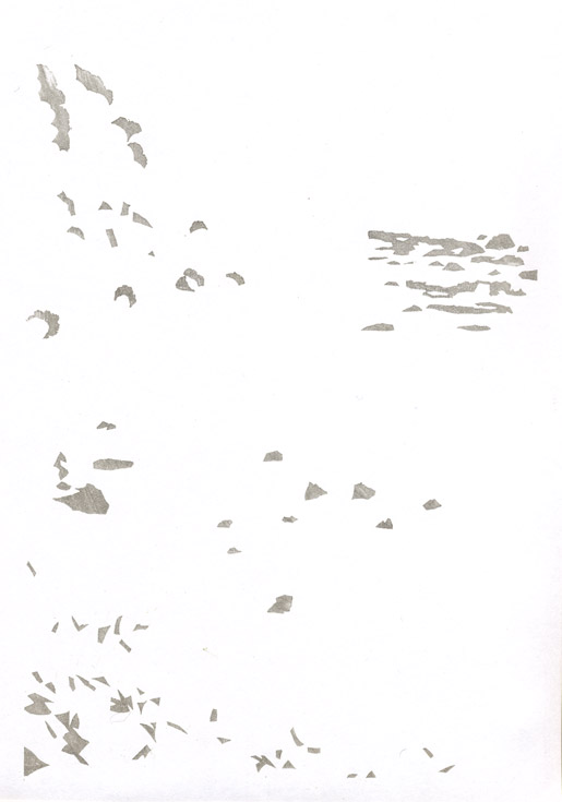
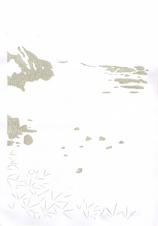
Impression #16 - Wave pattern on the sea ...
Don't miss looking at the enlargements on this one ... it's quite neat! The block for this pattern took a few days to carve, but I think the time spent was well worth while.
That impression by itself (on scrap paper ...) :
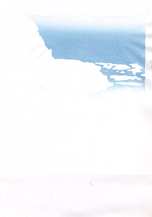
Impression #17 - Gradation on distant sea ...
I've been exchanging emails with a few people about the proofs of this print, and high up on the list of everybody's suggestions were alternate treatments of this block. More than one person suggested identical ideas - put a boat there ... or perhaps just a wake ... or perhaps just more wave patterns ... anything to break up the 'empty' area.
I listened to these suggestions, and indeed, had myself toyed with the idea of the boat (heading left, with an acute wake behind it ...), but decided to leave it empty. There are a couple of reasons: one is that I really, really want to avoid any chance of having my prints look like the more 'touristy' of the shin-hanga. You will never see in my prints such things as snow falling in front of the red temple ... a woman in the rain with an umbrella ... or, that other standard cliché - a lonely sailing boat on a distant sea. Never!
But the other reason is that I very much like that open area with the (very difficult to produce) light gradation at the top, up against the distant shore. It doesn't look so nice in the spoiled copy we are following in this sequence, but it'll look just fine in the properly finished print!
That impression by itself (on scrap paper ...) :
Impression #18 - Colour touch-ups ...
This is an unanticipated step ... touching up a couple of spots that have turned out the wrong colour. Back in Step 8 I put a yellowish base tone under the green on the mountain, and used a tone a bit brighter than when doing my previous proofing. Turns out that there are a couple of spots that don't have enough coverage from other blocks to mute that yellow, and it is now sticking out and looking strange.
So I pulled out the same block used in Step 8, and just dabbed pigment on in those areas, just enough to kill the unwanted brightness. For the next batch of prints, I'll either tone down Step 8, or take care of these places with adjustments on one of the other blocks that touch these areas.
That impression by itself (on scrap paper ...) :
The thread continues in [Seacoast in Autumn - 11] ...
Posted by Dave Bull at 9:43 PM
| Comments (0)
[Seacoast in Autumn - 9] : Printing - step 13 ~ 15
Continued from [Seacoast in Autumn - 8] | Starting point of the thread is [Seacoast in Autumn - 1]
Yet another three today ...
Impression #13 - Next level of green on the mountainside ...

That impression by itself (on scrap paper ...) :
Impression #14 - Second level of vermillion colouring on foreground leaves ...
Printed in the same 'careless' way as the previous vermillion impression. (I use what is known as a 'sandpaper' baren ... there is no actual coil of knotted bamboo inside ... just a sheet of sandpaper. No pressure can be used at all, and the resulting impression is faint and patchy.) The block is carved to about half the leaf area of the previous block ...
That impression by itself (on scrap paper ...) :
Impression #15 - Gradation on sea ...
Still two impressions to come on the water ...
If you click the image to bring up the enlarged version, you'll see where I had a bit of trouble this evening. I've been using the final sheet in the stack for the scanning, running over to the computer to make the scan immediately after the printing run is done. I can't wave the print around in the air too much or it will dry out, so I do this as quickly as possible. This evening, I was walking across the room, and dropped the print .. which landed face down on the floor! So from this impression up to the end, there is no escaping the dirty marks and streaks on it here and there ... sorry!
That impression by itself (on scrap paper ...) :
The thread continues in [Seacoast in Autumn - 10] ...
Posted by Dave Bull at 6:50 PM
| Comments (2)
[Seacoast in Autumn - 8] : Printing - step 10 ~ 12
Continued from [Seacoast in Autumn - 7] | Starting point of the thread is [Seacoast in Autumn - 1]
Three more today ... moving along slowly but steadily ...
Impression #10 - Next level of blue on the lower portion of the sea ...
The ragged area along the left side of the area is chopped out in a broken pattern. At printing time, after pigment is brushed over the entire area, I wipe off this edge with a damp tissue, to leave a kind of faint gradation there.
Also, the white foam cutouts around the rocks in the sea don't match the ones on the earlier block. These are larger holes, leaving the lighter blue visible in some ragged places in the 'foam'
That impression by itself (on scrap paper ...) :
Impression #11 - Vermillion colouring on foreground leaves ...
Printed in faily 'blotchy' colour by using rough brushing and weak baren pressure. It gives a much more interesting effect by printing the green first then this colour over the top, than by just mixing the required colour in a bowl and doing it once. There will be another block used here later ...
That impression by itself (on scrap paper ...) :
Impression #12 - Second level of grey tones on stones, and for shadowing on the foliage.
That impression by itself (on scrap paper ...) :
The thread continues in [Seacoast in Autumn - 9] ...
Posted by Dave Bull at 7:20 PM
| Comments (2)
[Seacoast in Autumn - 7] : Printing - step 7 ~ 9
Continued from [Seacoast in Autumn - 6] | Starting point of the thread is [Seacoast in Autumn - 1]
Three more impressions to upload today ...
Impression #7 - Base green on mountainside ...
That impression by itself (on scrap paper ...) :
Impression #8 - Gradation on mountainside ...
There is still one more different green block to come on this mountainside, but I want there to be a bit more variation in the tone, so am adding this gradation first ...
That impression by itself (on scrap paper ...) :
Impression #9 - 'Wet' part of the beach ...
This is the same pigment that was used for the beach base tone, so we end up with a bit more saturation ...
That impression by itself (on scrap paper ...) :
The thread continues in [Seacoast in Autumn - 8] ...
Posted by Dave Bull at 10:56 PM
| Comments (0)
[Seacoast in Autumn - 6] : Printing - step 4 ~ 6
Continued from [Seacoast in Autumn - 5] | Starting point of the thread is [Seacoast in Autumn - 1]
Three more impressions to upload today ...
Impression #4 - Grey/green undertone on rocks ...
That impression by itself (on scrap paper ...) :
Impression #5 - Base tone for sea area ...
Interesting to see the way that this very pale blue tone - simply by overlapping with the sky block - creates the distant mountains. Those are actually finished at this point ... one of the few areas of the block that won't be touched again ...
That impression by itself (on scrap paper ...) :
Impression #6 - First undertone on foreground foliage.
This isn't the final colour for this 'green' stuff ... we're going to try and remember that this is autumn ...
That impression by itself (on scrap paper ...) :
The thread continues in [Seacoast in Autumn - 7] ...
Posted by Dave Bull at 10:37 PM
| Comments (2)
[Seacoast in Autumn - 5] : Printing begins ... step by step
Continued from [Seacoast in Autumn - 4] | Starting point of the thread is [Seacoast in Autumn - 1]
It's been quite a while since the last update ... so many things going on here to distract from the production work!
After getting the basic set of blocks ready, I spent a few days proofing them, and trying out a few ideas. I got a bit of feedback from the few people I showed the samples to, and have settled on a basic concept for the image. I'm still not sure exactly where to take it, but the clock is ticking, and it's time to get going on the first batch for the eagerly waiting collectors! :-)
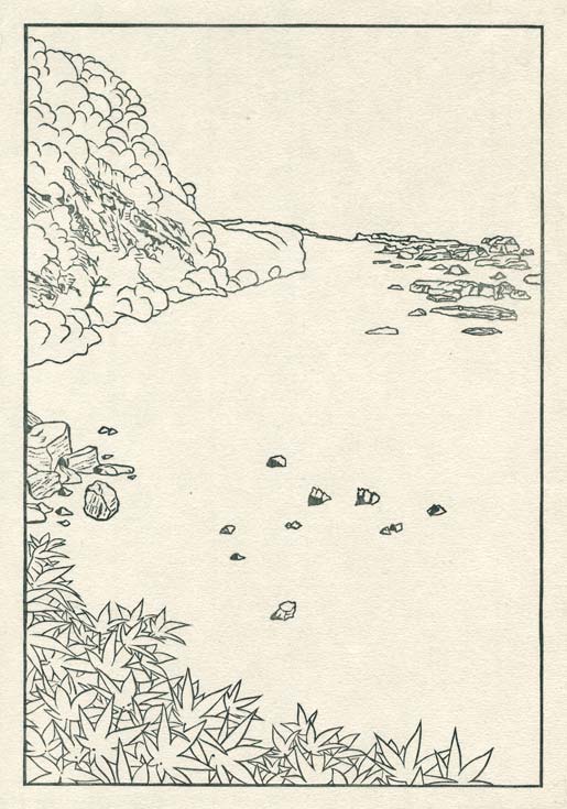
So here we go ... There is no beta block this time, as I don't want to kill the paper in those areas where there will be foam at the seashore, so we start right off with the keyblock (most of these images are clickable for enlargements):
Impression #1 - Key block ...
Impression #2 - Beach ...
The sand down in that cove is actually quite a dirty grey colour; it's a mix of grains from light-coloured sandstone, fragments from a dark-coloured volcanic rock, and the usual organic detritus. But I definitely don't want a darker gloomy feeling on this print, so I'm waving my 'artistic license wand' over the scene, and giving it a bit more 'sandy' feel ...
That impression by itself (on scrap paper ...) :
Impression #3 - Sky ...
There are actually mountains in the distance ... we'll add those later ...
That impression by itself (on scrap paper ...) :
The thread continues in [Seacoast in Autumn - 6] ...
Posted by Dave Bull at 6:53 PM
| Comments (2)