Posted by Dave Bull at 8:40 PM, September 29, 2007
OK, here we go again! The third print I am making in the My Solitudes series (actually the 6th volume of the book) is now under construction.
The design is ready, and the carving began this afternoon, but before we take a look at that (in the next post), let me introduce you to the location, with a few snapshots from my files ...
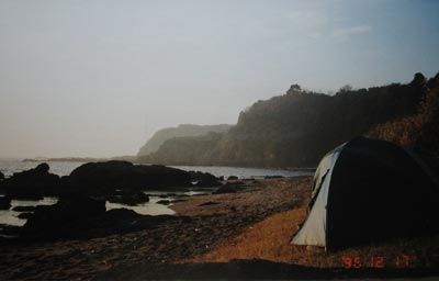
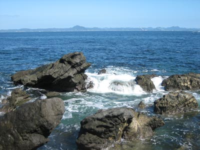
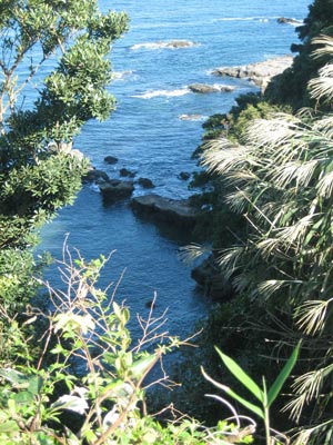
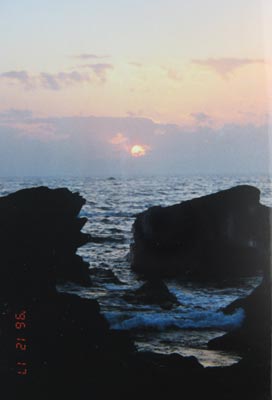
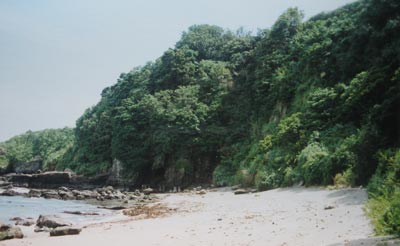
So, what kind of image of this little cove would you create for the print ...?

The thread continues in [Seacoast in Autumn - 2] ...
Dave,
they are all nice, I like #4 the best but I also like the long narrow format of #3, somehow it seems longer than #4 while they really are the same size...just a visual thing with the folige on both sides. I am sure which ever one you chose will be wonderful when it is done.
Aha ... Barbara, sorry for the confusion - I didn't mean to imply that I will be using one of these actual scenes as the basis for the print. I was just trying to ask a general question about what sort of approach I should take: a 'long' shot ... a close-up ... panoramic ... sea ... sand ... etc. etc.
The #4...........atmospheric with sea and sky........lends itself to the David Bull appraoch. Can't wait for your latest.........ElizA
I like #1, too but #4 is my favorite. There's a lot going on in that one from top to bottom -- that's a a romantic and mysterious sky with lovely pinks and blues. Even though you say, you won't use these, you could think about doing that sky at least in the one you pick.
Hi Dave,
Wow! Each of the views you posted is "nicer than all of the others". The place where the sea meets the land is ripe with possibilities!
My challenge would be to capture the motion of the water. The interplay of waves and rocks affords a great opportunity to do that. Here's one of my favorite prints designed by Takahashi Shotei:
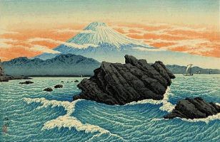
Your second snapshot and the shape of the big rock made me think of this print.
Best,
Marc
Dave, I like #3 for the depth the foilage gives the piece. It has a strong foreground of light and dark foilage. Also the water has a lot of depth going from dark to light. I also like #4, the colors are very nice and the dark shapes of the rocks are interesting in contrast to the lighter sky.
Marilynn
Thanks for the comments and suggestions ... Here are a couple of other factors that must be considered during my deliberations on the creation of this image ...
1) There will be four images of this seacoast contained in this print series, one for each season, so I can't make this one in isolation. I have to basically work out how it will fit with the other three within that framework.
2) These prints each accompany a lengthy story about a visit to this location, and thus must contain an element of 'illustration'. If the autumn visit was made on a calm clear day, it would not be appropriate to make a print depicting 'the interplay of waves and rocks' mentioned by Marc, for example.
So let me toss a few more tidbits of info your way!
- as it turned out, my summer visit coincided with a full moon ...
- the autumn visit was made quite late in the season, almost winter as it turned out ... but (as mentioned), on a calm day ...
- my winter visit was purposely made on a very windy day; I wanted to see some drama down there at water's edge!
- although it was far too dangerous during the winter trip, I did spend a lot of time in the water during the other three stays ...
So actually, given all that information, we see that the overall 'concept' for each of the four prints is thus pretty much established! Now can you 'design' the series? :-)
Living on the coast of Maine......and in my favorite season.......your #4 still speaks to me for an autumn print. Can't think further at the moment..............ElizA