Posted by Dave Bull at 9:43 PM, November 14, 2007
Continued from [Seacoast in Autumn - 9] | Starting point of the thread is [Seacoast in Autumn - 1]

Every day, three more!
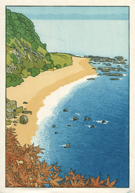
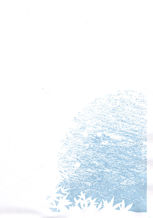
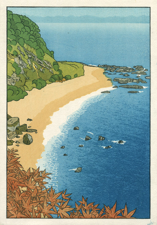
Impression #16 - Wave pattern on the sea ...
Don't miss looking at the enlargements on this one ... it's quite neat! The block for this pattern took a few days to carve, but I think the time spent was well worth while.
That impression by itself (on scrap paper ...) :
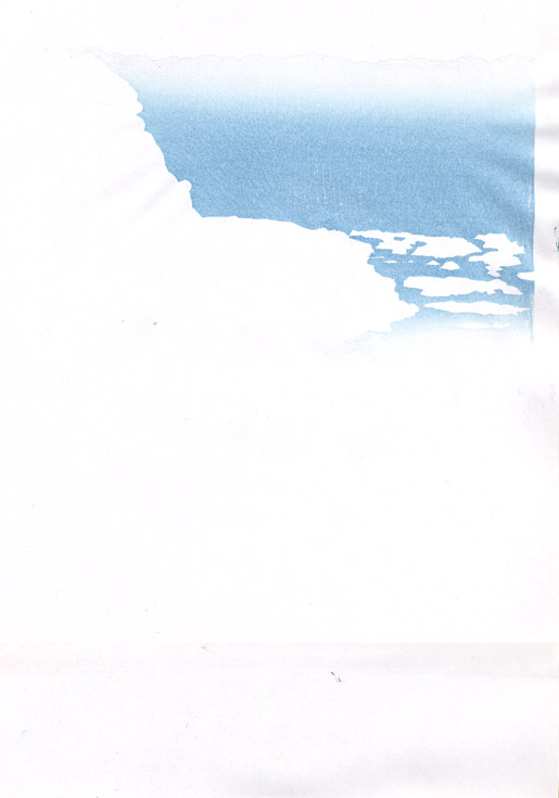
Impression #17 - Gradation on distant sea ...
I've been exchanging emails with a few people about the proofs of this print, and high up on the list of everybody's suggestions were alternate treatments of this block. More than one person suggested identical ideas - put a boat there ... or perhaps just a wake ... or perhaps just more wave patterns ... anything to break up the 'empty' area.
I listened to these suggestions, and indeed, had myself toyed with the idea of the boat (heading left, with an acute wake behind it ...), but decided to leave it empty. There are a couple of reasons: one is that I really, really want to avoid any chance of having my prints look like the more 'touristy' of the shin-hanga. You will never see in my prints such things as snow falling in front of the red temple ... a woman in the rain with an umbrella ... or, that other standard cliché - a lonely sailing boat on a distant sea. Never!
But the other reason is that I very much like that open area with the (very difficult to produce) light gradation at the top, up against the distant shore. It doesn't look so nice in the spoiled copy we are following in this sequence, but it'll look just fine in the properly finished print!
That impression by itself (on scrap paper ...) :
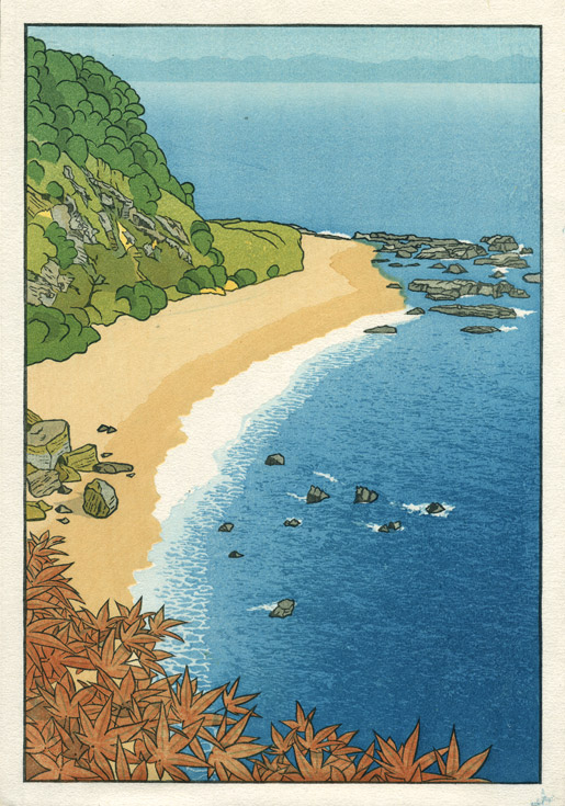
Impression #18 - Colour touch-ups ...
This is an unanticipated step ... touching up a couple of spots that have turned out the wrong colour. Back in Step 8 I put a yellowish base tone under the green on the mountain, and used a tone a bit brighter than when doing my previous proofing. Turns out that there are a couple of spots that don't have enough coverage from other blocks to mute that yellow, and it is now sticking out and looking strange.
So I pulled out the same block used in Step 8, and just dabbed pigment on in those areas, just enough to kill the unwanted brightness. For the next batch of prints, I'll either tone down Step 8, or take care of these places with adjustments on one of the other blocks that touch these areas.
That impression by itself (on scrap paper ...) :
The thread continues in [Seacoast in Autumn - 11] ...