Posted by Dave Bull at 2:38 PM, October 17, 2007
Continued from [Seacoast in Autumn - 3] | Starting point of the thread is [Seacoast in Autumn - 1]

Carving work has slowly trundled on, interrupted along the way with a round of printing for this year's gift print.
Here are a few of the blocks done so far:
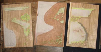
Some of the blocks contains carved areas that will be printed in different colours. This is possible as long as they are separated by adequate distance ... usually described as 'three fingers' ...

I'm still not quite sure just how I will create the different 'layers' of foam at the water's edge, where the sea swooshes up onto the sand. Here's an oblique view of one of the overlay blocks ...

And this is a similar shot of the foreground foliage ...

The thread continues in [Seacoast in Autumn - 5] ...
Looking forward to see how these print out. Carving on your foreground foliage block looks particularly deft. It's got to be a bit complicated sorting that design out to carve.
It's got to be a bit complicated
The part that is giving me the most trouble at this point is the area where the foam runs up the sand. The sea area, I think I have worked out; the beach, no problem. It's that 'jumbled' area of water, foam, and sand in the middle that I can't figure out yet.
As usual, I'll try 'something' first, then get re-carving once I see what it looks like ...
Dave, your carving is virtuoso, really incredibly clear and beautiful! One suggestion -- you've carved to your original design's uniform line width -- I think your image would benefit from a more 'traditional' approach, varying the line width according to the image. One conceptual approach (I 'discovered' this after many years of drawing from life 4 to 6 hours daily) is heavier lines can describe areas of greater contrast and lighter (thinner) lines define areas of less contrast. Maybe you can make sense of this?
Best,
Mike
you've carved to your original design's uniform line width
Thanks for 'checking in', and for the comments Mike ... As for those lines visible in that photo above - the ones delineating the beach areas - they are all muda-bori ('wasted carving'). They are there only to show the location of the border between zones, and will be cut off this key block once the colour blocks are done. For that job, the lines have to be as uniform as possible; any variation in width defeats the purpose ...
But not to reject your suggestion; in fact, this very question of 'overly mechanical lines' was one of the things I was discussing with Gary a couple of years back, when I asked him for an image for use in my Surimono Albums. I sent him some 'fude' pens to use for drawing the lines. These pens have a brush tip, and an ink reservoir inside, and are a neat way to draw lines with character, for those of us who have never learned how to use proper oriental calligraphy brushes.
Hi Dave
Continuing this theme of line variation I have emailed you a jpeg - Houshouji no Tou (The Pagoda at Houshouji Temple) by Kodama Kibou. Woodblock print circa 1969. I'm not clever enough to paste a link to it here - but if you feel your readers maybe interested to see some delicate and energetic line contrast and variation you might want to create a link somehow...Best wishes, Tim


