« June 2008 |
Main
| September 2008 »
[River in Autumn - 7] Colour block progress ...
Continued from [River in Autumn - 6] | Starting point of the thread is [River in Autumn - 1]

It has rained steadily this week - good incentive to just sit at my desk and keep at it!
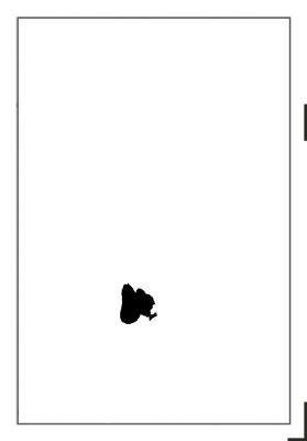
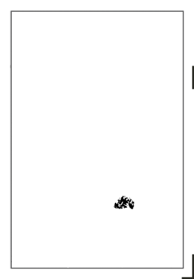
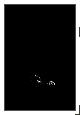
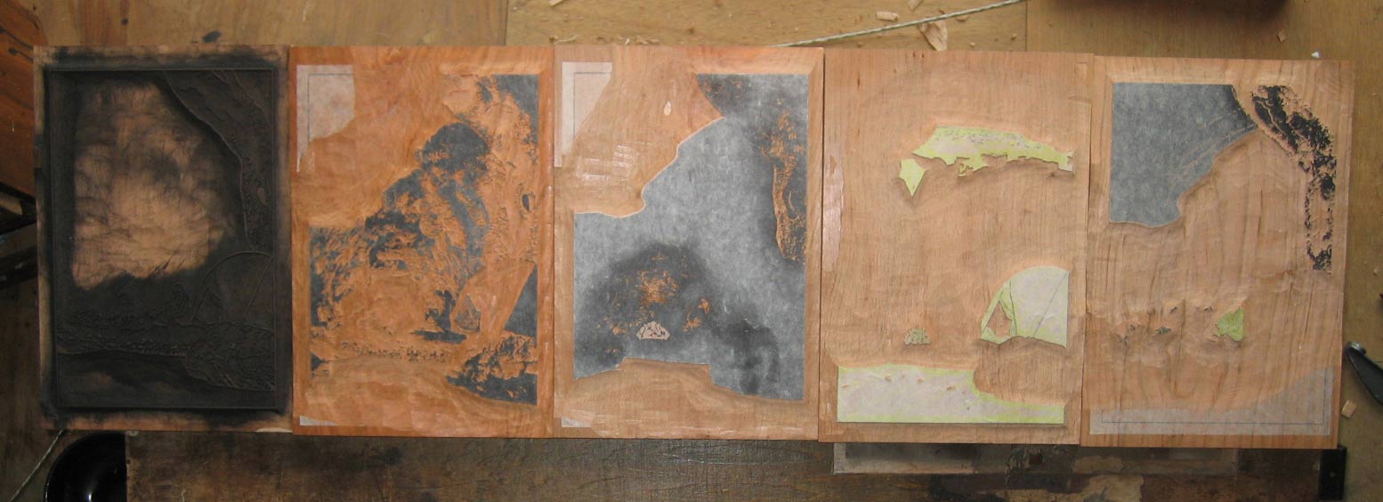
I worked out a way to get the separations combined onto 9 wood faces, so by using the back side of the keyblock, and four new pieces of wood, there will be five 'blocks' in told. Here are the faces completed so far (click for enlargement):

The one fourth from the left is a bit different - it will be used in two orientations, as one of the carved areas is 'upside down' in relation to the other ...
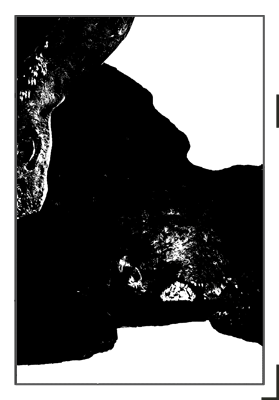
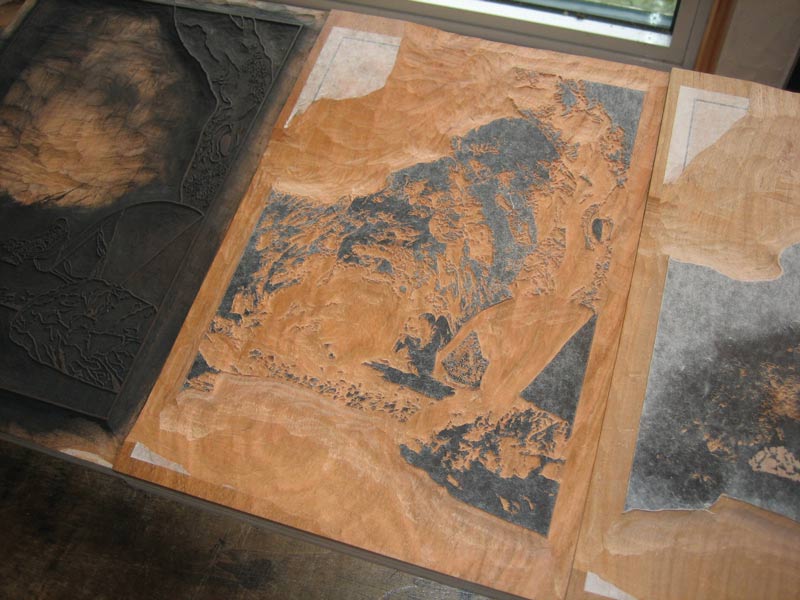
Here's a closer view of the most complex one ... (I'm a 'good boy' and usually start with the one that will take the longest time to cut ...)

The thread continues in [River in Autumn - 8] ...
Posted by Dave Bull at 12:30 PM
| Comments (0)
[River in Autumn - 6] 'Colour your Own' versions ...
Continued from [River in Autumn - 5] | Starting point of the thread is [River in Autumn - 1]
I wasn't quite sure if anybody would actually have a go at making their own version of this print based on the colour separations I posted in the previous post, but I have already received two versions from one reader, and some email letting me know that others are on the way.
Here is the first one:
I was so pleased to find this in my email yesterday! Is this a 'preview' of the print I will make? Well, yes and no. He has indeed tried to create the 'circle of light' that I talked about, so in that sense, this shows what to expect from my version later.
This differs from mine - of course - in the colours he has selected, but also in another major point - I will be using a lot more gradation printing. A good example of this is the shoreline/beach area. Mine will become much darker in the areas away from the fire, and the ground around the figure will probably end up being almost pitch dark. When seen flat as in this sample, the human figure is just too isolated (and we can clearly see that it was 'pasted in').
(Also, he made this version before I made the correction in the separations for the overhanging tree ...)
Next morning - this 'game' seems to be addictive! - he sent a second version, with a different colour arrangement, more gradations, and the addition of the keyblock:
Here's what I wrote in reply to this contributor:
Doing an electronic 'trial proof' like this is something that I usually avoid doing, mostly for the simple reason that it's so easy to end up doing things with the mouse that simply aren't possible with the brush and baren. In reality, I have to make a wood block print, not try to copy a digital master.
But having said that, seeing your test version _has_ opened up a viewpoint into a different way of balancing things. Comparing your overhanging branches with my own original paste-up (before making separations), I find that yours has captured the mood somewhat better. So I really would like to get input from more people on this; it's not that I 'need help' with the image - of course I have my own vision in mind - but I'm not such a 'genius' at this that I can't learn from suggestions, or more probably, simply have my eyes opened to alternative ways of approaching some of the decisions that have to be made.
I'd love to see a bunch more of these, from people with different ideas on how this image could be treated. If you already know my email address, send something as an attachment; if you don't have the address on file, then use my contact form to contact me first, and I'll write back to you directly. (This particular contributor asked that his name not be posted; let me know your own preference when you send me your version).
The thread continues in [River in Autumn - 7] ...
Posted by Dave Bull at 8:23 AM
| Comments (1)
[River in Autumn - 5] Here are the colour separations ...
Continued from [River in Autumn - 4] | Starting point of the thread is [River in Autumn - 1]
So, it has taken a good three days of sitting at this computer screen, giving Photoshop a pretty good workout, but I think I now have a good set of blocks for this print. It would be a bit premature to spend too much time talking about them at this point, as until I start printing there isn't much to see, but it might be interesting if I post them here for perusal ...
This is a 'raw' set of separations ... the 'logical' breakdown. There are sixteen of them here, but this of course doesn't mean the print will have sixteen impressions. Some of these will be used more than once, usually for a flat tone first, then for gradations to add depth. The larger ones will be pasted onto clean blocks by themselves, the smaller ones will be combined where possible, to save wood.
Best guess at this point, is that we'll end up with around 30 impressions in the final version.
Here they are, in no particular order:
I think there is enough information there to give you a pretty good idea of what the print may look like! Actually, now that I think of it, if you were to load these into your own computer and pull them into Photoshop (or Photoshop Elements), they would serve as perfect 'masks' for making a digital version of this image.
If you do try it, there are a couple of things to remember:
- the pigments we use in Japanese printmaking are all transparent, so don't forget to adjust the opacity of each layer as you add colour. Everything must remain visible through all subsequent overprintings.
- none of these separations give any hint as to what kind of gradations will be applied to them once I start printing; you'll have to figure that out yourself ...
(Update - in response to a question: No, I will not be printing 'black' for each impression. The black you see in these images simply shows the carver what areas of the block are to be carved. Once the finished blocks go to the printing step, any colour at all can be applied to the wood ...)
(Update 2: Don't forget, you may also include the key block, that I posted the other day)
(Update 3: I discovered that I made an error in two of the separations (13 14) when I saved them from Photoshop. I had the layer order mixed up, and the overhanging tree branch was hanging in open space in front of the large tree trunk, instead of being hidden behind it. If you've downloaded them, you should refresh your copies of those two ...)
The thread continues in [River in Autumn - 6] ...
Posted by Dave Bull at 4:40 PM
| Comments (2)
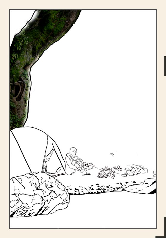
[River in Autumn - 4] Explaining colour separations
Continued from [River in Autumn - 3] | Starting point of the thread is [River in Autumn - 1]
As I mentioned in a comment on the previous entry, I really don't think it's going to be easy to 'explain' what happens next. Back in the ukiyo-e days, it was pretty straightforward - there were the outlines, 'fill in' the colours. That's a bit of an insult, because that process too is capable of deep complexity, but at least you had a sheet of paper in front of you, and with your eyes half closed, could 'see' what the final image would look like.
Well, I too now have a sheet of paper in front of me, and I too am sitting here with my eyes half closed, trying to visualize the final product. Do you remember what I wrote to set the scene?
Surrounded by the darkness which starts just a few metres away at the edge of this small circle of light, river gurgling away unseen just in front of me, hot chocolate in hand, I stare into the dancing flames, 'never still for an instant, in constant motion, yet never changing', just like the river itself. I wonder what I must look like seen from a distance, say from a long way down the river. A tiny oasis of flickering light; a small tent, a motionless figure sitting beside it ... all around the deep dark night ...
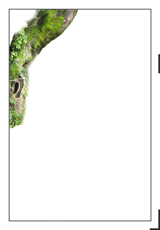
As I said before, because I want to create semi-invisible under-layers in this print, I am faced with some decisions on which way to go. For example, that tree up at the top left. Of course, as it is far from the campfire, it will be quite dark, although there should be some highlights here and there that pick up firelight. To simplify things somewhat, there are two ways to make that tree dark:
- work out the values that I want in the finished print, do some separations, and print it in dark colours
- work out the values that the tree has under a more revealing light, do some separations, and print it in lighter values, then 'make the sun set' by overprinting it (along with other areas) with deeper tones.
Given that I really want to try and create depth in this print, you can guess which method I am going to have a stab at! Let's see how it might be done ...
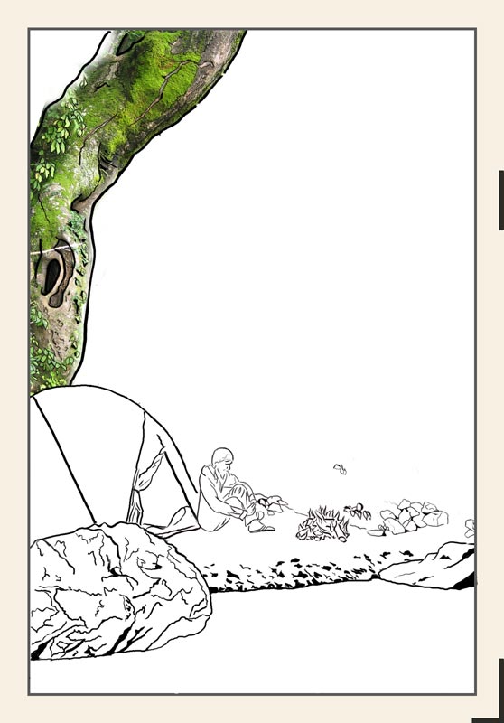
Before looking at the colour separations, I should mention something about the overall image. During my explanation of the first print in this project, I showed a photograph of the actual scene, and discussed how it became a print. This one is different. I am not going to show you a photograph. I can't. This scene doesn't exist.
The story itself is of course true; I did go camping there, etc. etc. The actual scene though, was not specifically 'picturesque'. (Not to mention the fact that night-time photography is an art in itself ...) So, just as I did with the Forest in Spring print, I have created my own image, using components from the general area.
The tree is indeed real, athough I never park my tent directly beneath it!
The stone at the bottom left is real, although it is located a bit farther along the riverbank.
Etc. etc.
At the moment, things just look baldly 'pasted' into place, as of course they are. Once they are all blended into place with overlapping colour blocks, I believe they will look far more natural. And of course as the rock face against which my campfire is pitched - and which will dominate the print - is not yet visible at all, it might be a bit soon for you to pass judgement! :-)
You may perhaps think this cut/paste process is 'cheating', but I rather suspect that even if we were watching a 'real' artist, sitting on the river bank in his beret, sketchpad in hand, drawing all these scenes, we would see him move elements around until he found a pleasing arrangement.
Anyway, let me try to illustrate what I was doing yesterday, trying to get these separations worked out.
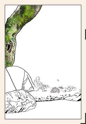
Here's a montage - a photo of the tree pasted into place (shot with the sun low in the sky, to try and get close to the proper shadow angles):
Now, to see what sort of effect we want to end up with, use Photoshop's Levels tool:

Woo-hee, that's dark! Can you imagine all the areas of the print treated this way? (Remembering of course that the focal center - the fire - would be glowing ...) But dark as this is, we can see that there is still visible detail in there, if we look closely:
Do you think I'll be able to catch much of that?! Let's have a go at turning this concept into reality. I created a separate Photoshop file with just the tree:
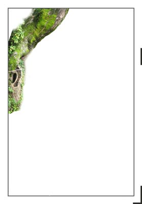
I then pulled out the green of the leaves and moss on the trunk, and saved this separately.
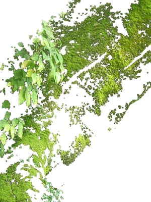
Later on, I will look at this detailed jumble, and trace around various parts of it, to create a 'green block' for this area. If this were to be a daytime print, we would need two green blocks, a 'bluer' one for the leaves, and a warmer one for the moss, but because of the massive overprinting that will follow, one basic green should suffice. The variants in tone will be created by the varied overprints.
Now, with the green 'taken care of', the next step is to try and find a way to create the blocks that would build up the various values on the trunk. I took the image from a couple of steps back, and made it into a greyscale:
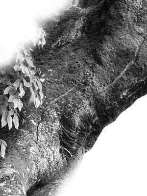
Lightened it a tad to expose more detail, then converted it to an 'indexed colour' version.
The purpose of the indexing step is that once there is an 'index' of 'colours' in the image, I can edit that to create a practical breakdown into a few levels. Using the Photoshop 'Colour Table' editing capability - and with plenty of trial and error - I broke the tree down into four values:
At this point, if I were to carve these five blocks (four grey and one green), I could use them to create a normal day-time scene. That could then be hit by overprinting from a flat uncarved block to turn it into the darker version. What I think I'll be doing is something in between; I'll be printing these blocks in fairly muted tones to start with, and will then use additional overprints to both find the final overall level, and to blend this with other areas.
So that's the basic process I am using, and other areas of the design are treated similarly. But if I were to do this same thing for each area in isolation, I would end up with a monstrous stack of blocks, and an image that was 'fractured' and had no coherence. I have to tie it all together. So when - for example - I work on the stone in the lower left corner, I have to find a value breakdown that both makes sense for the stone itself, and which will allow the use of as many of the same overprinting blocks from other areas as possible.
**
Now, before anybody asks, am I actually going to carve all the dots and dots that you see in these images? That's something I have been pushing back and forth with over the past couple of prints in the series. For the earliest print - the River in Summer - I did very little 'dot' carving. I kept things pretty flat. For the Forest in Spring print - which was more 'closeup' - I did massive amounts of dot carving, and parts of the image came out almost photo-realistic (forest floor in the foreground, etc.).
I like both methods a lot. At this point, no specific decisions have been made on that, and I myself won't really know what will happen until I get to the point where I am sitting there, knife in hand, facing the blocks. Cut wide and flat ... or close in and tight?
We'll see how it goes!
The thread continues in [River in Autumn - 5] ...
Posted by Dave Bull at 9:47 AM
| Comments (0)
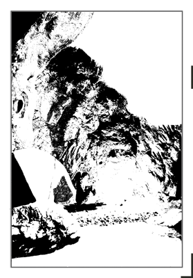
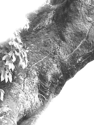
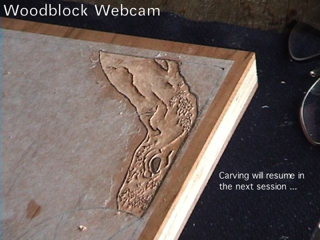
[River in Autumn - 3] Key Block done
Continued from [River in Autumn - 2] | Starting point of the thread is [River in Autumn - 1]
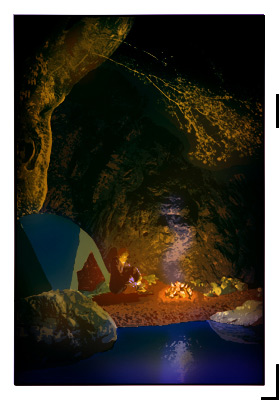
Well, I managed to get enough hours down at the bench the past two days to get the keyblock done. I got a bit sidetracked by some translation work at Sadako's place (along with a bit of electrical work for her), and also by a 'mid-river' meeting with my neighbour Tamura-san, whose home and garden you see whenever I turn the webcam to shoot out the window. He was down in the water clearing out some weeds this morning, and I went down to talk with him about some of the river maintenance problems. It was hours before I could get back to the block ...
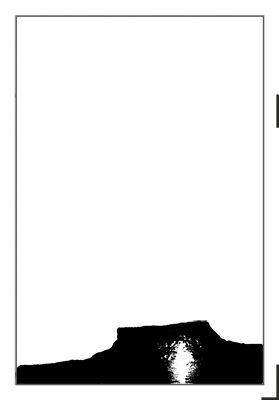
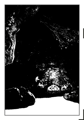
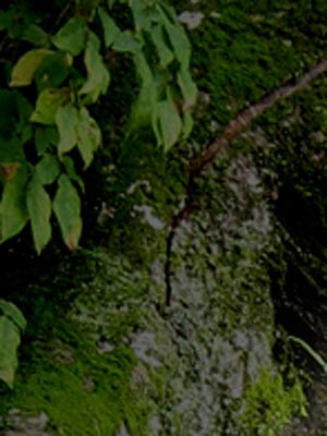
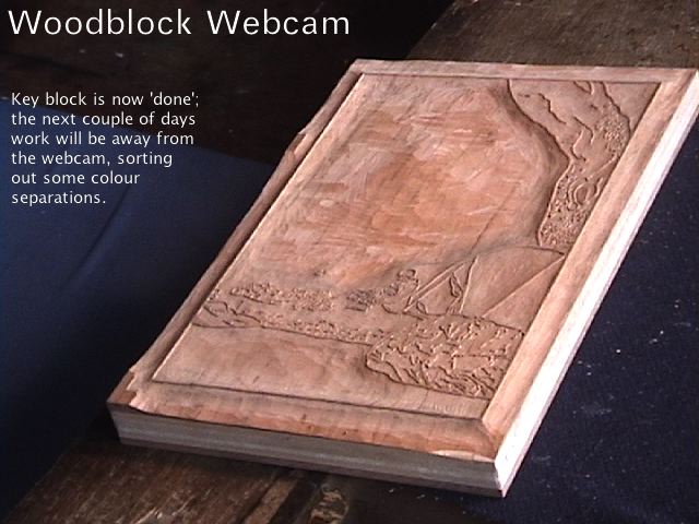
Anyway, as I did the other day, I'm linking to a shot taken from the Woodblock Webcam just as I signed off ...
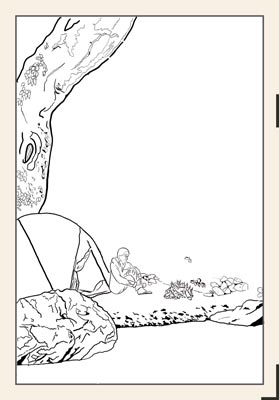
If you click it for the enlargement, you should be able to get a basic idea of the layout of the design. As mentioned, the focus is the campfire, and the other elements around it will disappear into the darkness, illuminated only on the parts that face the light. My campfire was placed near a rock wall, and we should hopefully be able to see some interesting light/shadow effects there ...
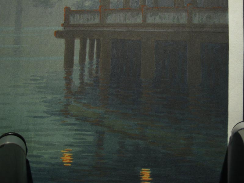
I was digging through my print folders here today, looking for something to show as an example of the things I'll be trying to achieve with this print. I don't have anything that has the same overall feeling, but here is one that I can use to illustrate part of what I'm after. It's a pre-war design from Ito Yuhan, published by Nishinomiya. This is an image that I found on the net somewhere of a not-particularly-fine copy:
I don't have an 'original' of this print (whatever that means), but I do have one made by Numabe-san, the contemporary printer who has done a number of my Mokuhankan editions. I had dropped in on him one day recently, and he was just finishing up a fresh batch of these for Nishinomiya; he had a few 'seconds', and was kind enough to give me one.
Here's a closeup snapshot of the area under the wooden structure:

There are actually columns underneath that platform, receding into the distance. Now why would he take the time and trouble to get these 'just right', when the printer of that older (presumably more 'authentic' copy) didn't bother?
Because he knows that there are people out there who know the difference.
Because even if there weren't, it is still worth doing.
Just because!
The thread continues in [River in Autumn - 4] ...
Posted by Dave Bull at 8:12 PM
| Comments (2)
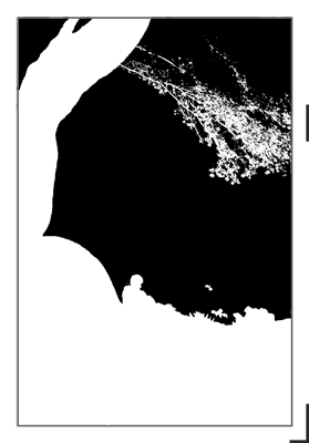
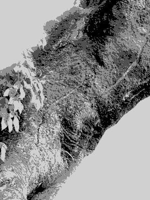
[River in Autumn - 2] Work begins
Continued from [River in Autumn - 1]
After spending quite a bit of time mulling over the design considerations I mentioned in the previous post, I did come to a decision on which approach to take, put something together, and have now started carving.
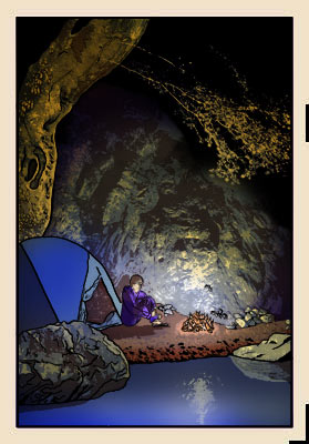
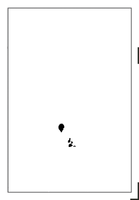
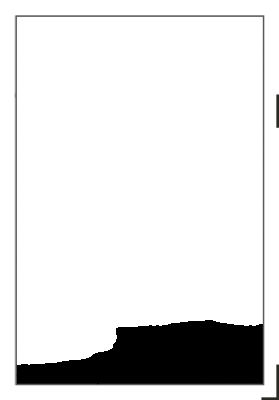
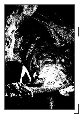
This is a shot taken from the Woodblock Webcam earlier today, at the point where I broke off for lunch:
What are we looking at there? Is it perhaps a column of smoke? Did I indeed decide to 'focus' on the fire? Well, no; as you will see, I have decided to take a more traditional approach, and the design will reflect the general description of the scene as I described it in that post. It's night-time, we're on the river bank, the river flows past, large trees loom over the scene, branches hang overhead, and ... of course ... there is a campfire.
This will be the third - and final - night scene in this series; we previously visited the woodland and the seacoast. (Unfortunately for the overall 'balance' of the completed series, these three night scenes come in chapters 3, 4 and 5! I certainly didn't intend for that to happen, but in the attempt to try and balance a great many other competing factors, this particular one didn't come out well ...)
To create the dark night sky in the previous print - the Seacoast in Summer - was 'easy'; just print a good deep black and that was it. But this print cannot be treated that way. The single colour black in the moon print may have been deep, but it didn't have 'depth'. (I'm contradicting myself here, but bear with me for a moment ...)
One of the ways that the shin-hanga genre of printmaking - in which I like to think that I am dabbling - differs from the earlier ukiyo-e style is its extensive use of multi-layered overprintings. (I'm thinking primarily of shin-hanga landscapes here, and not the images of women, which for the most part are in a neo-ukiyoe style.) Some ukiyo-e prints did in fact use overprinting, to produce richer and more varied colours than was possible through single impressions, but the result was still intended to be 'flat'. The shin-hanga prints, on the other hand, demonstrate how overprinting of transparent colours can achieve an effect like a beautiful violin varnish. The object is indeed 'flat', but we have the illusion that we are looking down quite deeply into the surface; a half-millimeter of varnish seems somehow to be far far deeper than that.
And so it is with woodblock prints. A deep black produced by the heavy application of a single impression has nowhere near the 'depth' of one produced by multiple impressions of different colours.
So the challenge for me in this print is to try and find a way to create a night scene with 'violin varnish depth'. Over here, in the area off to the right of the campfire, is that a tree trunk we can see in the gloom? I'm not sure ... Over there, we can vaguely see a large stone at the water's edge, and around the edge it is slightly illuminated by the campfire, but if we look closely ... can we see the textures of its dark side? We're not sure ... Up there at the top left of the scene, a very old tree stands guard; its thick trunk is covered with moss, which has broken away in a few places. At least I think that's what we are seeing ... but it's difficult to make out in this faint light ...
The print will be - of course - a flat piece of paper. But if I can succeed in what I want to do with this, it will have enough depth to satisfy the most demanding varnish connoisseur!
Now I should be careful how much of this sort of thing I write here in these entries, and how much I 'promise' in advance, because to tell the truth, I don't have a clue how to do this. Actually, that's not strictly true, as my experience gives me a basic idea of where to start, but whether or not I can produce the effect I want - without this thing ending up as a turgid muddy overprinted mess - is far from certain.
When I started typing this entry, I had intended to explain the carving of that first section, and how I'm beginning, but that's going to have to be enough for now; I've got to head back downstairs to the bench. This print is going to take a long time to produce, and every hour of delay in the work is one hour later that the payments will eventually arrive.
Talk about motivation!
The thread continues in [River in Autumn - 3] ...
Posted by Dave Bull at 3:26 PM
| Comments (0)
[River in Autumn - 1] Design considerations
Well, the Seacoast in Summer print is history ... and the prints are now in the hands of the collectors.
That's six out of the twelve complete, so the series is now half-way done. It has taken fifteen months, about 25% longer than my initial estimate of one year (two years for the entire project). When I did the financial calculations for this series, I estimated around 100 collectors, and a total time of two years. I have at present 77 collectors for the project, and when this is combined with the time slippage, my income is thus running at about 60% of the estimated amount. Things are definitely a bit tight at present.
But ... I'm a light eater, and with my younger daughter now graduated from university and fully independent, I'm getting by. I said that I estimated 100 collectors, but I have been making 200 copies of each of the prints; I intend to have this set available in my 'catalogue' for quite some time to come. If previous patterns are anything to go by (my Surimono Albums, etc.) orders will come in one by one steadily over the coming years.
Anyway, six down, six to go - time to get started on the next one!
It'll be Chapter Four - the River in Autumn. I kept the work on the previous print secret, but I see no reason not to share the construction process of this next one. Here's the quote from the accompanying text:
... but here at the riverside, with the light from the fire flickering on the underside of the tree branches overhead, I am not thinking of such things. Surrounded by the darkness which starts just a few metres away at the edge of this small circle of light, river gurgling away unseen just in front of me, hot chocolate in hand, I stare into the dancing flames, 'never still for an instant, in constant motion, yet never changing', just like the river itself. I wonder what I must look like seen from a distance, say from a long way down the river. A tiny oasis of flickering light; a small tent, a motionless figure sitting beside it ... all around the deep dark night ... And such a magical transformation in mood created by just a tiny pile of wood chips and a single match.
Kind of designs itself, doesn't it!
But ... that same thing could have been said about the previous print, the one with the full moon over the sea. In fact I did say something like that at the time ...
"Hmm ... full moon ... deep dark sky ... water ... The print kind of suggests itself, doesn't it." ...
But - as we saw - there was another possible approach.
In correspondence with one of the collectors the other day, he said - when discussing a couple of the earlier prints in the series:
[They have] focus. In taking back an artistic impression of an experience, we can embrace the wide view, or we can zero in on one outstanding element.
And so it is with this one ... a wider view, as suggested by the quote above, or a zoom-in focussed image of some particular element (I wonder which one?).
Opinions welcome. In the meantime, I'll continue to mull over the concept, and play with some sketches and design ideas ...
The thread continues in [River in Autumn - 2] ...
Posted by Dave Bull at 7:50 PM
| Comments (0)
[Seacoast in Summer - 3] print stages 7-10
Continued from [Seacoast in Summer - 2] | Starting point of the thread is [Seacoast in Summer - 1]
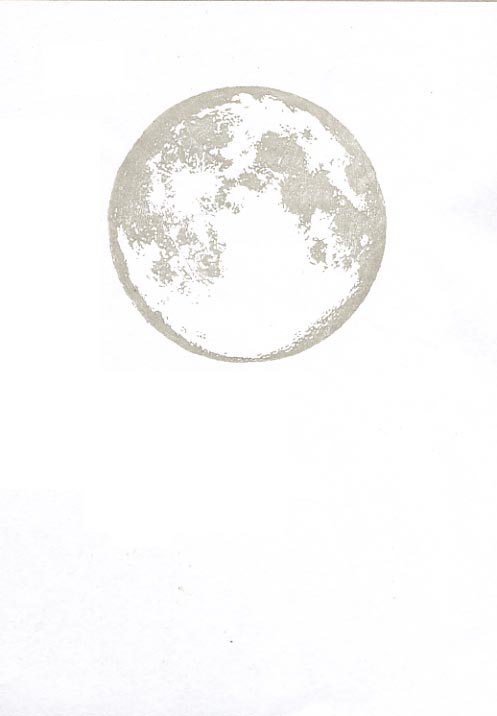
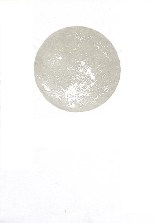
Impression #7 - Next level of tone ...
The resulting build-up :
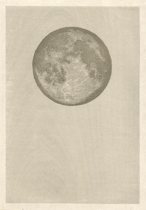
Impression #8 - Next level of tone ...
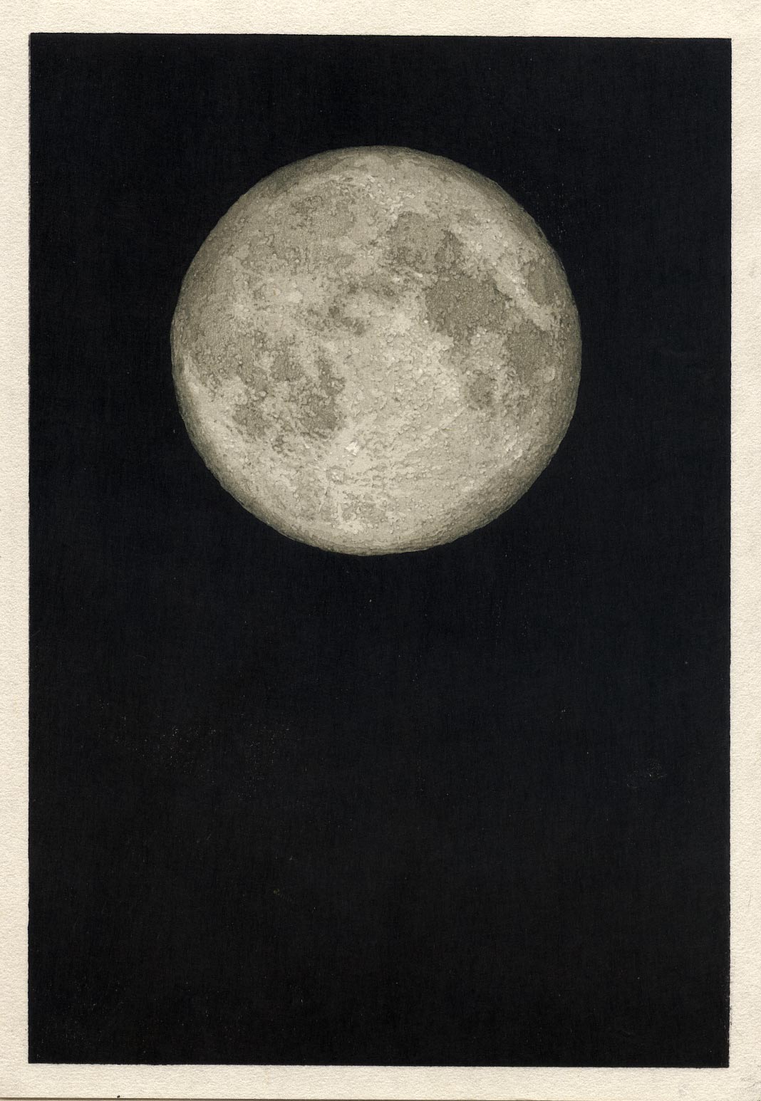
This one is a bit different. The main point of this impression is the final level of tone on the moon - it's barely visible in these small screen images, but it is there - around the very edge of the lunar surface.
Because that is so thin and difficult to print, I cut the block to also include the area under the sky. This has the added benefit of getting the entire surface of the paper back into nice moist condition ready for what is coming next ...
The resulting build-up :
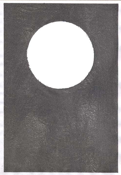
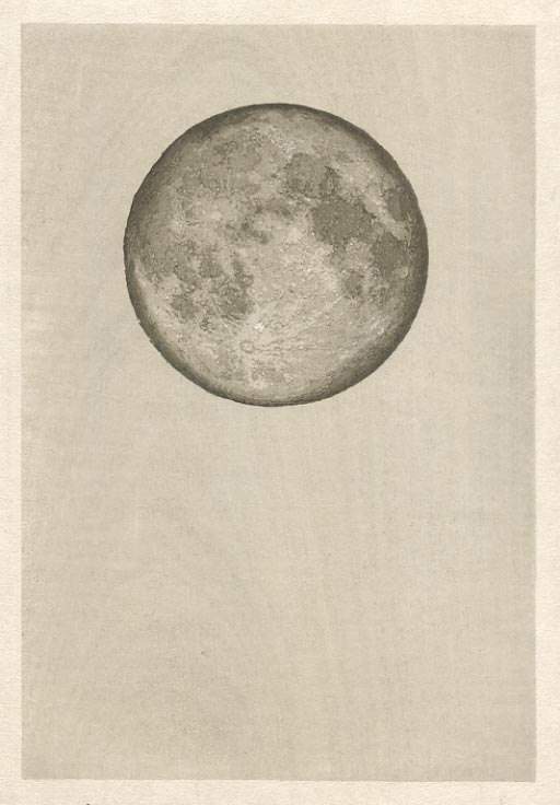
Impression #9~10 - Deep space
I don't have a separate sheet showing the area of this impression, but I think you can tell where it is! This block differs from the previous stage in having nothing at all on the lunar surface - just background.
I printed it twice, using 'neri-zumi', a thickened mixture of sumi and nikawa glue. I tried some tests using a tone with more 'colour' (indigo added), but I felt that it spoiled the effect of total deep dark space, so I went with just the black.
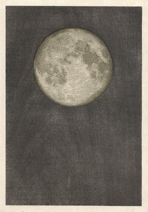
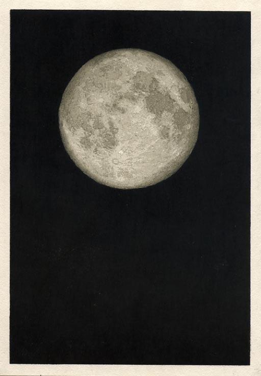
The final image:

Here is an enlarged image. I especially like the edge-on view of all the craters around the edges. Makes me want to get up there and walk around ... (Maybe one day!)
Posted by Dave Bull at 5:03 PM
| Comments (0)
[Seacoast in Summer - 2] print stages 4-6
Continued from [Seacoast in Summer - 1]
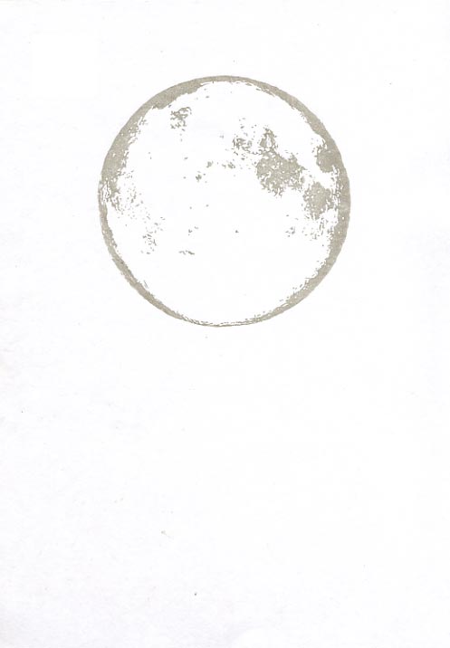
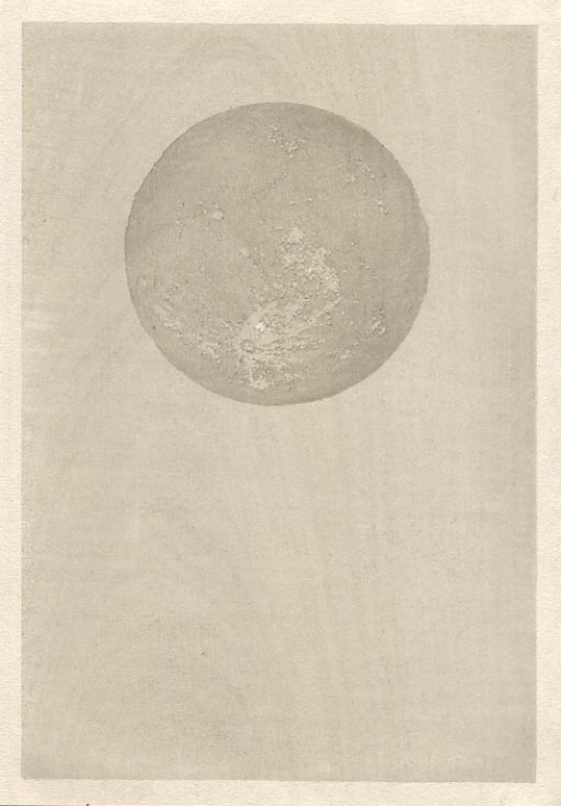
Impression #4 - Next level of tone ...
The resulting build-up :
Impression #5 - Next level of tone ...
The resulting build-up :
Impression #6 - Next level of tone ...
The resulting build-up :
The thread continues in [Seacoast in Summer - 3] ...
Posted by Dave Bull at 4:58 PM
| Comments (0)
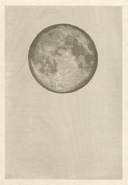
[Seacoast in Summer - 1] print stages 1-3
The Seacoast in Summer print has nowhere near the complexity of the previous Forest in Spring. It is very nearly a 'monotone', and builds up the varied densities of tone by repeated applications of the same grey/green mix.
The process started with a selection of photographs I downloaded from the NASA website (all public domain material). As I studied the surface of the moon in these photos, I learned that what I wanted to do is not actually possible in 'real life'. I wanted to show the spherical shape of the moon by shading off the light at the edges all the way around the visible circumference, but none of the photos showed this effect - all the way around. Perhaps it might be possible to take such a photo at the perfect moment of 'full moon' from a perfect point in space but that is not the way we usually see the moon.
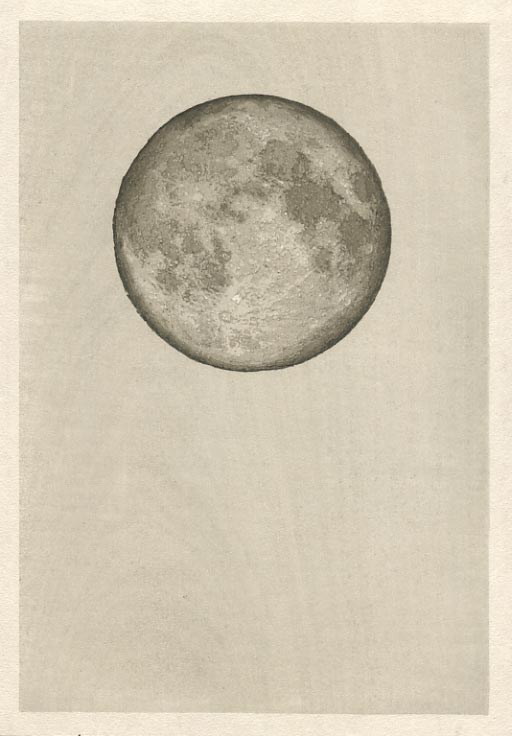
So to create the effect I made a composite, using photos taken at slightly different times. This is a view of the moon you have never seen, and will never see.
I then set to work and split the image into ten levels of tone. These are not evenly spread out along the tonal 'spectrum'. At one end is the bare white of the paper, visible in a very few places on the lunar surface; the other end is of course the total black of deep space. The remaining eight levels are pretty evenly spread out, sitting in a 'band' somewhere in the middle of the overall range.
The print took ten impressions. The basic 'white' is not printed, but the deep black is printed twice. Let's see how it comes together ...
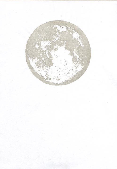
Impression #1: This is the base tone on the lunar surface, and by the time we get to the end will look nowhere near this dark - although it will of course really be so.
It's not a completely solid tone, as there are a few small hi-lights popped out here and there.
There is no specific reason that this colour should also cover the open sky area, as that will be totally buried later, but doing it this way serves to help get the entire sheet of paper into a nice 'equal' condition.
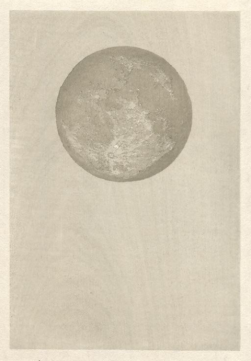
Impression #2 - Next level of tone ...
The resulting build-up :
Impression #3 - Next level of tone ...
The resulting build-up :
The thread continues in [Seacoast in Summer - 2] ...
Posted by Dave Bull at 4:09 PM
| Comments (0)
Seacoast in Summer ... Unveiled!
Well ... the print seems to be arriving at destinations here and there around the world ... so time to open it up for everybody to see.
Here's a small version ... and you can then jump over to the main page, where you will find links to an enlargement, and the usual process slideshow ...
"... And on a sudden impulse, I remember my binoculars, dig them out of their pouch, open the tent flap wide, and lie back on the mattress to steady my head and arms as I peer up into the sky to see what she looks like - close up.
"And now again, as I have many times before in my essays, and will many times in the future, again I have to bemoan my sorry writing skills. How can I find any words to describe to you what I saw up there in the sky? I can say at once though, that during the remaining travels for this little diary of four seasons in a few solitary places, if I were to discover nothing more of interest, nothing at all, then this project would still have been an outstanding success. Because tonight, I saw the moon, and in fifty-odd years on this planet, I have never seen it before. I think there are two kinds of people reading these words: one group, the amateur astronomers, who know very well just what I saw there in the sky, and who are smiling in compassion at my inability to describe what I saw, and then all the rest of you, who are reading these words in a general incomprehension. ...
"It is a sphere! Not a flat, silver-coloured disk stuck onto a flat black backdrop, but a gorgeous spherical silver orb floating in a deep velvety black cavern. Now I understand what that word 'orb' means! This moon is as fully round and textured as any ball that you can hold in your hands. Think of the difference between a coin and a ball. Do you have a good impression of this difference in your mind? The flatness of one, and the sphericity of the other? Well that thing hanging up there in the sky is a sphere! Of course I knew this intellectually, I knew that men have even flown around it, have walked on its surface, but now I know what shape it is. Now I know that it really is another world, hovering there in space in partnership with this one on which we live. "
The thread continued here ...
Posted by Dave Bull at 11:12 PM
| Comments (6)
