Posted by Dave Bull at 9:47 AM, August 21, 2008
Continued from [River in Autumn - 3] | Starting point of the thread is [River in Autumn - 1]

As I mentioned in a comment on the previous entry, I really don't think it's going to be easy to 'explain' what happens next. Back in the ukiyo-e days, it was pretty straightforward - there were the outlines, 'fill in' the colours. That's a bit of an insult, because that process too is capable of deep complexity, but at least you had a sheet of paper in front of you, and with your eyes half closed, could 'see' what the final image would look like.
Well, I too now have a sheet of paper in front of me, and I too am sitting here with my eyes half closed, trying to visualize the final product. Do you remember what I wrote to set the scene?
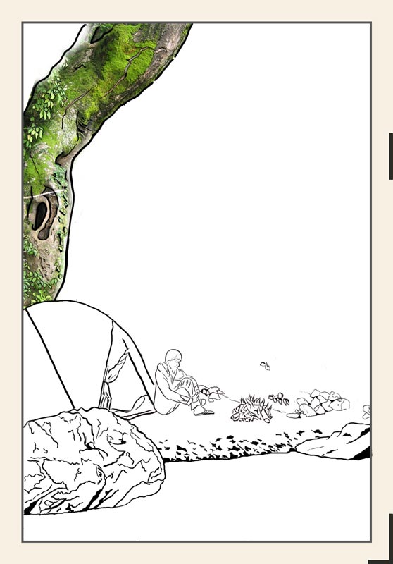
Surrounded by the darkness which starts just a few metres away at the edge of this small circle of light, river gurgling away unseen just in front of me, hot chocolate in hand, I stare into the dancing flames, 'never still for an instant, in constant motion, yet never changing', just like the river itself. I wonder what I must look like seen from a distance, say from a long way down the river. A tiny oasis of flickering light; a small tent, a motionless figure sitting beside it ... all around the deep dark night ...

As I said before, because I want to create semi-invisible under-layers in this print, I am faced with some decisions on which way to go. For example, that tree up at the top left. Of course, as it is far from the campfire, it will be quite dark, although there should be some highlights here and there that pick up firelight. To simplify things somewhat, there are two ways to make that tree dark:
- work out the values that I want in the finished print, do some separations, and print it in dark colours
- work out the values that the tree has under a more revealing light, do some separations, and print it in lighter values, then 'make the sun set' by overprinting it (along with other areas) with deeper tones.
Given that I really want to try and create depth in this print, you can guess which method I am going to have a stab at! Let's see how it might be done ...
Before looking at the colour separations, I should mention something about the overall image. During my explanation of the first print in this project, I showed a photograph of the actual scene, and discussed how it became a print. This one is different. I am not going to show you a photograph. I can't. This scene doesn't exist.
The story itself is of course true; I did go camping there, etc. etc. The actual scene though, was not specifically 'picturesque'. (Not to mention the fact that night-time photography is an art in itself ...) So, just as I did with the Forest in Spring print, I have created my own image, using components from the general area.
The tree is indeed real, athough I never park my tent directly beneath it!
The stone at the bottom left is real, although it is located a bit farther along the riverbank.
Etc. etc.
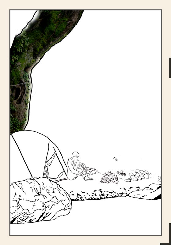
At the moment, things just look baldly 'pasted' into place, as of course they are. Once they are all blended into place with overlapping colour blocks, I believe they will look far more natural. And of course as the rock face against which my campfire is pitched - and which will dominate the print - is not yet visible at all, it might be a bit soon for you to pass judgement! :-)
You may perhaps think this cut/paste process is 'cheating', but I rather suspect that even if we were watching a 'real' artist, sitting on the river bank in his beret, sketchpad in hand, drawing all these scenes, we would see him move elements around until he found a pleasing arrangement.
Anyway, let me try to illustrate what I was doing yesterday, trying to get these separations worked out.
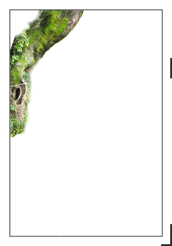
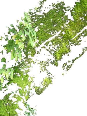
Here's a montage - a photo of the tree pasted into place (shot with the sun low in the sky, to try and get close to the proper shadow angles):
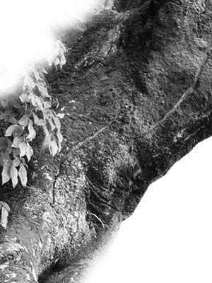
Now, to see what sort of effect we want to end up with, use Photoshop's Levels tool:
Woo-hee, that's dark! Can you imagine all the areas of the print treated this way? (Remembering of course that the focal center - the fire - would be glowing ...) But dark as this is, we can see that there is still visible detail in there, if we look closely:
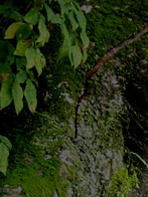
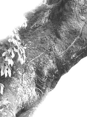
Do you think I'll be able to catch much of that?! Let's have a go at turning this concept into reality. I created a separate Photoshop file with just the tree:
I then pulled out the green of the leaves and moss on the trunk, and saved this separately.
Later on, I will look at this detailed jumble, and trace around various parts of it, to create a 'green block' for this area. If this were to be a daytime print, we would need two green blocks, a 'bluer' one for the leaves, and a warmer one for the moss, but because of the massive overprinting that will follow, one basic green should suffice. The variants in tone will be created by the varied overprints.
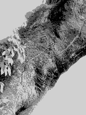
Now, with the green 'taken care of', the next step is to try and find a way to create the blocks that would build up the various values on the trunk. I took the image from a couple of steps back, and made it into a greyscale:
Lightened it a tad to expose more detail, then converted it to an 'indexed colour' version.
The purpose of the indexing step is that once there is an 'index' of 'colours' in the image, I can edit that to create a practical breakdown into a few levels. Using the Photoshop 'Colour Table' editing capability - and with plenty of trial and error - I broke the tree down into four values:
At this point, if I were to carve these five blocks (four grey and one green), I could use them to create a normal day-time scene. That could then be hit by overprinting from a flat uncarved block to turn it into the darker version. What I think I'll be doing is something in between; I'll be printing these blocks in fairly muted tones to start with, and will then use additional overprints to both find the final overall level, and to blend this with other areas.
So that's the basic process I am using, and other areas of the design are treated similarly. But if I were to do this same thing for each area in isolation, I would end up with a monstrous stack of blocks, and an image that was 'fractured' and had no coherence. I have to tie it all together. So when - for example - I work on the stone in the lower left corner, I have to find a value breakdown that both makes sense for the stone itself, and which will allow the use of as many of the same overprinting blocks from other areas as possible.
**
Now, before anybody asks, am I actually going to carve all the dots and dots that you see in these images? That's something I have been pushing back and forth with over the past couple of prints in the series. For the earliest print - the River in Summer - I did very little 'dot' carving. I kept things pretty flat. For the Forest in Spring print - which was more 'closeup' - I did massive amounts of dot carving, and parts of the image came out almost photo-realistic (forest floor in the foreground, etc.).
I like both methods a lot. At this point, no specific decisions have been made on that, and I myself won't really know what will happen until I get to the point where I am sitting there, knife in hand, facing the blocks. Cut wide and flat ... or close in and tight?
We'll see how it goes!
The thread continues in [River in Autumn - 5] ...