Posted by Dave Bull at 7:22 PM, June 9, 2007
Continued from [River in Summer - 22] | Starting point of the thread is [River in Summer]

OK, it's been a day since I finished up the printing work; time to stand back a bit, take a look at it, and see how it turned out.
Here is that final version:
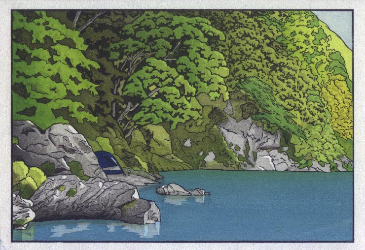
So how does this final version compare with the imaginary version I had in my head when I started?
Before I can ask that, I should try and explain just what I was aiming for when I started. Did I have this image 'finished' in my head? No, not at all. Honestly speaking, I had no idea at all what would come out at the end of the process. That may seem like a surprising thing for me to say, but let me try to explain, by comparing with the way that a print of this type would have been made back in the middle period of the last century, when the shin-hanga style was at its peak. The publisher would conceive of a particular project, either a single print he wanted to issue, or a themed collection, or whatever. At this point, there would be no particular 'image' in his mind of course, just the 'concept' ... the general type of picture. OK, that's where I myself started with this project a few months back ... a general concept. So far, so good ...
Next, he would have commissioned a designer to put some drawings down on paper. The publisher would obviously select a designer who he thought would be able to come up with something that matched the proposal, and of course the two of them would discuss the project requirements. Now in my case, publisher Dave sat down and had a chat with designer Dave, and it went something like this:
Publisher Dave: "... and so that's what I've got in mind. Do you think you can do the job for us?"
Designer Dave: "Well, as you know, I haven't got a lot of experience with this type of work, but I think I have a good understanding of what you want, and with a bit of help from my camera, I think I can hand in some decent line drawings for your people to work with."
Publisher Dave: "Yes, I guess I'm sticking my neck out a bit here by going with a beginner for this job, but I kind of like your attitude, and I'm willing to give you a try."
Designer Dave: "Thanks! I know you won't regret it!"
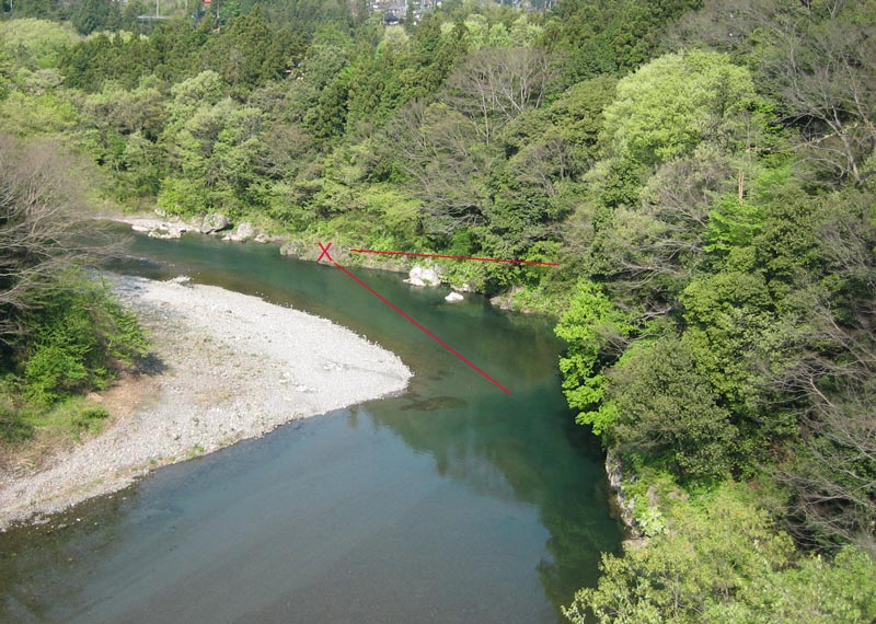
Designer Dave then headed off with his tent, and spent quite a lot of time sitting by the river, scouting out places that he thought would make interesting designs. Here's an aerial view of the place that he settled on for this print. The 'X' marks the spot on which he was standing, looking in the direction of the red lines ... (click it for an enlargement):
What did he see from that point? Here's the shot he brought home with him, with a white line showing where he mentally cropped it for the print:
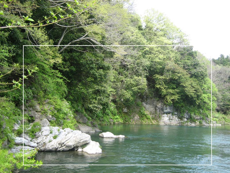
Now that's not a particularly 'beautiful' image. The vegetation is just a mish-mash of brush and spindly trees, nothing attractive at all, especially in the flat light. But if you sit there and look at it, and then think about how tree shapes could be drawn across the hillside, and how a good carver would be able to carve this kind of tree shape, and that kind of tree shape, and of how a good printer would think about where the light was coming from ... then it begins to have possibilities.
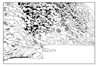
So Designer Dave came home with this shot, loaded it into his Mac, got out his pen tablet, and started drawing on top of this image. He worked at it until it looked sort of OK, and then handed in his line-drawing to Publisher Dave.
Publisher Dave: "Wow, you've certainly gone in for a lot of detail, haven't you! This isn't an o-ban print you know, it's going to have to be mounted inside an A4 size book. A lot of this detail is superfluous ... It's going to take twice as long to carve as I expected. And look at all those different tree shapes - are you expecting all those to have different tones?"
Designer Dave: "Oh, please ... let's give it a try. I know that all those extra colour blocks will be expensive to print, but I think the result should be worth it!"
Publisher Dave: "No way ... This is completely uneconomical. Try again, with far less detail."
Designer Dave: "Look, how about if I were to work for nothing ... take the money you would have paid me, and apply it to the craftsmen's fees ..."
Publisher Dave: "That's the only way that this project could work ... OK, if you insist!"
At this point, all that exists of the print is the line drawing ... no colours, no colour separations ... no 'finished' image at all. But the publisher has a secret weapon - two very highly skilled craftsmen: a carver and a printer. These men could take a child's scribble and turn it into something drop-dead gorgeous. He talks to the carver first:
Publisher Dave: "OK, here's that project I was telling you about ... the first one from that 12-print set of nature designs."
Carver Dave: "Cheeze, look at all that detail ... are you nuts?"
Publisher Dave: "Please ... bear with me. We're going to have to tighten the rein on this designer soon, but let's give him his head for this experiment ..."
Carver Dave: "OK, it's your money ..."
Carver Dave then sets to work. He cuts the keyblock first, pulls a bunch of kyogo impressions, and sends those over to Designer Dave. As expected, Designer Dave asks for a bunch more blank sheets, because there weren't enough. Carver Dave shrugs his shoulders - it's not his money - and sends them over. When the batch of sheets comes back, all covered with tiny detailed colour breakdowns, he thinks about calling Publisher Dave with his concerns, but decides to just plough ahead with the job. A few weeks later, the set of colour blocks is done, and sent off to the publisher.
The traditional publisher would at this point then think about which of his printers to use. It's a bit of a difficult choice this time, because with an unknown designer, there is no easily recognized style. Most of the better printers are easily capable of coming up with a pleasing set of colours, as long as they know what is roughly expected of them. This though, is a new designer, with no established style. Our story continues with Publisher Dave deciding to send the set of blocks over to Printer Dave ...
Publisher Dave: "I think you get the idea here. It's full of detail, but not particularly complicated. We want to try for a kind of early morning light. Nothing too gloomy in the shadows, but put enough depth in there to give the highlights a nice clean brightness. Nothing complicated on the water, but if you can, try and give it the impression of being deep over there at the far bank ... Other than that - over to you!"
Printer Dave: "OK boss ... By the way, what kind of paper are we using for this job?"
Publisher Dave: "The usual - the good stuff from Ichibei Iwano. With all these overprintings, I don't want to mess around with anything cheaper."
Printer Dave then sets to work, following the guidelines the publisher outlined. He does a few trial proofs, playing around a bit with different greens, and some different effects in the water, and then shows them to Designer Dave for comment.
Designer Dave: "Wow ... you've really started to bring this thing to life ... I think there's a nice print hiding in there!"
Printer Dave: "What do you mean 'hiding'? ... OK, OK, don't get upset ... let's talk about it ..."
The two men then have a good discussion of how to proceed from here. They bat it around, trying different combinations of greens in the vegetation, and different levels of grey on the stones. They spend a few days on this work, but then get a phone call from the publisher.
Publisher Dave: "What the hell is going on over there! Get that thing nailed down, and get going on the edition! We've got the staff here working like crazy on getting the book volumes ready to receive them - we have to get this one out the door before the end of the month!"
Designer Dave: "But we need more time to get this thing really perfect ..."
Publisher Dave: "Perfect? What's 'perfect'? The perfect is the enemy of the good ... If I give you your head, that print will _never_ get shipped. Sign off on a proof right now, and then get out of there and leave him alone! He's perfectly capable of making an attractive print ..."
Printer Dave then sets to work, and day after day over the next couple of weeks, quietly 'builds' the print. He makes plenty of adjustments along the way, based on what is developing before his eyes, and then after ten days work, and 31 impressions, calls it a day, dries them off, and sends them to the publisher.
The publisher opens the package, nods his head in general approval ... "Not bad ... Could have used better shading under that central tree; those water highlights would have been more effective if they had been deeper, and I don't know where he came up with the green on that tree over there ... But yeah, I can live with this ... Ship it!"
So ship it they did ...
***
At this point I had intended to give a list of things that I think 'worked' in this print, paired with a list of things that weren't so successful. But I think that before I do, it might be interesting to see what parts of the print other people find either particularly effective, or not, as the case may be.
Please use the comments box below, and feel free to post your ideas/thoughts/comments/criticism/etc. on this print!
The thread continues in [River in Summer] - Amendments ...
