Posted by Dave Bull at 8:23 AM, August 26, 2008
Continued from [River in Autumn - 5] | Starting point of the thread is [River in Autumn - 1]

I wasn't quite sure if anybody would actually have a go at making their own version of this print based on the colour separations I posted in the previous post, but I have already received two versions from one reader, and some email letting me know that others are on the way.
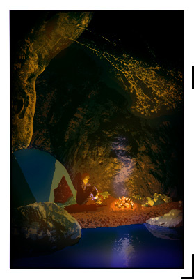
Here is the first one:

I was so pleased to find this in my email yesterday! Is this a 'preview' of the print I will make? Well, yes and no. He has indeed tried to create the 'circle of light' that I talked about, so in that sense, this shows what to expect from my version later.
This differs from mine - of course - in the colours he has selected, but also in another major point - I will be using a lot more gradation printing. A good example of this is the shoreline/beach area. Mine will become much darker in the areas away from the fire, and the ground around the figure will probably end up being almost pitch dark. When seen flat as in this sample, the human figure is just too isolated (and we can clearly see that it was 'pasted in').
(Also, he made this version before I made the correction in the separations for the overhanging tree ...)
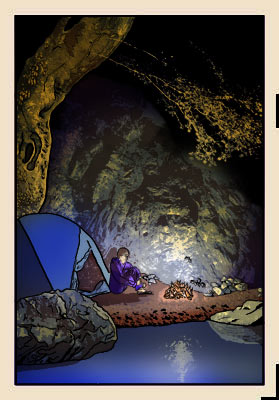
Next morning - this 'game' seems to be addictive! - he sent a second version, with a different colour arrangement, more gradations, and the addition of the keyblock:

Here's what I wrote in reply to this contributor:
Doing an electronic 'trial proof' like this is something that I usually avoid doing, mostly for the simple reason that it's so easy to end up doing things with the mouse that simply aren't possible with the brush and baren. In reality, I have to make a wood block print, not try to copy a digital master.
But having said that, seeing your test version _has_ opened up a viewpoint into a different way of balancing things. Comparing your overhanging branches with my own original paste-up (before making separations), I find that yours has captured the mood somewhat better. So I really would like to get input from more people on this; it's not that I 'need help' with the image - of course I have my own vision in mind - but I'm not such a 'genius' at this that I can't learn from suggestions, or more probably, simply have my eyes opened to alternative ways of approaching some of the decisions that have to be made.
I'd love to see a bunch more of these, from people with different ideas on how this image could be treated. If you already know my email address, send something as an attachment; if you don't have the address on file, then use my contact form to contact me first, and I'll write back to you directly. (This particular contributor asked that his name not be posted; let me know your own preference when you send me your version).

The thread continues in [River in Autumn - 7] ...
