Posted by Dave Bull at 4:40 PM, August 22, 2008
Continued from [River in Autumn - 4] | Starting point of the thread is [River in Autumn - 1]

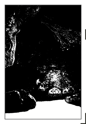
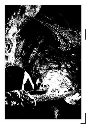
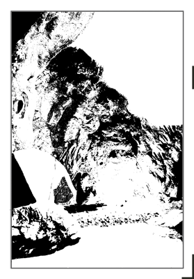
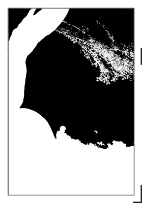
So, it has taken a good three days of sitting at this computer screen, giving Photoshop a pretty good workout, but I think I now have a good set of blocks for this print. It would be a bit premature to spend too much time talking about them at this point, as until I start printing there isn't much to see, but it might be interesting if I post them here for perusal ...
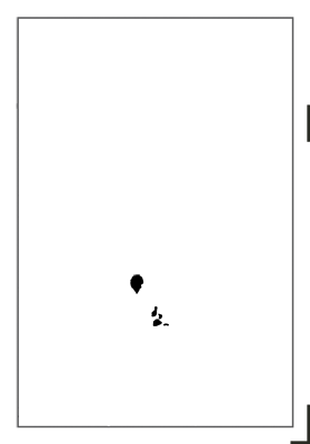
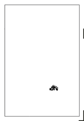
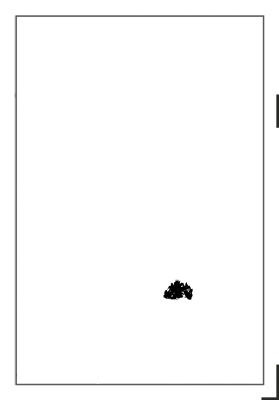
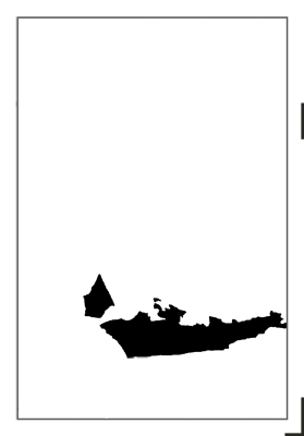
This is a 'raw' set of separations ... the 'logical' breakdown. There are sixteen of them here, but this of course doesn't mean the print will have sixteen impressions. Some of these will be used more than once, usually for a flat tone first, then for gradations to add depth. The larger ones will be pasted onto clean blocks by themselves, the smaller ones will be combined where possible, to save wood.
Best guess at this point, is that we'll end up with around 30 impressions in the final version.
Here they are, in no particular order:
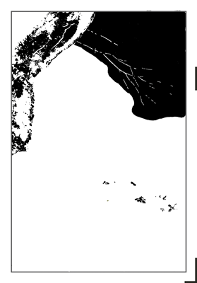
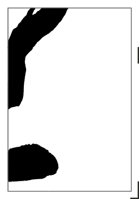
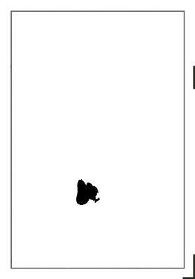
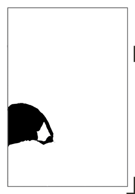
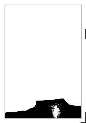
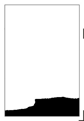
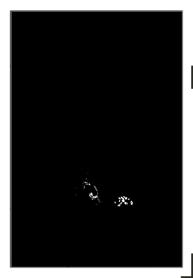
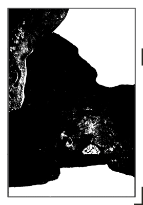
I think there is enough information there to give you a pretty good idea of what the print may look like! Actually, now that I think of it, if you were to load these into your own computer and pull them into Photoshop (or Photoshop Elements), they would serve as perfect 'masks' for making a digital version of this image.
If you do try it, there are a couple of things to remember:
- the pigments we use in Japanese printmaking are all transparent, so don't forget to adjust the opacity of each layer as you add colour. Everything must remain visible through all subsequent overprintings.
- none of these separations give any hint as to what kind of gradations will be applied to them once I start printing; you'll have to figure that out yourself ...
(Update - in response to a question: No, I will not be printing 'black' for each impression. The black you see in these images simply shows the carver what areas of the block are to be carved. Once the finished blocks go to the printing step, any colour at all can be applied to the wood ...)
(Update 2: Don't forget, you may also include the key block, that I posted the other day)
(Update 3: I discovered that I made an error in two of the separations (13 14) when I saved them from Photoshop. I had the layer order mixed up, and the overhanging tree branch was hanging in open space in front of the large tree trunk, instead of being hidden behind it. If you've downloaded them, you should refresh your copies of those two ...)
The thread continues in [River in Autumn - 6] ...
Hi Dave,
I find your process fascinating! There is an old design principle that "form follows function". I just had a look at the Wikipedia article about that principle. It's an interesting article.
If you were to follow that principle, you would have done a color study of the intended finished product, and then designed the blocks to attain that end. Surprisingly (to me - at first), you are taking the opposite approach of designing the blocks first and then later, finding the finished image by experimenting with the blocks.
Knowing you, and the historical path which got you to the point where you are, it makes perfect sense that you would take this approach. I suspect that in your exploration of the printing process, there will be some false starts. I would very much appreciate it if you would share those with us, in the interest of documenting your process.
Thank you for sharing!
Marc
... designing the blocks first and then later, finding the finished image ...
As you implied - with your knowledge of my background in making ukiyo-e prints - it's no surprise that I work this way. Back in the 'old days' there was no 'master copy' from which the craftsmen worked, and the first person on the planet to see any design in its finished form was whichever printer happened to be working on the last colour impression.
It makes sense for me to work that way, because - as should be pretty clear by now! - not having any skill at all in such things as drawing, sketching or painting, I have no ability to create a master copy to work from. (Which is why the reproduction work so suits me!)
An analogy with building construction is enlightening. An architect's office creates a complete and thorough set of plans for a structure. We can clearly 'see' what it is going to look like. This is then passed to construction workers, who set to work and build the thing.
In my case, I just stand in the open field, close my eyes, and try and visualize what structure I would like to appear there. I then get my shovel out, and start digging. I pour a bit of concrete here, and a bit over there. A few bricks go on top, etc. etc. I've got some experience with these materials and tools, and have worked on a lot of different types of buildings before, so I have some idea of what might work, and what to avoid. Whether or not my new structure will turn out to be useable depends on how well I manage to hold the original visualization in my head along the way.
For this print, I began with that quote from the story "... circle of light ..." and am proceeding from there, trying at every step to keep that thought in mind. When it comes time to start proofing in a couple of weeks, each impression I put onto the paper will be with that same image uppermost in mind - circle of light ...
So I would quibble a bit with your choice of words "finding the finished image". I think the image is already there; safely tucked inside my head. Not 'in detail' of course. It was extremely vague at first, and is becoming slowly clearer as we move along ... But I would like to think that I'm not 'finding' it, I'm 'creating' it. The challenge is to replicate it in a physical form that other people can also see!
(Having said that though, I have to admit that the argument could indeed be made the other way around. When I was proofing the Forest in Spring print, I showed a number of different proof copies, and I was clearly stumbling around, trying to ... 'find' ... a good image!)