« July 2009 |
Main
| October 2009 »
It was a 'Tokyo' day for me today - a couple of hours on the train to get downtown (to Kinko's to print out the summer issue of my newsletter) - so I had plenty of time to get caught up on some of the unread newspapers stacked-up here!
I came across an interesting story in the New York Times from last weekend. I see that it's also online, so you can read it at this link (if you have registered your email with them).
It's entitled 'At Louvre, Many Stop to Snap but Few Stay to Focus', and the writer basically just riffs on some thoughts that came to him while 'people-watching' in that museum, and by posing the question 'What exactly are we looking for when we roam as tourists around museums?'
The key sentence that jumped out at me from his ruminations was:
'Almost nobody, over the course of that hour or two, paused before any object for as long as a full minute.'
Now this is of course my experience too. I don't mean as a gallery visitor - no, not me - but my experience with watching the visitors to my own exhibitions. People walk over to where a picture is on the wall, look at it for 'a moment', and then move on to the next one. Some stop longer than others; some never actually stop at all, but stroll slowly along the line of images with their feet always moving ...
Part of me always wants to shout out, "Lady, I spent three months making that thing! You think that ten seconds is enough to drink it all in?"
But of course I keep quiet.
I spoke to Sadako one day at one of my exhibitions about this, and her comment was predictable (and true): "Well, perhaps if your prints were a bit more interesting ..." And I have no argument with that. I cannot claim that my images are so intense - or wonderfully made - that I can demand that people bow down in deep admiration, but ... ten seconds? Surely, I deserve a bit more than that! Just what, actually, did their eyes focus on during the time they looked at the piece? What did they 'think'?
The writer of the New York Times piece - in a section of his story that touched on this question of 'how long' to look at the object on display - mentioned this:
"The art historian T. J. Clark ... has lately written a book about devoting several months of his time to looking intently at two paintings by Poussin. Slow looking, like slow cooking, may yet become the new radical chic."
Now that's an interesting idea. Stop walking around. Grab one image (or two, whatever), and look closely. It's analogous to the idea of choosing one spot for a vacation and staying there for a couple of weeks, instead of travelling around to many different places day by day. Sit still. Dig in.
Assuming you choose a place (or image) with plenty of 'depth', then presumably you will be rewarded with ... Well, I'm not exactly sure what you will be rewarded with. A 'deeper' knowledge, one presumes, but perhaps an understanding of a whole different kind.
Thinking about this now reminds me of an episode with an interviewer here some years ago. I was showing him some of the stuff in my collection and when we got to one particular item (a print I own, not one that I had made), we somehow got onto the topic of 'what he should look at'. I started to blab about this, pointing out this feature, that point, this point ... He was receptive to the conversation, and it ended up with me giving him a 'seminar' on that particular image; we spent probably the best part of an hour on it.
So perhaps the people in that museum in the newspaper story aren't really to 'blame'. After all, they are not professionals; they know nothing of what they could, or should, be looking at in those paintings on the wall. And so many paintings are on the wall in most museums! Well of course people end up walking along in a daze ...
Maybe that should be my next exhibition then. Just one print. Something with meat. Put it up there on one wall by itself. On the other walls of the room, tell the 'rest of the story'. Do what I did with that interviewer - talk about the details of its composition and design ... how it came together ... what the imagery stands for ... the layers of meaning ...
'Slow looking'.
I wonder if this would work, or if people would reject it. "Eh? I came all the way down here, and all you have on display is one print? I want my money back!"
Posted by Dave Bull at 12:12 PM
| Comments (4)
by A.A. Milne, 1921
(written for one of the British magazines of the day)
[Note from Dave: although the writing style here is certainly old-fashioned (especially in his rather clumsy introductory section), this little 1500-word piece is definitely worth reading, and his 'conclusion' should provoke some interesting discussion, I think!]

By an "artist" I mean Shakespeare and Me and Bach and Myself and Velasquez and Phidias, and even You if you have ever written four lines on the sunset in somebody's album, or modelled a Noah's Ark for your little boy in plasticine. Perhaps we have not quite reached the heights where Shakespeare stands, but we are on his track. Shakespeare can be representative of all of us, or Velasquez if you prefer him. One of them shall be President of our United Artists' Federation. Let us, then, consider what place in the scheme of things our federation can claim.
Probably we artists have all been a little modest about ourselves lately. During the war we asked ourselves gloomily what use we were to the State compared with the noble digger of coals, the much-to-be- reverenced maker of boots, and the god-like grower of wheat. Looking at the pictures in the illustrated papers of brawny, half-dressed men pushing about blocks of red-hot iron, we have told ourselves that these heroes were the pillars of society, and that we were just an incidental decoration. It was a wonder that we were allowed to live. And now in these days of strikes, when a single union of manual workers can hold up the rest of the nation, it is a bitter refection to us that, if we were to strike, the country would go on its way quite happily, and nine-tenths of the population would not even know that we had downed our pens and brushes.
If there is any artist who has been depressed by such thoughts as these, let him take comfort. We are all right.
I made the discovery that we were all right by studying the life of the bee. All that I knew about bees until yesterday was derived from that great naturalist, Dr. Isaac Watts. In common with every one who has been a child I knew that the insect in question improved each shining hour by something honey something something every something flower. I had also heard that bees could not sting you if you held your breath, a precaution which would make conversation by the herbaceous border an affair altogether too spasmodic; and, finally, that in any case the same bee could only sting you once—though, apparently, there was no similar provision of Nature's that the same person could not be stung twice.
Well, that was all that I knew about bees until yesterday. I used to see them about the place from time to time, busy enough, no douht, but really no busier than I was; and as they were not much interested in me they had no reason to complain that I was not much interested in them. But since yesterday, when I read a book which dealt fully, not only with the public life of the bee, but with the most intimate details of its private life, I have looked at them with a new interest and a new sympathy. For there is no animal which does not get more out of life than the pitiable insect which Dr. Watts holds up as an example to us.
Hitherto, it may be, you have thought of the bee as an admirable and industrious insect, member of a model community which worked day and night to but one end—the well-being of the coming race. You knew perhaps that it fertilized the flowers, but you also knew that the bee didn't know; you were aware that, if any bee deliberately went about trying to improve your delphiniums instead of gathering honey for the State, it would be turned down promptly by the other workers. For nothing is done in the hive without this one utilitarian purpose. Even the drones take their place in the scheme of things; a minor place in the stud; and when the next generation is assured, and the drones cease to be useful and can now only revert to the ornamental, they are ruthlessly cast out.
It comes, then, to this. The bee devotes its whole life to preparing for the next generation. But what is the next generation going to do? It is going to spend its whole life preparing for the third generation... and so on for ever.
An admirable community, the moralists tell us. Poor moralists! To miss so much of the joy of life; to deny oneself the pleasure (to mention only one among many) of reclining lazily on one's back in a snap-dragon, watching the little white clouds sail past upon a sea of blue; to miss these things for no other reason than that the next generation may also have an opportunity of missing them—is that admirable? What do the bees think that they are doing? If they live a life of toil and self-sacrifice merely in order that the next generation may live a life of equal toil and self-sacrifice, what has been gained? Ask the next bee you meet what it thinks it is doing in this world, and the only answer it can give you is, "Keeping up the supply of bees." Is that an admirable answer? How much more admirable if it could reply that it was eschewing all pleasure and living the life of a galley-slave in order that the next generation might have leisure to paint the poppy a more glorious scarlet. But no. The next generation is going at it just as hard for the same unproductive end; it has no wish to leave anything behind it—a new colour, a new scent, a new idea. It has one object only in this world—more bees. Could any scheme of life be more sterile?
Having come to this conclusion about the bee, I took fresh courage. I saw at once that it was the artist in Man which made him less contemptible than the Bee. That god-like person the grower of wheat assumed his proper level. Bread may be necessary to existence, but what is the use of existence if you are merely going to employ it in making bread? True, the farmer makes bread, not only for himself, but for the miner; and the miner produces coal—not only for himself, but for the farmer; and the farmer also Produces bread for the maker of boots, who Produces boots, not only for himself, but for the farmer and the miner. But you are still getting no further. It is the Life of the Bee over again, with no other object in it but mere existence. If this were all, there would be nothing to write on our tombstones but "Born 1800; Died 1880. He lived till then."
But it is not all, because—and here I strike my breast proudly—because of us artists. Not only can we write on Shakespeare's tomb, "He wrote Hamlet" or "He was not for an age, but for all time," but we can write on a contemporary baker's tomb, "He provided bread for the man who wrote Hamlet," and on a contemporary butcher's tomb, "He was not only for himself, but for Shakespeare." We perceive, in fact, that the only matter upon which any worker, other than the artist, can congratulate himself, whether he be manual-worker, brain-worker, surgeon, judge, or politician, is that he is helping to make the world tolerable for the artist. It is only the artist who will leave anything behind him. He is the fighting-man, the man who counts; the others are merely the Army Service Corps of civilization. A world without its artists, a world of bees, would be as futile and as meaningless a thing as an army composed entirely of the Service Corps.
Possibly you put in a plea here for the explorer and the scientist. The explorer perhaps may stand alone. His discovery of a peak in Darien is something in itself, quite apart from the happy possibility that Keats may be tempted to bring it into a sonnet. Yes, if a Beef-Essence-Merchant has only provided sustenance for an Explorer he has not lived in vain, however much the poets and the painters recoil from his wares. But of the scientist I am less certain. I fancy that his invention of the telephone (for instance) can only be counted to his credit because it has brought the author into closer touch with his publisher.
So we artists (yes, and explorers) may be of good faith. They may try to pretend, these others, in their little times of stress, that we are nothing—decorative, inessential; that it is they who make the world go round. This will not upset us. We could not live without them; true. But (a much more bitter thought) they would have no reason for living at all, were it not for us.
Posted by Dave Bull at 12:31 PM
| Comments (5)
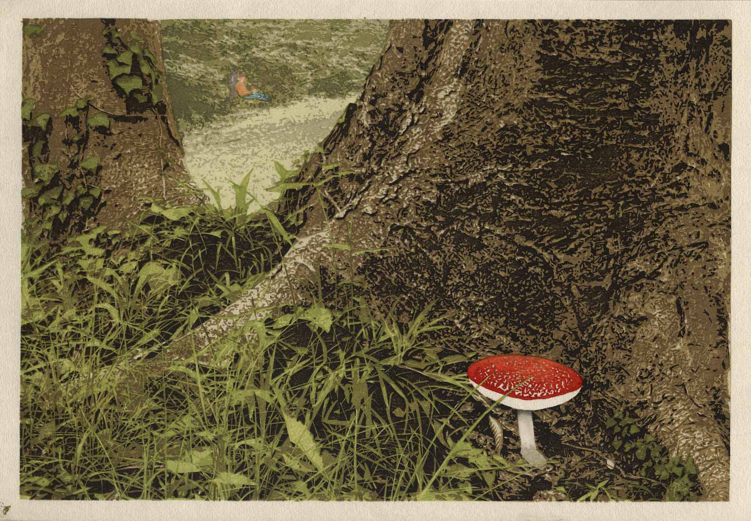
[Forest in Summer - 19] : Wrapup ...
Continued from [Forest in Summer - 18] | Starting point of the thread is [Forest in Summer - 1]
With the first batch of prints now dried and ready for signing, here's a 'roundup' of some things that might be of interest; first, a few links:
- the slideshow illustrating the entire printing process is now online here
- a hi-res enlargement of the finished print is here
- the web page of the print, with links to story excerpts, etc., is here
Now. Given that this print obviously has its roots in a photograph, I thought it might be interesting to show you how it came together.
The story being illustrated is the 'Forest in Summer' chapter in the 'My Solitudes', so when trying to come up with a design, I spent a lot of time up at my camping spot (it's only a few minutes walk from home) strolling around looking for inspiration.
It's not the most beautiful forest. The whole area was clearcut around 60 years ago, and it has grown back in fits and starts, with the different landowners handling maintenance in different ways (or not at all). And as I mentioned back at the beginning of this thread, it was very difficult to come up with an attractive concept - there are no 'vistas' in these woods, just a whole bunch of trees all crammed together fairly tightly.
This means that there are lots of photogenic details, but no 'views'. So the idea came to mind to focus closely on one of the more interesting trees, to try and make an interesting composition out of it. I walked and walked, but didn't come across anything that really jumped up and said 'look at me!'
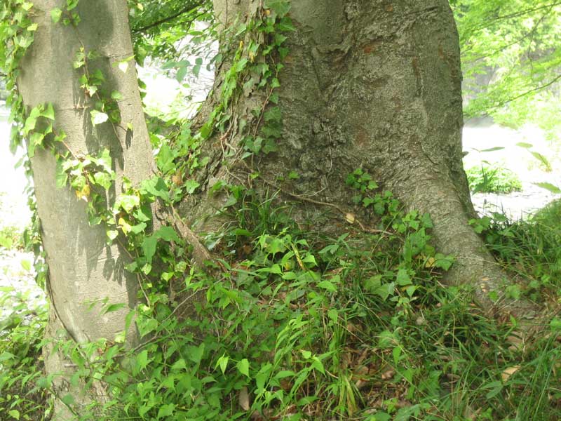
But one day, when I was having a lunch break down at the river park near my home (I'm very nicely sandwiched between river and hills), I came across this specimen of keyaki tree (Zelkova Serrata):
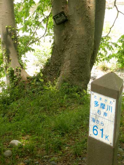
As it happens, it stands right next to one of the posts that measures distance down the river to the sea. The sign reads "Left bank of the Tama River; 61 kilometers from the sea."
Now this is a tree with character, and lots of possibilities. The first problem is that it 'lives' down by the river, not up in the forest where I go camping. Well ... what can I say ... I cheated ... I 'moved' it up to my camp area.
First step was to take a few snapshots, put them on my desktop at home, and think about it for a while. The longer I studied it, the better this looked, so I went back down there, checked out some different angles, and came up with this view:
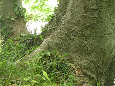
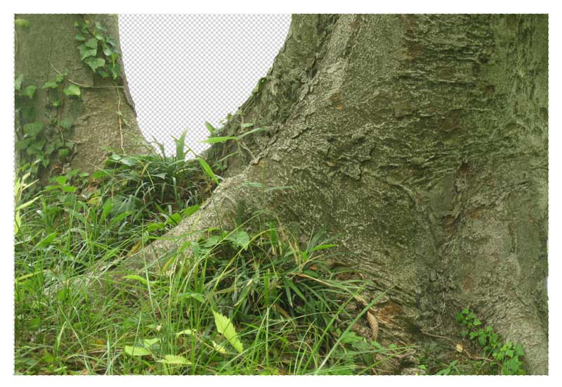
That's interesting, but not good enough - the lower right corner doesn't 'work' at all. It just 'falls off the table'.
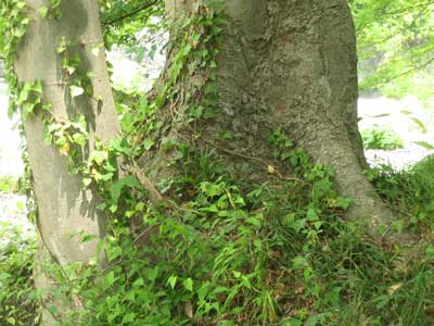
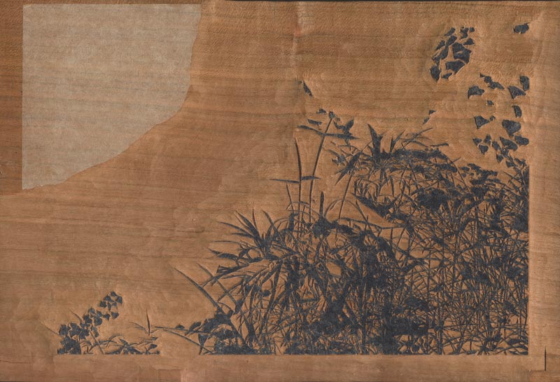
Photoshop to the rescue though, and with the help of this shot of the same tree taken from a slightly different angle:
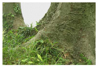
... I 'built' a new tree design, fixing the problems in that corner:
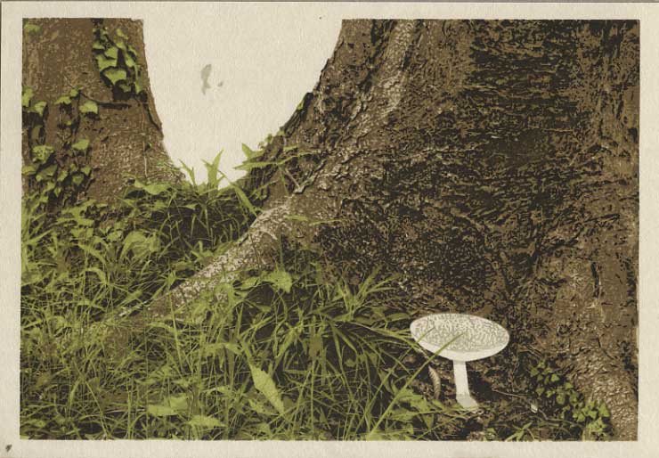
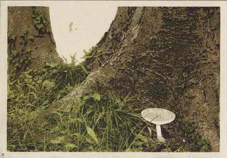
Now that's much improved, with lots of interesting texture and detail, but it does still lack a good focus point. So I hunted through my stack of mushroom shots (you can't walk two paces up in the woods during the damp summer without coming across a mushroom or fungus of one type or another), found a very nice shot of a (poisonous, I believe) red toadstool, and smoothly transplanted it snugly up against the trunk:
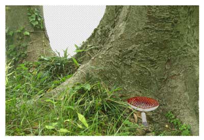
Woo-hee, we almost have a print here!
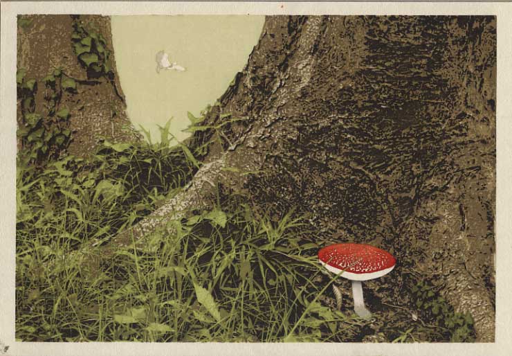
But, what to do about the missing background? As I mentioned, it is very difficult to get 'distance' in these woods. There are some small glades here and there though, and actually one of them features in this chapter of the book. Here's a small snapshot taken there:
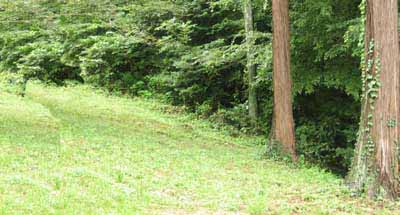
Hmm ....
Once I flipped it over, it did indeed fit right in place, filling out the background area of this design. But I found that without any recognizable objects in that area to provide 'scale', it was impossible to tell if the background was six feet back, or sixty feet back. So - as I mentioned the other day - I went to this page, stole that image, and dropped it in:
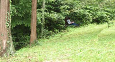
So there we have it; all put together, it came out like this:
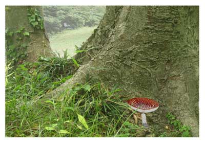
As they say, "And now you know ... the rest of the story!"
* * *
But I also promised one more thing - a tabulation of the time it took to get this thing made. Here's a recap of what I posted earlier covering the carving time:
164 hours, spread out over 31 different days.
And here's a table of the printing hours for the first batch of prints - 112 sheets. The paper in the stack is divided into six groups, containing 20, 20, 16, 20, 20, 16 sheets respectively. (I very much like to keep things tightly organized, and each sheet stays in its proper place in the order throughout the entire process.) So in this table, when I say that I printed Impression 1 (1 ~ 2), I mean that during that particular time period, I got through the first two groups of paper (the first 40 sheets), before packing it up until the next work period.
| Date | | Work | Hours |
| Sat, July 25 | | Cut paper | 2.0 |
| Sun, July 26 | | Apply nail polish | 1.5 |
| Mon, July 27 | am | Moisten paper | 1.0 |
| eve | Impression 1 (1 ~ 2) | 2.0 |
| Tue, July 28 | am | Impression 1 (3 ~ 6) | 3.0 |
| pm | Impression 2 (1 ~ 2) | 2.0 |
| eve | Impression 2 (3 ~ 6) | 3.0 |
| Wed, July 29 | pm | Impression 3 (1 ~ 4) | 3.0 |
| eve | Impression 3 (5 ~ 6) | 2.0 |
| Thu, July 30 | am | Impression 4 (1 ~ 3) | 2.5 |
| pm | Impression 4 (4 ~ 6) | 2.5 |
| eve | Impression 5 (1 ~ 2) | 2.0 |
| Fri, July 31 | am | Impression 5 (3 ~ 6) | 3.0 |
| pm | Impression 6 (1 ~ 6) | 4.0 |
| Sat, Aug 1 | am | Impression 7 (1 ~ 4) | 3.5 |
| pm | Impression 7 (5 ~ 6) | 1.5 |
| | Impression 8 (1 ~ 2) | 1.5 |
| eve | Impression 8 (3 ~ 6) | 2.5 |
| Sun, Aug 2 | am | Impression 9 (1 ~ 6) | 1.5 |
| | Impression 10 (1 ~ 2) | 1.5 |
| pm | Impression 10 (3 ~ 6) | 2.0 |
| | Impression 11 (1) | 1.0 |
| eve | Impression 11 (2 ~ 6) | 1.5 |
| Mon, Aug 3 | am | Impression 12 (1 ~ 6) | 2.5 |
| pm | Impression 13 (1 ~ 6) | 2.5 |
| eve | Impression 14 (1 ~ 6) | 1.5 |
| Tue, Aug 4 | mixed | Impression 15 (1 ~ 6) | 3.0 |
| Wed, Aug 5 | am | Impression 16 (1 ~ 6) | 2.5 |
| pm | Impression 17 (1 ~ 6) | 2.0 |
| | Impression 18 (1 ~ 6) | .5 |
| Thu, Aug 6 | am | Impression 19 (1 ~ 6) | 1.0 |
| | Impression 20 (1 ~ 6) | 1.0 |
| | Impression 21 (1 ~ 6) | 1.0 |
| pm | Dry prints | 3.0 |
It seems that it took me about 71.5 hours, which is a bit more than I would have estimated if I had been guessing before I started. The second batch won't take quite as long, as there was quite a bit of 'fooling around' with pigment mixing, re-checking tone levels, etc., that won't be happening next time.
So, adding it all up:
| Hours |
| Carving: | 164.5 |
| Printing (112 sheets): | 71.5 |
| Printing (112 sheets): | (est) 60.0 |
| Total: | (est) 296 |
Given that I will be 'keeping' 200 sheets for the saleable edition, it looks like I will have about 1.5 hours per sheet as a basic labour investment. Considering the complexity of the print, I think that's fantastic! Remember, this is the single most inefficient print I have ever made - I spent 50 hours carving one block!
It demonstrates pretty vividly just how efficient this technology is, which should be no surprise, considering that it was used for all image and text reproduction in Japan for nearly three hundred years, until the machines finally took over in the early 1900's. And the craftsmen in those days were of course far more effective than Dave here, who really just 'pokes along', at a pace that would be an embarrassment if they were watching ...
Interesting ...
Posted by Dave Bull at 10:22 AM
| Comments (0)
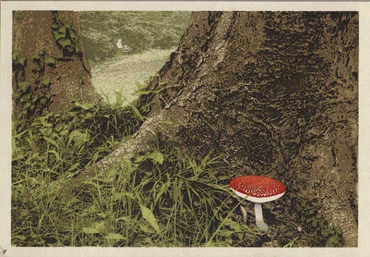
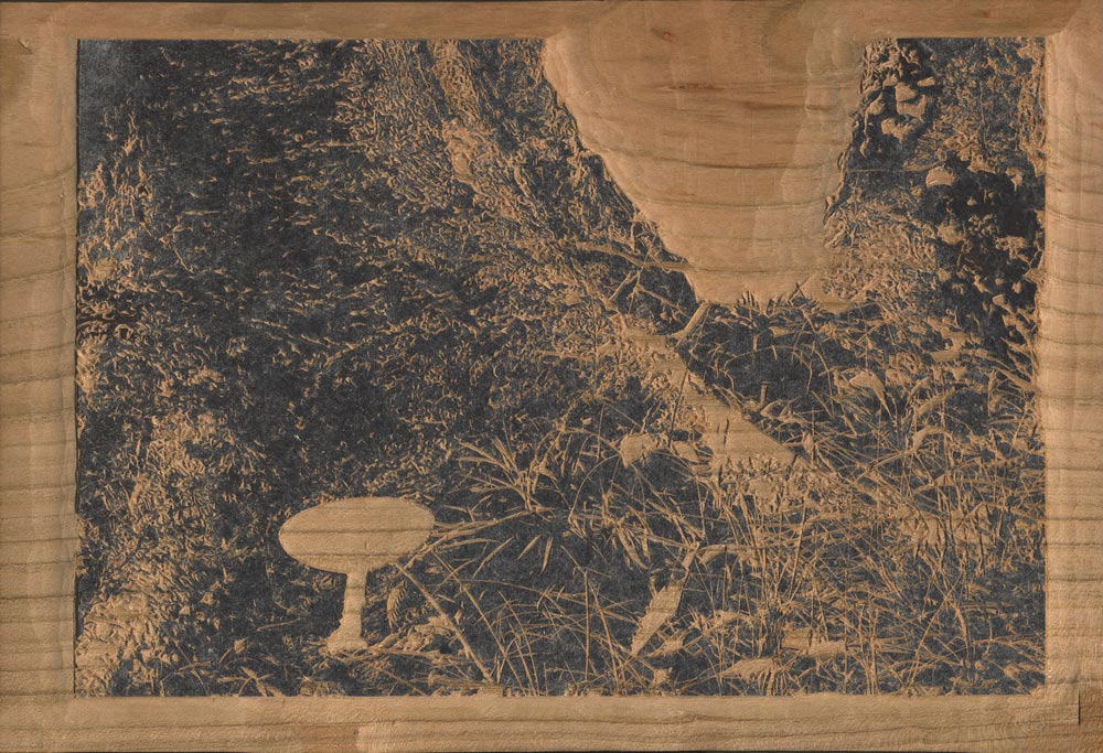
[Forest in Summer - 18] : Finished!
Continued from [Forest in Summer - 17] | Starting point of the thread is [Forest in Summer - 1]
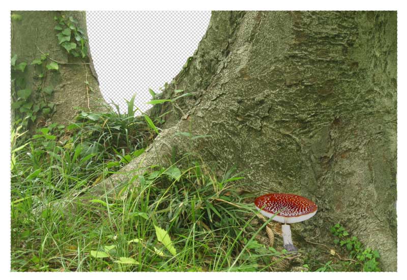
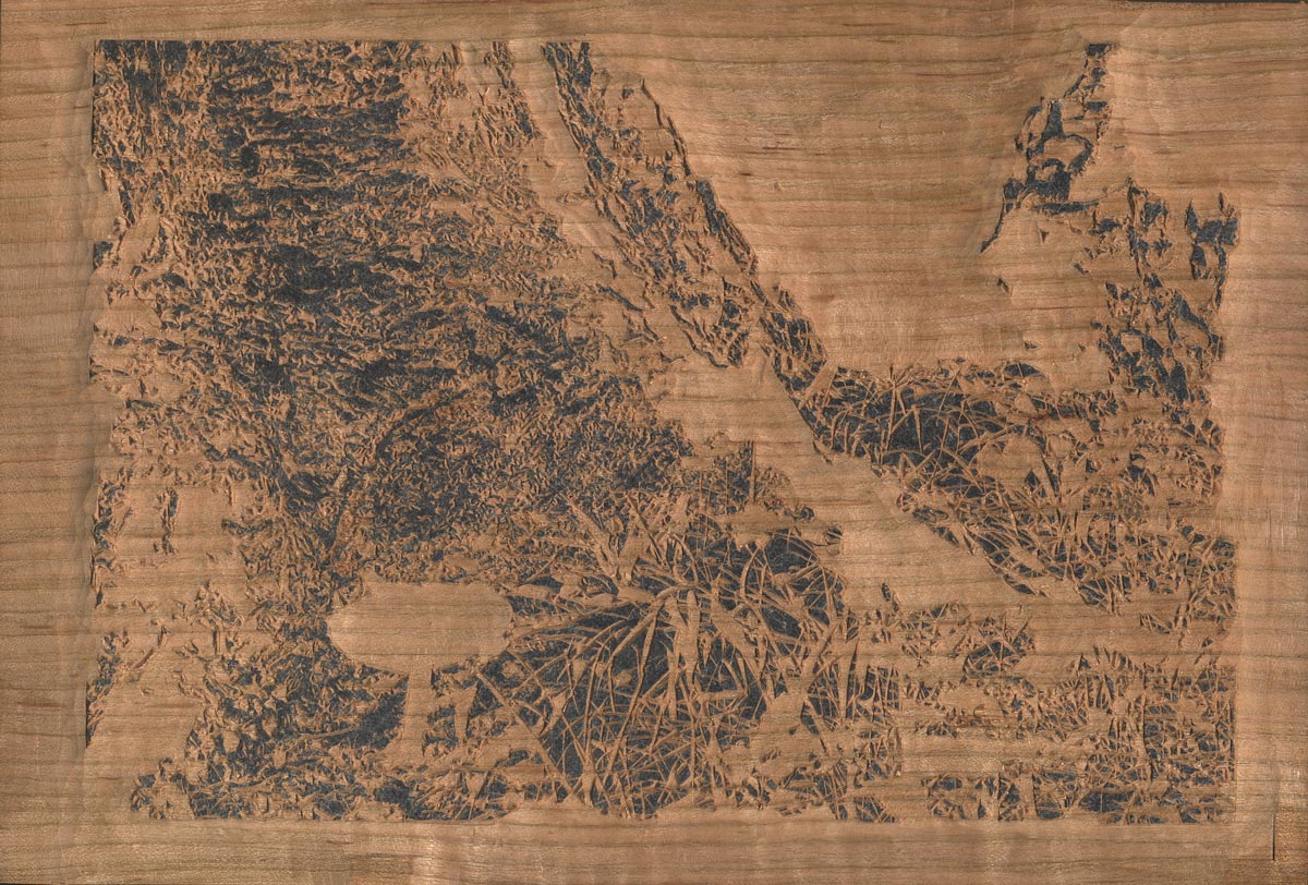
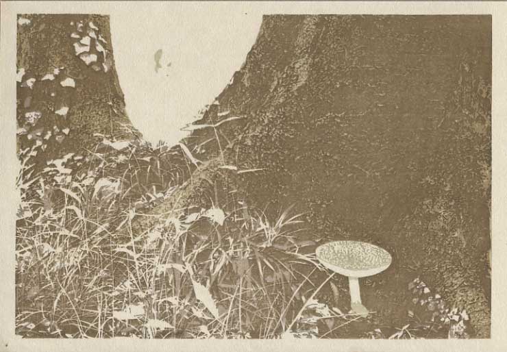
So, today's printing will be pretty easy ... just three very small areas of 'spot' colour. In case you haven't figured out what's happening in the background - going by the 'negative' space that was left - the main image on this page should provide the answer.
Here we go then; let's give Dave a bit of skin tone:

And he needs some trousers:
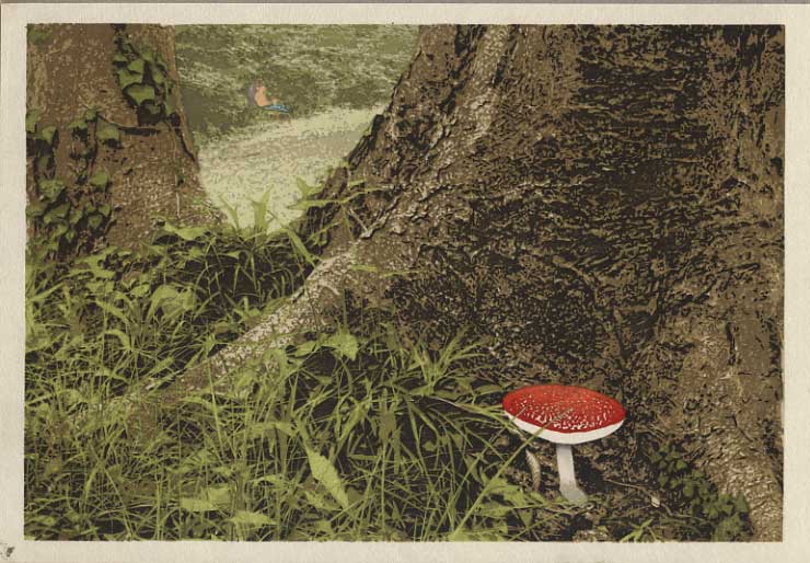
And there were way too many mosquitoes around that day for him to be topless, so he needs a shirt too:
So we're done. I've got to get busy drying these things, as the paper has been damp for a bit over 10 days, but when I get a minute I'll scan one of them at a larger resolution and post it here.
I posted earlier about the time it took to carve these blocks, and I was good about keeping track of the printing hours too, so I'll tally those up and we'll see just how long the whole thing has taken (so far - there is still another batch of 100+ to be printed, but that won't be starting for a week or so ...)
The thread continues in [Forest in Summer - 19] ...
Posted by Dave Bull at 12:11 PM
| Comments (3)
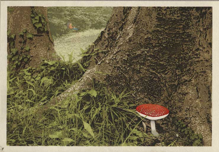
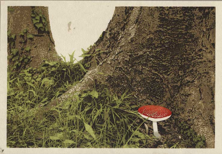
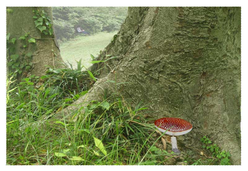
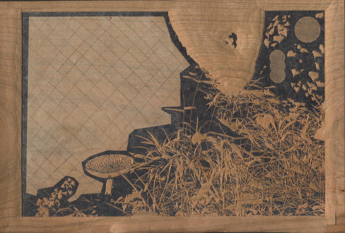
[Forest in Summer - 17] : Filling in the background ...
Continued from [Forest in Summer - 16] | Starting point of the thread is [Forest in Summer - 1]
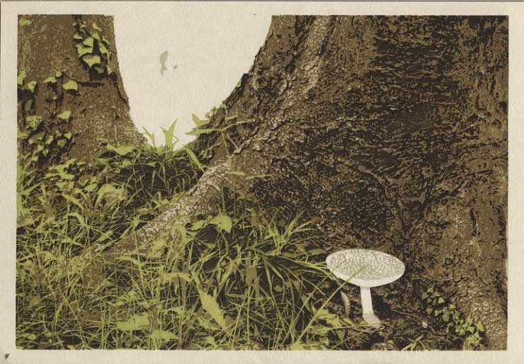
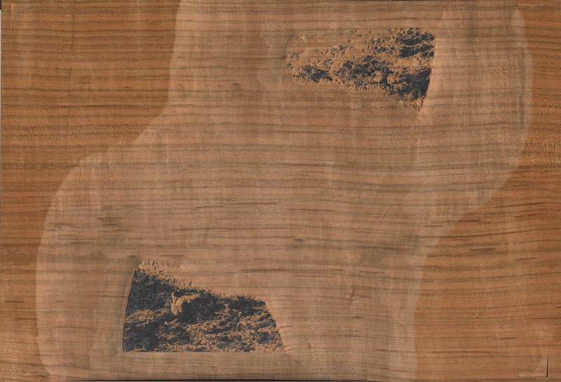
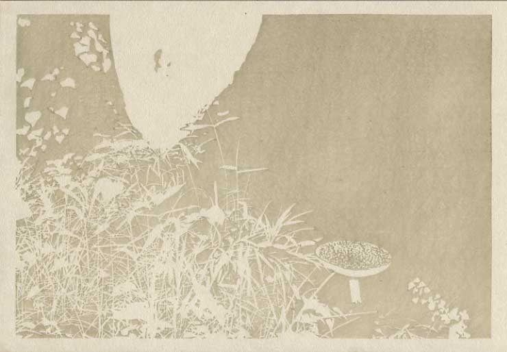
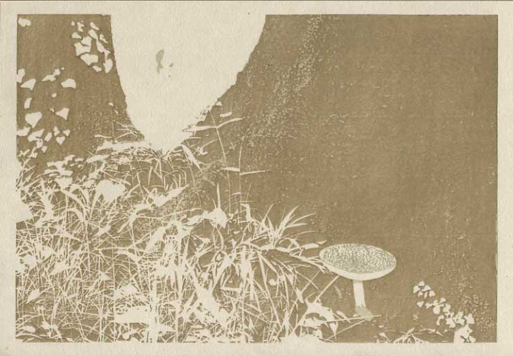
In strong contrast to the extreme clarity of the front portion of this print, the distant scenery is going to be fuzzier and more vague. I considered putting some completely abstract patterning in there - random pale greens and shadows with no form at all ... sort of a 'camera out of focus' mood - but I 'chickened out' from going that far. We'll try and get some semblance of form, although I have to admit right up front, that in the very small amount of 'testing' I did by showing a few friends the concept, not everybody 'got' what I was trying to do. Anyway, with that green base tone in place, here we go with three layers, a deeper green, a pale grey, and a slightly darker grey:
There; we can now see the bushes at the far side of the glade. But as you can see - if you look closely - we're not quite done. Three final small impressions tomorrow morning should suffice to wrap it up!
The thread continues in [Forest in Summer - 18] ...
Posted by Dave Bull at 12:02 PM
| Comments (3)
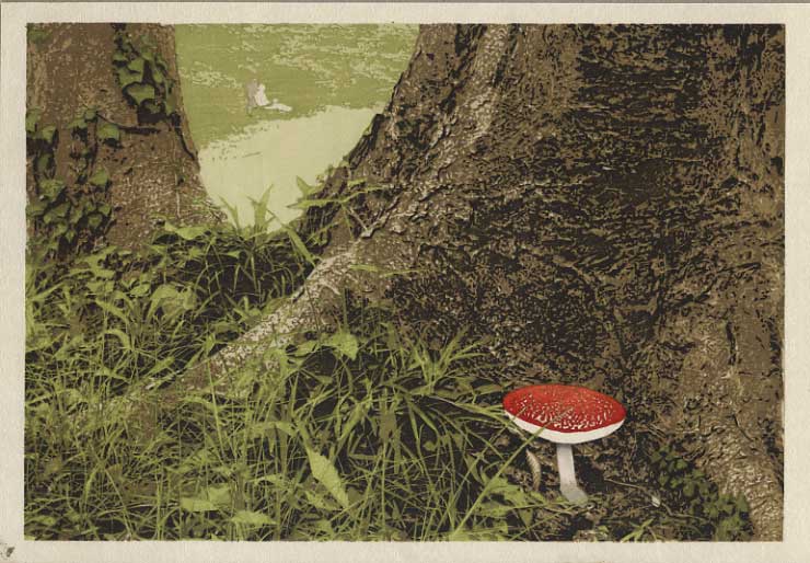
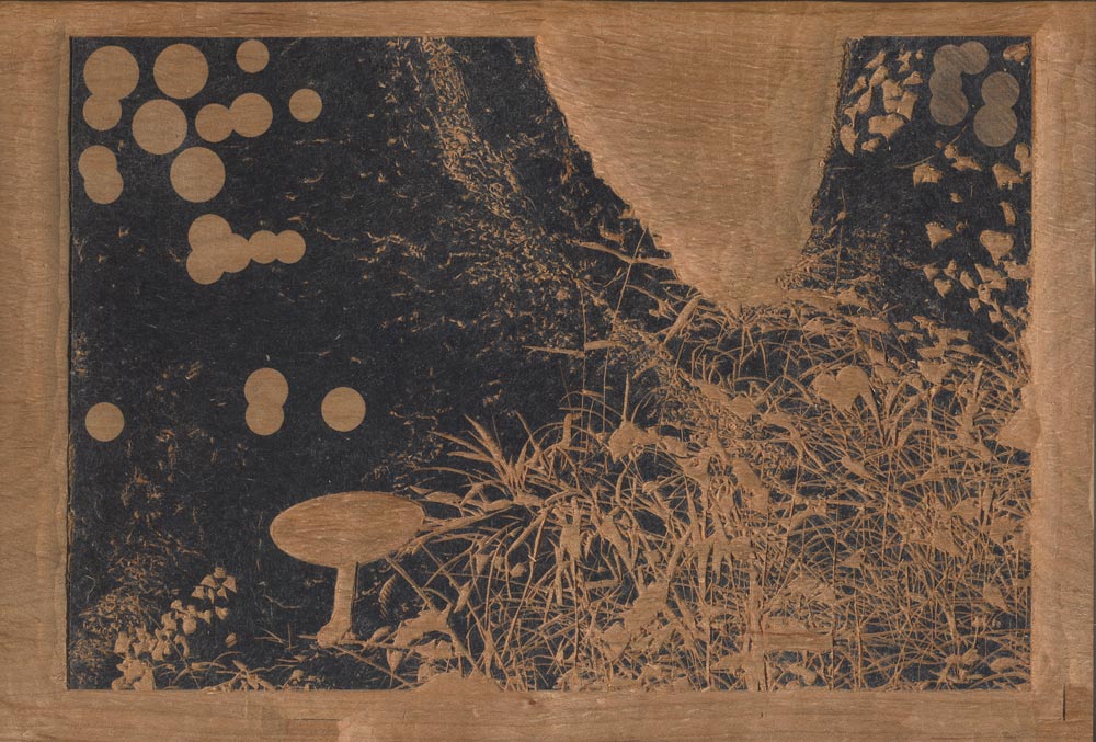
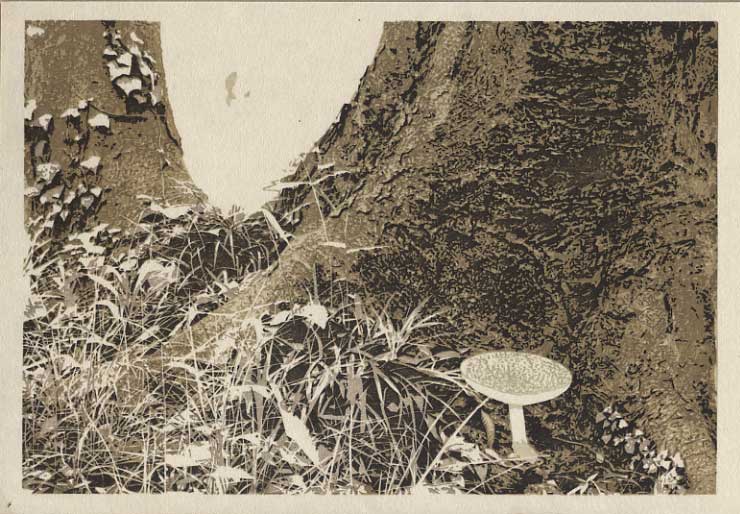
[Forest in Summer - 16] : Nearly done ...
Continued from [Forest in Summer - 15] | Starting point of the thread is [Forest in Summer - 1]
These next couple are very small areas, and won't really show effectively at this scale. First up is a rough 'dirty' gradation at the bottom of the mushroom stem:
The second one is a bit more visible - a tiny smear of pigment at the top of the stem, just under the cap, Gives a nice bit of depth!
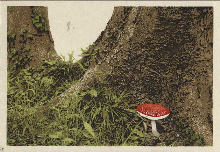
I think this might just be it for the main 'front' part of the print. Now we'll move to the area in the 'v' - the distant background. The portion of the book chapter that this print is illustrating deals with Dave taking a stroll through the woodland until he comes across an open glade ... He spends a couple of peaceful hours there, resting against a tree, making a few notes, and ... perhaps does he even nod off? Who knows ...
Just another couple of days work left ...
The thread continues in [Forest in Summer - 17] ...
Posted by Dave Bull at 12:02 PM
| Comments (3)
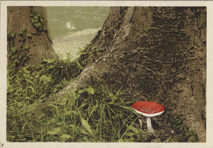
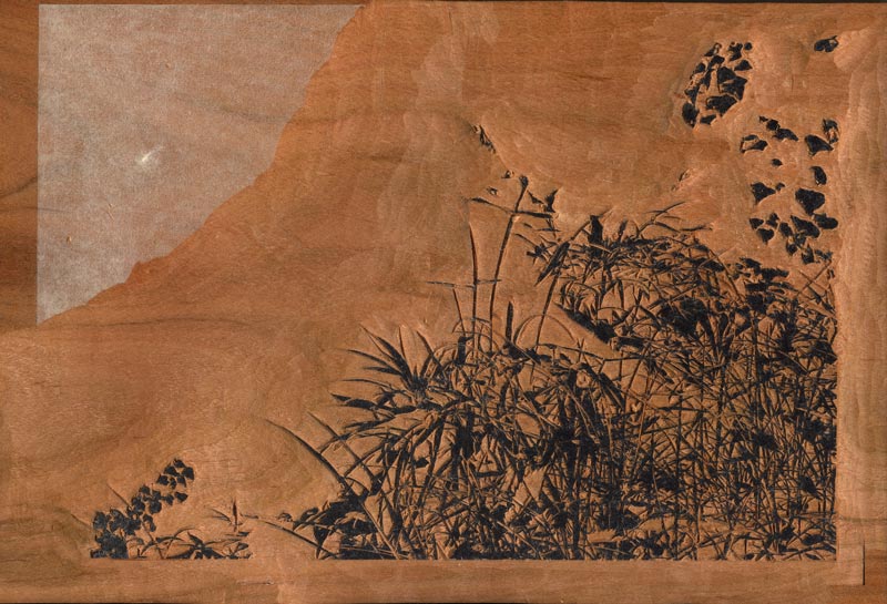
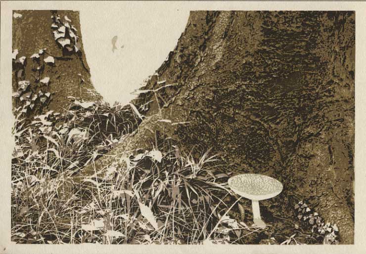
[Forest in Summer - 15] : Filling it out ...
Continued from [Forest in Summer - 14] | Starting point of the thread is [Forest in Summer - 1]
At first glance, what's happening in this next one may not be so apparent. These scans are a tad 'washed out' and have a bit less contrast than the thing I am holding in my hand. Anyway, I've pulled out the block used for the darkest parts of the tree, and have done a gradation on it, deepening the areas around the green grass (this step will show more clearly in the 'process slideshow' that I will prepare once I'm done):
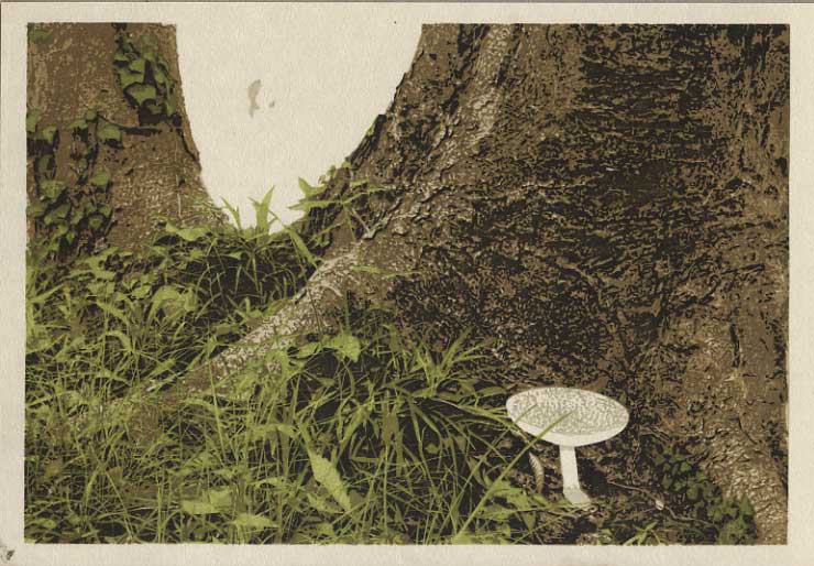
Then, moving on to the mushroom ... first step is to put a vermillion 'underlayer' onto the top surface:
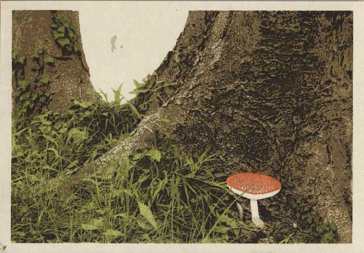
And then, put a gradation of a richer red over the top of that::
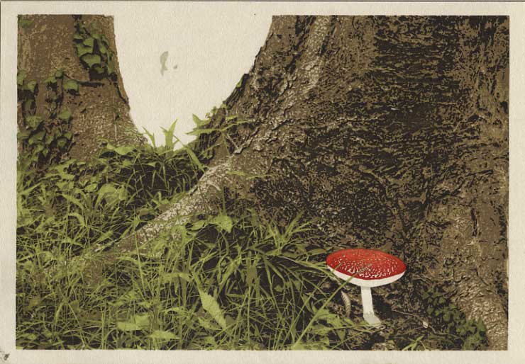
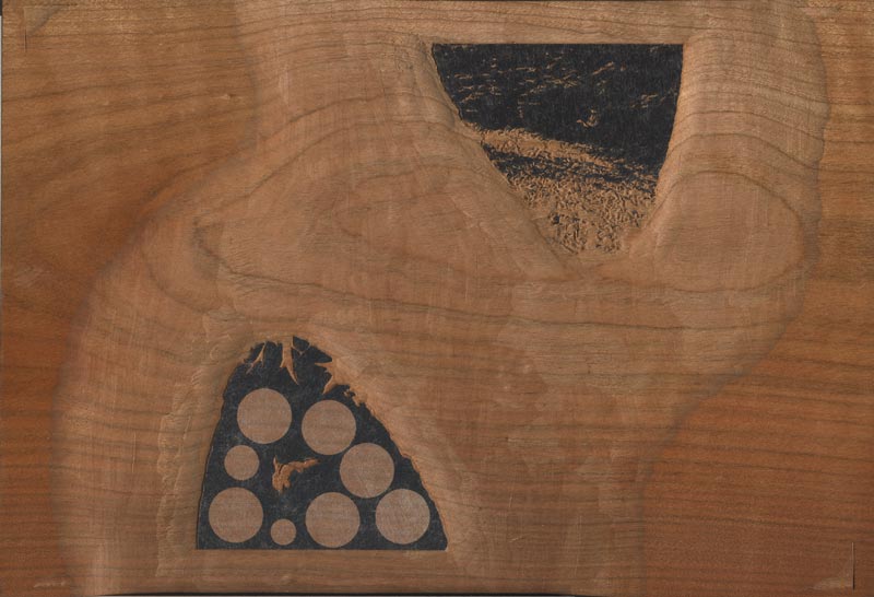
Time for a 'count' ... how many left now? I'm thinking two more on the mushroom, and then ... still not completely sure about this ... perhaps six to print the background area in the 'v' ...
The thread continues in [Forest in Summer - 16] ...
Posted by Dave Bull at 12:34 PM
| Comments (0)
[Forest in Summer - 14] : Adding some colour!
Continued from [Forest in Summer - 13] | Starting point of the thread is [Forest in Summer - 1]
After all the greys and duns, it's finally time to add at least a bit of colour!
As we saw back when the carving was going on, the two blocks that will delineate the grasses are very similar. The first one is printed in a quite light green:
... and the second one overlays much of it with a slightly darker shade:
Then, back to the first block, but this time just with a splash of dark green on the ivy at top left and lower right::
Our print still certainly looks a bit 'dirty', but we'll start to brighten it up soon ... by adding more dark, of course!
The thread continues in [Forest in Summer - 15] ...
Posted by Dave Bull at 10:31 AM
| Comments (2)

