Posted by Dave Bull at 2:31 PM, May 27, 2009
Time to get going again!
I mentioned in the post a couple of days ago that I was kind of procrastinating with the next design, and so I was, but there's a limit to just how far I can carry that sort of thing. Yesterday I finally got started on some serious work on it. The impetus for getting moving was looking at the calendar for the next few days: some guests are due here Friday, I've got to head to Tokyo on Saturday for a friend's guitar concert, and I'll be over in Sadako's garden on Thursday helping her bring down some trees (Tree killing! Shades of last week's 'A Story A Week'!).
So if I don't get something down on paper soon, it'll be another 'week' before I get back to it ... Having a few 'days off' coming up though, does have one benefit for the work, in that if I do get something down on paper before I take that break, then it'll mean that I get a chance to see the design with a slightly fresh eye when I come back to it. As we've seen many times during this series, there are nearly always obvious improvements that come to light after the cutting is well under way.
So anyway, what's this one going to be all about?
It's a forest scene, and I have to say these have been far and away the most difficult for me, for a number of reasons (maybe I've talked about this before, I don't remember. And there is no way that I can find anything in this damned RoundTable!).
1) For both the river and the seacoast, the very breadth of view has meant an infinity of possible scenes - from immediate close-up, all the way up to wide panoramic views. The forest (at least this forest) offers no such diversity. No horizons; no panorama. Just trees, trees and more trees.
2) Mid-range trees and leaves are tough to do in woodblock. Just look through your Hasui book to see that this is so. Distant mountain slopes covered in trees? Completely no problem. A few leaves closeup? No problem. But the in-between range - where individual elements are still visible, but far too numerous to be sensibly carved - resists easy interpretation. Many (most) of the 20th century sosaku people who created prints requiring such mid-range greenery did so with the use of goma-zuri (sesame seed printing). They didn't attempt to carve the details, but used 'silhouetted' shapes printed with a mottled pattern that suggested it. Typical example of the genre is Ido Masao. No problem with that, but it's not my taste at all.
3) To create a believable ground surface is also difficult. (This is not specific to forest scenes, but to all woodblock prints depicting natural scenes.) If you don't believe this, take a look through your copy of the Hiroshi Yoshida complete works. The guy was a master, right? Sure he was, but if you flip through that book not letting him divert your attention with the other elements of the images, and just look at the grounds, you'll see what I mean. There are some real 'howlers' in there. So far in this series of mine, I've tried as best I can to avoid including ground in the prints, but of course it is impossible, and - just like Mr. Yoshida on a bad day - I have not passed the test all that well.
But now that I've pointed out to you in advance what's going to be wrong with this print :-) let's move on to think about the design. The previous two forest prints - Forest in Autumn, and Forest in Spring - both took basically the same stance: a 'full-range' view, covering the entire area from right in front of your own feet, to right back as far as you can see. It's time to do something a bit different.
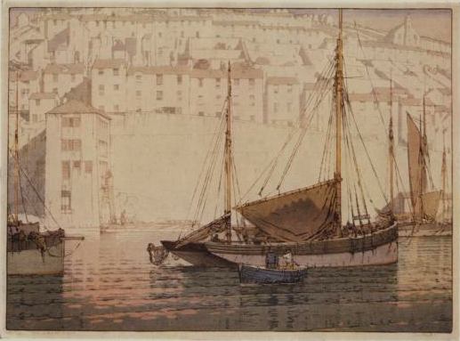
First, let me show you a couple of images that I find interesting. (Nothing to do with forests ...) Here's a seascape by John Platt:

The interesting point here is the total separation into two 'planes' - the normally printed foreground scene, and the 'unsaturated' backdrop. I don't think he was particularly intending to make a 'misty' effect here; just he found an interesting way to visually separate the two worlds.
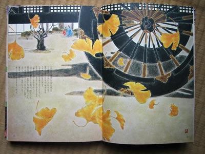
Next up isn't a woodblock print, but a watercolour book illustration by Yoshio Okada. This is from his set of illustrations to the Genji Monogatari:

It depicts the wooden wheels of one of those bullock carts that the nobility used to travel from place to place in and around the capital. But the cart isn't the 'topic' of this design. What is being 'illustrated' is the meeting of the three people (click the image to see them).
I was given a copy of this book by the Yuyudo Publishers on my first visit to Japan back in 1981. (We had purchased some of their Okada Genji prints, and this was a bit of extra 'service' on their part.) Years later, when I had the chance to meet Mr. Okada, I remembered many of these illustrations, and took a shot in the dark, "You really like going to movies, don't you!"
Bingo!
Now he thought that was pretty cool, but actually, the technique - a closeup of something 'supportive', with the 'main event' relegated to a distant perspective - predates the movies. It was actually common even back in the 1850's, when Hiroshige was doing his 'Hundred Scenes of Edo'.


Alright. So if I'm thinking about something like this for my summer forest scene, what elements will we have in it? Well, there are ... you know ... trees.
What other elements would one expect to find in a woodland in Ome in the summer? And which of these things should be 'up front' in your face, and which ones far in the distance? I've got something down on paper now, so I'm not asking for your 'help', but as usual, it would be fun to see what suggestions other people might have for this!

The thread continues in [Forest in Summer - 2] ...
