Posted by Dave Bull at 12:11 PM, August 6, 2009
Continued from [Forest in Summer - 17] | Starting point of the thread is [Forest in Summer - 1]

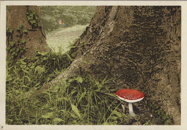
So, today's printing will be pretty easy ... just three very small areas of 'spot' colour. In case you haven't figured out what's happening in the background - going by the 'negative' space that was left - the main image on this page should provide the answer.
Here we go then; let's give Dave a bit of skin tone:

And he needs some trousers:

And there were way too many mosquitoes around that day for him to be topless, so he needs a shirt too:

So we're done. I've got to get busy drying these things, as the paper has been damp for a bit over 10 days, but when I get a minute I'll scan one of them at a larger resolution and post it here.
I posted earlier about the time it took to carve these blocks, and I was good about keeping track of the printing hours too, so I'll tally those up and we'll see just how long the whole thing has taken (so far - there is still another batch of 100+ to be printed, but that won't be starting for a week or so ...)

The thread continues in [Forest in Summer - 19] ...
Nice work, Dave. I'd say this print is one of the best in the current series. I do like the way you have given us distance, a peek between the trees. The fuzziness works extremely well.
Still, I am not fond of the photographic realism of the foreground. Yes, it is your style, from the beginning, I know. But in this piece, it is close to too much. Well, OK, from the images on this computer and the blog, it is hard to really tell what is going on. I'll just have to wait until my copy arrives in the mail and I can look at the authentic print.
In any event, truly good work.
Richard

... from the images on this computer and the blog, it is hard to really tell what is going on ...
It is indeed! I think you'll feel a bit better once you've got it in hand, but there is a kind of a 'disconnect' happening with these recent few prints of mine.
Back when I was making the traditional surimono stuff, they were very clearly a 'hold in the hand, view them close up' type of print. There was no perspective, they had lots of tactile paper texture (due to the plentiful open white space), and they had delicate small details. Putting them in frames and viewing them 'vertically' (as though through a 'window') made no sense at all.
But these recent prints of my own design are of course made to a different pattern: they have perspective and there is no palpable paper texture. It thus makes more sense to view them from a bit of a distance (again, as though through a window).
If you stand back to look, you would get the overall perspective and 'scene' OK, but the print is too small in overall scale to allow the viewer to stand back! And on top of that, I have put in too much bizarre tiny detail to see from a distance!
Then on the other hand, if you do hold it close to see the detail, the perspective and 'view' all become distorted. You can make the argument that 'it doesn't work either way'!
These recent prints would 'work' far better if they were 'poster' size. But made at that scale, I doubt that anybody would be able to afford them!
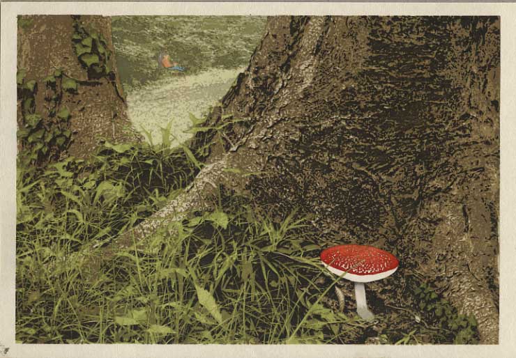
(As for being hard to see in these computer images, perhaps this 1500+ pixel enlargement will help!)
Thanks for the comments, Richard!

Dave, I like this very much. The little bit of color (you) in the distance rhymes ever so delicately with the mushroom. I think that's a brilliant touch.


