Posted by Dave Bull at 7:17 AM, August 3, 2010 [Permalink]
This thread about paper sizing is continued from here, and started here.

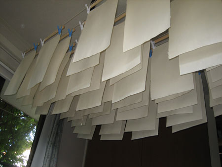
So, here we are with what - I hope - will be the final entry in the sizing saga. I ran the batch this morning, and by just before noon, they were all dry. Here they are, hanging in my bedroom upstairs:


The job went pretty smoothly, and because there were 60 sheets in the batch - compared to the previous test batches of just a few sheets each - I was able to really get a much better 'rhythm' in the work. Some things I learned:
- I'm not 'strong' enough to make a good full stroke with just the arm, as the brush really has a lot of resistance on the surface of the paper. Shifting from one foot to the other as I move across the sheet (shifting the body weight), really helps keep it moving smoothly.
- The 'angle of attack' of the brush on the paper is critical. Too vertical and the sizing all dumps out quickly. Keeping the angle lower helps control the flow of the liquid steadily.
- After dipping and wiping the brush, you have to hold it horizontally in the moments before you make contact. If held vertically, it not only tends to drip, but all the liquid gathers at the tip, and then gets 'dumped' right away. Holding it horizontally until the very last second seems to help with this.
In the interests of 'keeping my options open', I sized only the front surface of the sheets. The tests the other day which had just a single face sized were no problem, so I'll give it a try this way first. If something goes wrong at printing time, I can always dry the paper off, size the back side, and then resume ...
So it should be time to move on to the printing, but unfortunately there has been another interruption. Some people from NHK are coming over tomorrow to discuss an upcoming show they want to do with me. I don't have many details yet, but this one should be of particular interest to RoundTable readers, because it is intended for NHK's overseas networks, and the program (30 minutes proposed) will be in English.
* * *
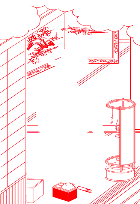
In the meantime I'll 'keep busy' by getting started on the keyblock for image #6, the one that shares the block with the Hasui image we saw earlier.
First step is to scan an original of the print, and then trace all the key lines with my tablet. Here's what it looks like so far:

Great info re: what you learned about handling the brush. Thanks again, Dave.
The paper I used for the Pilgrims was nishinouchi from McClain's and when I first wet it there were some unmistakable bare spots where no size (or an extremely small amount) had been left by the brush. In several cases this remained visible in the final print, leaving streaks of darker pigment that looked just like brush strokes. I'm thinking that inconsistent application of size is the worst problem to deal with.

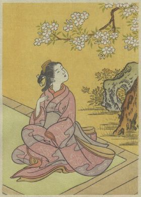
My first guess for image #6: a woman doing some needle work, a design by Harunobu?
I couldn't find it in my Chiba museum book though ...

You can't find it in your Chiba museum book of Harunobu images because he didn't design it ... :-)

Jacques and I are thinking along the same lines. I figured it was probably either Suzuki Harunobu or Nishikawa Sukenobu. Now that Harunobu has been ruled out, I'm thinking that it's a Sukenobu design. One problem with that is that all of Sukenobu's designs were originally printed without color, just "singing lines" as described by James Michener. The figure in key-block of this design is suggested by the negative space in the center, but without any lines. This fact argues against a Sukenobu attribution, but it wouldn't be the first time that Dave Bull has taken liberties with a Sukenobu design. Here's an example, from one of the Surimono albums, of Dave taking a black-on-white Sukenobu design and adding color:

Could it be that Dave is going to implement a Sukenobu figure, in color, without key-block lines? Hard to imagine, but that's my best guess.

Hi Dave, keep us posted on your meeting with NHK.
We can get their English language channel on satellite in the UK and there are some good shows, especially 'Begin Japanology' with Peter Barakan, which I record. I've not seen an edition on woodblock printing yet, so maybe this could be it.
Thanks also for the latest Mystique print which arrived last week.
Kindest regards,
Mark.

(Lots of topics coming together on this one RoundTable webpage: Dave's current sizing experiments, upcoming NHK broadcasts of his woodblock printing work, and guesses about his next Mystique print design ...)
Hi Marc!
You could be right of course. The main clue on which I based my first guess is that 'cloudy formation' at the top of Dave's tracing of his next Mystique print.
My primary reaction is then to expect such formations to be filled with some kind of Japanese text, in which case designers like Koryusai and Buncho could also be potential candidates. What do you think?
Jacques

a Sukenobu figure, in color, without key-block lines?
I think you missed one thing that I said above: "Here's what it looks like so far ..." And I also talked about the plan for this image last week in this post. I think you should now have enough information to put everything together ...
As for the NHK program, their original email to me mentioned: "30分中、半分がゲスト紹介用のVTR、残り半分が番組の司会者であるピーター・バラカンとのトークです" ("It will be 30 minutes, about half of which will be pre-recorded video introducing the guest's activities, with the remainder of the time spent in chatting with the program host, Peter Barakan.") So maybe Mark has this one spotted ...
Also - if this is to be a 'thread' about various things mixed together - I might as well put a link here to something I did last week with the Nikkei newspaper. They have some kind of project tie-up with the Canon company to make reproductions of famous historical art objects, using Canon's cameras and high-end ink-jet printers. I'm not involved with the project itself at all; my contribution was to be a 'commentator' ... a 'well-known' figure in the art world, who would look over their project, and nod his 'approval' ... The resulting website (temporary, I think) is here.

Dave,
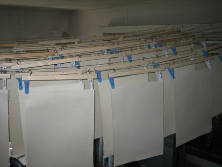
I notice in your pictures that all of the paper hangers have one white clip and one blue clip. I'm suspecting that this combination allows you to keep track of the "front" and "back" of the papers so that, after drying, you can stack them consistently. Is that it?
Marc

'Gold Star' to Marc!
When I bought those clips, the packages had equal number of white and blue ones inside - this wasn't anything I chose to do at first. But when I started to put the units together, I thought about how I might use the two-tone aspect as a 'feature'.
First thought was to make half of the units all white, the other half blue. So I could then (say) start hanging with the white units first, so that once everything was up on the strings, I would know which ones should be dry first ...
But I then thought of the alternative idea, to make two-tone units, which would give them a clear visual 'front and back' orientation. That's the way I decided to go, although in truth, telling the front from the back isn't a problem at all, as the texture is quite different.
Mostly though, I suspect that it's just part of the general penchant for 'good organization' that seems to hang around this place a lot of the time!
***
Printing of the first batch of the Hasui design should be done by late this evening, if everything goes well today. There have been a lot of interruptions along the way this week: NHK has confirmed that we're to go ahead with the filming, and they'll want three days for it - two days here, and one down in their studio with Barakan; then a meeting downtown with carver Asaka-san and his students/apprentices; and time spent dealing with a request from a magazine about my participation in a story featuring seven 'artists' (more on this one later ... you'll laugh for sure! You wouldn't guess the name of the magazine in a hundred years ...)


