Posted by Dave Bull at 9:25 AM, November 23, 2009
Continued from [Forest in Winter - 3] | Starting point of the thread is [Forest in Winter - 1]

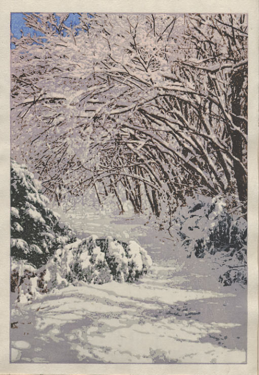
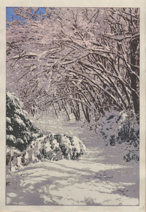
Had a pleasant day of proofing work yesterday ... This is one of those prints where even a very delicate change in the depth/tint of any of the blocks makes a tremendous difference in the finished result. And as you can't see the way that tones balance together until they are all on the paper ... and dry ... it's very difficult to know just what to put on the block at any particular step.
So a lot of this is kind of just flying blind; you put something on the paper that you think might be suitable, then dry them off and sit and look at what you've done. Make some notes on what could be altered, then start again.
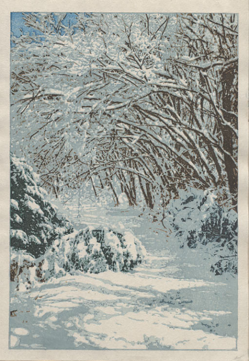
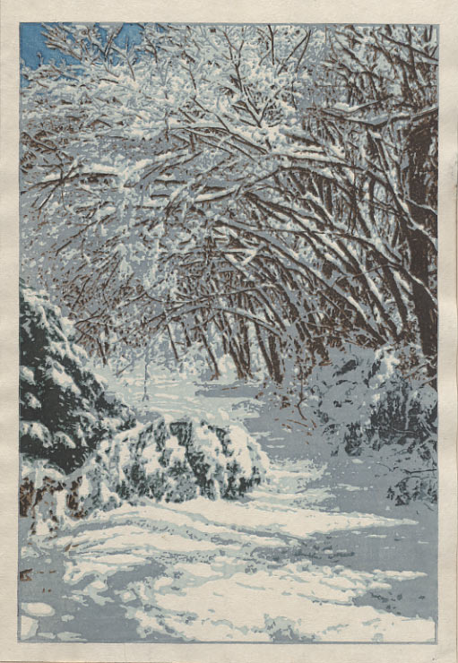
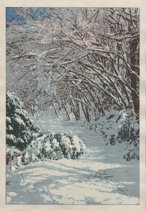
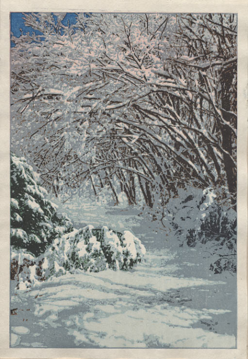
Here is a set of six images - the first (and so far, only) six sheets that have come off these blocks.
Rather than click all six in a row here, click the first one to view it in your browser. Then adjust the 'proof_01' part of the address in the URL to read 'proof_02', etc. etc. stepping through all six. Once they are loaded, you can then just use your Forward/Back buttons to step back and forth through the sequence. (Or here on my Mac, the 'Command [' and 'Command ]' do the same thing.)
#1 | #2 | #3 | #4 | #5 | #6
If you do want to see all six side-by-side, there is a 'gang' image here. (These are in vertical pairs: 1~2, 3~4, etc. The lower one of each pair is basically the same as the upper, but with the snow shadows done more deeply)
As always, I'll be interested in hearing your comments ...
The thread continues in [Forest in Winter - 5] ...
I vote for number 1! It's clean, fresh, and looks the truest. Difficult design task there, but the complexity of design well handled. A beautiful winter print!
I like #5 in the group arrangement, but looking at it by itself, the trees seem a little too black/contrasty against the shadows. In #2 I think the shadows are a little too dark.
I like the others! #6 might be a little too pink but it does have a nice glow.
I agree with Gary. Print #1 give the best feeling. The added contrast in #2 & #4 gives an "hostile" feel to the print and I believe this is not what you woud like to impart.
Possibly reinforcing the blue of the sky in #1 would give the additional relief you've been seeking with the added shadow.
In any case, I like the design and the intricacy of the branches with the snow.
I'm just heading downstairs in a few minutes to work on pair 7~8 ... It's interesting to see the positive reactions to #1, which - to my thinking so far - was just the first 'get something, anything, down on paper, so you can then see where to really go ...' print.
I agree that it has a lighter airy feeling, but don't you think it lacks a bit of ... 'something'? And you have no feeling that you can 'walk into' the image. For example, put your eyes on a spot on the path just behind the bent-over tree ... just below the dead center of the print. For the three prints in the top row, when I do this I get no reaction, but when I look at that same spot in #2 and #4, I get 'pulled in', and want to head down that path ...
Anyway, down to work I go. It's not such a great idea to be proofing in the evening; daylight is much better ... No doubt I'll be surprised in the morning by what came off the blocks. Hopefully pleasantly!
This being a snow print, I'd like to see you maximize the unprinted white paper. The rose sunrise color detracts from that. That's why I like 1 and 2. I think that 2 goes a bit over-the-top on contrast. Therefore, I'm with Gary on this one. Number 1 is subtle, clean, and crisp.
Marc
I like 2 & 4. Living in the "snow belt" and an avid snowshoe-er, I love the days when the sun is low and rosey, the snow is crisp and white and the trail is unmarked. Beautiful.
Personally, I think there is a balance to be struck between proofs 3 & 4. They both have an appealing balance of crisp brightness and sharp contrast I associate with a snowy day in the woods. The lighter sky also helps. The first proof just seems a bit too washed out, whereas the shadow tones in the later proofs feel too warm.
I find myself drawn to #3 - I really like the rosy light in the trees vs. the colder grey/blue in the snow. I like #4 for the same reason. I'm amazed at how much difference just a little more intensity in the shadows can make.
Hi Dave,
This one is tough! I find I like parts from several prints, though I agree with Marc about the pink - I like the ones without it better.The snow I like best in proof 1, the bent trees on the left in #3, the right hand trees in #2 and the sky I think you're right about the colour being too dark, #6 is my fav but playing with it to make it paler (maybe??) might be interesting...
Can't wait to see the final version!
Lee.
Not sure if I have a favorite...but I think the bank of shadows on the right side needs something, it's all one tone in all the proofs...perhaps if you were to use a darker tone in the foreground and then lighter as it resedes to the background.....use "color" perspective to gradually draw the eye into the distance path.....maybe a touch more of blue in the grey foreground to balance the patch of sky...