Posted by Dave Bull at 10:38 AM, November 24, 2009
Continued from [Forest in Winter - 4] | Starting point of the thread is [Forest in Winter - 1]

Very much appreciating the comments and suggestion that people are leaving on these proofs. It's the old 'ju-nin to-iro' at work here ... 'Ten people, Ten colours' ... There'll be certainly no way to please everybody, but hopefully whatever I come up with as a final version will at least be acceptable to most of the collectors!
I mentioned in the previous post that it wasn't such a good idea to try this kind of work in the evening, under a single hanging bulb, and I was right, I pretty much borked it. These next two sheets don't really add anything to the discussion.
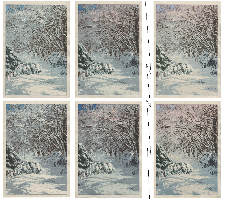
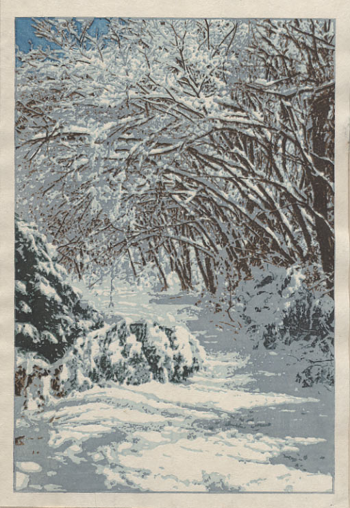
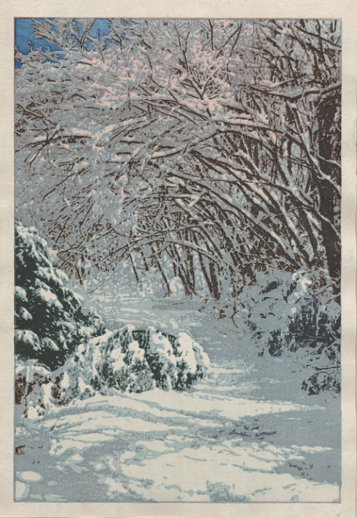
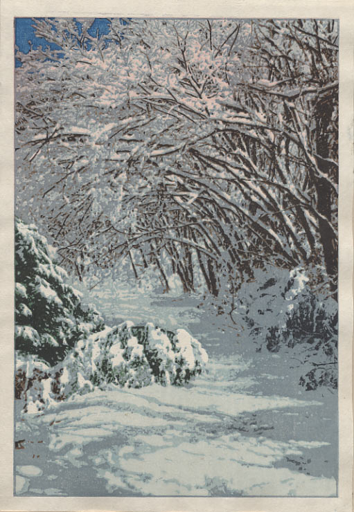
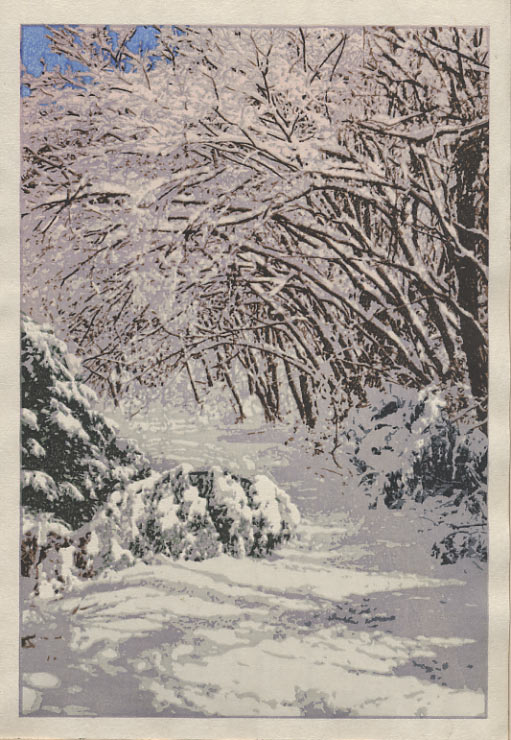
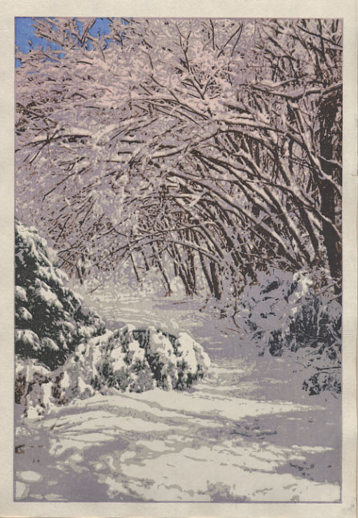
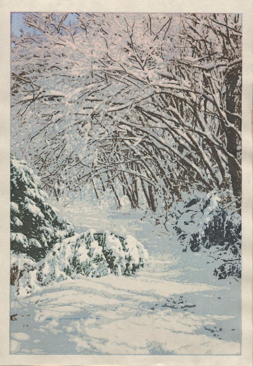
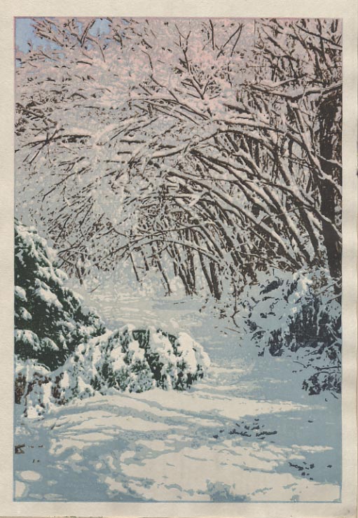
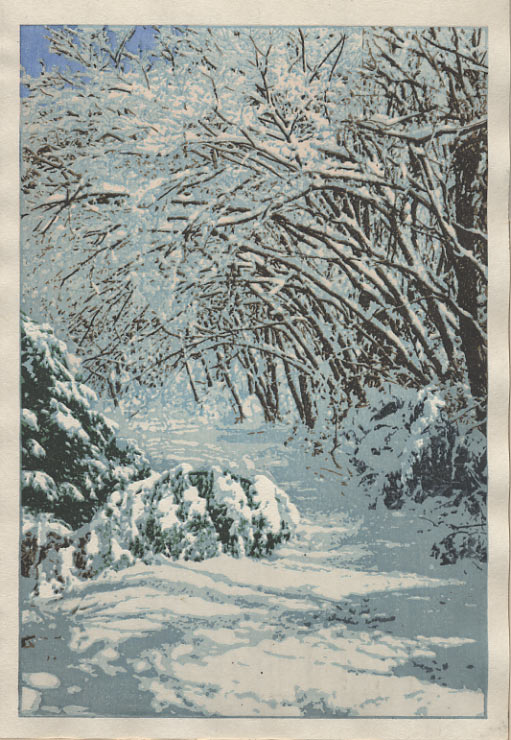
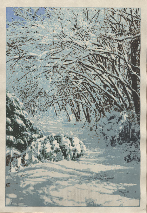
Here's the grid image with the proofs to date, with #5 and 6 pulled out (they were far too warm and muddy, and actually looked more like cherry blossoms than anything else ... so what you are seeing is 1+2 3+4 and 7+8)
Looking at #7 and 8, I see that I completely failed in what I had intended to try last night; I was going to cut the rose right back, keep a good contrast in the foreground, and cut back the snow shadows up in the tree branches. I totally missed on the first two, only succeeding in the third ...
I think that cutting back the shadows up in the trees is a good thing - making everything 'lighter' overhead. But with those shadows pulled back, even a very faint rose came forward too much. And we've now lost any sense that there is an embankment on the right hand side. Might be that I have to cut another block for that, we'll see ...
It's also interesting to see that - as usual - the more I try things, the more I seem to be wandering away from where it should be. I could have easily sent out #1 or #3 (say) as 'the print', and it would have probably been very well received.
But I think I can get this thing worked out a little bit better than what we've seen, so it's back to the drawing board printing bench! But that'll have to wait until this afternoon, as there is a pile of office work waiting this morning. That's the huge problem with this 'independent craftsman' way of life - turning the lights on over in the 'office' means that the 'factory' shuts down completely! Anyway, first I have to get the Mokuhankan orders from the weekend down to the Post Office:
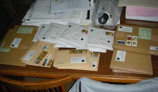
It's mostly CDs (the white packets) and Gift Prints, which are starting to wake up after a slow start over the past couple of weeks.
And then I have to head for City Hall. I need to renew my Alien Registration (they need a new photo every five years), and then go and talk to the people in the tax department and medical insurance bureau ... Let them know that no, I haven't run away, and yes I will be catching up soon ... At least I will if I can find a solution to this proofing, and then get these things made and out the door! :~)
The thread continues in [Forest in Winter - 6] ...