Posted by Dave Bull at 11:58 AM, October 14, 2009
So, after taking a full month 'off' - and a very productive month it was indeed! - it's now time to get back to reality and get started on the design work for the next print in the 'My Solitudes' series.
This will be the 'Forest in Winter'. I'm not giving away any secrets when I tell you that the main 'ingredients' for this one will be ... snow and trees!
Now 'shin-hanga printmaking' and 'snow', go together like raspberry jam on rice pudding - there is just no better combination to be found anywhere, anyplace. Hasui et al popped these things out on an assembly line basis. This print should be easy.
Should.
As usual though - there are a number of things getting in the way of a smooth run through this one.
In the kind of printmaking that I do, white snow is always delineated by the white paper. So in that sense, creating a snow scene is kind of easy - just chop away areas from a normal landscape image, and presto, you get snow. Or you can go the other way, start with a blank sheet, and just touch here and there with black, leaving people with the impression that everything else is snow. Yoshida did one like that a long time ago:
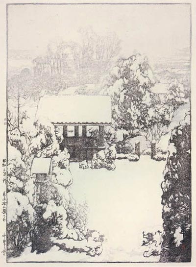
Now that's OK of course, but for me it just doesn't 'pop' enough. On the day that I made the trip described in the story that will accompany this print, it snowed during the night, and I woke up to a world completely buried in snow. I had a little camera with me, and took a few snaps:
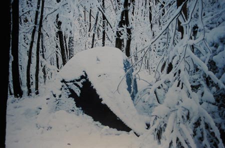
That photo - of my tent - was taken at daybreak, when it was still kind of gloomy - no nice sunshine yet. But that forest is so tangled in most places, that even when the sun did come up, it was still difficult to find nice 'bright' scenes.
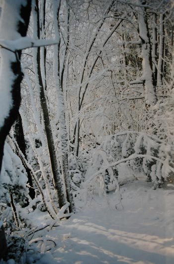
Now snow blanketing a wide landscape is 'picturesque' ... as is snow on a single tree seen against the sky. But snow like this to the extent that it blots out everything in sight, is nothing but a damn mess. So how did Hasui and the boys deal with this kind of thing?
Their main way was to avoid the question entirely. They never came into the forest - they stood back and looked at the overall scene. Piece of cake. (We had this same kind of problem when dealing with the Forest in Summer print - mid-range stuff is difficult.) For them, a snowy tree was either part of a 'mass' on the mountainside, or, as mentioned, a single element against the sky (done in either slate grey or bright blue, depending on the mood).
So my challenge is to find a way to create a composition within this snowy forest that will let people feel the overwhelming sensation of being buried in snow, yet which will also radiate the crisp brightness that I saw in those places where the sun managed to get through (and of course which will also be an attractive 'artistic' composition in its own right.)
Hmm ...
Well, to make white areas pop, you need to surround them with something dark. Finding the balance between the two - in an attractive composition - is the key here.
Stay tuned!
PS: I've of course been studying the snapshots I took that day, and have left a few of them scattered across my computer desktop. I came back from lunch yesterday to find that my screen-saver had kicked in. The screen-saver I use these days leaves the content of the screen as is, and overlays it with other things ...
Seeing this made me wonder ... the subsequent (and final) print in this series will be of the Seacoast ... Maybe I should combine these two!

The thread continues in [Forest in Winter - 2] ...
Dave, In comparing the photos you have been working with to the Yoshida prints I am reminded of an idea that might be of interest; the evolutionary basis for aesthetics, also known a Savanna theory. In brief, every picture is judged on a sense of hard-wired aesthetics. Every landscape scene is judged on the basis of how closely it represents an ideal prototypical landscape. The evidence suggest that most people like a scene with a parkland feel, running water, places to take refuge and a path that leads to further pastures - a few distant mountains help. An added bonus is to have a couple of deer hanging around to provide an easy dinner.
Sounds corny, but it is worth thinking about - does my picture appeal to basic human instinct. There is a book by Dennis Dutton, The Art Instinct, that fleshes things out. The basic premise is to ask, would a person want to enter my picture? What would a person imagine they could do inside my picture?
Tom,
I haven't read the book itself, but read a number of the reviews when it came out a while back. It's certainly an interesting concept, although I wonder if there is anything to it. People have drawn that kind of image for centuries, but I suspect there could be a simpler reason for it that the ones he proposes: we just draw what we see in front of us.
How does he explain the popularity of rugged mountain scenery?
Anyway, the image that has come together here (she's almost ready) can't be said to have a 'parkland' feel (depicting a forest scene, as it does), but it does check off a couple of the boxes: a path that beckons one to follow, a 'refuge' feeling ... no deer that day though ... although maybe rabbit tracks would count?
In fact, looking back now over the set of designs in this series, perhaps this one will be the most 'classical' in the series (in terms of the 'composition').
Dave, we don't just draw what we see in front of us, there is more to capturing the imagination of a viewer. Fidelity to the scene you see in front of you is fine, so long as you seek out scenes that mean something. When Hasui went out to make his sketches he wasn't taking random holday snaps.
But, if learning the inner language of the landscape seems too contrived, you can seek out patterns that seem to mean nothing, but your selection will carry meaning. Abstraction also carries meaning. The point I am making is that you can't avoid trying to communicate something. You gotta make a stand; here is a picture I believe in, here is a place that I want you to see.
Regarding rugged mountains, we all know that mountains are the source of life. From mountains comes the water in spring, and from the water comes the fish and the crops. We love the mountains for good reason, it makes evolutionary sense to see your self at the foot of a mountain.
If you doubt that objects carry an innate visual meaning ask yourself why people recoil at snakes and are excited by nudes. It's all pretty basic really.
I think you've perhaps read more into my 'draw what we see in front of us' statement than I meant. I was simply suggesting a simpler explanation for the commonality of the 'prototypical' landscape described in that book. That kind of landscape is common in art, because that kind of landscape is common on the planet ... that's all I meant to say ...
... wasn't taking random holiday snaps
Well, I'm not in the Hasui league of course, but I would like to think that I too have taken some basically 'mundane' locations, and made 'something' of them - the previous Forest in Summer print being an example. And I think that the motivation is kind of like you describe - 'here is a place I want you to see ...'
Yep, that's what people do - you put up a statement and they plough on and read more into it. Make a picture and you gotta hope people are inspired to bring imagination to the viewing experience.
I suggest that symbolism, or associations, stimulate the imagination. I am not claiming that there is a universal language of sub-conscious thought, where every object has a shared symbolic meaning, but at some level there is an unconscious chatter that goes on before people decide "I like this picture", or not.
For instance, you might wonder if more people would prefer to see a mushroom or a toadstool in a forest scene. The mushroom might be edible while the toadstool is likely to make you turn green. Toadstools are coloured red - because - there is an evolutionary awareness that red is a marker for toxicity. The viewer is innately programed to react to this symbolism. In this context red is the colour of danger and perhaps green is the colour of decaying flesh. (a little extreme, but I'm painting a picture here)
I like your toadstool print because I like to ponder existential questions. As an artist you may not have intended to raise these questions, but I hope you agree that it is important that your art stimulates something in my imagination.
I think when comparing aesthetics it is important to remember that the Yoshida's and the rest of the shin-hanga movement was mostly catering to the western market for sales.
Trained as a landscape painter and influenced by his many trips abroad, Hiroshi's mix of western style landscapes and Japanese woodblock techniques created something new and exciting that still is very popular today.
ps. That snowy image by Yoshida is of a new home they built in 1926 in a suburb outside Tokyo.
I agree Julio, it is important to understand the motivations of the artist and I think the commercial imperative often drives the design. In the case of Japanese prints there has always been the need to make sales. When the customer is an American who has a romantic idea of the Japanese countryside the resulting images became quite sanitised. There are no pwer poles in shin hanga (OK there are a couple) - but there are plenty in sosaku hanga. I like shin hanga but I also like power poles.