« [Forest in Winter - 2] : Block set is finished ... | Main | [Forest in Winter - 4] : Proof puzzles ... »

[Forest in Winter - 3] : Proofing day ...

Posted by Dave Bull at 12:38 PM, November 21, 2009

Continued from [Forest in Winter - 2] | Starting point of the thread is [Forest in Winter - 1]

So, the little Gift Prints are now all back 'in stock' waiting to be sent off to places around the world, and I can now get back to work on the Forest in Winter ...

There aren't actually going to be so many impressions on this one, so that makes the proofing a bit easier. And as the basic concept is set - sunlight on snow in the forest - I certainly know where to start. This one is going to be all about the 'contrast' - how dark to make the darks and intermediates in order to let the brights (the bare paper) shine properly.

Anyway, here we are ... time for the 'corkboard' test; I finished a proofing batch last night, but didn't attempt to study it too closely. I dried it off, and then last thing before heading for bed, pinned it up on the corkboard. How it would look in the morning - with fresh eyes - would be more relevant ... Here it is (remember, this isn't 'final', just one sheet from the initial batch of a few copies ...)

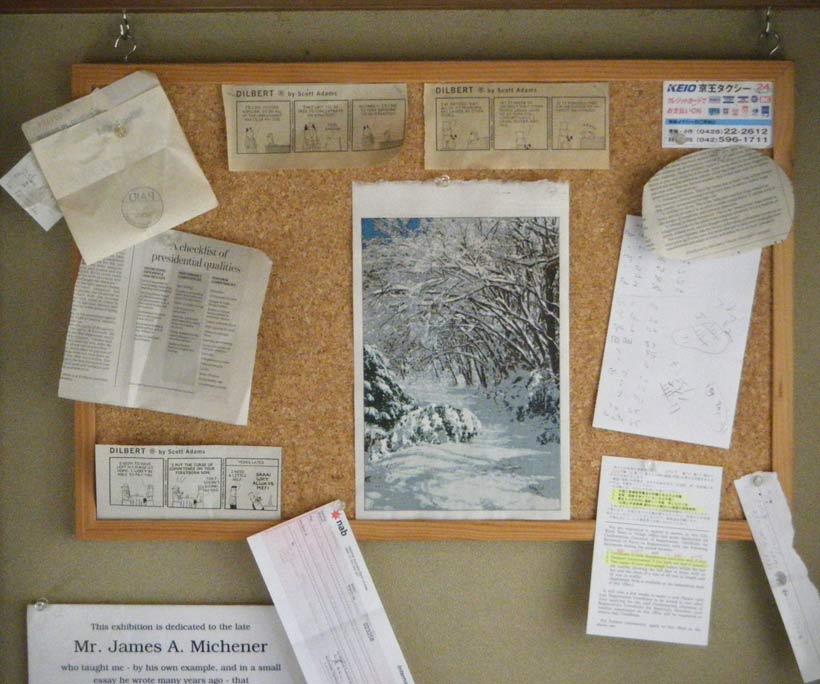
That doesn't look so bad for the first shot. When I do some more tomorrow, I'll work on the contrast end of it, to see where the best balance lies.

But looking at it a bit closer this morning, I see that I have an 'issue' with this one. It's something that has been dogging this entire series, and on this design, it has become a real problem.

I think I may have talked about this in an earlier RoundTable post - it's the question of the proper 'scale' for any particular design. This design doesn't look so bad in that photo above; we are standing 'back', and thus the perspective in the design makes sense. And we are far back enough that the individual dots and lines aren't visible - we see the 'forest', not marks on paper.

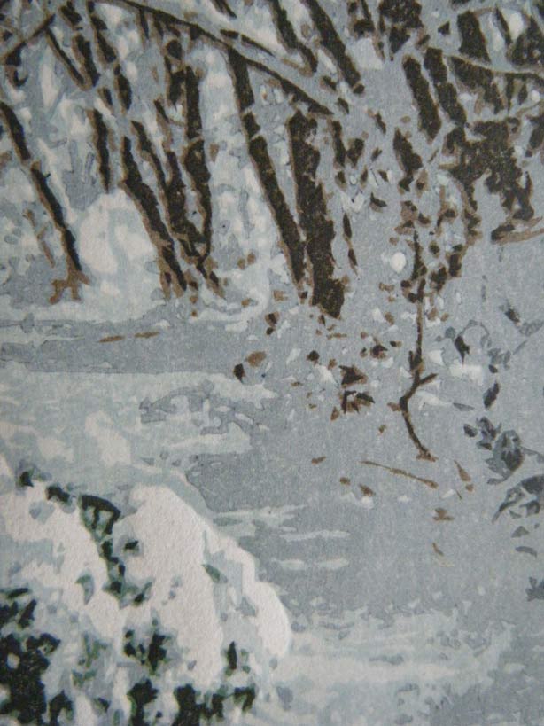
But these prints aren't being made at a scale that allows them to be seen 'on a wall' in this fashion. After I finish printing, they will be passed to helper Ichikawa-san, who will then insert them into the books. The collectors will receive the package, open it up to the print page, and unless they prop the book up on a table and step back and look at it from across the room, all they will see will be a muddy jumble of dots and lines (click this for an enlargement):

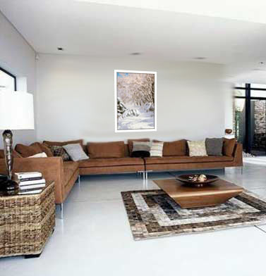
A design like this doesn't belong in small-scale stuffed inside a book and viewed at a funny angle - it needs to be seen at a scale that makes sense! Here's a mockup of how this design could be presented!

So I don't know ... At this point, I don't see what else I can do except press on. I can't jump back in time three years and re-organize the project!

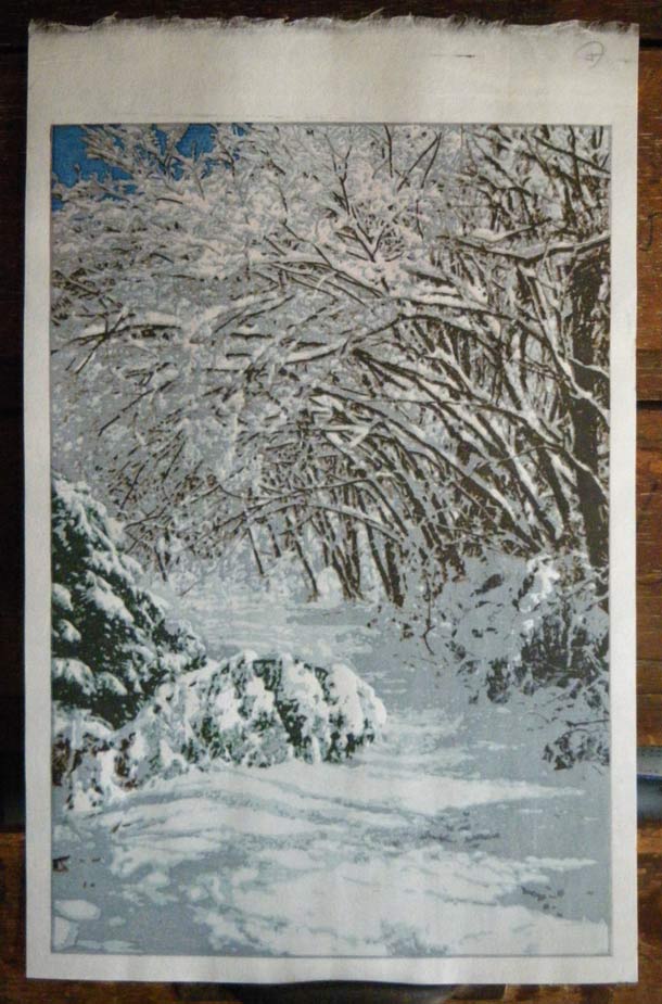
Anyway, here's a closer view of the proof (clickable). For the next batch I'll try and find a way to balance the requirement for having dark surroundings to make the snow bright, but without making the overall feeling too muddy and gloomy. Those tree trunks over on the right have to be darker, for sure. And that dirty sky has to be turned into a fresh light 'morning' blue ...

The thread continues in [Forest in Winter - 4] ...

Discussion

Following comment posted by: Marc Kahn on November 21, 2009 11:13 PM

I like the way you've redone your living room!


Following comment posted by: Dave on November 21, 2009 11:30 PM

Did I forget to show you that room when you were here Marc? Must have slipped my mind ...


Following comment posted by: Barbara Mason on November 22, 2009 12:24 AM

I love it just the way it is so if you make it better, I will have to rip it out of the book and hang it on the wall
hahahaha
Barbara


Following comment posted by: Diana on November 22, 2009 12:41 AM

Scale is a quite an interesting issue. My work is pretty small (5x7) but this being the US it is more likely to hang on the wall, so I try to have it so it is interesting at say 10 feet and has something for closer investigation..try being the operative word....Obviously you must press on, because it looks so crisp and chill, perhaps some large scale works in future?


Following comment posted by: Gayle on November 22, 2009 12:53 AM

Looking at the image on the screen, I don't see what you call a "dirty sky". I'd say the design elements look pretty good, so to me it's a very nice print, Dave.


Following comment posted by: Jennifer on November 22, 2009 10:23 AM

This is beautiful!
I wouldn't lighten the sky, I would just make it a clear cobalt blue, no leaning toward yellow. Keep the deep contrast with the snow.
But its already a gorgeous print! I can't wait to see the final version.


Following comment posted by: Odawara on November 22, 2009 4:59 PM

Indeed, this is beautiful.
I, a Karazuri freak, would like to see Karazuri in "My Solitudes" series, and I think this print might be the one for it.
However, I'm not sure where or how ...


Following comment posted by: Dave on November 22, 2009 7:01 PM

Yes, some of this snow is going to be our only chance for karazuri in this series I think. (Certainly no chance in the next print ...)

But even though the snow is basically blank paper, and should stand out from the surrounding printed areas, I'm thinking that I want to put some 'morning light' (perhaps a tint of rose) in the upper branches of those trees, and that would kill any embossed feeling in that zone. (The 'living room' sample print shows the kind of tone I mean ...)

So if there do turn out to be any pure 'blank' areas it will be just the snow on the bent-over tree blocking the path in the foreground ...


Following comment posted by: Margot Rocklen on November 23, 2009 8:47 AM

Your print is of an intimate natur-a moment in time. I appreciate its small size. With appropriate matting and framing, it will invite viewers to take a long look...an even longer, more thorough study when in portfolio or book format. For me, large hanging works have the most impact when they include one or more bold focal points that make a statement. When those large works do not feature one or more focal points, they become background matter. I prefer looking at small works for detail, pattern and texture. The fine craftsmanship in your prints might be lost in a larger format.


Add Your Input


Remember Me? (with a cookie ...)

(you may use HTML tags for style)

Back to the Main Page