Posted by Dave Bull at 12:33 PM, October 30, 2009
I kind of knew this would happen - more people are showing interest in 'how I did it', than in the eBook itself!
The photographs of the prints in the new David's Choice eBook are one of its most important features. The whole point of the book is that I wanted people to be able to experience seeing the prints as though they were sitting together with me right here in my own library. Scanning is useless, as woodblocks always come out flat and lifeless in scans.
I needed photos, and I needed special photos. And I couldn't possibly afford to hire a professional team, and - to tell the truth - I'm not sure that such a group would even have been able to produce what I myself knew could be done.
Before I explain my method, here's an example of one of the photos from the book. (This is 500 pixels across - in the book it is nearly five times as large: 2300 pixels ...)
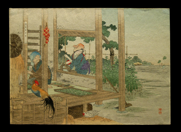
Now this is pretty close to the 'real thing' that I see lying on the table here in my own room. Actually, it is better. The paper has the same good texture that I can see in the real object, but the lighting is much improved - being perfectly smooth across the surface of the print. When we normally look at things in our own room, the light is usually very uneven, coming from different directions and in different 'colors' all mixed together.
Anyway, here's a quick demonstration of how these photos were taken ...
When first thinking about how it might be possible to take photos like this, it was obvious that the light source had to be raking - the light had to fall at an angle over the surface of the print. But when I did experiments with this in my room, I always came up against the problem that the top of the print - being closer to the light - was always a lot brighter than the lower area. Even when it looked 'the same' to my eye, the camera knew different, and the images were unusable.
The light source obviously had to be moved back - and back far enough so that the difference in illumination between the top and bottom of the print became inconsequential. Distant light, yet bright enough for clear photography. I needed a spotlight.
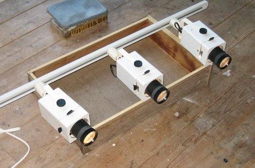
So a number of years back, when I saw an internet auction for a few spotlights being salvaged from a karaoke lounge that was closing, I bought them, thinking ahead to the time when I would try this.
Here are three of the little lights, mounted on a track (sitting on an unused desk drawer to keep them up off the floor a bit):
The first experiments shooting this way showed me that I needed to ensure that the print was exactly flat on the table. Even the slightest deviation made the resulting photos useless. I needed a vacuum table.
So here it is. A small wooden frame with a smooth perforated metal grill on the top. On one side it has a small plastic 'plug' (made from a film canister) which fits exactly the input tube of my vacuum cleaner (which has a power control on the handle).
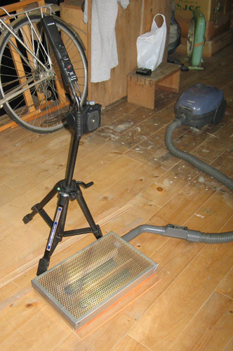
I couldn't lay the prints directly on the mesh, as this would show through the thin paper (especially once the vacuum pulled the sheet down tightly), so I wrapped the box in a grey t-shirt. A white shirt was too bright, but this more neutral colour seemed to work the best.
And here's the way - after some experimentation with angles, heights, etc - that I used these components to shoot the prints for the David's Choice book ...
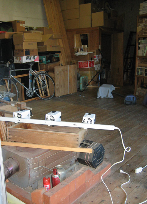
The light bar is pointed across the room at the vacuum table (about five metres away), which is sitting on a small wooden stand. (Getting everything up off the floor made it easier to make adjustments in the 'angle of attack'.) The lights have little 'shutters' (the little black knobs) that direct the output into a more/less tight beam, and I have adjusted these to get the light falling perfectly across the vacuum table area (although the spots are unplugged in that photo ...)
The camera is mounted on a strong Handycam tripod, of course nicely lined up with the plane of the print. Once each print is placed and lined up properly, I turn out the main room lights. I use the maximum resolution settings on the camera, and set the white balance control before each session, using a standard 'grey-scale' card. Without this, the colour in the photos will be all over the map, and nothing close to reality.
I can't give you the exact angles etc. of the lights and vacuum table here, partly because I have no way to easily measure them, and partly because they weren't consistent. Each print - with its different paper tone and texture - needed the angle to be adjusted individually, to find the best way to show the texture but without having it become too intrusive.
But even with all this careful preparation, there was still one major problem with the setup I used, and the photos will have to be redone later, when I can afford to buy a better camera.
The camera I used has pretty good resolution (pixel count), but lacks a very important feature. It will only save images in the compressed jpg format. And even at the 'best' setting of this camera, this compression results in a lot of ugly artifacts in the image that become apparent when you zoom in (as you can see in my finished book). So this kind of job absolutely demands a camera that will store images in the RAW format - uncompressed. Each image will be a huge file, but the quality is 'perfect'.
As I said though, that'll have to wait for a bit later ...
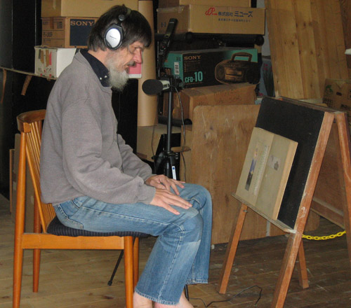
Also, about the audio. I posted a while ago here about the little Zoom recorder I bought, and of course I used that for this job. I mounted it on the same tripod, put the prints on an easel, turned it on ... and pretended there was a guest sitting there with me. Here's a shot from the session ... "recorded at a secret underground location somewhere in Tokyo!"
I had a lot of fun making this book, and now have to restrain myself from starting Volume Two right away. For the next month or so, I have to concentrate on getting my own new print out the door, instead of drooling over more of these old ones!

