« July 2007 |
Main
| September 2007 »
[Forest in Autumn - 12] : Pause for Thought ...
Continued from [Forest in Autumn - 11] | Starting point of the thread is [Forest in Autumn - 1]

Time for a break in the printing process here, for a couple of reasons.
First, the paper has to be dried off. It is very hot here in Tokyo these days, and this batch of paper has now been wet for over a week. Even though I keep it in the refrigerator when not actually printing, there is a huge risk of it becoming moldy if we go much further, so I dried off the entire stack.
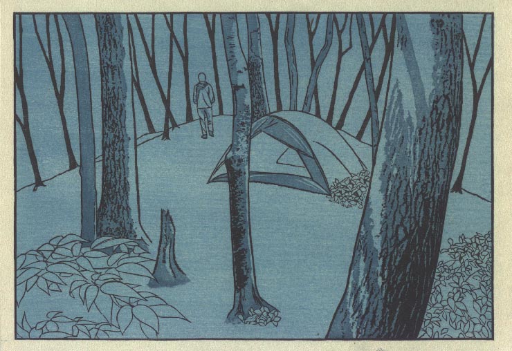
Secondly, I'm actually not sure at this point where to go from here. This print now matches pretty closely the proof copy I settled on during my proofing the other week, and I guess it could be considered 'finished'.
But ... it's not so simple. You see, the print you have been seeing step-by-step as we go along, isn't really the print as it actually appears. The problem is the scanning process. As I printed the final sheet in each batch along the way, I fired up my scanner, took a quick scan, and then quickly slipped the sheet back into the stack.
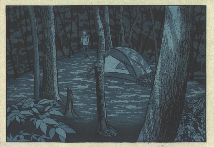
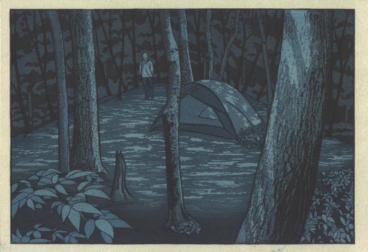
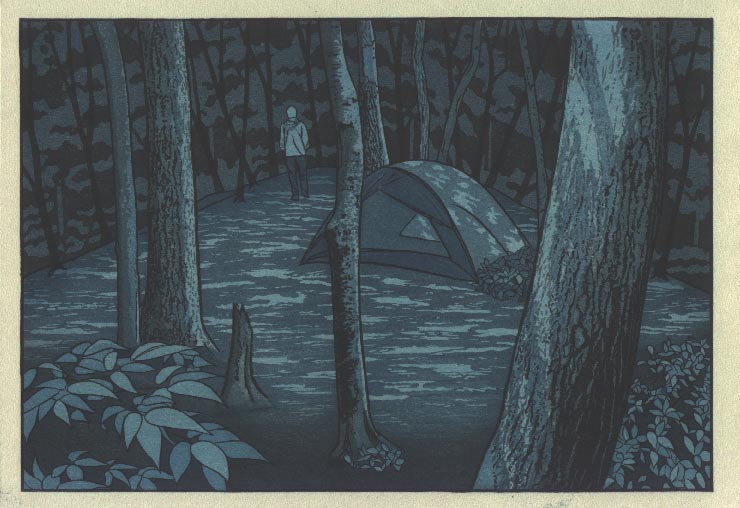
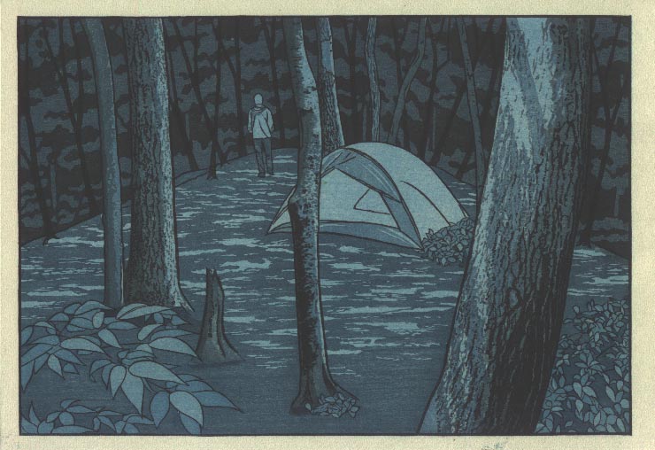
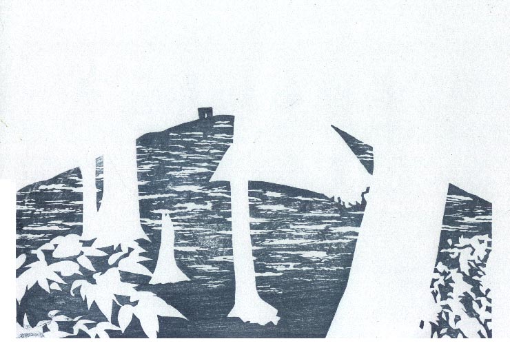
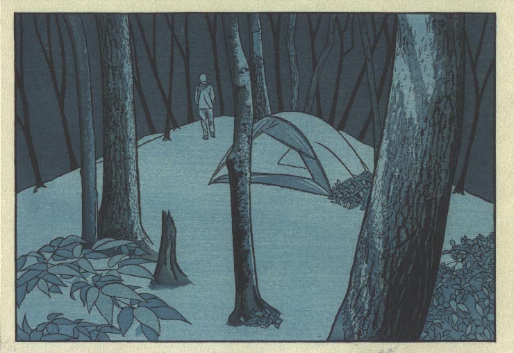
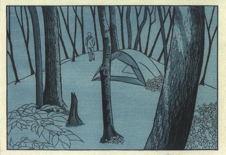
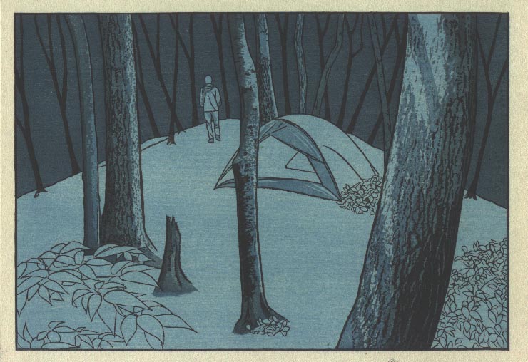
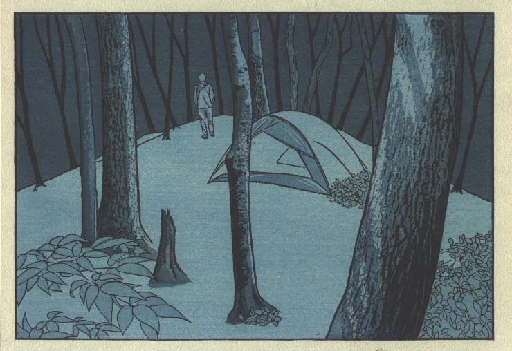
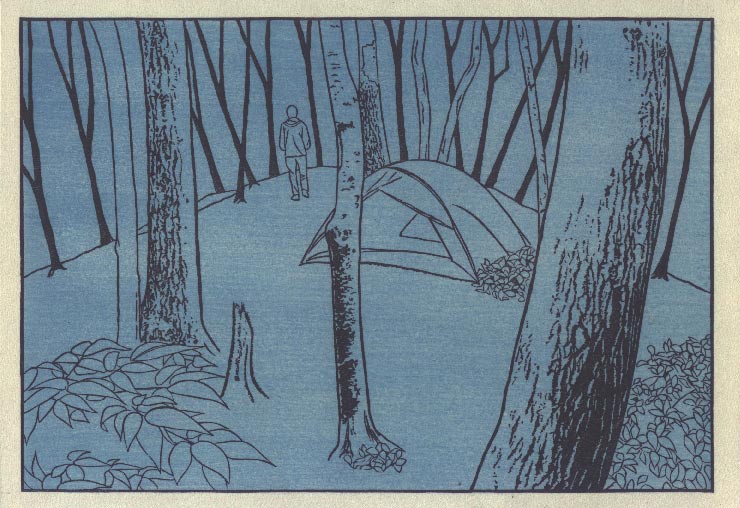
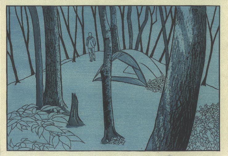
So we are dealing with wet paper, and of course the appearance of the colour is completely different from that of dry paper. The colours look much more saturated then they will be after drying. Here again is the scan of the previous stage:
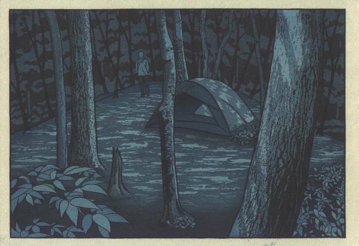
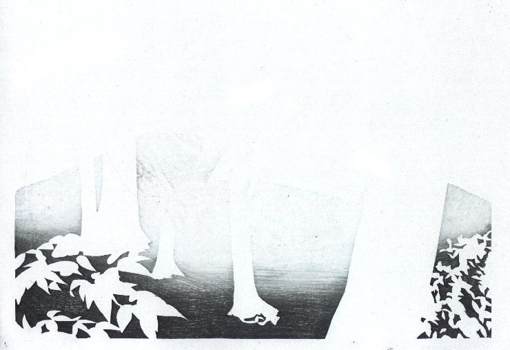
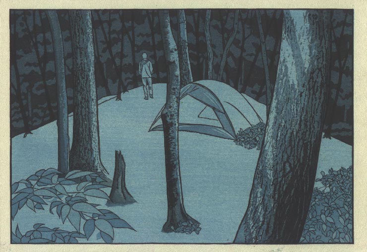
And now, for comparison, is a photograph (with flash) of the same thing after drying:
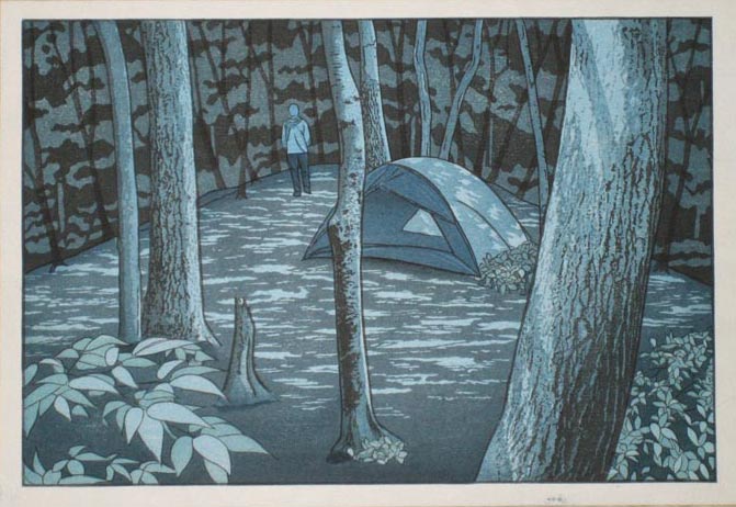
Which one is the 'real' print? Actually, neither. The scan is quite a bit darker than the real thing, and the photo is washed-out compared to the actual print.
Further exacerbating the problem is the question of what kind of light the print will be viewed under. The lighting in my 'living room' is not so strong, and the real print looks quite attractive there. (This is kind of like seeing a woman by candlelight ... in that setting, they are all beautiful!) But of course, most collectors seeing the print in their own homes will see it with a much brighter illumination that I have here. What looks to me here as 'deep tones' will appear far more 'shallow' to them.
And there is yet another level of confusion! I will send this print out into the world inserted into a book. It will thus be viewed at a very close distance, and the perspective and colour saturation will thus have a certain appearance. But I also know that many of the collectors will be (temporarily) removing it from the book for display in a frame or on a stand. Seen that way - from a distance - both perspective and colour depth will be entirely different.
So is my print 'finished' or not? Darned if I know!
I think at this point, most people reading this page would probably say "Something in between those two images would be about right: not too gloomy, not too washed out." And I think so too ... and as I said, the 'real' print I have here in my hand is somewhere between those two images. But after a few days of sitting and studying it, and with the help of a few people who have tossed their (sometimes conflicting) advice in my direction, I have decided to put a few more impressions on. I have now re-moistened the paper and will resume printing. The goal is to try and catch as much as I can of the drama of the darker image, without letting the thing become too dense and muddy.
But just how I'm going to share the results with you, I can't tell at the moment. I'll continue to scan the (wet) steps as I go, but please keep in mind that they are overly saturated. Then, when I'm done, I'll try and set up the camera with proper lighting (and white balancing, etc.) to capture a relatively realistic final shot ...
The thread continues in [Forest in Autumn - 13] ...
Posted by Dave Bull at 11:57 PM
| Comments (2)
[Forest in Autumn - 11] : Impressions 16 ~ 18
Continued from [Forest in Autumn - 10] | Starting point of the thread is [Forest in Autumn - 1]
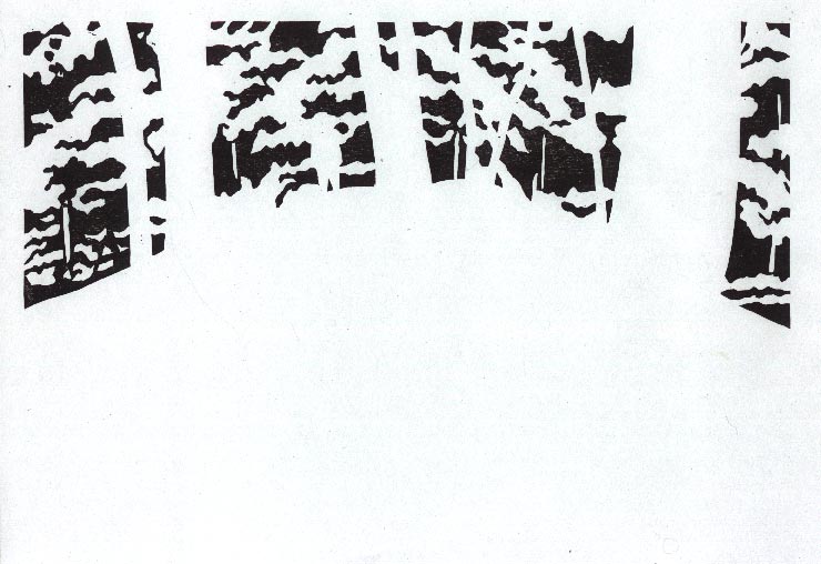
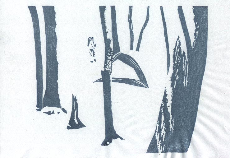
Impression #16 - Deeper tone on jacket

That impression by itself (on scrap paper ...) :
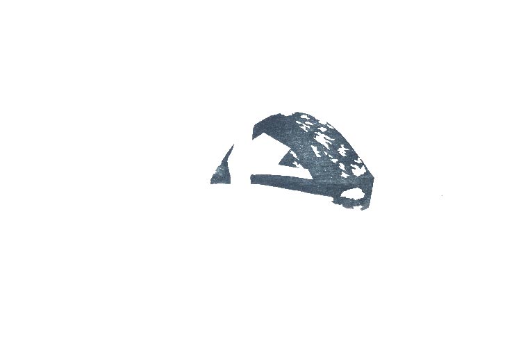
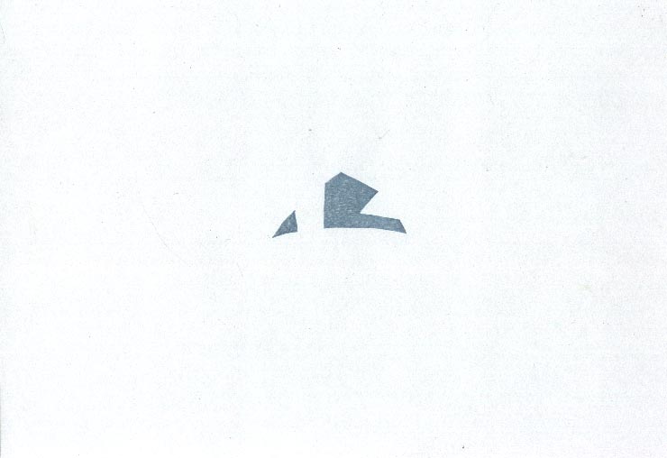
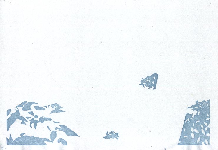
Impression #17 - Gradation underneath tent ...

That impression by itself (on scrap paper ...) :
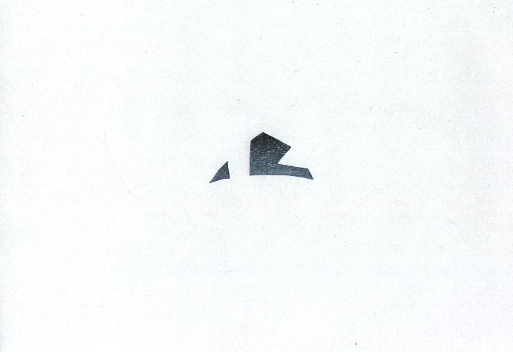
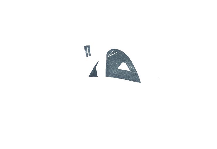
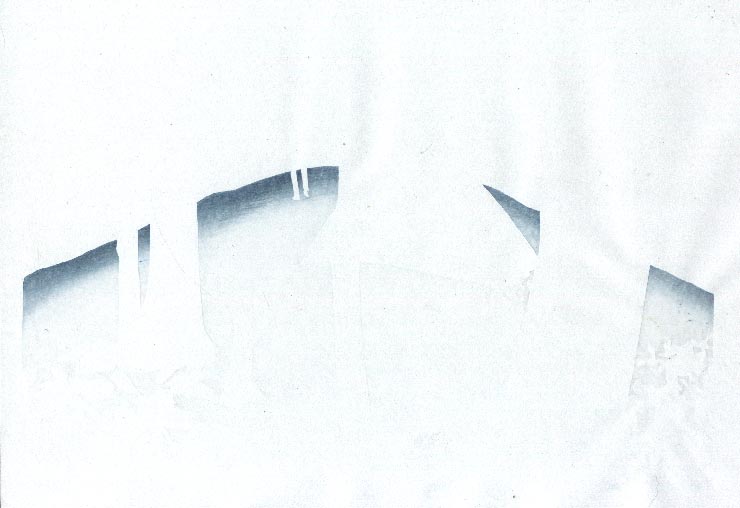
Impression #18 - Gradation inside tent ...
That impression by itself (on scrap paper ...) :
The thread continues in [Forest in Autumn - 12] ...
Posted by Dave Bull at 6:34 PM
| Comments (2)
[Forest in Autumn - 10] : Impressions 13 ~ 15
Continued from [Forest in Autumn - 9] | Starting point of the thread is [Forest in Autumn - 1]
Impression #13 - Dappled light on tent
That impression by itself (on scrap paper ...) :
Impression #14 - Deeper tone on front of tent ...
That impression by itself (on scrap paper ...) :
Impression #15 - Deeper tone inside tent ...
That impression by itself (on scrap paper ...) :
The thread continues in [Forest in Autumn - 11] ...
Posted by Dave Bull at 6:32 PM
| Comments (3)
[Forest in Autumn - 9] : Impressions 10 ~ 12
Continued from [Forest in Autumn - 8] | Starting point of the thread is [Forest in Autumn - 1]
Impression #10 - Dappled moonlight on forest floor ...
That impression by itself (on scrap paper ...) :
Impression #11 - Gradation to deepen foreground ...
That impression by itself (on scrap paper ...) :
Impression #12 - Gradation at distant edge of ground block ...
That impression by itself (on scrap paper ...) :
This certainly isn't the end; still not sure how many more there will be ...
The thread continues in [Forest in Autumn - 10] ...
Posted by Dave Bull at 6:28 PM
| Comments (5)
[Forest in Autumn - 8] : Impressions 8 ~ 9
Continued from [Forest in Autumn - 7] | Starting point of the thread is [Forest in Autumn - 1]
Bit of a slow day today ... here are the next two impressions ... slowly moving along ...
Impression #8 - Second tone on foreground leaves ...
That impression by itself (on scrap paper ...) :
Impression #9 - Darker modelling on distant backdrop ...
That impression by itself (on scrap paper ...) :
The thread continues in [Forest in Autumn - 9] ...
Posted by Dave Bull at 10:08 PM
| Comments (2)
[Forest in Autumn - 7] : Impressions 5 ~ 7
Continued from [Forest in Autumn - 6] | Starting point of the thread is [Forest in Autumn - 1]
Not really sure if I should be posting these stages along the way; unlike the previous print, which just got better bit by bit as the colours went on, this one doesn't look 'like anything' at these partial stages of completion. But anyway, I guess it'll be useful to see these steps later on, when looking back and thinking 'how was this made?'
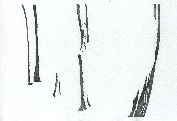
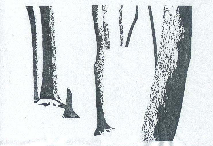
Impression #5 - Darkest modelling on trees ...
That impression by itself (on scrap paper ...) :
Impression #6 - Base tone for distant backdrop ...
That impression by itself (on scrap paper ...) :
Impression #7 - Base tone on foreground leaves ...
That impression by itself (on scrap paper ...) :
The thread continues in [Forest in Autumn - 8] ...
Posted by Dave Bull at 9:58 PM
| Comments (2)
[Forest in Autumn - 6] : Impressions 2 ~ 4
Continued from [Forest in Autumn - 5] | Starting point of the thread is [Forest in Autumn - 1]
Impression #2 - Key block
That impression by itself (on scrap paper ...) :
Impression #3 - First level of modelling on trees ...
That impression by itself (on scrap paper ...) :
Impression #4 - Second level of modelling on trees ...
That impression by itself (on scrap paper ...) :
The thread continues in [Forest in Autumn - 7] ...
Posted by Dave Bull at 1:07 PM
| Comments (0)
[Forest in Autumn - 5] : Impression 1
Continued from [Forest in Autumn - 4] | Starting point of the thread is [Forest in Autumn - 1]
So printing is under way; here is the first impression ...
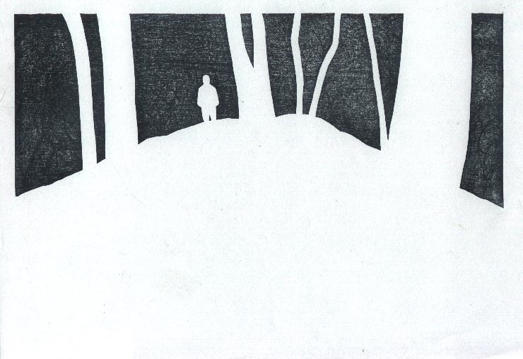
Impression #1 - Base tone, most of which will of course be covered up later; this is also - believe it! - the moonlight block!

The thread continues in [Forest in Autumn - 6] ...
Posted by Dave Bull at 8:32 AM
| Comments (0)
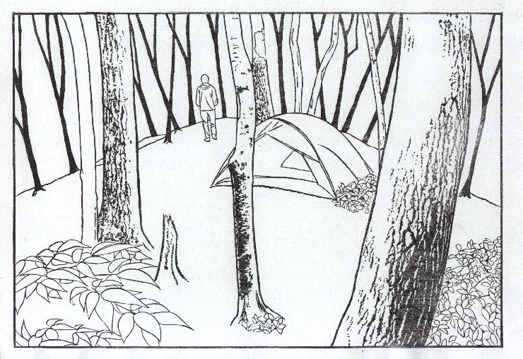
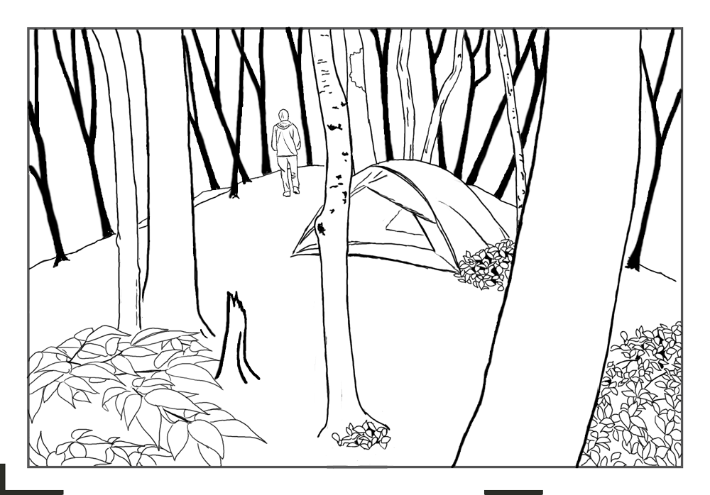
[Forest in Autumn - 4] : Colour Your Own!
Continued from [Forest in Autumn - 3] | Starting point of the thread is [Forest in Autumn - 1]
During the construction period for the previous print in this My Solitudes series - the River in Summer, I posted a page entitled 'Colour Your Own', inviting people to create their own version of the print - before I finished my own.
It was quite successful, and a number of people did indeed give it a try ... So, let's make it a regular feature; I will post a transparent line drawing again, to see what people can come up with.

Instructions:
- Download it here
- It is a transparent png file, which can be opened in any common image editing software (Photoshop/Illustrator/etc.).
- Create multiple 'layers' (positioned beneath the transparent line drawing) to make it easy to brush colour across the required areas of the design (Adjusting the opacity on some of your overlapping colour layers will make the print more closely resemble the kind of print I will be producing ...)
- Go!
Send me your images, and - just as we did last time - I will post them on this page for comment and discussion.
The thread continues in [Forest in Autumn - 5] ...
Posted by Dave Bull at 3:41 PM
| Comments (0)