Posted by Dave Bull at 10:40 PM, September 1, 2007
Continued from [Forest in Autumn - 12] | Starting point of the thread is [Forest in Autumn - 1]

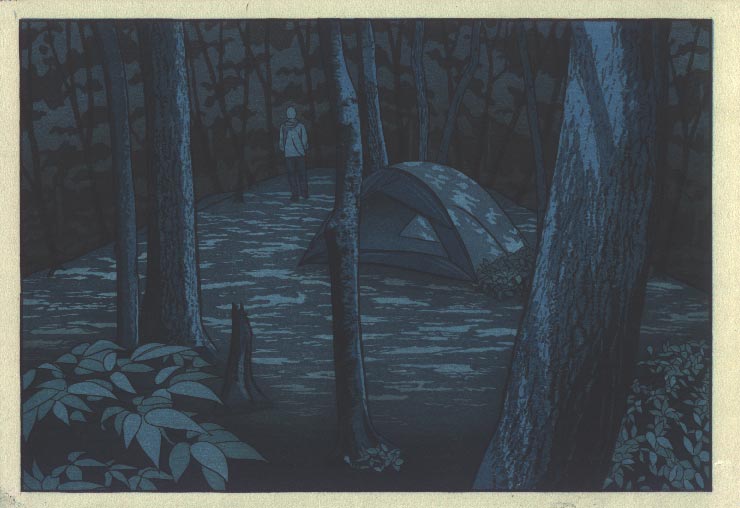
OK, it's been a few days ... and I think she is now done. I put ten more impressions on it, all 're-dos' of previous steps ... no new blocks. Rather than put all ten steps here, I'm going to show them in groups.
First step was to put more depth and 'night' into the background, with a black 'bottom up' gradation:
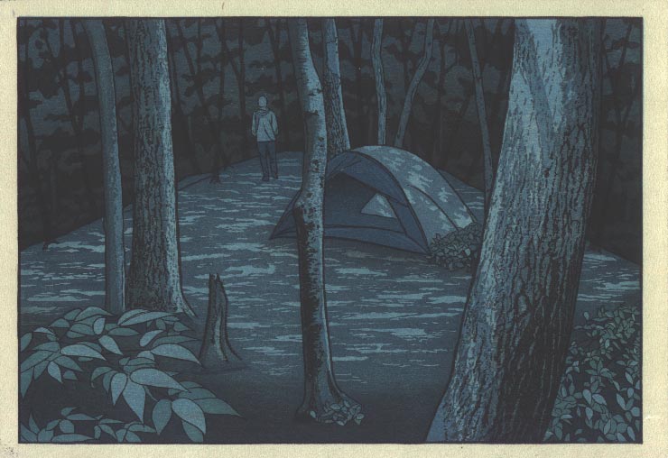
This was followed by a deepening of the major tree groups, using all four blocks that cover that area. (Three of these had been used in previous steps, one - the tree base tone - had not been used yet.)
Next, I used a dark blue-black to deepen the gradation on the foreground:
This left the foreground leaves looking too bright, so I deepened them, and then also re-did the two blocks containing the dappling effect:
And finally, I went back to the same block that I used for the first impression a couple of weeks ago, the blank 'beta' block, and put a thin layer of blue over the whole thing:
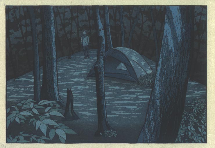
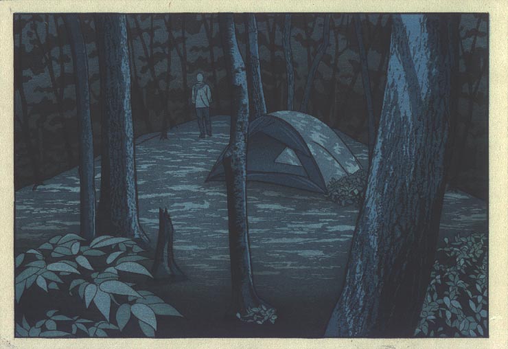
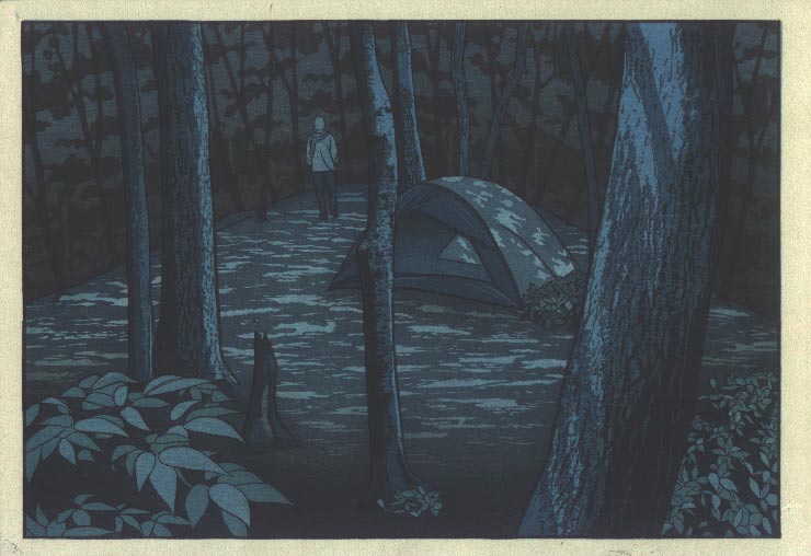
And that's it ... As I mentioned before, these scans are done on wet paper, and this is not 'exactly' what the print looks like. I'll try and get a good photograph as soon as I can, but anyway, this image should do for now! I've just updated the slideshow page with a complete set of the progress images.
After a couple of days of deskwork, I'll prepare another 112 sheets of paper for the second half ... which should go a lot more smoothly I hope!
I printed out a copy of this print and have been looking at it for over a week, and although I realize that the real print would be different I can say that even the copy is very powerful in evoking the sense of being out amongst the trees at night with the moon high above. I can almost hear the wildlife animals moving about. The subject is the fascinating thing here: fancy thinking of making a print of deep night!
Quite inspiring, thank you.
I just have to say that I think this series is a very important step. I really like the images thus far and am really glad to see you working on your own images. They're both subtle and strong at the same time. There is obviously so much thought and work in them. It's already a successful series to me. I can't wait to see the rest of them.
I agree with Mike L; a very important step. The focus in this discussion has been on the prints, but there is much more to this series than the prints.
Dave is an accomplished author. Many of his short essays about Japanese culture from an outsider/insider's point of view have been published in English language periodicals and newspapers in Japan. In my opinion, his prose is a perfect match for his prints.
Still, there's more... The hand-bound books themselves are yet another thing of beauty.
I'm pleased to be a subscriber and very impressed with the whole package!
Marc
... Quite inspiring ... a successful series ... very impressed ...
Wow! Thanks everybody, for these comments ... I am so 'close' to all this that there is absolutely no way that I can make any objective judgments about the work. Maybe in years to come, I'll be able to look at these prints and try to come to some sense of how 'good' they are (or not!), but for now, I'll be happy to accept these comments! :-)