Posted by Dave Bull at 1:05 PM, June 2, 2007
In a private email with a friend, discussing the progress of my current print - the River in Summer, from the 'My Solitudes' series - he mentioned that he was trying to think of different ways that I could move forward with the colouring of the print. That gave me an idea ... why not make it easy for anybody to make their own version!
So here's what we're going to do ... I have created a full-size down-loadable version of the hanshita (the line drawing) that I used to guide the carving of the key block of this print.)
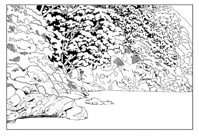
Feel free to download it, then open it up in any image editing software such as Illustrator or Photoshop. It is in png form, and is transparent, so it is very easy to add colours to different areas. Colour it in to make an attractive 'print', and then either post it online somewhere we can see it, or send me a copy and I'll post it here.
Instructions:
- download it here
- open it in your editing software
- you may then have to change the image 'mode' to RGB, before you can add colour ...
- create multiple 'layers' (positioned beneath the transparent line drawing) to make it easy to brush colour across the design
Go for it!
(There is a long thread on this RoundTable showing the progress of the print - from design through to finished version. The starting point of the thread is [River in Summer].)
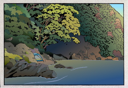
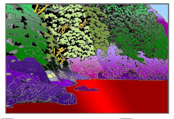
Here is my very first quick-and-dirty attempt at getting a colour impression of your first River in Summer print hanshita design:
Done in Adobe Illustrator CS2 with its Live Trace and Live Paint options.
I have to admit I didn't even check up on your colour woodblocks when making this impression, and used the colour swatch called 'Forest' included in Illustrator to try and get a sensible colour combination for this kind of scenery.
I am utterly dissatisfied with the colours at the right of the mountain hill side of my interpretation of your design, but there you go, that's what quick-and-dirty is all about!
I'm sure you've got a much better colour design lined up for this print, but I couldn't resist the challenge you put up to us viewers about its possible final colouring scheme...
I'm looking forward to see the next steps in the printing of your design!
Jacques

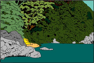
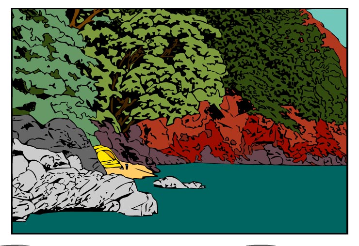
Just for fun, I took your black and white keyblock and based on it and my imagination will color it in, just to see how far we have diverged when we get to the finish.
I think the central part of your composition, the area of the trees with trunks, will be the focal point of the print, as it is most stylized.
Your vegetation to the left and right is a bit chaotic, causing all kinds of problems as there is little recognizable there to get a handle on without additional information, like a photo of the spot!
Your keyblock does not define any given area either without running into another area, and to make them all the same color would be a bit boring, so I am having to use a little license here.... :)
This is too much fun, I've wasted a good part of the day 'playing' with this!
(But I am rather liking what I see so far.)
When I am done, I'll send it to you, and you can either put it up or toss it out, as you like. It's just interesting to play with someone _else's_ composition for a change, especially a keyblock, without additional background as to what the image is supposed to look like!
Gary
[And here's the image Gary sent in ... Somebody's been busy today! - Dave]
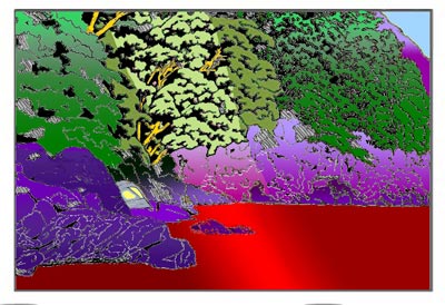
Here's another version from Jacques ... shifting it a bit into autumn, it seems!
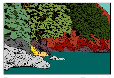
Sorry for the slight seasonal shift...
Thoroughly enjoyed having a go at the possible colour scheme in this very first print of your new series though!
Here's another one received today, from Aeleen Frisch. She added, "one designed to suggest different possibilities than the merely natural ..."
I find it interesting how different the various versions look. There is not even consensus on what is foliage and what is land, based on the hanshita alone (without reference to Dave's canonical coloring). Fun!
