Posted by Dave Bull at 6:24 PM, October 31, 2013 [Permalink]
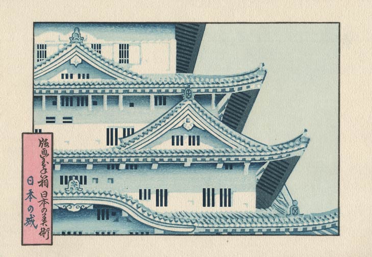
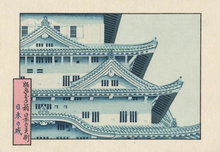
OK, here's the impression that pulls everything together - the deep blue/black tone for the 'windows' (is that what such openings in a castle wall are called?)

These dark areas make the white areas of the wall whiter, and add depth and mystery to the shadowed places.
The final colour impression is a 'beta' tone of extremely faint blue over the entire thing, to take the bareness off the white areas, and let them blend a bit more smoothly with the neighbouring tones. It also kills most of the 'fluffy' effect of the areas of unprinted paper, which can be attractive in some designs, but which is a distraction here.

Just the embossing of the border area to come ...
Simply gorgeous! How do I get a copy?

Wow! This is stunning! I'm really looking forward to this one.

I wish that you were still taking subscriptions for this series!

still taking subscriptions
Please hang on a 'bit'. I'm making a full complement of 100+ copies of each one, even though there are currently only 80 or so subscribers. I have a hold on new sign-ups because we have no paulownia cases here, nor any chance of getting any more made in the near future. But one way or another, sooner or later, I will have cases for that final 20 or so sets, and will open for new subscriptions at that time.
(And as I posted a couple of weeks ago, we have had a couple of breakthroughs in case making recently, so the solution for this might not actually be that far off ...)


