Posted by Dave Bull at 11:45 PM, October 30, 2013 [Permalink]
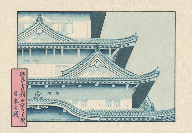
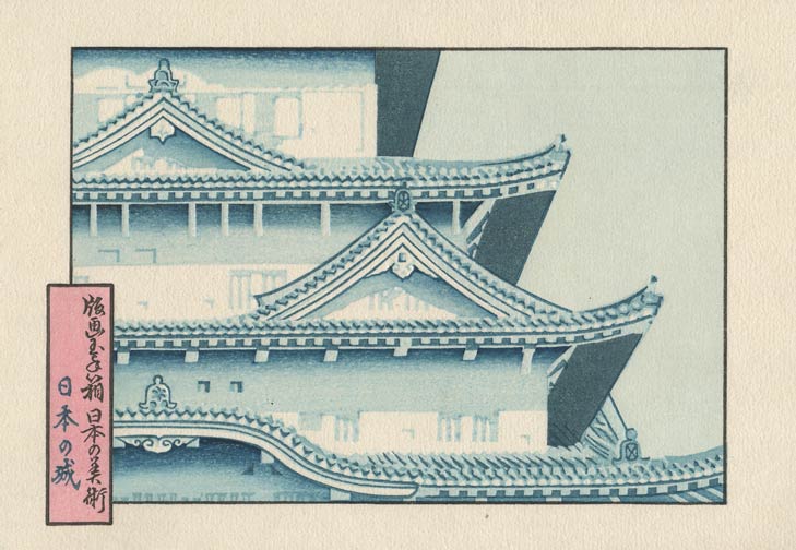
This one wasn't simple - it has to run in a curve that matches the shape of the overhanging eave. Because is it quite blurred, it needn't match up exactly, but it has to 'look right' ...

This one you might not notice at first. There are two of them, in those triangular gables. The zones are too small to make clear 'calculated' gradations; we just need a light touch of pigment to take away the bare whiteness in those places.

That's it for the shadow gradations. I think we have three impressions left ...
