Posted by Dave Bull at 12:11 PM, February 27, 2010
Continued from [Seacoast in Spring - 7] | Starting point of the thread is [Seacoast in Spring - 1]

Although we have a number of different shades of pebble here, more of them are a 'sandy' colour than any other. We get some variation from the different grey blocks that overlay, and some of the subsequent colour blocks will also overlap some of them:
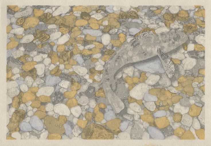
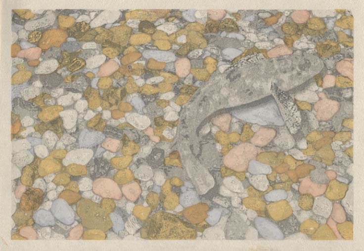
A kind of vermillion/salmon tint is also represented in the mix ...
Keeping on track fairly well, after the interruption for the Tokyo trip yesterday. I certainly won't be able to finish it by the 'end of February' as I had targeted, but it might be done by Monday, we'll see ...
The thread continues in [Seacoast in Spring - 9] ...
I find it fascinating, and especially evident at this stage of this particular print, how overlays can produce multiple distinct tones. After just 8 overlays, there must already be dozens of them.
Mathematically, I think that the number of possible tones would be 2 raised to the power of the number of blocks. So far, 2 to the 8th power is 256 possible combinations. I tried to count how many of those 256 possibilities you've used, but there's no way.
This is turning out to be a lovely print!
Marc
Well, there is certainly no way that I can 'count' the combinations in play here. There is something interesting to note about it though: the people who do reduction prints - where a block is printed, then 'reduced' in area, printed again, then reduced again, etc. and etc. - end up with a 'gradated' series of tones, from the lightest parts that got only one impression, down the the darkest ones that received all the impressions.
The kind of print I am making here works in a completely different way. The five grey blocks I used were not in a 'reduction' sequence, working from light to dark, but in a more 'cross-pollinated' pattern (I'm struggling to find a term for it.)
If you think of them as A B C D and E, there are places where A is on top of B, or on top of D, and where B covers C and E, etc. etc. It's insanely complicated, and I don't in any way pretend that I was able to visualize exactly how it was going to come out. I simply plotted a bunch of what seemed to be sensible variations, anticipating that the result would have the 'randomness' typical of a natural scene. (And of course I had photos of pebbles and a fish to guide me on typical tone values).
But yes, the first few proofing sheets were fun, seeing exactly what was going to come up off the blocks!
(Once we're done here, I'll be posting a collection of those sheets, so that people can get an idea of just a few of the other variations that are possible ...)
I know I'm skipping ahead, but are you planning a few 'all over' impressions of the surface of the water after the printing of the pebble and fish colours?
I was looking at a very similar view at the river a small walk from our house, last summer. I stood looking at the pebbles below the water, and at the surface of the water, and thought that it would be a great challenge for any printmaker.
Cheers,
Mark.
When I was planning this one, the idea of showing the water surface (by having some sky reflection, in ripples, or perhaps patches) of course came to mind, and I ran up a quick test. It looked very interesting, but there is a big problem with it - I have used that concept already once in this series, in the River in Spring print.
If I hadn't already used it there, then without question I would have done it here, giving us clearly two layers to look at - the top surface of the water, and the gravel layer. But I didn't really think that the idea could be used twice in a series of only 12 images, so decided to simply make the water totally transparent instead. I did do a test using sho-men-zuri (front rubbing) over the entire surface of the paper, and it is effective at making the water surface 'shine', but I can't help feeling that it is somewhat gimmicky, so my current intention is to leave it off.
(I should note though, that the final print will look quite a bit different to what you see here so far, because the last impression will certainly change things a lot ...)