Posted by Dave Bull at 10:51 AM, May 2, 2009
Continued from [River in Spring - 8] | Starting point of the thread is [River in Spring - 1]

It was nice to read the comments on the previous post about the finished print. I don't know about the other 5.99 billion people on the planet, but anyway, seems a few people think this print is worthwhile.
But ...
The day after the printing wrapped up was - as usual - a catch-up office day, spent answering back-logged emails, doing laundry, etc. etc. At lunchtime, I threw some stuff in a bag, and went down to the stream behind my house. I walked through the shallow water over to a place nearby where I know there is a comfortable spot to sit and relax, and had a pleasant lunch break.
The stream widens into a little pool there, and it's kind of a miniature version of the camping spot on the Tama River where the design for this print originated. Just for fun, I idly tossed some pebbles into the pool while I was sitting there eating my muffins - to try and make a 're-creation' of the print design.
And I noticed something interesting!
Whether or not you can see 'sky' in a reflection makes a big different in its appearance. (We all know this, but I hadn't been paying attention.) If you position yourself so that the reflected image doesn't include any open sky, and if the ripples are gentle, then the water stays transparent, and you can see the 'image' clearly.
But if there is open sky visible, or the ripples are large enough to have the correct angle to include reflected sky, then each ripple has a bright clear 'highlight' along its length.
A few weeks back, when I had been working out this design, I created a ripple pattern of the simple type - I distorted the reflected image in a 'ripply' way, sliding parts of it left and right in turn to create the effect. But I didn't include any 'highlights', partly because my reflection didn't include open sky, and partly (mostly!) because I just didn't think of it.
But after watching the ripples in this little pool at lunchtime, I came home in the afternoon with the seed of an idea - what if this new print had made some kind of attempt to include the bright/dark highlights on each of the circular ripples. What would it look like?
Well, why not try it? I certainly can't re-build the whole thing from the ground up at this point; after all, the first half of the edition is already printed and waiting to be packed into the book chapters. And I can't take colour 'away' from the paper to leave bright highlights. But the way to make parts of a print look lighter is to make the surrounding areas darker, and that is something that can be altered 'after the fact'.
So I cut another block, and did some test printing just now - re-wetting a copy from the finished batch, and printing on top of it. Here is a 'Before and After':
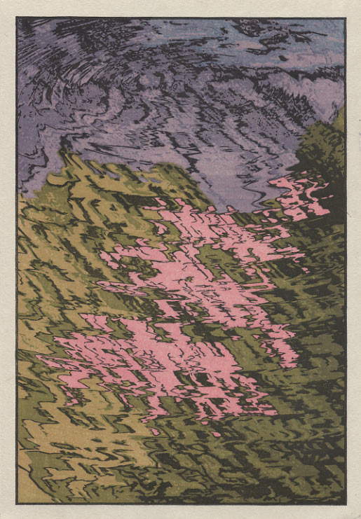
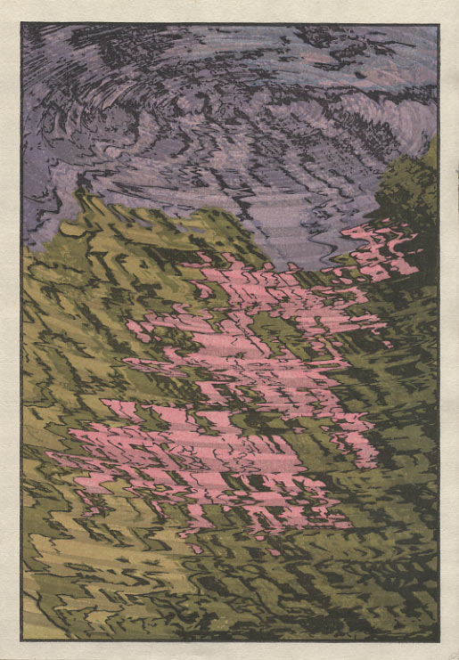
This is interesting! So now I have a decision to make. Just let this go, and file the idea for future use, or - re-wet the batch, and do them all this way. As usual, having a choice to make always makes things more complicated. If I had never shown this new image, most people would have accepted the previous version as being 'finished', without doubting it.
But now that there is a choice, we can 'take sides' ... preferring one over the other. The problem for me, of course, is that I now have to make a decision, and I have to make it right now!
So, without any visual distraction, here it is again (click for an enlargement):
What do you think?
The thread continues in [River in Spring - 10] ...