Posted by Dave Bull at 1:27 PM, April 28, 2009
Continued from [River in Spring - 7] | Starting point of the thread is [River in Spring - 1]

The next impression is the kind of thing that Hiroshi Yoshida called the nezumi block. (Nezumi being 'mouse', and thus a shorthand word for 'grey'). Although grey is commonly used for this block - which adds 'shadows' and deeper tones to various areas over an image - in this case I repeated the dull blue/purple mix.
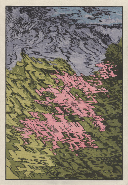
And that's almost it; all we need is one final block, a 'beta-ban' ('flat block') which covers the entire sheet, printing it with a faint red tone. I did this with very light pressure on the baren, leaving a faint mottled appearance over the whole thing (click it for an enlargement):
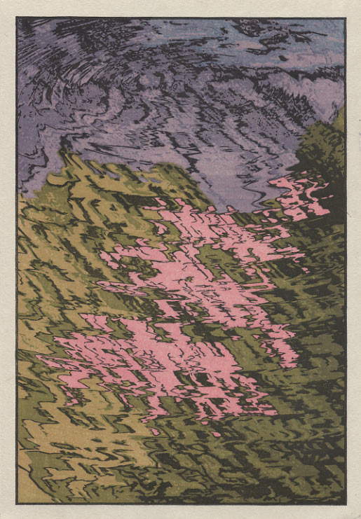
And that's it. Unless I'm overlooking something, eight impressions is the fewest we have had in this series so far.
***
Now that she's done, the more I look at this one, the more I like it. It's not going to be everybody's favourite, but I think that there can certainly be room in the set for a 'not-quite-straight-ahead' print like this.
I'll be interested in seeing what people think of it ...
The thread continues in [River in Spring - 9] ...
Having seen your 10 year old video, there seems added depth to my understanding of your liking for taking off to the quieter corners to recharge your batteries. This print is so suggestive of that staring into the reflections we all do .. thinking slightly abstract thoughts. I look forward to seeing the actual print. I love it.
It is like a visual Haiku even with its 'season' suggestion.
I think this is the most interesting print of the set so far. The unusual viewpoint creates and challenges our idea of the "subject" and this is reiterated in the technique used. Direct and reflected light, direct and reflected color. Water, looking glass, sky, cherry blossoms, tree.
It is both original and still referential to its place in woodblock "history" in a way that is interesting, beautiful, playful and very, very well done.
I think this is the most interesting of the set to date. The "subject"/focus is done in an innovative way that both referential to the history of woodblock traditions yet fresh and modern in tone, technique and viewpoint. The colors are beautiful and the overall composition exciting and very, very, well done. Nice work.
I agree. This is a favorite so far. I like very much how the subject is suggested just through color, I love the jazziness of the lines and how the subject is portrayed as being both frenetic and calm. This can be looked at as either a really interesting abstract piece or something quite realistic as well.
It reminds me of the type of patterns used in old kimono designs from the last century....very nice.
It has a certain marbling (Suminagashi) feel to it.