Posted by Dave Bull at 9:40 PM, February 3, 2009
Continued from [Seacoast in Winter - 5] | Starting point of the thread is [Seacoast in Winter]

Step #2 - There are three basic 'areas' in this print. We had the sky base first, now it's the turn of the water. The base blue doesn't cover the entire water area, as there are some cutouts for white 'foam' ...
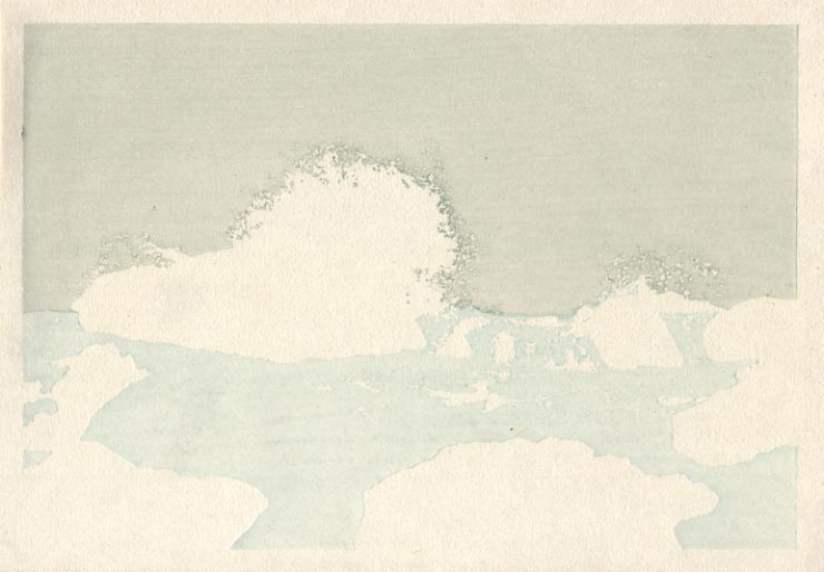
Step #3 - And the base tone on the rocks takes care of the final area.

Anything left in white at this point will still be white in the finished print. From here on, we are going to build up tone/colour/texture/depth on each area in turn ...
The thread continues in [Seacoast in Winter - 7] ...
Hi Dave,
Looking at the base tone for the rocks, I saw some horizontal texturing to it. Looking a bit deeper, I can see similar (but not quite so pronounced) texture in both the sky and water base tones. They all are oriented in the same horizontal direction.
I've seen similar texturing done with baren work but that is always more like arcs and circles. Since it is all horizontal and apparently continuous across colors, I'm thinking that it's the paper. Is this another manifestation of your problems with sizing?
Marc
I'm thinking that it's the paper
Nope. Woodgrain.
Fresh blocks, fairly thin colour (at least for the water and sky), and vigorous baren pressure. That's pretty much exactly the recipe for showing woodgrain.
It doesn't matter at all, as the upcoming impressions - all from blocks with their own different woodgrain patterns - will blur it all into the background.