Posted by Dave Bull at 3:31 PM, January 13, 2008
Continued from [River in Winter - 4] | Starting point of the thread is [River in Winter - 1]

It's been a busy couple of weeks ... proofing work, mixed with all kinds of preparation for the upcoming exhibition.
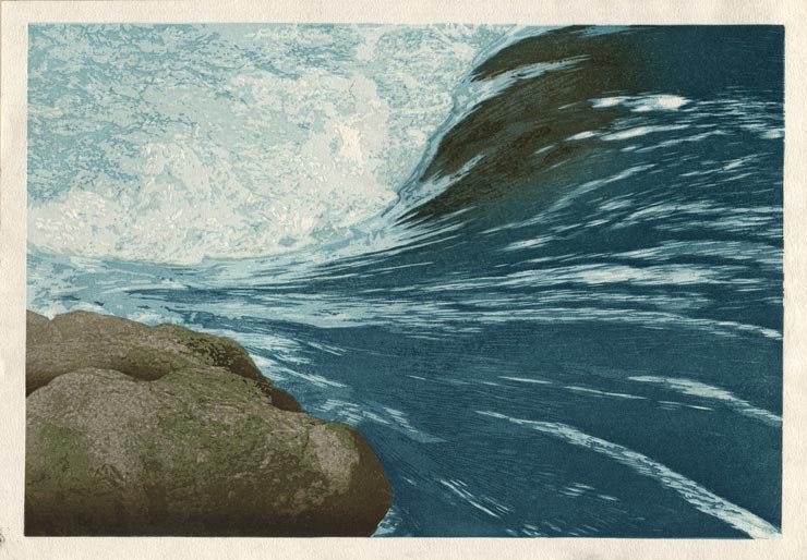
Proofing for this one - a bit to my surprise - has proceeded without too much frustration. Experience counts for something, I guess, because it came out very close to what I had been anticipating. I made a few versions, some with deeper water tones, and tried some variations here and there, but these are just kind of 'tweaking' - the basic image came out very well. Here she is!
I'm now going to put all workshop work on hold for a couple of weeks. The next week will be devoted to publicity and construction work for the exhibition, which begins on the 20th. Once the show is over, on the 26th, I'll be getting down into the workshop to make the edition.
This gap - of more than two weeks - between proofing and editioning, is very unusual for me, as there simply is never any time for such a luxury. But this gives you your chance ... take a look at the print (an enlargement is available over on the Solitudes page), and feel free to send suggestions on how this can be improved before I start 'real' printing!
The thread continues in [River in Winter - 6] ...
I think that this is an exceptional print. The ambiguity of whether this is an abstract or representational image is very interesting. Your skillful depiction of the various aspects of moving water (unimpeded flow, flow over rock, turbulence/foam) is just great.
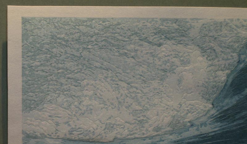
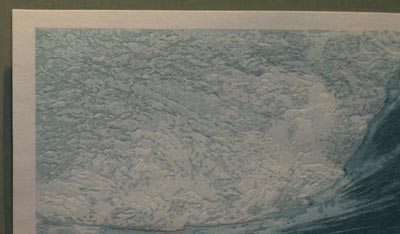
I'm looking forward to holding this one in my hands to get a clear look at the karazuri in the foamy area.
Well done!
Marc
looking forward to holding this one in my hands to get a clear look at the karazuri in the foamy area
Oops! This is what I get for talking about these prints 'in advance' ... Marc, I'm not sure about that karazuri; the image you see here doesn't have it, and I'm thinking that I might not do it. I was originally thinking that an embossed pattern of jumbled waves would be needed in that area, and I went to the trouble of carving the block, but once I tried it, it just seemed like overkill.
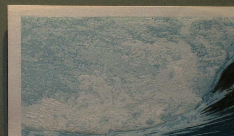
Here are a couple of images; first - with the karazuri:
Next - without:

Click them to check the enlargements, then tell me ... what do you think?
(And thanks for the positive reaction to this one!)
This seems to me to be a huge creative step into a new direction. Personally I just love it, and will enjoy following your final decisions when your show is over. Happy showing J
Hmm... I see what you mean. It's a question of balance with the proper level of contrast between the foam and the flow. Adding the karazuri that you carved originally turns up the contrast, perhaps too much. Additionally, the printing process itself has created an appropiate amount of 3-dimensional raised paper in the unprinted white.
Without physically being there to view the proofing process, I can't really offer an opinion, but that's certainly not going to stop me. I'd like to see some karazuri, but not as much as you originally carved. Perhaps a newly carved block or perhaps you could carve off some of the existing block to make it less intense.
Dave,
I have not looked in on this print till now, I think I prefer to see the end product rather than go with each step, but I must say I am very impressed with this print. I particularly like the water, you have created something deep and mysterious. In the arears of the print where you have used the indexed colour the texture is less alive, this suits the rock, but I think the foam benefits from the karazuri. Perhaps a little random bashing of the block with a meat tenderiser?
Hello Dave,
I can only echo Marc's first comments. This is a superb print and I enjoy the peace of it, even with the turbulent water, and its abstract/figurative image.
I looked closely (as much as my screen allows me to) at the 2 pictures, with and without karazuri. I guess I would like it to be "in-between", but it is really difficult to judge in a 2-dimension picture. At the end of the day, you're the best judge...and the artist.
Sorry won't be coming to Japan in the near future and will miss the show. In any case, best wishes for success.
Serge
Hi Dave,
This is really beautiful. I love the sense of the fast movement of the water. The rock under the water and the way the water flows over it is fantastic. I don't think it needs any special embossing on the foam; I agree with you that it may be "over egging the pudding" (as we say in Lancashire).
The technique you used to get the blocks for the rock does work well, but I get a slight feeling that the complexity and detail of the rock has been seen through a more artifical, processing eye than an instinctual, emotional human eye. I'm not being critical at all, because it's a valuable technique to have under your belt, but I think that if the blocks for the rock had been worked out by eye only, it would have felt different.
But really Dave, this is a beautiful print, and no black key block! I'd spent a lot of time looking at "The Sea Coast in Autumn" which has a black line on about 50% of it and thinking how it would look without any, and here the development is complete.
Good luck with the exhibition, I wish I could pay a visit.
Kindest regards, Mark.
detail of the rock ... a more artifical, processing eye
Yes, it looks somewhat mechanical, no doubt about it. Part of that is because I printed each of the 'zones' in flat colour, without attempting any kind of 'finesse'. When I get back to the proofing after the exhibition, I'm going to play with this a bit more, and I think I'll be able to make that rock look like it 'belongs' there a bit better ...
no black key block!
I was wondering if anybody would notice this ... I left it off completely! (Not that there was much of it in the first place ...) I did do a test with the key printed, but the outlines didn't add anything to that rock, so I thought of cutting it away in that area, leaving just the rectangular outline. But before I did that, I tried a version without any outline at all, and it looks fine, so I'll just leave it this way I think.
Thanks to everybody for all the supportive comments!
Hi Dave,
I love this print and think it's exceptional (even amongst all your wonderful prints!) You mention wanting the bottom rock to look like it 'belongs' more - have you thought about tweaking the bottom centre water to bring a bit of brown reflection into it? I think, at the moment, the colour jump and the white highlight are what are making the transition seem abrupt; especially in contrast to the smooth gradations around the uppermost rock. I'm not sure I would have ever noticed it if you hadn't mentioned it though.
Thank you for sharing your process with us, it is fantastic to see and I learn something each time I check out the site.
Cheers,
Lee.
2nd comment..........
I disagree with objection to the stark look of the rock. I think it is as a rock should be......hard and abrupt next to the loose flow of the water.......perfect.
ouhh, this is so powerful print, and so marvelous work on carving clear shapes... wonderful art! many thank you, David
Extremely breathtaking print, and the rock seems surreal and interesting to me in that setting. I like it a lot.