« June 2007 |
Main
| August 2007 »
[Forest in Autumn - 3] : Colour Separations
Continued from [Forest in Autumn - 2] | Starting point of the thread is [Forest in Autumn - 1]

I'm really not sure just how much detail of the process I should be showing for each of these prints. There are going to be 12 prints in the set, but surely, watchers are not particularly interested in seeing every stage of every print?
Or assuming that these postings are for the purpose of helping people understand how multi-coloured prints of this tradition are made, surely that doesn't mean that every step needs to be explained 12 times?
Anyway, we'll see what people seem to want, and see what kind of time I can spend on this. This next step involves some differences with the previous print, so let's look at these colour separations ...
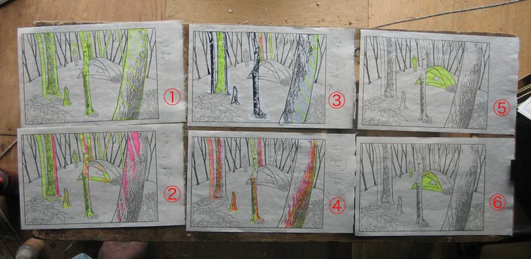
Here - laid out on my carving bench - are 12 of the kyogo-zuri (colour separation sheets). (These images are clickable for enlargements).


There will be more than 12 needed for this print. Not shown here are the 'beta-ban' (blank block with no carving, for a base tone), the key block (already done), and the 'nezumi' block (which I won't be able to work out until some test printing has been done ...).
12+ colour impressions is really overkill for this print, no doubt about it. There certainly aren't going to be 12 colours, and in fact, I'm going to start my first test printing, when it's time, with only grey and blue. But I do want to have many layers and levels in the print, so a lot of the components have to be on different blocks, of course. Even so, this is clearly too many.
The problem is, because of my inexperience with this sort of work, I want to leave myself as much flexibility as possible for the printing process. I am sure that it would be possible to combine many of these items into a smaller number of blocks, but 1) 'combined' items have to print with the same colour, and 2) when altering the colour of something on a block, other things on the same block also get altered. Combining items can save a great deal of time ... if you know what you are doing. If!
Let's look at a run-down of those 12 blocks. I have broken the design into 'planes'. Blocks 1~4 are the frontmost plane - the largest trees. These are to be carved with quite a lot of detail, and they should come out looking quite realistic in shape. If this were a photo, these items would be in sharp focus at the 'front' of the picture, and the other objects would be somewhat 'fuzzier' ...
Block 1 is a base tone, block 2 overlays this in places, block 3 builds on this still more, and adds more bark texture, and block 4 will be used for the darkest areas of the trunks. You can see on sheet 3 where I have pasted on an overlay sheet containing bark patterns, printed out from my Photoshop master.
(By the way, these numbers are just to refer to the photos above; they have no relevance to the printing order we will see later ...)
Blocks 7 and 8 will make up the most distant plane of the image - a forested hillside in the far distance. This is not intended to be realistic at all, and will consist of vague tree-shape forms, perhaps rather like a backdrop on a stage ... There are two blocks shown here, but I think a third one may be necessary; I'll find out at test printing time. Number 8 looks a bit of a mess in this photo, but I think it will make sense when it is in its proper place later. (Remember - the blacks, yellows and reds being used for these sheets have nothing at all to do with the colour tones that will be used in the print itself ...)
Falling between those two extremes of 'front' and 'back' is the mid-plane of the image:
- blocks 5 and 6 will be used for base tone/deeper tone, on the tent and the hiker.
- 9 and 10 are self evident; these are two tone levels on the patches of leaves and bushes.
- 11 and 12 are the two blocks for the ground cover; one for a base tone, and one for texture. I'm still not quite sure what I'll be doing here, and it's possible I may not actually make block 12; I prepared this so that I could sit and look at it for a while, imagining how it would be printed. But it should be possible to print block 11 in a couple of 'layers', using varied baren techniques to produce texture ... we'll see.
- the 'nezumi' block (not shown here) will be printed over the top of all blocks in this group, and will strongly darken the entire area, with holes chopped in it that will - hopefully - leave a dappled moonlight effect.
I think that if the men who worked on the shin-hanga prints back in the last century could see this block breakdown, they would shake their heads ... "This isn't how it's done ..."
There is no way that they would have separated all the planes so strictly, but as I said, I want to leave myself with as much flexibility as possible, and I'm willing to put up with the negatives in order to get that. And there are quite a few negatives with doing it this way.
First, of course is the fact that it takes more blocks, which means more expense for wood (these blocks are around 3200 yen each), more carving time, and then of course, much more printing time later.
But more of a problem is the fact that because all the zones are isolated from each other, it is going to be quite difficult to get the print to look 'unified' across the entire image. I do want different planes to be visible, but not at the price of having the print look like it was pasted together from different pieces!
Anyway, we'll wrestle with all that stuff later; for now, I have a good week's carving work clearly set out in front of me!
The thread continues in [Forest in Autumn - 4] ...
Posted by Dave Bull at 11:41 PM
| Comments (3)
[Forest in Autumn - 2] : first steps
Continued from [Forest in Autumn - 1]
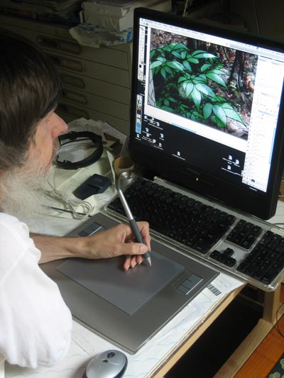
Unlike the previous print, which was structured around an actual view of the river, this one is not a 'real' scene, but one 'assembled' from pieces ... the tent, some trees, and some bushes. These are all put together in a series of Photoshop layers, and then, when it seems to be satisfactory, I trace the image using my Wacom pen tablet, working at a high level of magnification:
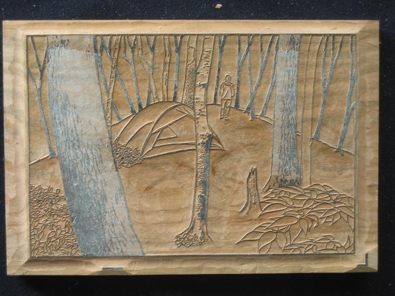
When all parts of the image are done, blocking out the photo layers gives me the line drawing ready to print onto thin paper for pasting onto the block. We saw this in the previous post, but here it is again:

Then, finally, down to the carving bench in the workshop! I've actually had a very productive couple of days carving work on this block, and it's almost done! Just those last two textured tree trunks to go (click to enlarge) ...

The thread continues in [Forest in Autumn - 3] ...
Posted by Dave Bull at 11:05 PM
| Comments (2)
[Forest in Autumn - 1] : the concept
Here we go again! Just as I did a couple of months ago with the River in Summer print, I am going to show many details of the production process for the next one in the series: the Forest in Autumn.
My campspot on the river is around 20 minutes by bicycle from my home, but the woodland spot is much closer - the 'trailhead' is less than 60 seconds walk from my front door, and once in the forest, it's less than five minutes walk (stroll, actually) to the place where I usually park my tent for these little trips.
When blogging about the progress of the previous print, I held back showing a photograph of the actual location until after finishing the print, as I didn't want viewers to get a preconception of what the print might look like. In the case of this print, I'm going to show it up front, because the situation is quite different ...
Here's a snapshot of my tent in place:
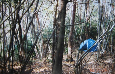
What a mess! As subscribers to this series will learn when they read this chapter of the book, this woodland is really in poor condition. After being clear-cut just over 50 years ago, it was fenced in and abandoned, and has had no maintenance at all in the intervening years. Now it's still a pleasant place to camp for a while, as long as you don't want to 'do' anything - just sit and enjoy the peace and quiet. But it is difficult to walk around in many areas, as the undergrowth has run rampant, and on windy days it is quite dangerous, as many trees are rotten, or have weak, dead branches ready to fall.
It's also not 'picturesque' at all, as you can see from that photo. I certainly can't simply 'point and shoot' ... expecting to come up with an attractive image.
But if you have read the short description of this print here, then you know that this is going to be a night scene. Well ... a night scene means a dark image, so most of the detail can be hidden in the gloom, no?
Well ... 'unfortunately', in this case, it's not just a night scene, but a moonlit night scene, so there is going to be plenty of illumination! I can't just 'hide' things in dark corners!
The main problem for coming up with a design based on this woodland area, is how to 'open it up'. There are no long vistas possible, so the only way to get some space in a design is to get my (virtual) axe out, and start removing trees. I 'clear cut' an area around the tent, and prepared an image with some components arranged in four planes:
- a few trees in the foreground, which will be carved in enough detail to show surface texture.
- the tent and a couple more trees in the next plane
- a group of (imaginary) trees to define the rear boundary of the visible area, and finally ...
- a 'backdrop' plane, also completely imaginary, to try and indicate the presence of a more distant area of the woodland.
Before I show you the design, there is one more thing perhaps worth mentioning. The design for the previous print did actually 'look like' the finished print. All the major components of the print were visible in the line drawing. This one is different. The first and second planes are basically visible, but the third and fourth will be primarily defined by colour blocks, at a later stage in the process.
Anyway, here is the basic drawing around which the print will be built:
As far as I can tell at this point, there should be around 12 faces of colour blocks, and maybe 20~24 printing impressions. I wasn't hugely successful with getting the lighting right in the previous print, but this time, that is going to be critical. Moonlight on a woodland glade - it has to be dark, yet at the same time the dappled areas of light on the forest floor will have to glow brightly!
I wonder what I've got myself into this time ....
The thread continues in [Forest in Autumn - 2] ...
Posted by Dave Bull at 6:16 PM
| Comments (4)
My Solitudes project ... status update mid-July
Been getting quite a number of emails asking about the status of the project ....
- first print packages have finally been mailed. They were set to go out the first week of July (while I was in Canada visiting family), but Ichikawa-san got tied up with family work (tending to their parents) and couldn't devote enough time to bookmaking. But they are now on their way ...
- as for work on the second print, I have spent the previous week walking around up in the forest, sitting and studying locations, shooting sample photos, etc. etc. It has been very difficult trying to decide on the overall approach to take. With something like the river scenes, there are many approaches possible - close ups, 'long shots', and mid-range stuff like the one I chose. But when sitting in the forest, long shots are impossible, mid shots are difficult - cutting gadzillions of leaves, etc. - and closeups don't give the proper sense of 'where you are'.
Another problem is how to handle - or how to create - open space. This is a pretty dense forest, and I think I have to get out my (virtual) axe, in order to get some breathing room!
But I think I came up with a reasonable concept last night, and am now working on the sen-gaki, the line drawing. Once it's 'done', I'll post it here in the RoundTable, and the next sequence of progress reports will then come to life, as I get started on the carving ...
Posted by Dave Bull at 8:36 AM
| Comments (0)
My Solitudes project ... the business side
Over the past couple of months, there have been dozens of posts on this RoundTable giving information about the printmaking process for the 'My Solitudes' series. Now it's time for a bit of background to the project ... subscriptions and budget matters!
I mentioned in earlier posts that I am making 200 copies of each print (and book). I am not expecting anywhere near that many subscribers to be on board during the life of the project. The reason I make more than I currently 'need' is that my income for many years now has come from a mix of current prints and 'back-number' prints, and in order to make sure that I have something to sell years down the road, I print these 'extra' copies now.
(I should also mention that out of that 200, ten copies are spoken for as 'freebies'. Who gets these? Four go to family members, one to Iwano-san the paper maker, three to the ladies working on the project - translating, bookmaking and proofreading, one goes to the National Library, and I keep one.)
So how many subscribers do I have, and how many do I need, to make this project viable?
As I write this, there are 45 people 'signed up' to receive the print set. Assuming that I keep to my announced schedule of a print every two months, and with a price of 8,000 yen per print, that gives me an income of 2,160,000 yen per year (just around $17,000 USD at today's rate.)
Is that enough? Hah! Not even close ... Here's a table showing the estimated expenses of the next 12 months of the project, which come to around $45,000 ...
| Item |
Amount |
| Print Production |
|
| - printing paper |
230,000 |
| - wood blocks |
150,000 |
| |
|
| Book Production |
|
| - materials |
800,000 |
| - labour (bookmaking/shipping) |
600,000 |
| |
|
| Publicity |
|
| - exhibition |
800,000 |
| - newsletter |
250,000 |
| |
|
| 'Personal' |
|
| - home/studio (mortgage/utilities) |
1,750,000 |
| - taxes |
550,000 |
| - medical insurance |
320,000 |
| |
|
| Total |
5,454,000 |
Couple of things to note: these are conservative expenses, and ignore lots of small items ... office expense, general miscellaneous, etc., and ... a slight detail ... they don't include my own personal living expenses, little stuff like food, clothing, etc. This is just a list of the necessary expenses to run this project for a year, (based on production of six prints in the series).
There is obviously a huge shortfall. Expenses of 5 1/2 million yen and an income of around 2 million yen, just doesn't add up. But there is a bit more to include: I mentioned earlier that the 'long tail' of the edition will sell bit by bit over the coming years, and that is what is still happening with earlier print sets that I made. I still have subscribers for the Surimono Albums, and other prints. Income from these sales should be somewhere around another 2 million. That helps, but it still leaves me in the red ...
Am I panicking? Well, not yet. The new series is just getting started, and new subscribers are coming in, bit by bit. Once a couple more prints are up on the site, I hope more people will be convinced to join, and of course the January exhibition next year - if I can swing some decent publicity - should bring in some more. If I can lift the subscriber total to around 80 people, I should be able to scrape by. If I can get it higher than that, then I can even start to pay some of my daughter's college expenses again, something that my own parents have been doing this year because I am unable to.
So I guess it's a 'glass half-empty/half-full' situation. Yes, I'm in the red, but on the other hand, having 45 subscribers is a wonderful vote of confidence, and if you think of it as 45 x 12, that's 540 prints sold, not a bad achievement! Mind you, now I have to make them! :-)
Posted by Dave Bull at 9:34 PM
| Comments (0)