Posted by Dave Bull at 5:55 PM, June 26, 2007 [Permalink]
Continued from [River in Summer] - Block Scans | Starting point of the thread is [River in Summer]

Last night saw the completion of the printing on the second batch; the edition is now complete, and the blocks will be set aside to dry. Just when they might ever be used again is completely unknown, but they will be wrapped up and carefully stored away.
The edition documentation page has been updated with relevant information from the printing sessions, including a couple of photographs that show a slight variance between the first and second batches. I decided part-way along to make a change in the lighting of the tent - letting us see inside it more clearly ...


And now, with the real work out of the way, here's a bit of fun ...
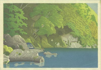
During the run of the second batch, I tried a little experiment - I skipped one of the sheets in the pile while printing the key block impression. For all the other blocks, I let it go through as normal, so we now have a copy of the print minus the key lines:

This doesn't 'work' as a good print, because there is just not enough definition between many of the adjoining colour areas, but it does provide some hints about how such a print could be designed. We'll have to see if this idea looks useable for one of the future designs in the series ...
