Posted by Dave Bull at 12:26 AM, June 13, 2007
Continued from [River in Summer] - Post Mortem | Starting point of the thread is [River in Summer]

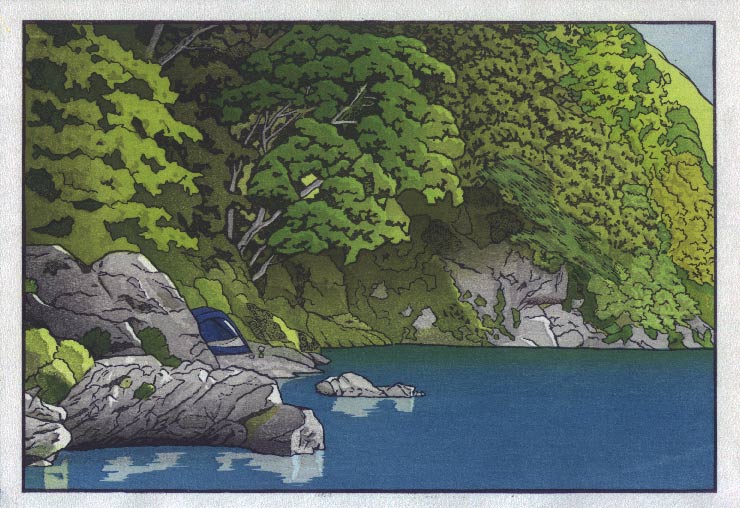
OK, time for a couple of experiments this evening, picking up ideas from some of the suggestions made on the 'Post Mortem' post. (These next two print images are not Photoshop, but actual test prints ...)
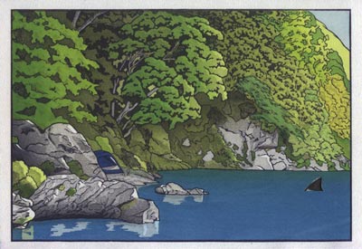
Here's a version with some extra shadow in the undergrowth, similar to what Gary put in his version at that point:

From the beginning I had a block carved for this, but didn't use it when doing the print run, as it just seemed to make things a bit too 'gloomy' under there. But I guess it does look better ...
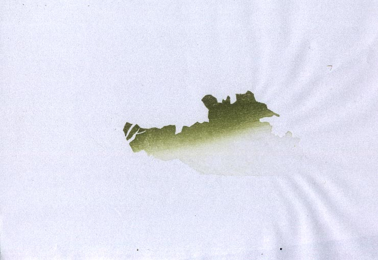
Here's the impression (on scrap paper) (block):
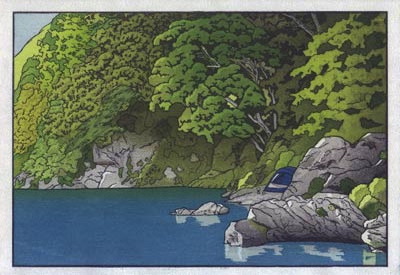
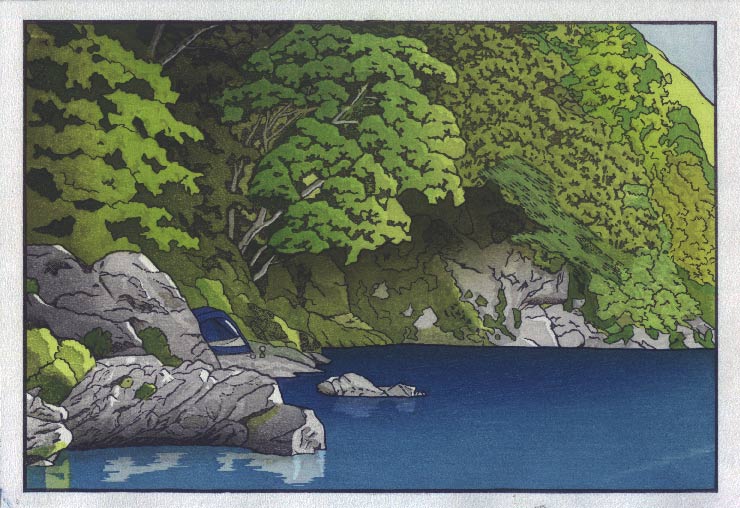
Next up, take one of those tests, and wipe a gradation across the water block, in line with Tom's suggestion:

This completely wipes out the green gradation in the water over by the far bank, but it definitely improves the effect of the white stones in the water.
So what do you think? Should I put the stack of paper back into play? At the moment, I'm thinking that the undergrowth is a definite 'go', and the water gradation is a definite 'Hmm ... maybe' ... :-)
The thread continues in [River in Summer] - Block Scans ...
This looks better to me. The added contrast in my opinion gives this a little more depth and mystery which better lends itself to your theme.
Reflections seem a bit inconsistent though. The rock in the center looks about right, the near rocks too bright, and the far rocks of the bank have none at all, even though you have highlights on all of them.
Then the sky is too blah. If this is morning, a little warmth in that sky would be nice!
I vote for putting the stack back on the gaming table.
I think the extra shadow in the undergrowth adds a tremendous amount of depth to the print and is a definite yes. Although I like the darker bokashi in the water, Gary's comment about the rocks on the far bank needing some reflections rings true.
I think we must remember this is a print and not a photograph are we shooting for photo realism here?? I think not. Its handmade, which makes it very unique. I'm beginning to understand what goes into a print, I think one could easily drive themselves crazy with all the variables. That being said I like the bottom print, it seems to have more depth within the trees and water. Its a very nice print either way you go.
I like the extra tone in the foliage, because I do see this as an overcast scene. But a little more blue sky and reflection would brighten things up.
To me the water surface was always underdone compared to the foliage. As a reflective surface it should relate more consistently to the bank and yes, the far rocks should register. It would be good to carve another block picking up some highlights from the far rocks, and also putting some motion into the water. Your green bokashi would pop up nicely. The extra blue in the water will do no harm, but I would be looking to leave plenty of lighter tones in the foreground-water. One last quibble, I would put a little charcoal shading at the waterline of those far rocks as you have done for the near rock.
Would a speed boat be out of the question?
I think I would go for David's #23 as it was(is).
I find the light more balanced and natural.
The later two are admittedly more dramatic
but I feel the stronger contrast kills the atmopheric perspective in the trees and
makes the space feel smaller and somewhat constricted.
Just my impression.
Were it mine and were I to continue in the direction of these tests I would try
to go several degrees lighter on both the blue and grey.
But I'm really in no position to talk as I could never get near this
in terms of control. Both print and this thread are really inspiring.
Would a speed boat be out of the question?
Actually Tom, I was thinking perhaps more along these lines ... :-)
Forget the speedboat........like the shark.
Seriously, my fingers itch to add some grass tips along that far shore to break up that stark line.
Hi Dave, I have to admire your bravery in opening up a "work in progress" to the whole world, especially on this new direction into original designs. You are a highly skilled print artist and it would be a shame if your personal vision for this work (and others in your solitudes collection) became muddied through too many varied suggestions. Constructive criticism from peers is great as long as it's balanced out with focus on your original aims for the work.
I always hold my work up to a mirror, and anything that isn't quite right just pops out at me.
I always hold my work up to a mirror
That works very well ...helps to give a fresh viewpoint. And funny, seen backwards this way it seems (to my eyes) to have more of that 'morning light shining in' that I was trying to get ...
I've never done that; what I always do is look at the thing upside down, to 'erase' the content, and just leave me with the colours, tones and masses:
Seeing it that way now, makes me think that this is where Publisher Dave is going to call it a day with this one.
it would be a shame if your personal vision for this work became muddied through too many varied suggestions
Not to worry ... I have a very clear concept of where I'm going (overall). It's fun getting these extra viewpoints on the work, and helps to expand my options (which are pretty much infinite, anyway!).
Water per Tom K's suggestion MUCH improved... Also, that print is helped by deeper (bokashi?) shadows under trees in center and top left -- just much punchier all around!
-- Mike
Hi Dave,
I've been following your project with great interest. It's beautiful. After everyone else jumped in the pool I can't stop myself and will have to wet my toes as well. The suggestion of darkening the water looked good at first glance until I realized what made it better. A few days ago I thought the blue of the little tent was to strong and it kept drawing my eyes to it. I was going to suggest to still have it bluish, but lighter and if anything, more grey. The foliage is absolutely bang on. It completely suggests the mystery and tranquility of the forest on a river bank. As for the water. It's like a garden where the lawn provides an area for your eyes to come to rest before looking again at all the interesting elements around it. Being a "pool" as it is in the bend of the river it will be like a flat mirror not needing too much tampering. Looking at the way the light comes in I wouldn't touch any parts of the rocks at all ( they are all perfect), make the blue bokashi in the water far less intense but as Tom suggested, put in some faded reflection in the water of the rocks on the far bank and may be have another look at the reflections of the rock in the fore ground. e.g.Those walrus tooth. Once again, It's great what you are doing and very enjoyable to watch the whole project unfolding.
Regards,
Wouter
Dave, I completely agree with Mark. Please don't let yourself being put on a wild goose chase by all these - undoubtedly well-meant - comments over on your website, and just leave it at version thirty-one of your print.
After all, the worst thing that could possibly happen to you is that your publisher will be terribly pissed off about his income from your first 'My Solitudes' print.
But what the heck: as things stand you've still got eleven great prints lined up to prove _that_guy_ wrong... Right?
Anyway: you won't loose this one customer!
An interesting explanation for the fact that the backwards version of your print gives more of that early morning feel is that we - as Westerners - are accustomed to always watch a scene from the left to the right.
I remember reading that the famous 'Great Wave' print by Hokusai (in his 36 Views of the Mount Fuji Series) was especially effective in Japan because Japanese viewers are used to see everything from the _right_to_the_left, thus making the threat of the huge crushing down of the wave much more dramatic to Eastern than Western eyes...
Dave
Great print! Your documentation of the process is a great lesson! Thank you!
My two cents:
I like the far water blue bokashi. Thank you for the tranquil waters and no far reflection necessary.
The far rocks could be a bit darker making them more distant or shadowed by those overhanging trees.
If the top of the center tree was catching more light then the inner shadows would not have to go as deep as some suggest.
The vertical bokashi on the near left tree flattens the image for me. I lose the sculpted depth of the light you created in other areas.
With my deep admiration
Joe Sheridan