« [River in Summer - 21] - Impressions 24~27 | Main | [River in Summer] - Post Mortem ... »

[River in Summer - 22] - Impressions 28~31

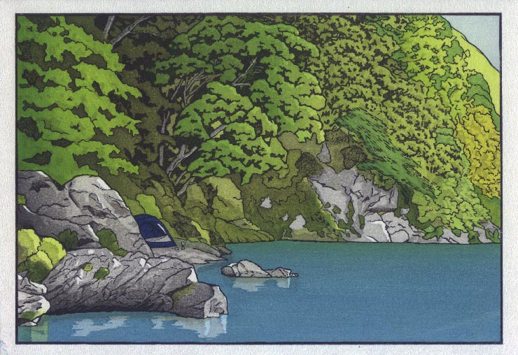
Posted by Dave Bull at 2:08 PM, June 9, 2007

Continued from [River in Summer - 21] | Starting point of the thread is [River in Summer]

So here we go ... let's wrap this one up!

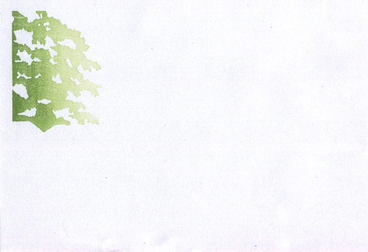
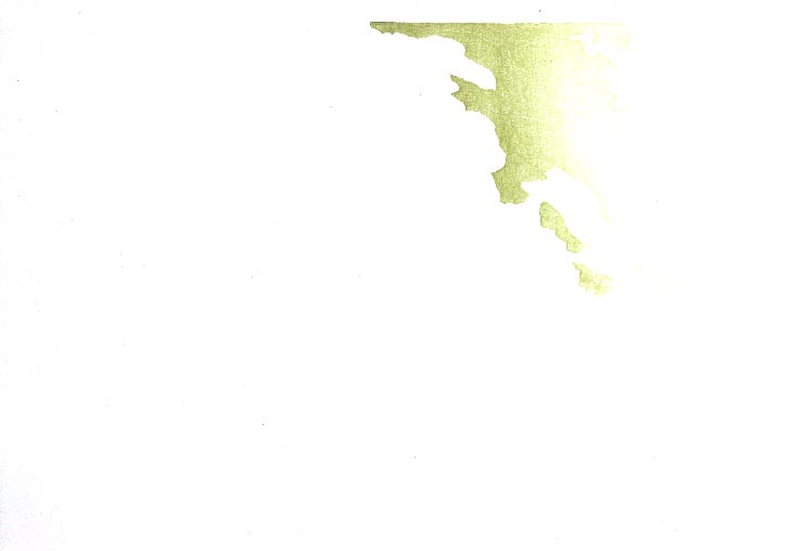
Impression #28 - Gradation on tree at far left ...:

That impression by itself (on scrap paper ...) (block):

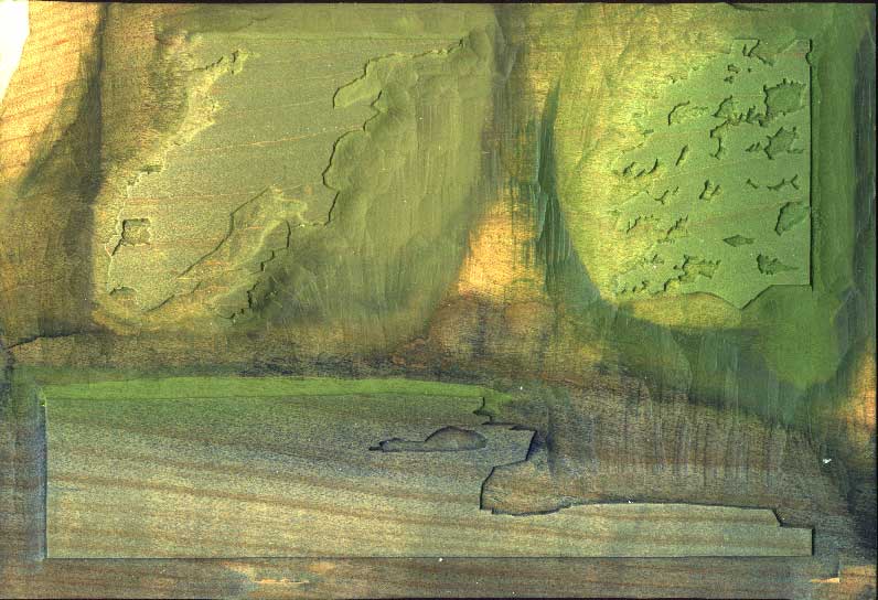
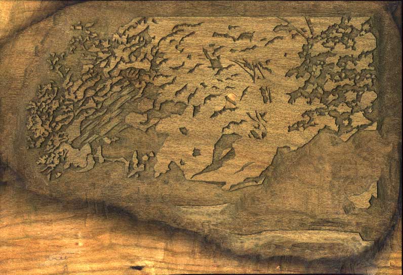
Impression #29 - Grey tone block over all tree areas ...:

The impression by itself (on scrap paper ...) (block):

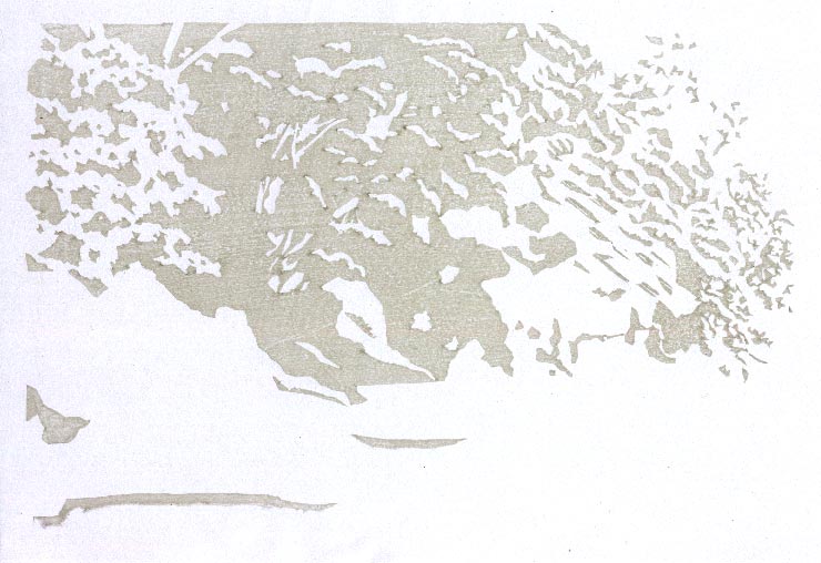
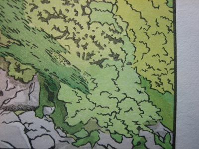
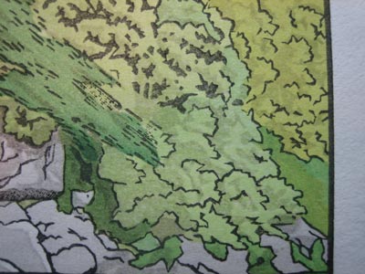
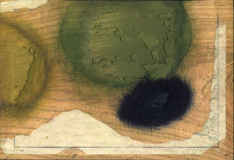
This kind of block is known as a 'nezumi-ban' (literally 'mouse block' - meaning 'mouse colour', or 'grey block'). It underlays all the tree areas, and is cut with patterns that add shadow effects to all the areas it touches. Here are a couple of closeups - 'before' and 'after':


Impression #30 - Tent ...:

That impression by itself (on scrap paper ...) (block):

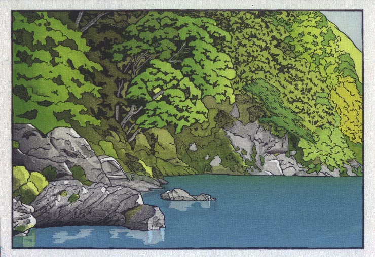
Impression #31 - Then, I think we need a repeat of step #14, to add depth ...

That impression by itself (on scrap paper ...) (block):

Seems I should have done step #14 a bit deeper; it needed to go darker at the left side, to make the more brightly lit front trees stand out more prominently.

So there we have it ... I started May 1st, sitting down to figure out what the design should be, and here she is. As I mentioned earlier, the printing I have just finished is the first batch - 100+ copies. After a couple of days getting the story printed out ready for sending to Ichikawa-san for binding, I'll make another pile of paper wet for printing the second batch of 100+. I should be finished that by the end of the month. So it seems as though my basic concept of one every two months seems basically reachable.

Tomorrow, after I've had a bit of time to look at this print and think about it, I'll make another post to this RoundTable giving my thoughts on how it turned out, and asking for comments/etc. from viewers. I think it turned out pretty well, but I can already see many places where it should have been better. I'll be interested in hearing what suggestions everybody can add to the mix; please give it some consideration, and then tomorrow, send in your comments ...

The thread continues in [River in Summer] - Post Mortem ...

Discussion

Following comment posted by: Mike Lyon on June 13, 2007 1:03 AM

Reflections... The crispy yellow green in the far shore reflection pulls it forward -- wrong color -- you need something 'cooler' -- try magenta or just sumi. Some wave-top reflections, especially in the light areas reflected might work, I dunno. The reflections under the rocks are very nice, but 'wrong' in that the light/dark areas don't look at all as they should (the view looking up toward the rocks from the reflected angle of our eye, now under water... That's not very clear language, but you know what I mean, I think -- dark areas of rocks should not reflect (in those areas we look deep into the water), light areas of rocks should reflect.

VERY COOL PRINT, Dave -- been meaning to write before -- I haven't read comments, only looked at pictures, but wonderful to see you develop the image AND, HOORAH and HUZZAH and CONGRATULATIONS on your decision to (finally) produce your OWN images in print! Breathlessly waiting to see your rapid development -- about damn time, IMHO!

Don't lose heart -- you're off to a GREAT start!

Best always,

Mike


Following comment posted by: Dave on June 13, 2007 1:13 AM

wrong' in that the light/dark areas don't look at all as they should

This was intentional ... or at least 'intentional' in that I was trying to avoid too much realism. That's something I'm going to be consciously trying to fight throughout this project - most of the time unsuccessfully! So in that place, I just scribbled in some ripply light areas, not 'measuring' anything at all ... (at least that's my story, and I'm sticking to it!)

Don't lose heart

Not a chance ... I'm having too much fun with this. And besides, I have nothing to lose ... if these prints turn out to be not so interesting, well, we all knew all along that Dave was 'not an artist'. And if they do happen to develop in an interesting way, then I'm a winner! :-)


Add Your Input


Remember Me? (with a cookie ...)

(you may use HTML tags for style)

Back to the Main Page