![]() Technical Notes on the prints (#19 ~ #24)
Technical Notes on the prints (#19 ~ #24)
![]()
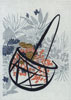
Print #19: Flower Basket, by Hakamada Sekka
Not really many 'technical notes' to write about this simple print ... I did cut one block that ended up not being used - a 'beta-ban' (blank block) covering the entire print area. I thought it might look better with some kind of background tone, but in the end, decided to leave it this way - with just the pure paper texture instead ...
Blocks: 7 cherrywood
Printing impressions: 7

Print #20: Bonsai, by Mishima Shoso
This is another 'reverse engineered' print - without access to the original blocks, it is completely impossible to discern the exact way that the separations of the various leaf colours were made. I traced the outlines of the design with no problem, then created what I thought made a reasonable breakdown of the various shades and tones.
When comparing my finished print with the original, I see that yet again, I have been a bit too 'careful' - my colour divisions run pretty much along the lines of the drawing, but the original is quite a bit more 'messy' and random. It's not really a question of right or wrong, as they both look OK, but this is another example for me of why I have found the right job for my character ... reproducing existing designs instead of trying to 'draw' with my knives ...
Blocks: 8 cherrywood
Printing impressions: 9
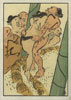
Print #21: Sumo Wrestlers, by Cho Gessho
Not much to add on this one either - the main story covered the main technical 'problem' ... how 'rough' to make the print. By looking at the original image you can get an idea of just how roughly a lot of the old work was done ... But there is no way I could ever send out something like that to my collectors!
Blocks: 8 cherrywood
Printing impressions: 8
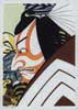
Print #22: 'Shibaraku', by Utagawa Kunimasa
The toughest part of this one - by far - was to get the mass of the hair dark enough, without smashing up the other parts of the same block. It helps to do the impression twice, with a bit lighter pigment; doing it this way means less vigorous pressure is necessary, but the registration - getting the paper into the exact same spot - becomes difficult.
If I had a young apprentice just starting here (this will never happen, this is just 'for example') I would start him out with printing black. He would learn how to print a basic black outline, how to print varying wash tones of black/grey, and how to print these rich dark blacks. Then, after a couple of years at this kind of practice, I would let him move on to colour work. He wouldn't need any more training actually, because that first couple of years working with black would teach him all he needs to know ...
Wonderful training ... maybe I should put my tools away, then bring them out fresh and try it myself! :-)
Blocks: 8 cherrywood
Printing impressions: 10

Print #23: Hiyodori and Nanten, by Nakayama Sugaku
You can't tell from looking at it, but this print is actually just a postcard-size section trimmed from a full o-ban print. I suppose I could have tried to show off and do the whole thing at this reduced size, but the bird would be so small there wouldn't have been much point ...
Blocks: 8 cherrywood
Printing impressions: 9
Print #24: Deep Winter, by Shibata Zeshin
Was that such a good thing to do, save the 'easiest' print for the last? Honestly speaking though, technical factors weren't a consideration - I just had to close the series with this design! All through the year, I have been receiving feedback from collectors about how perfectly the prints have matched the seasons outside their window ...
Well, this one's for me! And I don't mean outside my window!
Blocks: 7 cherrywood
Printing impressions: 7
|
Treasure Chest Front Page | Introduction | The 24 Prints | Subscriptions |
|
All material Copyright © 2004~5 David Bull |
|
Contact: David Bull |