![]() Hanga Treasure Chest: Print #19
Hanga Treasure Chest: Print #19
![]()
![]()

|
||
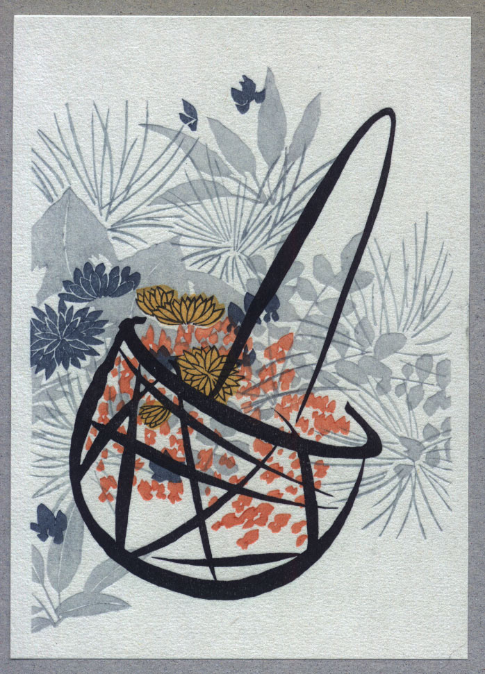
Flower Basket
I have mentioned frequently in these little stories that I am trying to keep in mind that the people collecting this set of prints fall into two major categories: those familiar with Japanese culture, and those not so familiar.
For the most part, due to the fact that I am choosing simple and 'decorative' designs, it doesn't really matter so much what level of cultural knowledge the viewers have; each of us can enjoy these prints at our own level. But in one particular aspect it does make a difference - and that is the inclusion of calligraphy.
A print with calligraphy is of course seen and understood in completely different ways by the two groups: Japanese people can read the content of the characters, and can also enjoy the beauty inherent in the calligraphic work itself, but for many foreigners, neither of these things can be appreciated, and indeed, the presence of calligraphy can itself become a distraction.
Now, most Japanese people do not realize this, but everybody in this country has been trained as an artist, in a process that started the day they first began to draw the simple kana characters. They were given a sheet of paper ruled into square boxes, and had to learn not only to make the characters in the correct shape, and to give each stroke the proper nuance, but above all, to position and balance the character properly in the given space.
There is nothing comparable to this in the standard western methods of learning the 'A B C ...', where the process does not go beyond getting the basically correct shape of the character.
So when I came across this design, I thought to myself "Perhaps this is a way that I can try to show the Western collectors some small aspect of the beauty of calligraphy."
There is no 'meaning' in these strokes, and they do not 'distract' from the image; they are the image! Just looking at them makes me want to dip a brush into some rich black ink and give it a try ...
David
|
Treasure Chest Front Page | Introduction | The 24 Prints | Subscriptions |
|
All material Copyright © 2004~5 David Bull |
|
Contact: David Bull |