Posted by Dave Bull at 2:52 AM, May 20, 2012 [Permalink]
OK, I think I've done about all the tracing, sketching, and general fiddling that I can do on this one; let's have a look at it!
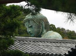
Here's the general concept I have been playing with - a very small photo that I noticed on a little Geocities web page about flower arranging, when in the early stages of perusing source material for this Arts of Japan series:

Seeing it reminded me instantly of my own first 'view' of the Kamakura Daibutsu more than thirty years ago. We were walking through back streets from the station, and caught this kind of glimpse from a distance - just the top of the statue looming over other buildings. "There it is!" Seeing it that way heightened our eagerness to get closer and see the 'real thing' ...
So I think I'll base my print on this concept. As for the 'style', I'm going to take a general shin-hanga approach, modelling the three areas (statue, roof, distant greenery) with overlaid colour blocks and nezumi-ban.
But we need an outline drawing first, and - as we saw in the earlier post introducing not-very-well-drawn versions by Hiroshige, Keith, and Hasui - this statue is not easy to 'capture' in outline.
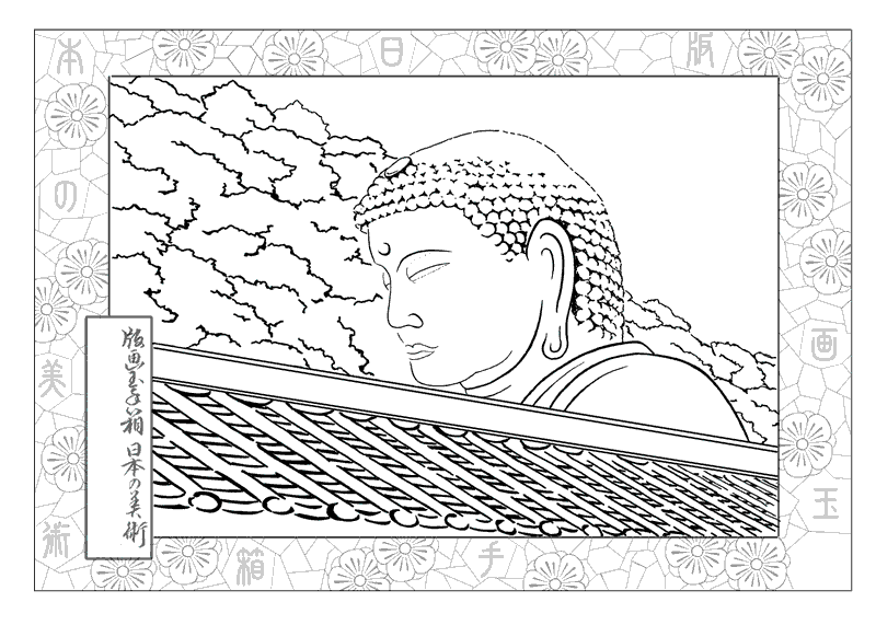
Here's a first attempt to trace over that (blurry) photo, with some cropping and editing to get the overall shape:

Don't run away just yet ... we can do better than that ...
The eye and mouth are both very difficult, but after a number of inbetween steps too tedious to show here, it starts to look a bit better:

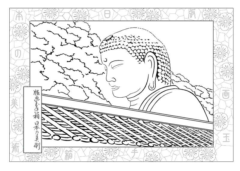
Illustrator friend Jed Henry over in the US made a suggestion that I should 'elevate' the head away from the roof line, and that's clearly an improvement:

The eye still looked slightly 'evil', and I thought that reversing the curve would eradicate that feeling:

... but it only made it worse. I don't feel that any of the illustrators I showed in the previous post could catch the eyes properly either, but once I simplified the line, and also 'gentled' the curve of his jaw/chin ...

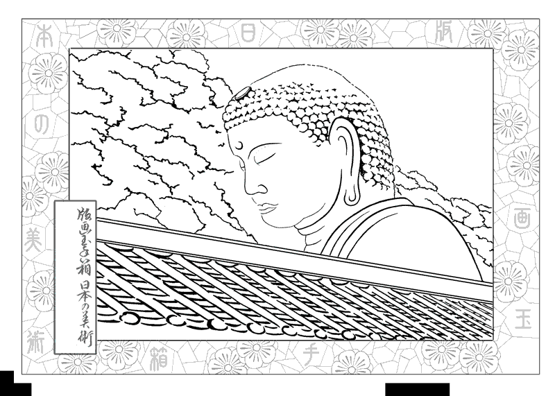
... he began to radiate some proper 'peace and harmony'. But returning to the original photo, I realize that somewhere along the line I managed to get him sitting up a bit too straight, so I pushed his head forward a bit:

And that, I think, is where I am going to leave it for a bit. I've already begun carving the rooftop and greenery, but will keep the 'head space' clear until at least tomorrow, so that I can let this sink in and percolate for a while.

