Posted by Dave Bull at 2:26 AM, May 18, 2012 [Permalink]
If you followed the Google image link that I included in the previous post, you will have seen that the Kamakura Daibutsu can be viewed and 'framed' in a huge number of different ways.
Just how to depict it will depend on a number of things, but one over-riding factor will be the relatively small size of my print (this is of course decided for the entire series). I'm pretty good at getting a lot of detail in my prints, but that's not the approach we need to take every time!
Here are a few images showing some earlier woodblock versions. First ... Hiroshige:
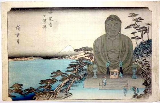
What a mournful looking Daibutsu! Did Hiroshige actually go and look at it? It seems doubtful ...
British designer Elizabeth Keith did one in 1919 (carved/printed by Watanabe):
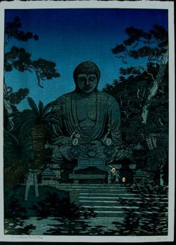
And Kawase Hasui had two kicks at the cat, a simple postcard version, and a large o-ban print. This was also by Watanabe, and it's curious to see that both the Watanabe editions use leaf shadows on the stonework, although in Hasui's version the steps have changed, as the statue's base was apparently destroyed in the 1923 earthquake.
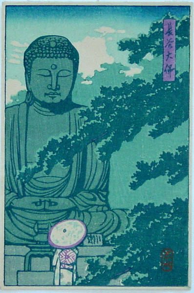
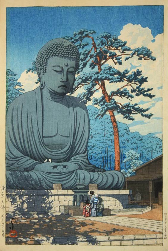
It's curious also that Hasui - just like Hiroshige - got the thing 'wrong'. Here's a photo from basically the same angle as Hasui's version:
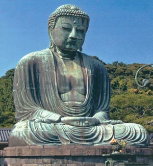
Not quite sure why Hasui thought that the Daibutsu might look better with a football helmet ...
Anyway, all those designers took the same basic approach - a full view of the statue in its surroundings with some overhanging tree branches for 'compositional effect'. I don't think I have quite that much room, and there's a idea I've been mulling over for quite some time ... but let's save that for the next post!

