Posted by Dave Bull at 3:47 AM, July 22, 2010
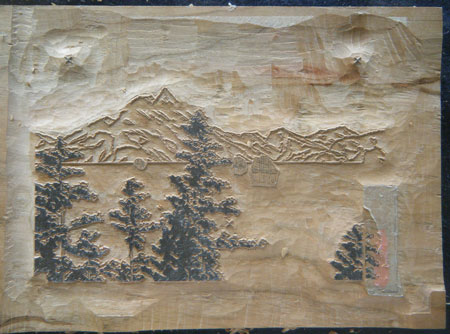
Although it is now extremely hot here - even down by the river - the work has moved forward, and the key block for the Hasui design is now done:
Just before completion - with the small boats waiting:

And after washing (under the strong light bulb at night, sorry):

The empty zone over at the right is where the cartouche lettering will be carved later, after I get the master copy of the calligraphy back from collector Tauchi-san, who has taken on the chore of doing them for the whole series.
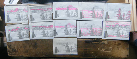
But I can get busy on the colour blocks while waiting for that to arrive. I think we are looking at 12 faces in all (including the key), but I'm not sure how many impressions it will be; there are going to be a number of gradations and overprintings, obviously. Here are the separations, ready to be pasted down (click to enlarge):

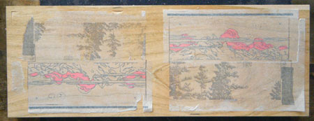
And here is one of the colour blocks, waiting for carving to start:

If you have been 'following along', you should have questions here!
I thought the wide blocks were so you could print two different prints at once? So why are you putting the key block for this one twice on one block, and why are they oriented differently?

It seems that the different orientation is so that each separation can effectively be on the "left" side of the block. What I want to know is why the two color separations that are pasted down seem to be almost exactly the same (I think I see one difference, but I'm not quite sure of that, even).
On another note, I saw your daughters' business in Martha Stewart Weddings! Now, if only we could get you listed in their registry suggestions...

Thanks for the comments ... I'll be covering this in one of the upcoming posts, but for now can mention that there are a number of different reasons for putting two designs on one piece of wood, and only one of those is that printing the same colour side-by-side saves time. In fact if you look back at the two previous pair sets, there haven't actually been many (any) cases where the colours do line up (except for the key blocks) ...
Anyway, there will be two prints on this block set; (at least there will be when I have figured out what the 'other' design is going to be!)

Ah, so are you doing the "One set of blocks, two different color schemes producing vastly different images" thing? I remember seeing a few different editions of one of Yoshida Hiroshi's sailboat prints, and the difference between them was impressive, especially since they used the same blocks.

One set of blocks, two different color schemes
That is really something I want to do at some point, but I don't think it would be so suitable for this series. I think people would prefer me to do 'all new' designs for each one ...
It was also something that I originally considered for the Solitudes series - sticking to four exact locations, and just changing the season. But I didn't have confidence that I could make them interesting enough to counteract the negative impact of having so much repetition.
So the idea - at present - just remains on my 'to do' list ...
As for what is happening here, it is explained in the next post.

Well, I can only speak as one collector when I say that it wouldn't disappoint me at all, especially if you did a pair that was, like Yoshida's sailboats, literally Night and Day. Even so, maybe it wouldn't be ideal to put them right next to each other in a series... see how many collectors you could fool into thinking they hadn't seen this print before!

