Continued from [River in Spring - 1]

I spent the past couple of days preparing the set of tracings to guide the carving. This print will have a 'key' block, in the sense that there is a block with a number of black outlines, but that block won't be carved first and then used to produce colour separations, as in the classical procedure.
Instead, I'm pulling colour separation sheets from the Photoshop rough-up. I think everything should match up once I'm done, but I'll certainly have to be careful when cutting the colour blocks, and keep to the 'plan'.
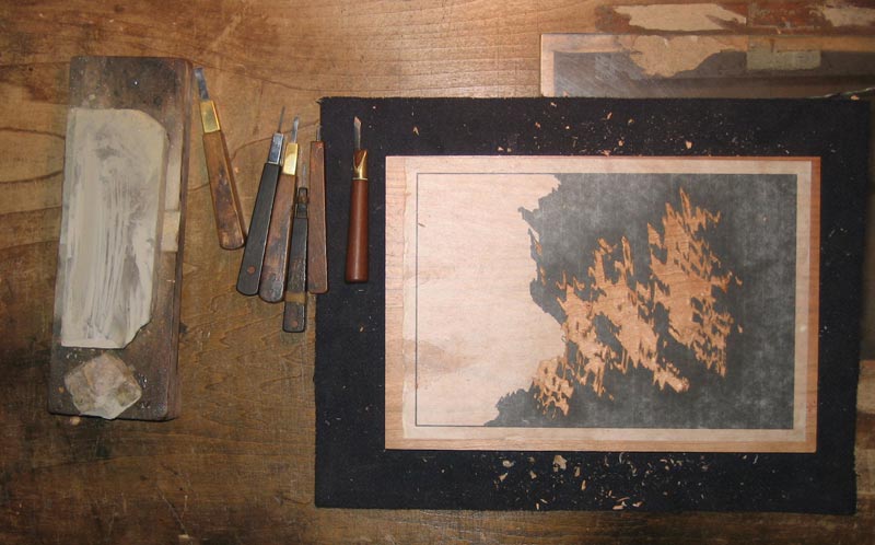
Speaking of colour blocks, here's the second one, nearly done ... (clickable)

The thread continues in [River in Spring - 3] ...
Posted by Dave Bull at 2:11 PM
| Comments (3)
Finally time for work to begin on the next print in the 'My Solitudes' series; this will be the River in Spring. We've had three river views so far, and this will be the fourth and final one from that location. As you can see from the small images on the index page for the series, only one of the three has been a 'clear' view of the area; the other two took a different direction. So I have been thinking that this one should 'pull back' and show a good overview of the place.
Here are a couple of quotes from the story. I think either one of these could make a good starting point:
I hadn't realized it when here during the other seasons, but I now learn that there is an extra bonus to this spot that I have chosen for my camps. One of the trees on the opposite bank, upstream a few metres from where I sit, is a cherry. It's not a particularly large or showy one, but the branches do hang out over the water in an attractive way. It is now in bloom, although in this evening light the blossoms are little more than clusters of pale shadows against the dark background. When I open the tent flap in the morning this tree will be the first thing I see, and in that fresh new light it will certainly set the stamp of the season on this trip.
... and ...
As I get to the top of the path, at the point where the road becomes visible and I 'return to civilization', I turn back for another look at the river. I hadn't noticed it before, even though I have passed this way many times, but the view from this point is quite attractive. Well, I'm in no rush this afternoon, so why not ... I swing my pack off, lean it against a fallen trunk at the side of the path, and take a seat. Nearby trees on the hillside form a frame for the scene. The water down below is seen just at the point where it leaves the deep pool at the base of the tall crag (which no longer looks very high seen from this point!). The steep cliff on the opposite shore catches the afternoon sunshine. I can no longer hear the ripple of the water rushing past; that 'soundtrack' - which has been with me unceasing over the past 24 hours - has been replaced by the sound of birdsong in the forest around me.
Back when I made those camping trips that eventually became this 'Solitudes' series, I had no intention at all of creating prints of the places; I was just camping. But I sometimes took my camera with me, and digging through the photo albums now I see this image (from 1997) that matches that first quote. This isn't much of a 'design', but anyway, just so you can see the place - the lonely cherry tree:

I turned up no photos of the other view - from the top of the path - so jumped on my bike and made a scouting trip over there the other day. This is the location:

This one has possibilities; there are any number of ways to organize the elements, the water surface, the overhanging trees, opposite bank, etc. etc. I took a number of shots to give me plenty of ideas, and then came home to sit and think about it ...
But.
Before I get too far involved in this, there are a couple of things to think about. The first, which I have been talking about in emails with friends recently, is that the last few prints in this series have moved off in a direction that I really don't want to go. They have included far too much 'realistic detail'. Now this isn't just a reflection of their roots in photographs. After all, the very first print in this series was also 'based' on a photograph, as described and illustrated here, but yet it ended up clearly looking like a print.
Where to draw the line between abstraction and realism is turning out to be a difficult decision. I want the prints to look 'real' - I'm not an abstractionist - but if they end up looking completely realistic, then there's no point in making woodblock prints. So this next one is going to move back a step or two, more in the direction of that first print.
There is another factor though. Of the eight prints finished so far, two stand out head and shoulders above the rest in terms of the reaction they have received from collectors, and the 'market'. I get frequent emails from people asking to buy 'just that one please!' ...
As you know, I don't break up my sets to sell these prints individually, so I regretfully have to decline such orders. But it would be foolish of me to ignore what is happening - this is feedback. Those people are saying "This is good - I like this!"
The two prints are the River in Winter, and the Seacoast in Summer:

What do these designs share?
- focus - elimination of extraneous material; there is just 'one' idea
- originality; they are a surprise when first seen; they have an 'eh?' factor ...
- and yes ... absolute photographic realism!
Mostly though, what I myself find most attractive about these two is the 'originality'. I'm very happy to have come up with two ideas that - even though they are very simple - have a 'look at that!' aspect to them. I'd love to be able to do that again, with this print!
So I spent quite a bit of time sitting and thinking about all these things, and how they may interplay with those images of the two design concepts I introduced above. A couple of days ago a bit of an idea came to me, and I scribbled some quick shapes on a sheet of paper. Hmm ...
I looked through a number of the books on my shelves to see how other print designers handled similar ideas, and although I found related work, didn't find anything quite like this.
So I put together a rough mockup of what the thing might look like, and slept on it. In the morning, when I opened the image to see it with somewhat fresher eyes, I couldn't decide which way to think ... "Wow, look at that!" was one reaction. "What the hell is that?" was another.
That's all the encouragement I need! :-)
* * *
I'm not going to show that concept image at this point. The real print is still only something inside my mind, and I don't want to give you a distorted view of the thing by posting something different. But I will post progress shots as we go along ...
One thing to mention right away: no photographs - none at all - will be harmed in the making of this print!
Anyway, let's begin. I'm going to chop a small piece from the River in Summer print, and start there:
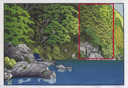
That red lined area will be our print. :-)
The thread continues in [River in Spring - 2] ...
Posted by Dave Bull at 10:45 AM
| Comments (7)
The 'Summer Sale' that I held for a few weeks last year - featuring one special print - was quite successful, so perhaps it's time for another one. But we won't wait until August, we'll have it right now, while the plum blossoms are in bloom here in Ome!
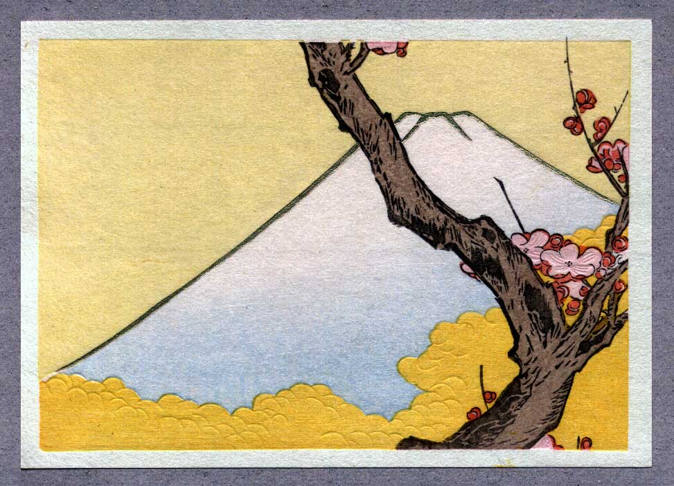
We'll do the same thing we did last time; I'll choose one design from among the prints that I normally only distribute in set form, and make it available as a single item. It's 'Spring Fuji', a design by Teisai Hokuba, a pupil of Hokusai.
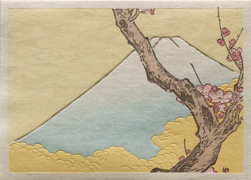
This is the first of the 24 prints included in my Hanga Treasure Chest, and there is an interesting reason why it is this print in particular that was chosen for this sale.
In December 2004 I was in incredible time pressure on my work. I was wrapping up the printing on the last of the four prints in my Beauties of Four Seasons series, while at the same time getting ready to launch the new Treasure Chest series (and do all the preparation and publicity for the January exhibition). On top of all this, I had to cut and print a few hundred copies of a design for a new year greeting print. It was all getting to be a bit much, and I came up with the idea of doing a 'double print' - cutting a 'two-up' set of blocks that would include both the new year design and the first print in the Treasure Chest.
This wasn't an original concept; making such combined blocks was very common in the old days, especially with smaller prints like this. Sometimes the same design was cut side by side, and sometimes different designs. When that was the case, they were usually selected to use similar colours, and this would really save time in the printing.
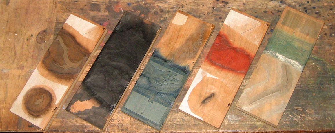
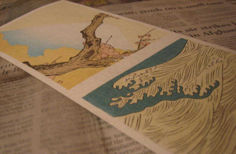
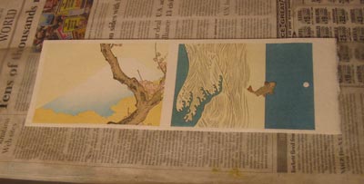
I went ahead with it, and cut this set of blocks (the back sides are also used, but not shown here):

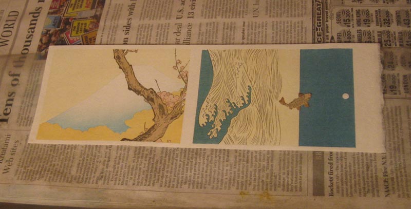
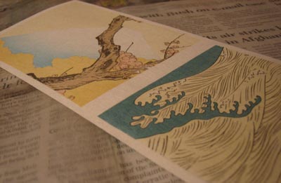
One half is this Spring Fuji print, and the other half is the Leaping Carp, which was my new year greeting print that year. Here's a shot taken part way through the printing, with the two prints visible on one sheet of paper:
And a closeup ...
So ... those of you who have been following (or purchasing!) my Gift Prints recently can now 'put two and two together' and will understand why Spring Fuji is the print for this Spring Sale.
Yes ... the Leaping Carp was selected for the Gift page last autumn, so I had to print up a fresh batch of them for that. But that design is the one on the outside of the pair, meaning that the other one had to be printed as well, even though I didn't 'need' any copies just then.
What to do with them ... :-) The order page is here!
Posted by Dave Bull at 2:04 PM
| Comments (0)