Posted by Dave Bull at 10:35 PM, October 8, 2008
Continued from [River in Autumn - 9] | Starting point of the thread is [River in Autumn - 1]

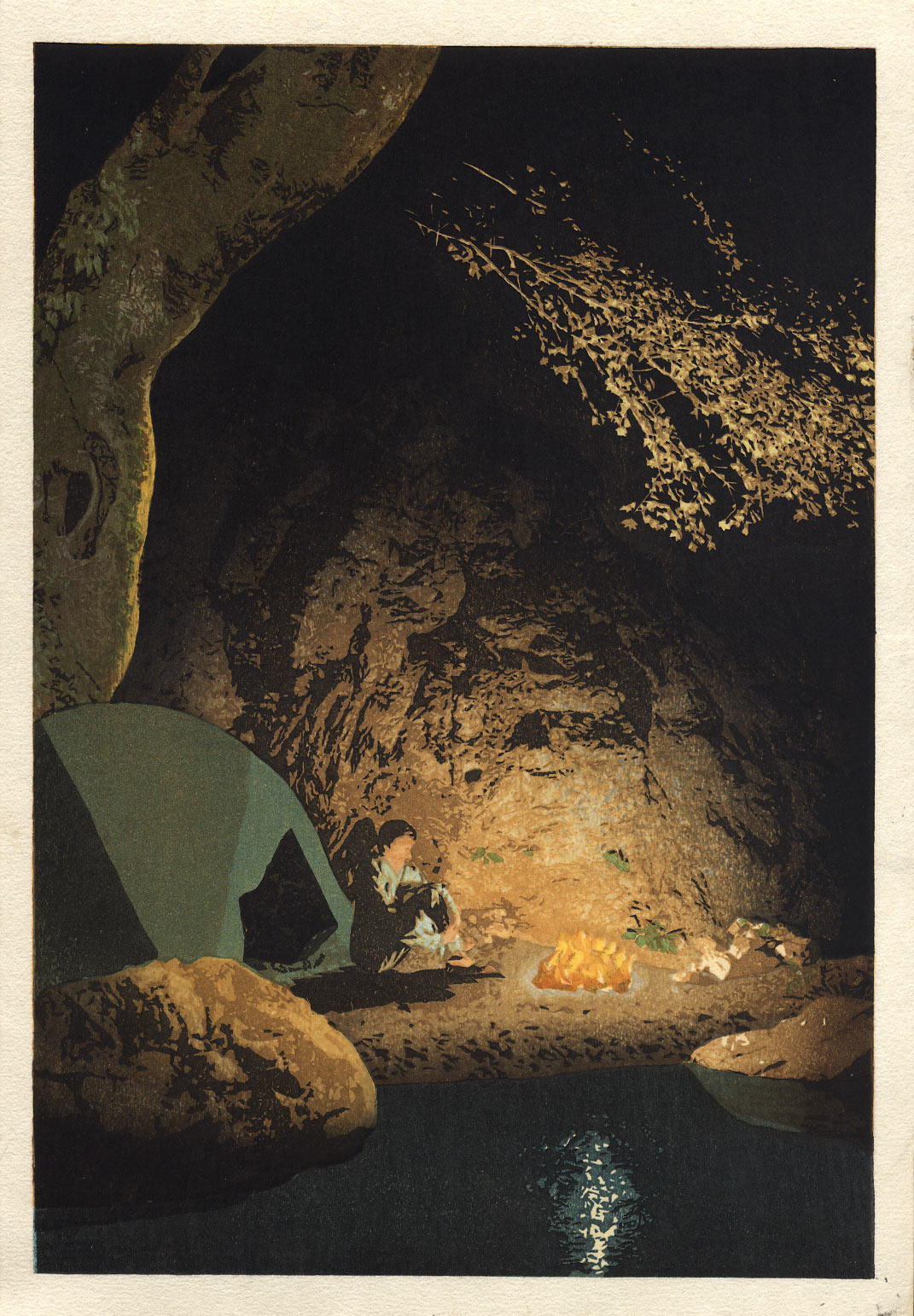
A couple of weeks since the previous update ... that's how long it has taken to get the first batch (of 110 sheets) done. There were a number of interruptions along the way of course, but as the weather here has turned markedly cooler, I was able to get it done before the paper 'gave up' ...
It's not dramatically different from the proof we saw in the previous post. I did try some changes: to the fire, to the reflection, and in some of the gradations, but nothing I did seemed to make any particular improvement ... so I decided to go with what we see here.

having seen the final print, alittle dissapointment. the figure is not there, and where is daves face. the fire is yellow and the water shows white, I am annoyed about this print....plus a tent....in green, colour it all you want. you could do a woodblock of a car! a proper one
anyway good luck with the next one, you can do it
Of course I feel passionate about your prints, that is why I can't help being critical.
I am not being nasty
I would hate to see such ability lost
having seen the final print, a little disappointment ... I am annoyed about this print ...
Well, not sure what to reply ... Back when I was making the Surimono Albums, I included in each set designs from a variety of sources. Nobody liked them all (except me of course!). But my hope was that people would see the set as an object in itself, even though some of the individual items inside it were not to their taste.
I think this current project should be seen the same way. I never promised that I would produce 12 'masterpieces' (whatever that means). I did promise that I would use my skills to produce prints that were as good as I could make them - but with the understanding that because I do not have an established body of work out there (speaking of my own designs), you have to be prepared to come across things that you might not expect to see. There is no established 'Dave Bull style'. In that sense, this series is very much an experiment, one being supported by the people who have chosen to collect the set, even though they have no idea what is coming up next.
Whether or not the experiment is wildly successful, or a total failure - or of course, probably something inbetween - is a judgement each viewer will make for himself. I myself think that the prints are coming out pretty well, although I can see things in each and every one of them that could be/should be improved. But they're done, behind me, and the focus moves to the next one ...
One point I might make about the comments re: the 'figure is not there' ... 'the face' , etc. etc. I myself do not think of this print as being 'realistic', although I understand that there is a lot of confusion about this. How can I say 'not realistic' when parts of this print are actually photo realistic? This is a kind of contradiction in the recent prints, and I suspect that this may turn out to become a defining characteristic of my work. Perhaps it may lead to the work being rejected as 'incoherent' or 'confused', or perhaps it may settle down to something that can be accepted. I myself have no idea; I just make the things.
Anyway, thanks for the candid comments; when I decided to keep most of the process out in the open, I was looking forward to having a good give-and-take with the viewers, and it seems that this is what I might get. I have a pretty robust ego, and I think I can 'take it'. :-)
I think you are being critical for the sake of critique. If you have ever observed night time reflections in water, you would have seen that they are often white, something about the light and the reflective quality of the water. It is not a true mirror. The green of the tent makes a nice balancing element and breaks what otherwise might be monotonous (a fault with many night-time images). Dave, I think you have done another masterful job!
and it seems that this is what I might get'
I am critical because of your talent
I only care about your printmaking
I would hate to turn this into a blog for dumbos!
I also think you have it within you...
there you go 4 I's
Take care
i will always be candid...the girl can't help it!
Hey Dave,
I haven't yet received the print to look at it directly, but looking at your digital image, I believe it to be a successful print. For comparable subject matter, check out these 3 prints designed by the eminent shin-hanga artist Hiroshi Yoshida [click for enlargements]:
To me, your print is more successful than at least 2 of those 3 (I'll leave it to you to guess which 2!).
As we discussed earlier, I would have preferred a more focused view of the fire, so that you could have had more of an opportunity to make the flames "dance". This would have been more in the vein of the water flowing over the rocks and the moon, which are so far my favorites of the series. But I truly feel that you've got nothing to be ashamed of with this print. You accomplished what you set out to accomplish. What more could be asked of you?
Marc
check out these 3 prints designed by the eminent shin-hanga artist Hiroshi Yoshida
... more successful than ...
Well, whatever else I'm trying to do with this printmaking work, having a competition with Yoshida-san isn't part of the calculation! But thanks for the vote! :-)
There is something that has to be mentioned though when looking at other such images, and that is the scale of the work. Two of those prints you link to are o-ban size (the common dimension for shin-hanga landscape prints, and one of them (Hunter's Cave) is a double o-ban - a massive print!
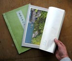
Mine are tiny! (For readers who haven't seen any of these prints in 'real life' this photo gives a rough idea. The prints are sized to fit inside an A4 book volume.
So to try and make a comparison between my scene and the Yoshida Hunter, based on equivalent little images on our computer monitors, is very difficult. (I'm not shooting at you here, Marc, just laying this out for the benefit of viewers who may not have been aware of this.)
In truth (have I talked about this before?) my prints in this series are all being made at the 'wrong' size. My 25+ years of training in this field has all been in making small, delicate, closeup work, so when I started this 'Solitudes' project, I just followed naturally in the same footsteps. I also had severe financial restraints - to start making these at the double o-ban size of the Hunter would have resulted in immediate bankruptcy.
But as it is turning out, I'm thinking that these designs I have produced are not really 'in the hand' prints at all, but should be up there 'on the wall'. The perspective is important, and that is destroyed close up. The view as a 'scene' is important, and that is completely missing when held in the hand. And these prints have very little of those features that are so important in a hand-held print: embossing, delicate fine carving, etc. etc.
When I get a minute to try it, I'm going to take some hi-res .tif files of a few of these prints down to Kinko's and get them printed out at larger size, o-ban, and maybe even a couple of them at double o-ban, so I can stick them up and stand back and see ... I'm thinking that at those dimensions, they may really have some punch. (I'm thinking of the river water print particularly ...)
Who knows, maybe this entire three-year project may have turned out to be a dead end ... inviting people to enjoy the 'close up delicacy' of the work, when what was really necessary was to ignore the detail, and paint with a wider brush. Contradictions, contradictions ...
I'd love to see this one on a 'gallery wall', up next to that Hunter!
Given the limitations of the woodblock media to imitate bright light at night, I think your print has brushed up against those limits quite respectably, Dave. This was a tough scene to do, but then you have always challenged yourself with some difficult scenes that nonetheless always seem to present something for us to appreciate. Aside from Hiroshi Yoshida who designed his prints as well as produced them, most had others to lean on for contributions of their expertise. You are a one man show!
'when what was really necessary was to ignore the detail, and paint with a wider brush.
I to feel your financial position...though worse, my rice bowl is empty!
The only sensible thing of value in art is vision.
Through quality and skill attributes are owned. you have those in bucket loads...
Still take time to find your image.
I do mean that in the right way
Take care
Tim