Posted by Dave Bull at 4:47 PM, September 13, 2008
Continued from [River in Autumn - 8] | Starting point of the thread is [River in Autumn - 1]

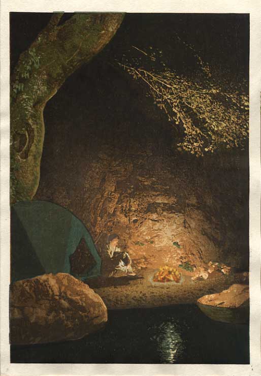
So, with a few days of proofing under my belt, perhaps it's time to show some of the results. Although I've been pretty open with the process of making the prints in this series, I haven't shown many of the proof printing steps. The reason is simple - most of them just don't look any good. This print is really quite complicated, and there is no way that I can prepare a sheet of paper, sit down with the block set, print each of the steps in turn, and then show you a 'beautiful print' right off the bat. Even though I know where I want to go, there is simply no way that I can put my feet in all the correct footsteps between 'here' and 'there'. At least not first time up. For a relatively simple print, I can usually get pretty close on the first time, but not with something like this.
So what I usually do - and what I did this time - is not attempt a 'real' print at first. I do a run-through of the block set, using colours/tones that should be related to what I expect to use, and generally keep things on the light side, to keep everything clear and visible. This gives me a 'feel' for the blocks, and I start to uncover such things as which block should be printed before others, etc. etc. things that are not clear until you actually try them.
But of course, the result doesn't look good; it's a kind of parody of what the print will (hopefully) come to look like later. Once this first sheet is done, I take it upstairs, pin it up on my cork board, and get busy with other work, of course taking a look at the proof now and then, to let it seep in ...
I then make myself a 'change order' list, starting to make notes about what needs to be altered to bring this sample closer to the final version, then get downstairs and have another go at it.
Each proof stage uses two sheets. With a print like this - around thirty steps - it's just too easy to screw everything up with a dab of 'too much pigment' on one block or something like that, so having a 'backup' copy right there at hand saves a great deal of time. One of the two sheets ends up being a 'quick test' sheet, and the other one the actual 'proof'.
Anyway, here we go. Here is a scan of the first rough version (images are all clickable for enlargements):

Now I don't have my notes for this - they were just scribbled on a sheet of scrap paper - but they must have included such things as:
- more contrast - darken the darks ... it's just too 'dull'
- human figure doesn't stand out
- water is far too 'bright'
- bottom left boulder is unanchored
- fire doesn't glow ...
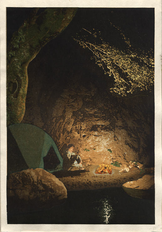
With those points in hand, the next morning saw this one come off the blocks:

Clearly improved! But so 'dull' in tone still ... Maybe these were the next notes?
- make this 'warmer' ... it should look inviting
- human figure still doesn't stand out
- top left tree is too 'flat'
Moving on ... to version three:
Much warmer! But still problems ...
- bottom left boulder is worse; now unanchored again ...
- still the figure doesn't stand out!
- reflection in water at right is too bright; not natural for night-time ...
- what's with the speckles inside the tent?
- tree at left much improved, but it wouldn't have that much light overall ...
- needs more saturation ... still darker blacks, etc.
So, back downstairs again, and just a few minutes ago, I finished up the fourth trial.
We're definitely getting closer now! But each time, at around this stage, the big question raises its head - when to yell "Cut! Print!"
I don't think that this is 'it'. There are still things to change:
- overhanging branches are catching too much light I think; they should 'disappear' into the night ...
- the campfire is wimpy ... just doesn't glow enough
- maybe that stone in the water at right is too bright
- the light edge of the left tree could be glowing more ...
- tent should be smoother colour; no reason for the 'goma' there ...
- the ground around the fire looks strange; might need a block plug somewhere there ...
- there is a faint white line underneath the overhanging branch - this is an indentation in the paper from the edge of one of the rockface blocks ...
And other than these, there are still quite a few block trims and adjustments to be made (there is no key block being used here, so a lot of the registration is very difficult ...)
Anyway, that's where she stands at the moment. I'll now pin it up on the wall for a couple of days while I get busy with other jobs (and the paper preparation), and will either make a fifth run at it, or just dive into the main printing, with a list of things to be changed 'on the fly'. I'm sure that it could be 'improved' endlessly with more proofing, but that's a luxury that I just don't have. If I don't get this thing out the door and off to Ichikawa-san for binding within the next couple of weeks, the bailiffs will be knocking on the door come the end of next month!