« January 2008 |
Main
| March 2008 »
Woodblock Widget ready for download ...
Mac user? Got 10.4 or newer OSX? Interested in keeping track of the prints on Woodblock.com?
Here you go! The Woodblock Widget is now available for download:
The Widget - easily loaded into the system Dashboard - shows a small image and description of the most recent print, and is of course 'clickable' to take you directly to the appropriate page of the website. It updates each time a new print appears on the site.
And of course ... it's a free download! Get it from here, or directly from the Apple Widget Website.
Posted by Dave Bull at 11:25 AM
| Comments (2)
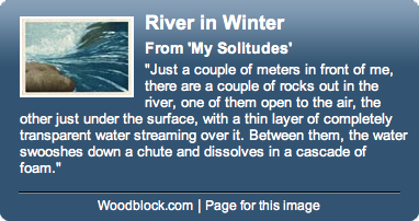
[River in Winter - 10] : Impressions 19 ~ 23
Continued from [River in Winter - 9] | Starting point of the thread is [River in Winter - 1]

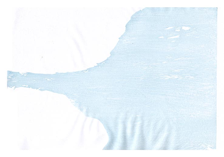
Step #19 - Again re-using one of the earlier blocks, a thin layer of blue helps push the stones under the water ...

That impression by itself (on scrap paper ...) :
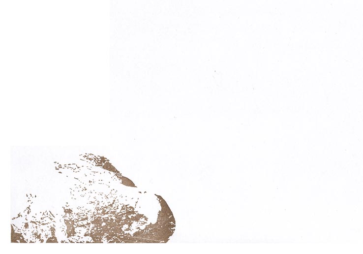
Step #20 - This one is just for fun ... a small 'touch' on the stones ...
That impression by itself (on scrap paper ...) :

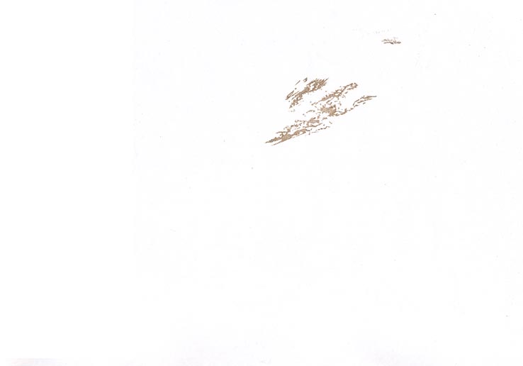
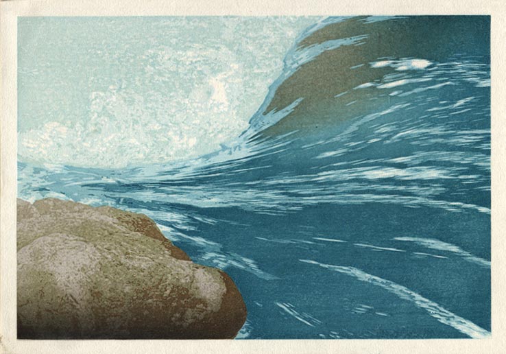
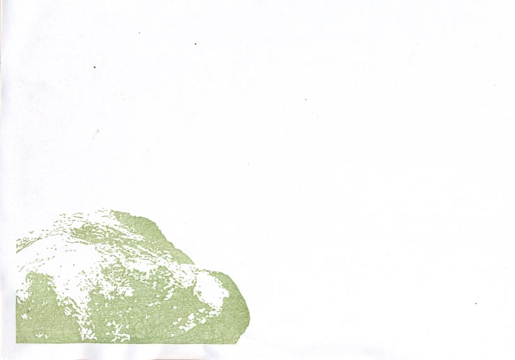
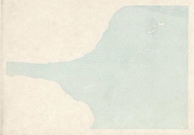
Step #21 - A bit of rough carving, to give more texture to the underwater stones:

That impression by itself (on scrap paper ...) :
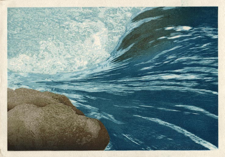
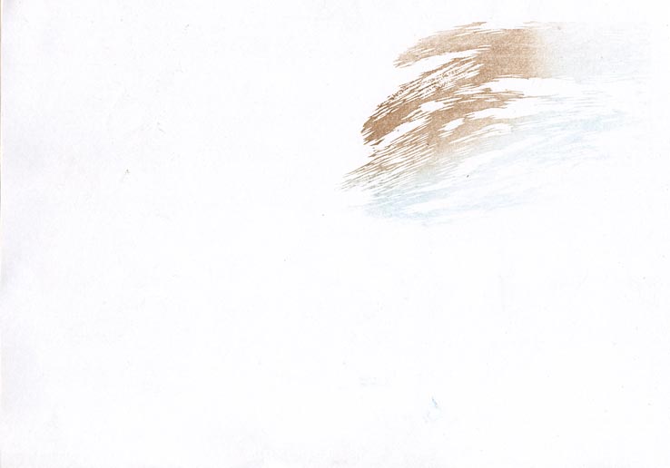
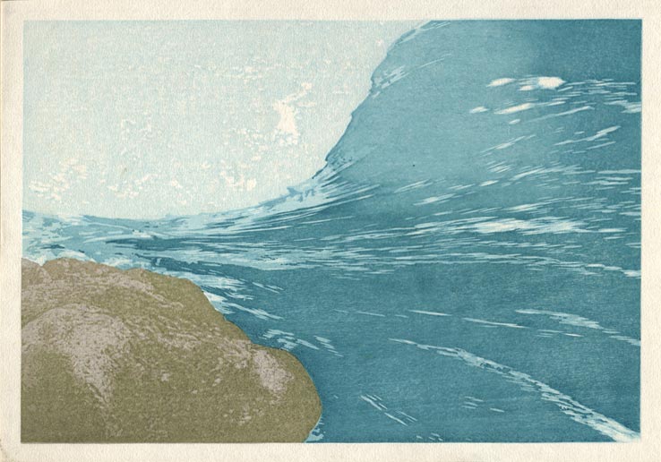
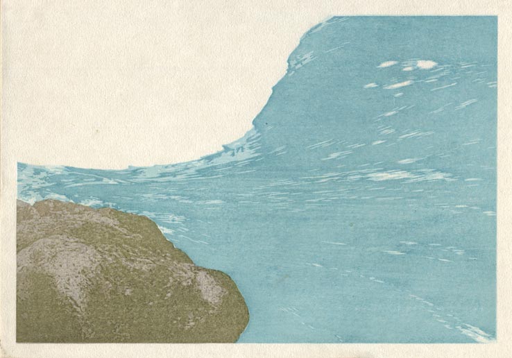
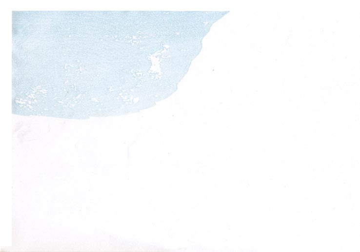
Step #22 - And a bit more water over the top of them ...
That impression by itself (on scrap paper ...) :

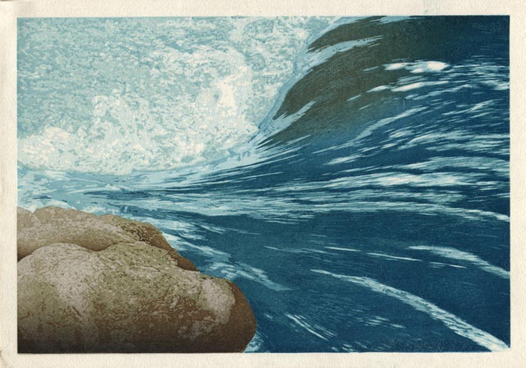
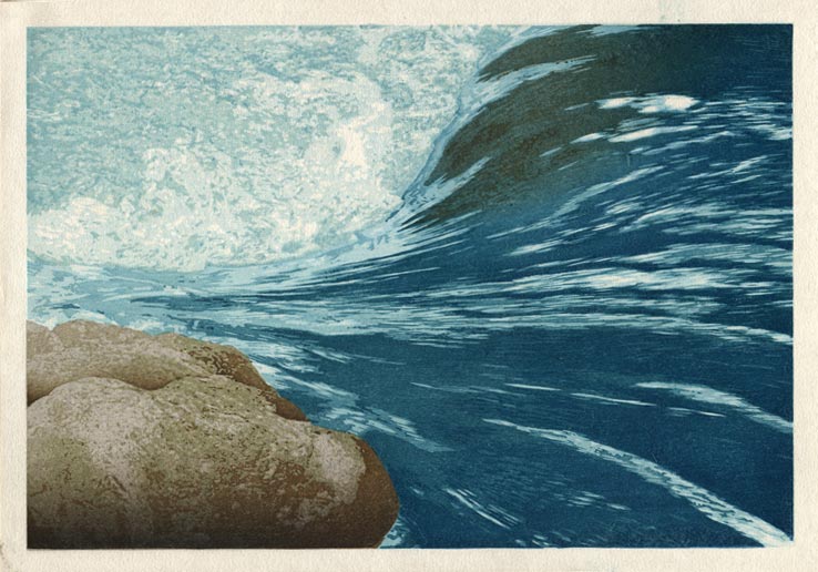
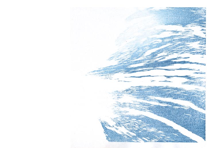
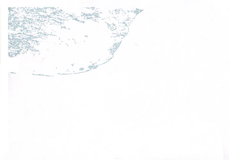
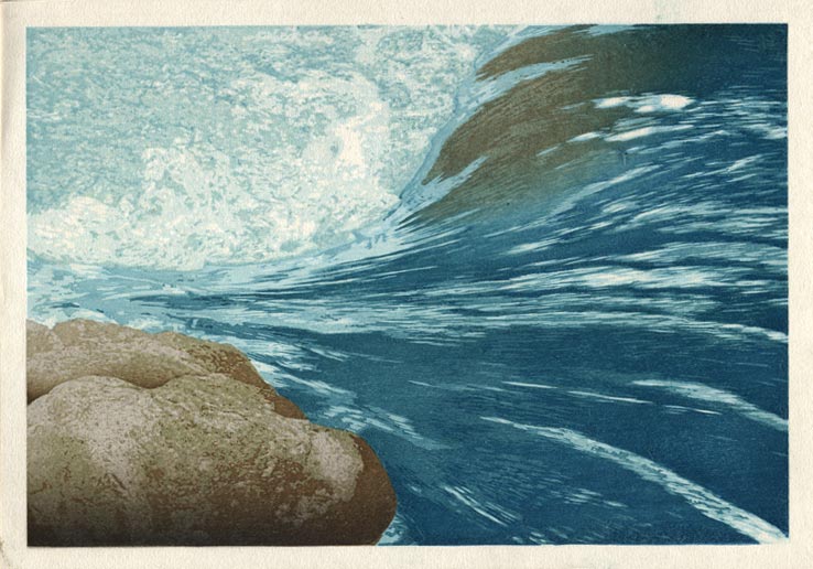
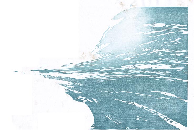
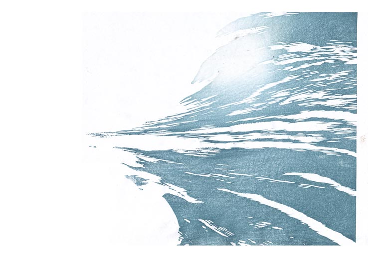
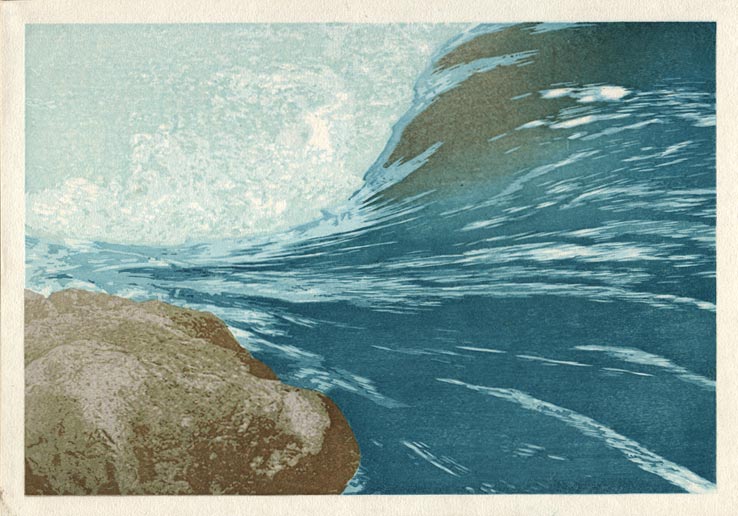
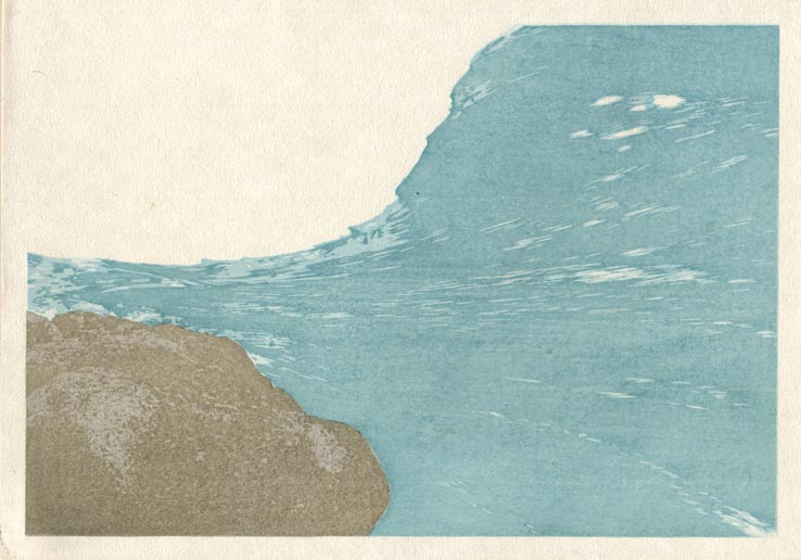
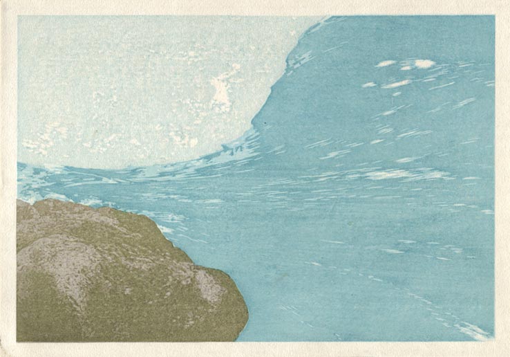
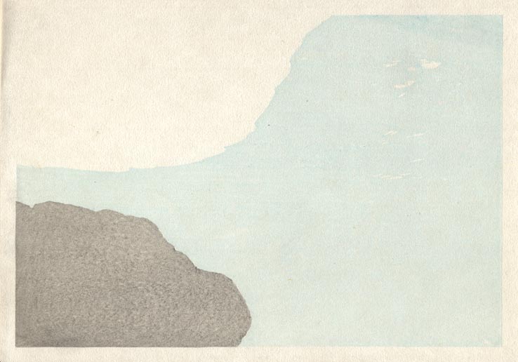
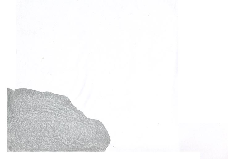
Step #23 - And here we are - a re-do of the base tone block for the stones, to darken them a bit ...
That impression by itself (on scrap paper ...) :

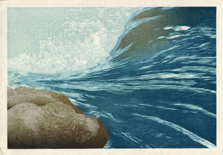
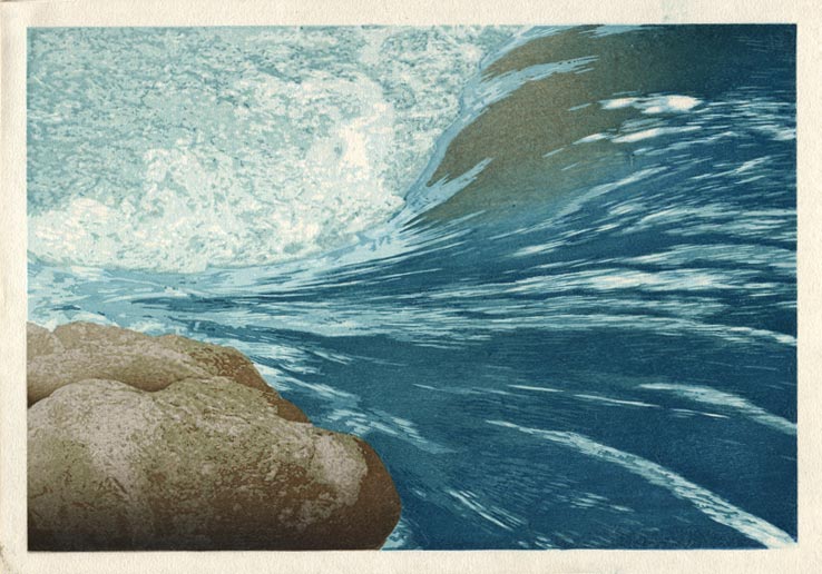
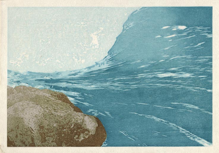
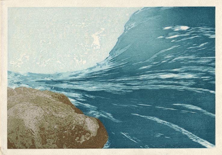
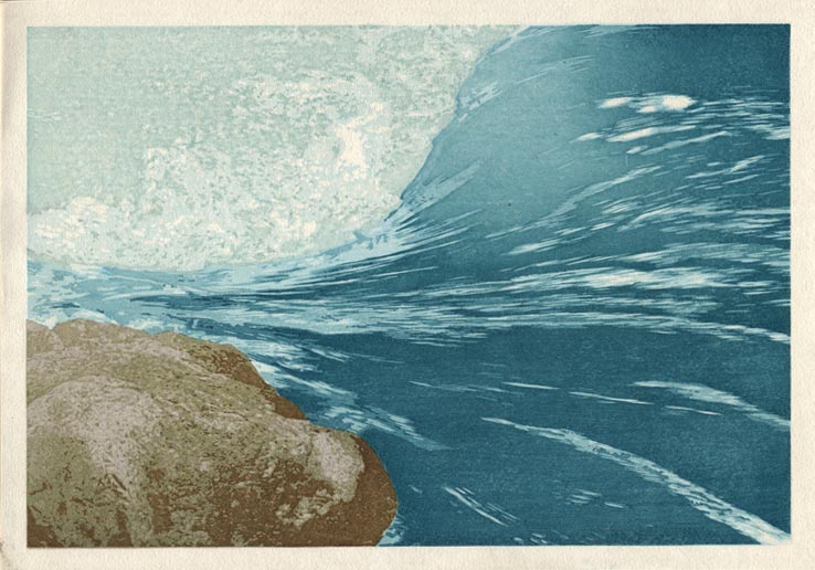
Now that we've come all the way, I've put up the slideshow version of this process ...
Is this the only print that could be made from this set of blocks? Not at all ... this one has pretty much infinite variations possible. It would be fun to play with them and see what else could be done, but such experiments will have to wait for 'another day' ...
Posted by Dave Bull at 8:31 PM
| Comments (2)
[River in Winter - 9] : Impressions 14 ~ 18
Continued from [River in Winter - 8] | Starting point of the thread is [River in Winter - 1]
Step #14 - A simple gradation at the bottom of the stones makes them 'disappear' off the edge of the print ...
That impression by itself (on scrap paper ...) :
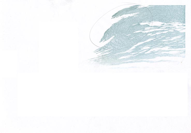
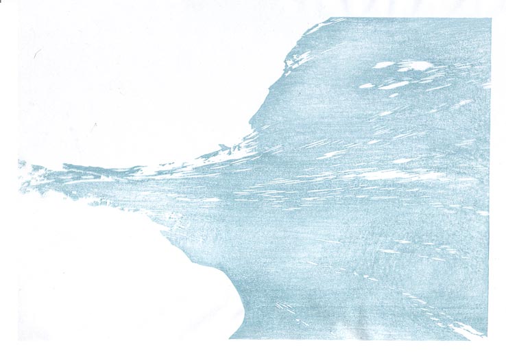
Step #15 - This is the sixth and final tone level on the main rushing water. We'll have a few more overprintings later, but the basic breakdown is now visible.

That impression by itself (on scrap paper ...) :
Step #16 - The two stones need to be pushed apart, and a couple of small gradations will do the job ...
That impression by itself (on scrap paper ...) :
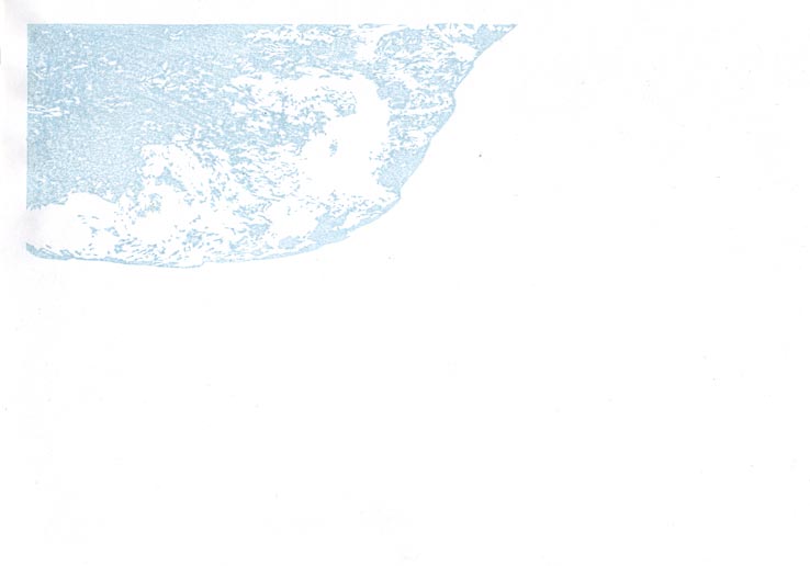
Step #17 - This is the last impression on the foam area ...
That impression by itself (on scrap paper ...) :
Step #18 - Back to the underwater stone, using the same block as Step #15 above ...
That impression by itself (on scrap paper ...) :
The thread continues in [River in Winter - 10] ...
Posted by Dave Bull at 8:30 PM
| Comments (0)
[River in Winter - 8] : Impressions 9 ~ 13
Continued from [River in Winter - 7] | Starting point of the thread is [River in Winter - 1]
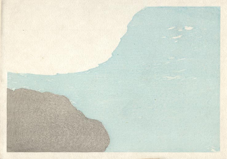
Step #9 - Here's the fourth level of water, and something a bit different starts to happen - I'm leaving a 'bald' patch in the impression. This of course is where the underwater stone will go. This same block will come into play twice more, once for the stone, and then with blue to cover it, but I want to be able to control the levels separately ...
That impression by itself (on scrap paper ...) :
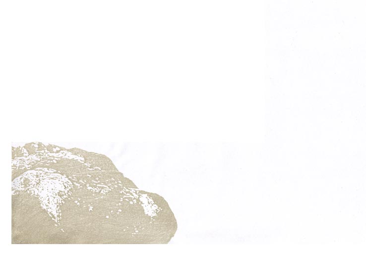
Step #10 - Another tone level on the foreground stones ...
That impression by itself (on scrap paper ...) :
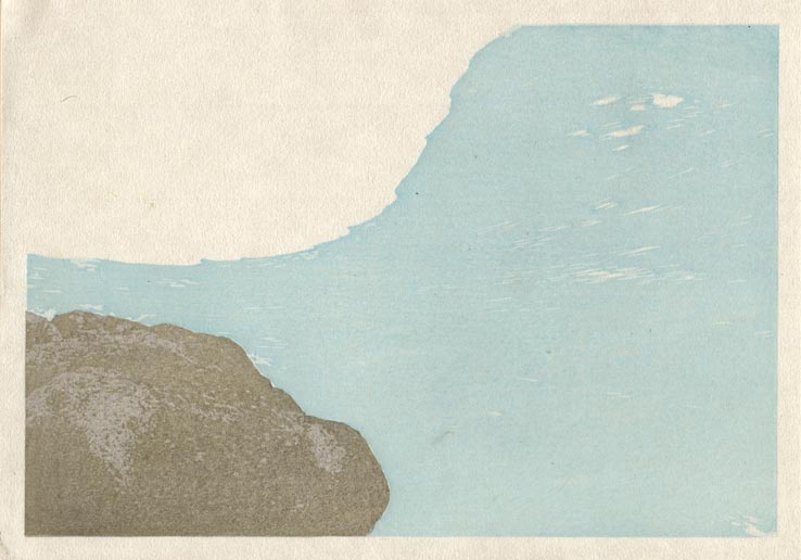
Step #11 - Then back to the water, for the next level of tone. Again, the underwater stone area will be done separately later:
That impression by itself (on scrap paper ...) :
Step #12 - Over to the foam, for the next level ... Keep moving around the print, never allowing any given area to get too saturated ...
That impression by itself (on scrap paper ...) :
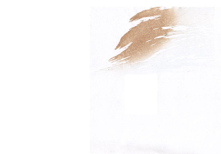
Step #13 - And here we go, the same block used in Step #9, with a brown gradation ...
That impression by itself (on scrap paper ...) :
The thread continues in [River in Winter - 9] ...
Posted by Dave Bull at 8:28 PM
| Comments (0)
[River in Winter - 7] : Impressions 4 ~ 8
Continued from [River in Winter - 6] | Starting point of the thread is [River in Winter - 1]
Step #4 - Back to the water for the next level of tone. Same colour exactly - just there are a few cut-outs here and there, which you can see better if you click for the enlargement.
That impression by itself (on scrap paper ...) :

Step #5 - Next is one of the tone layers on the foreground stones; so long to carve - just a few seconds to print!
That impression by itself (on scrap paper ...) :
Step #6 - Back to the water, for the next level. The colour now is changing slightly, with a tad more yellow mixed into the blue, to give a more greeny feel ...
That impression by itself (on scrap paper ...) :
Step #7 - Over to the stones again, for a splash of mossy dapple ...
That impression by itself (on scrap paper ...) :
Step #8 - Time to move over to the untouched top area of the print, with a base tone for the tumbling foam ...
That impression by itself (on scrap paper ...) :
The thread continues in [River in Winter - 8] ...
Posted by Dave Bull at 8:25 PM
| Comments (0)
[River in Winter - 6] : Printing begins ...
Continued from [River in Winter - 5] | Starting point of the thread is [River in Winter - 1]
So with the annual exhibition now out of the way, it's time to get back to work! There are 112 sheets in the stack for this batch; this will be the first run, to be followed by another batch of 112 later. Here are the first steps:
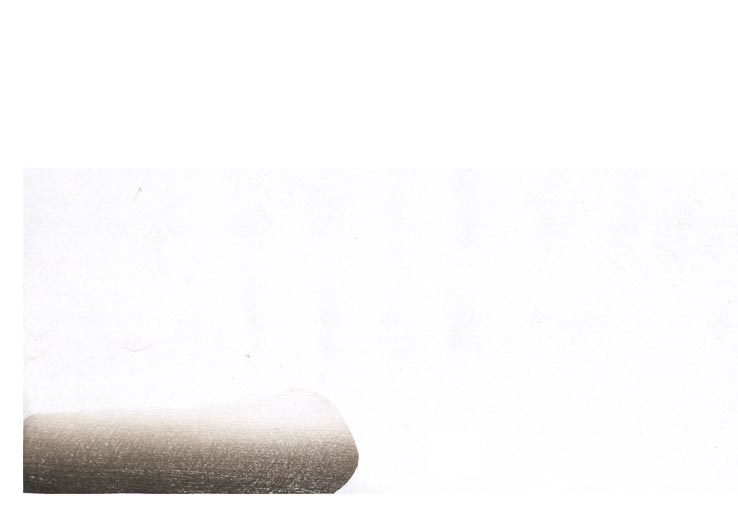
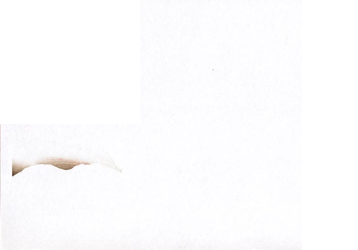
Step #1 - Here's the blank sheeet, ready to begin. There is no blank 'beta-ban' for this print, as I want to preserve the body of the paper in the area of tumbled foam.

Step #2 - The actual printing starts off with the first undertone for the rushing water area. Not much 'rushing' yet, is there!
That impression by itself (on scrap paper ...) :
Step #3 - Rather than put the next colour onto the water, it's best to keep moving around the print, to avoid saturating the paper in any given area. Next up will be the base tone on the foreground stone:
That impression by itself (on scrap paper ...) :
Posted by Dave Bull at 11:10 PM
| Comments (0)