Posted by Dave Bull at 12:30 AM, June 2, 2007 [Permalink]
Continued from [River in Summer - 13] | Starting point of the thread is [River in Summer]

Once the print is finished, I will be making a page with all the step-by-step images placed in sequence, but for now, let's show them here on the RoundTable. (Update: the slideshow with those images is here) (Update #2: Don't miss the Colour Your Own page, where people are making their own versions of this print!) Anyway, here we go with the step-by-step ...
Impression #1 - beta ban (block):

That's the result of the beta-ban printing - the margins aren't touched, but the central area of the paper is now smooth and flat.
Impression #2 - key block (block):
Because the paper is so smooth and receptive, very little pressure is needed to get a good impression of the keyblock.
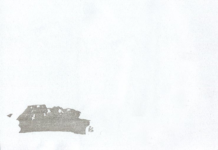
Impression #3 - base grey tone on boulder:

This is the first of 'quite a few' tone impressions for the boulders. There are going to be five levels of grey, but it will take many more than five impressions to do it, as it was necessary to split some quite similar areas up onto more than one block ... for reasons that will become apparent later!
Here's that impression by itself (on scrap paper ...) (block):
Note: All the process steps are clickable for larger versions. I am going to do my best to scan all these steps with the paper held in the same spot on the scanner bed, so if you want to play around, you can save copies to your own computer, and then 'stack them up' in image software (like Photoshop), to make a 'slideshow' of the print coming to life ...
The thread continues in [River in Summer - 15] ...