Posted by Dave Bull at 10:45 PM, September 22, 2012 [Permalink]
A very long and full day of printing today, and lots to show you!
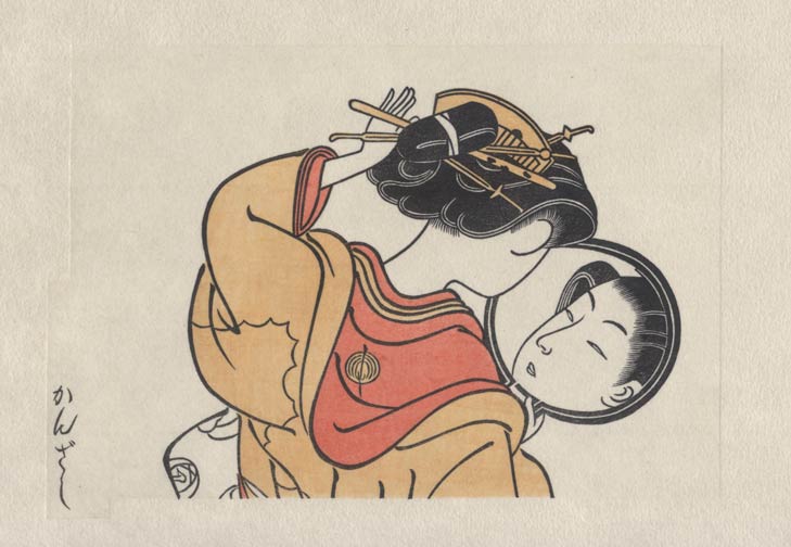
First up is the pale vermillion tone on her under kimono. The pigment has a touch of sumi mixed into it, to bring the 'brightness' down to a level that will match the kimono that will surround it later:
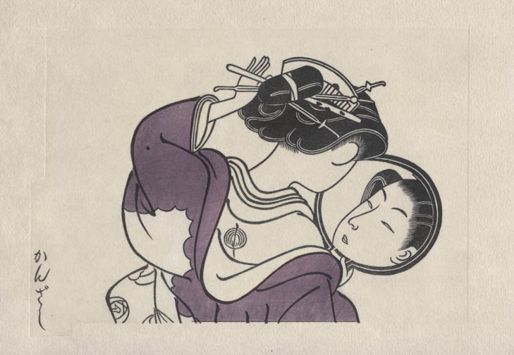
Now, before I show you the next stages of the print, I'd like to put up an image of one of the test sheets I did last week. This is a proof sheet showing the raw purple colour that I will use for her outer kimono. Note that in this case, it is printed right on the bare paper, with no undertone. The colour you see here is basically what is in my pigment bowl:
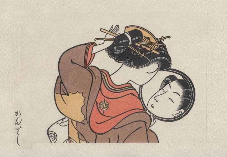
And here we have exactly the same colour, printed in a light impression onto the print itself. Hard to believe it's the same stuff, but it is ...
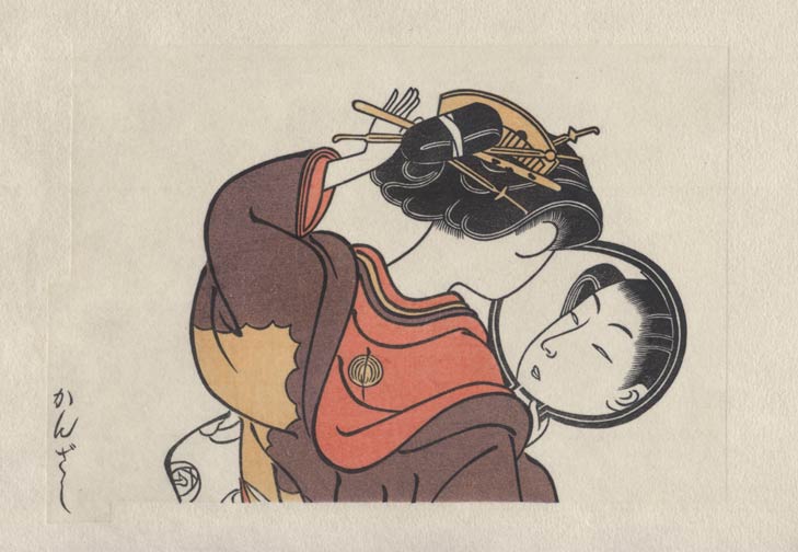
Now that's not a bad colour, but this is now where we will be leaving it. Once I got to the end of the stack of 120 sheets, I flipped it over and started again at the beginning, with the same pigment and the same block, doing a second impression of the same thing. And this will be the final tone for her kimono, quite similar to the colour known as 'Kodai Murasaki' (Ancient Purple):
There must be a good reason to go through twice the effort to do 2 light impressions, rather than to do a single medium impression, else you wouldn't do it that way. The finished color is certainly a lovely tone, but it would be nice to get an explanation of why the 2 impressions were necessary to get it.

Couple of reasons Marc. First is that it really does have a bit more depth when it's done that way. Doing a lighter tone always leaves a bit more of the undertone showing, and even if you do it twice, the effect is preserved.
But there is also another reason, one that I suppose I shouldn't 'advertise' too heavily, so keep this to yourself, OK? It's that when doing a single impression of a deep and rich colour, you only have one chance to get it perfect. The colour has to be perfectly smooth across every part of the printing area, with no brush strokes visible at all. With pale colours, it's easy, with deep and rich colours, it's very difficult.
When doing a double layer of paler tone though, you have a kind of safety margin. The printer will brush out the first layer at one angle, and the second layer at a different angle, thus covering up all brush strokes. And any slightly 'thin' spots usually get covered by the other impression. There are far fewer spoiled copies when doing it this way. A very highly competent old-style printer would laugh at this, "Just lay it down and print it; once is enough. What's your problem?"
But that was then, and this is now ...