Posted by Dave Bull at 2:23 AM, June 13, 2012 [Permalink]
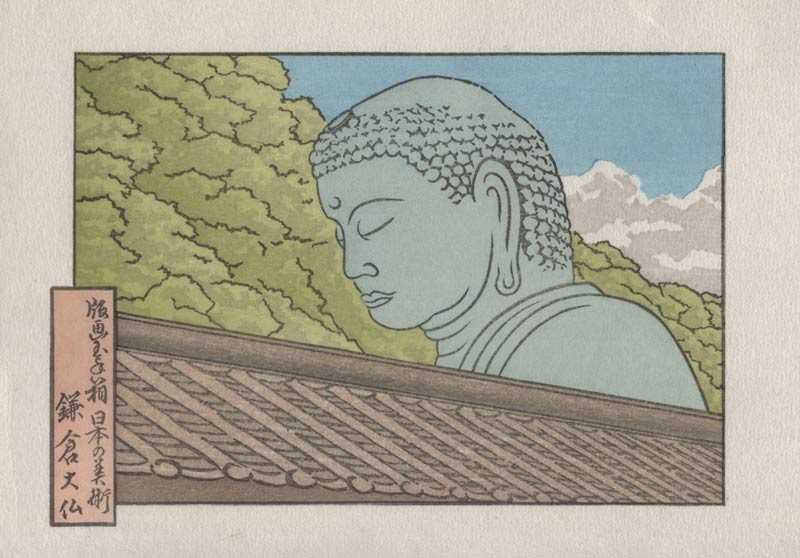
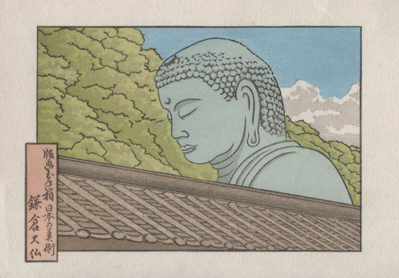
The next three - the final three actual colours - are all small in area, but make a nice difference in the appearance. Let's put a thin gradation along the base of the ridge of the roof:

And at the bottom edge of the image, a darker tone to the wall there should give a bit more three-dimensionality to the near edge of the roof:

And then finally, the statue does need some shadowing. I wrestled a lot with this, trying some more 'dramatic' effects, before pulling back and leaving just a few light touches here and there. I think this approach is more suitable to the overall quiet and peaceful mood that we have created ...

That's it, except for the outer embossing block ...

