« Arts of Japan series : print #1 - printing steps 14~16 | Main | Arts of Japan series : print #1 - printing steps 21~22 »

Arts of Japan series : print #1 - printing steps 17~20

Posted by Dave Bull at 2:44 AM, April 19, 2012 [Permalink]

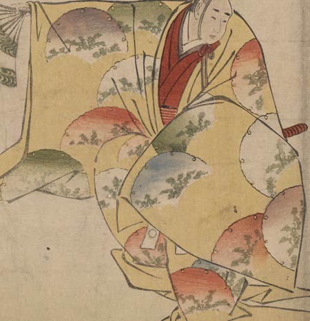
Four of the blocks carrying gradations for the fans are now done, and here's the next one - orange on three of them:

A couple of weeks back - during the carving - I prepared five of these gradation blocks, simply following the patterns of the original print. But when I finished this orange impression, it was clear that we have a problem - the three untouched fans look silly. This is how the original was made, and I had blindly followed it assuming that it was the original makers' intention to have three of them 'blank'. Now that I see it though, I realize that this almost certainly wasn't the case - it looks far too bare. The original print was clearly a very low-budget production, and I suspect that somebody slipped up a bit at the carving stage, and by the time they got to the printing stages, it simply wasn't considered worthwhile to go back and prepare another block.

But I have all the time in the world :-) so I got the carving tools out and prepared a block for the three missing fans. A light brown should do nicely ...

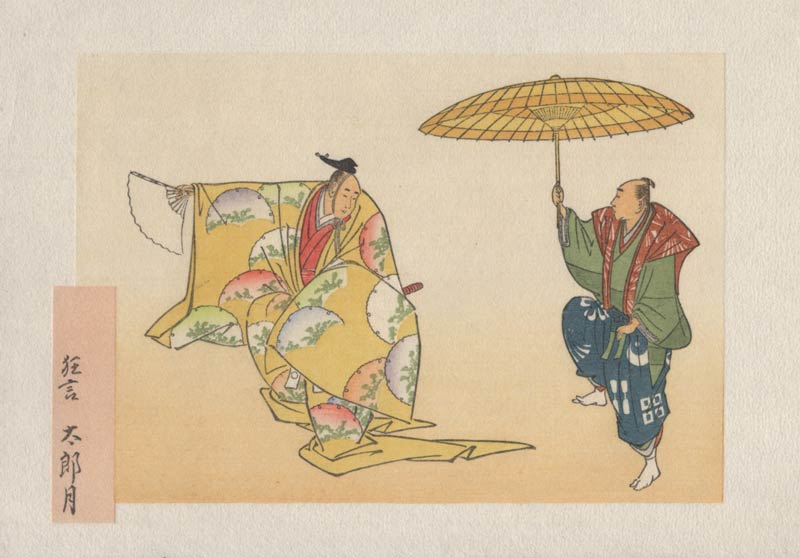
Now we're really in the home stretch. Next comes a little filigree pattern to add a bit of 'something' to the fan:

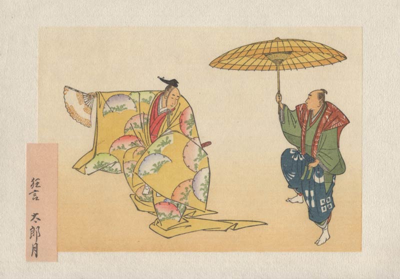
And the next one would perhaps go un-noticed if I didn't point it out. Look up in the inside of the umbrella - we have a tiny block putting in some of the inner construction of the umbrella:

So we're now within striking distance ... tomorrow will see this thing done!

Discussion

Following comment posted by: Barbara Mason on April 20, 2012 1:38 AM

Dave,
You are so right...it looks so much better with those fans colored in!
I thought it was fine until I saw the finished one...an amazing difference.


Following comment posted by: Sharri on April 20, 2012 2:48 AM

Could the missing fans have been originally a fugitive color and it has just faded to nothing over the years? And, then the reference materials reproduced it without the color and we all think it was meant to be that way?


Following comment posted by: Dave on April 20, 2012 8:13 AM

fugutive colour ...

That's certainly something very common. In this particular case, I don't quite think so - at least going by a close-up view of the area in question. The paper really does seem untouched, and some of the nearby coilours - light blue, for one - are of a type that are also fugitive, and they are still there ...

It's also interesting, that even though the fans are quite roughly printed in the original, and the colours are quite 'gloomy' - with plenty of sumi added to each one - the overall effect is still very attractive. That just comes with the territory when you are a Japanese woodblock print, and you reach 220 years old ... I'd really like to see mine this way, but I suppose that might not turn out to be possible. Maybe if I get good exercise, eat right, etc. etc. I might be able to make it about halfway there, do you think?


Add Your Input


Remember Me? (with a cookie ...)

(you may use HTML tags for style)

Back to the Main Page